


Learn Coding Visually
Learn to code with interactive, live-preview playgrounds — HTML, CSS, JavaScript, React & more.
 HTML Playground42 lessons · Click-based · Live preview
 CSS PlaygroundLearn CSS with a live editor
 JavaScript Playground60 lessons · DOM · Async · Canvas
 React PlaygroundLearn React with a live code editor
 GSAP PlaygroundLearn GSAP animation interactively
 SVG Playground44 lessons · shapes · paths · animation
 SCSS Playground45 lessons · Sass modules · tokens
 Tailwind PlaygroundLearn Tailwind CSS with a live editor
 Bootstrap 5 Playground50 lessons · live preview
Gradient-Fill Value Slider — HTML CSS JS Snippet
Gradient-Fill Value Slider · Forms · Plain HTML, CSS & JS · Live preview
What's included
Features
About this UI Snippet
Gradient-Fill Value Slider — Sampling the Same Gradient the Fill Bar Uses
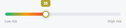
The fill bar's CSS gradient (green → amber → red) is trivial — the interesting part is that the thumb's border color and the tooltip's background *aren't* hardcoded, they're computed in JavaScript to match whatever color the CSS gradient is actually showing at that exact percentage. Move the thumb to 50% and both the border and tooltip turn amber; move it to 90% and they turn red — because a matching color-stop table is interpolated in JS on every render, not just declared once in CSS and left alone.
A tiny linear-gradient interpreter, in JavaScript
STOPS mirrors the CSS gradient's color stops as plain { pct, color } objects. colorAt(pct) finds which two stops the current percentage falls between, computes how far between them it is (t), and linearly interpolates each RGB channel independently with lerp. That's a linear gradient, reimplemented from first principles — the same math the browser's own gradient renderer does internally, just exposed so JavaScript can query "what color is showing at 63%?" and get a real answer back.
Track click-to-jump, separate from thumb drag
Clicking the track (but not the thumb itself, guarded by e.target === thumb) jumps the value directly to that position — a separate, simpler interaction from dragging the thumb, letting a user set a rough value with one click and then fine-tune it by dragging if needed.
Build with AI
Build, Understand, Optimize, and Extend It With AI
Paste this snippet's HTML, CSS, and JS into an AI coding assistant like Claude and ask it to explain exactly how colorAt() reimplements a CSS linear-gradient's color interpolation in JavaScript, and why the STOPS array and the CSS gradient declaration both have to be kept in sync by hand rather than one being derived automatically from the other. It's also worth asking the assistant to write a small helper that parses an actual CSS linear-gradient string into a STOPS-like array automatically, removing the need to keep the two declarations manually synchronized.
Prompt to recreate it
Copy this into your AI assistant of choice to build the effect from scratch, or as a jumping-off point for your own variant:
Build a single-handle range slider in plain HTML, CSS, and vanilla JavaScript whose track uses a multi-color CSS gradient fill, where the thumb's accent color and an attached tooltip dynamically match the exact gradient color at the thumb's current position — no library.

Requirements:
- A track with a fill bar styled with a CSS linear-gradient spanning at least three colors (e.g. green to amber to red), and a draggable circular thumb positioned according to the current value as a percentage of a configurable min/max range.
- A JavaScript array of color stop objects (each with a percentage position and an RGB color) that mirrors the exact same color stops used in the CSS gradient declaration.
- A function that, given any percentage between 0 and 100, determines which two adjacent color stops that percentage falls between and linearly interpolates each of the red, green, and blue channels independently between those two stops' colors, returning a usable CSS color string — this must correctly reproduce the same color the CSS gradient visually shows at that exact percentage, not an approximation.
- On every value change, apply the interpolated color at the current percentage to both the thumb's border/accent color and the background color of a tooltip element positioned above the thumb, so both visually match the gradient's actual appearance at that exact position, not a fixed or averaged color.
- The tooltip must also display the current numeric value as text.
- Support both dragging the thumb (via pointer events with touch fallback) and clicking directly on the track (excluding clicks on the thumb itself) to jump the value to that position.
- Keyboard support: the thumb must be focusable and respond to Left/Right or Down/Up arrow keys with a small step, and produce a larger step when a modifier key such as Shift is held.
- The thumb must carry correct ARIA slider role and value attributes.
Want to tighten it up first? Run this prompt through the AI Prompt Studio to score it across 8 quality dimensions, catch anti-patterns, and tune the wording for Claude, ChatGPT, or Gemini before you paste it in.
Source Code
<div class="gfs-wrap">
  <div class="gfs-track" id="gfsTrack">
    <div class="gfs-fill" id="gfsFill"></div>
    <div class="gfs-thumb" id="gfsThumb" tabindex="0" role="slider" aria-label="Risk level" aria-valuemin="0" aria-valuemax="100" aria-valuenow="35">
      <div class="gfs-tooltip" id="gfsTooltip">35</div>
    </div>
  </div>
  <div class="gfs-scale"><span>Low risk</span><span>High risk</span></div>
</div>*{box-sizing:border-box;margin:0;padding:0}
body{font-family:system-ui,-apple-system,sans-serif;background:#f6f7f9;min-height:100vh;display:flex;align-items:center;justify-content:center;padding:24px}
.gfs-wrap{width:100%;max-width:380px}
.gfs-track{position:relative;height:10px;border-radius:10px;background:#e5e7eb;margin:26px 2px 0}
.gfs-fill{position:absolute;top:0;left:0;height:100%;border-radius:10px;width:35%;background:linear-gradient(90deg,#10b981,#f59e0b,#ef4444)}
.gfs-thumb{position:absolute;top:50%;left:35%;width:22px;height:22px;border-radius:50%;background:#fff;box-shadow:0 2px 10px rgba(15,23,42,.3);transform:translate(-50%,-50%);cursor:grab;touch-action:none;border:3px solid transparent}
.gfs-thumb:active{cursor:grabbing}
.gfs-thumb:focus-visible{outline:2px solid #1f2937;outline-offset:3px}
.gfs-tooltip{position:absolute;bottom:32px;left:50%;transform:translateX(-50%);font:800 11.5px system-ui,sans-serif;color:#fff;padding:4px 9px;border-radius:6px;white-space:nowrap}
.gfs-tooltip::after{content:'';position:absolute;top:100%;left:50%;transform:translateX(-50%);border:5px solid transparent;border-top-color:inherit}
.gfs-scale{display:flex;justify-content:space-between;margin-top:10px;font:600 11px system-ui,sans-serif;color:#9ca3af}var track = document.getElementById('gfsTrack');
var fill = document.getElementById('gfsFill');
var thumb = document.getElementById('gfsThumb');
var tooltip = document.getElementById('gfsTooltip');
var MIN = 0, MAX = 100;
var value = 35;
// Same three-color stop gradient as the fill bar — sampled at the current
// percentage so the tooltip and thumb border always match the fill's color
// exactly at the thumb's position, not just the average or endpoint color.
var STOPS = [
{ pct: 0, color: [16, 185, 129] },
{ pct: 50, color: [245, 158, 11] },
{ pct: 100, color: [239, 68, 68] },
];
function lerp(a, b, t) { return Math.round(a + (b - a) * t); }
function colorAt(pct) {
for (var i = 0; i < STOPS.length - 1; i++) {
var a = STOPS[i], b = STOPS[i + 1];
if (pct >= a.pct && pct <= b.pct) {
var t = (pct - a.pct) / (b.pct - a.pct);
var c = [lerp(a.color[0], b.color[0], t), lerp(a.color[1], b.color[1], t), lerp(a.color[2], b.color[2], t)];
return 'rgb(' + c.join(',') + ')';
}
}
return 'rgb(239,68,68)';
}
function render() {
var pct = ((value - MIN) / (MAX - MIN)) * 100;
fill.style.width = pct + '%';
thumb.style.left = pct + '%';
var color = colorAt(pct);
thumb.style.borderColor = color;
tooltip.style.background = color;
tooltip.textContent = Math.round(value);
thumb.setAttribute('aria-valuenow', Math.round(value));
}
function valueFromClientX(clientX) {
var rect = track.getBoundingClientRect();
var x = Math.max(0, Math.min(rect.width, clientX - rect.left));
return MIN + (x / rect.width) * (MAX - MIN);
}
var dragging = false;
function onMove(e) {
if (!dragging) return;
var clientX = e.touches ? e.touches[0].clientX : e.clientX;
value = valueFromClientX(clientX);
render();
}
thumb.addEventListener('pointerdown', function () { dragging = true; });
window.addEventListener('pointermove', onMove);
window.addEventListener('pointerup', function () { dragging = false; });
thumb.addEventListener('touchstart', function () { dragging = true; }, { passive: true });
window.addEventListener('touchmove', onMove, { passive: true });
window.addEventListener('touchend', function () { dragging = false; });
track.addEventListener('pointerdown', function (e) {
if (e.target === thumb) return;
value = valueFromClientX(e.clientX);
render();
});
thumb.addEventListener('keydown', function (e) {
var step = e.shiftKey ? 10 : 1;
if (e.key === 'ArrowRight' || e.key === 'ArrowUp') { value = Math.min(MAX, value + step); render(); e.preventDefault(); }
else if (e.key === 'ArrowLeft' || e.key === 'ArrowDown') { value = Math.max(MIN, value - step); render(); e.preventDefault(); }
});
render();Step by step
How to Use
- 1Paste HTML, CSS, and JSA gradient slider appears at 35, with a green-tinted thumb border and tooltip.
- 2Drag the thumb rightThe border and tooltip shift from green through amber to red as the value climbs — matching the fill exactly.
- 3Click anywhere on the trackJump straight to that value without needing to grab the thumb first.
- 4Use the keyboardFocus the thumb and press Left/Right for single steps, or hold Shift for steps of 10.
- 5Change the gradientEdit the STOPS array's colors (and the CSS gradient to match) to represent any scale, not just risk.
Real-world uses
Common Use Cases
Got questions?
Frequently Asked Questions
Update both the CSS linear-gradient on .gfs-fill and the STOPS array's color values (as [r, g, b] arrays) to match — they must describe the same gradient for the sampled color to actually align with what's visually showing.
Yes — add more entries to STOPS with their pct and color, and update the CSS gradient with matching percentage stops; colorAt() already loops generically through however many stops exist.
There's no browser API that returns "the color of a linear-gradient at pixel X" — computed styles only expose the gradient's declaration, not a rendered sample at an arbitrary point, so interpolating the same stops manually is the practical way to get a matching color value in JavaScript.
It's already always rendered (not opacity-hidden) in this snippet — if you want it to appear only during interaction, toggle a visibility/opacity class on pointerdown and remove it on pointerup.
Yes — the thumb carries role="slider" with aria-valuemin/max/now, and is independently focusable and operable via Left/Right/Up/Down (plus Shift for larger steps) without a mouse.