Source Code
<div class="wrap">
<div class="scene">
<div class="cube" id="cube">
<div class="face front">
<span class="step-label">Step 1 / 4</span>
<h3>Welcome</h3>
<p>This onboarding carousel swaps steps by rotating a true 3D cube instead of sliding or fading — each step lives on its own face.</p>
</div>
<div class="face right">
<span class="step-label">Step 2 / 4</span>
<h3>Connect your data</h3>
<p>Link your accounts to start syncing. Nothing here is a flat image — every face is real interactive content.</p>
</div>
<div class="face back">
<span class="step-label">Step 3 / 4</span>
<h3>Invite your team</h3>
<p>Add teammates by email. They will see this exact same onboarding cube when they first sign in.</p>
</div>
<div class="face left">
<span class="step-label">Step 4 / 4</span>
<h3>You are ready</h3>
<p>That is the whole flow. Click Finish to close, or Prev to rotate back through the earlier steps.</p>
</div>
</div>
</div>
<div class="controls">
<button id="prevBtn">← Prev</button>
<div class="dots" id="dots"></div>
<button id="nextBtn">Next →</button>
</div>
</div>* { box-sizing: border-box; }
body { font-family: system-ui, sans-serif; background: #0f172a; display: flex; justify-content: center; align-items: center; min-height: 100vh; padding: 40px 20px; }
.wrap { width: 100%; max-width: 340px; }
.scene { perspective: 1400px; width: 100%; height: 260px; margin-bottom: 22px; }
.cube {
position: relative; width: 100%; height: 100%; transform-style: preserve-3d;
transition: transform 0.65s cubic-bezier(0.65,0,0.35,1);
transform: translateZ(-150px) rotateY(0deg);
}
.face {
position: absolute; inset: 0; width: 100%; height: 100%;
border-radius: 16px; padding: 26px;
background: linear-gradient(160deg, #1e293b, #111827);
border: 1px solid rgba(148,163,184,0.25);
display: flex; flex-direction: column; justify-content: center;
backface-visibility: hidden;
}
.front { transform: rotateY(0deg) translateZ(150px); }
.right { transform: rotateY(90deg) translateZ(150px); }
.back { transform: rotateY(180deg) translateZ(150px); }
.left { transform: rotateY(270deg) translateZ(150px); }
.step-label { font-size: 11px; font-weight: 800; letter-spacing: 0.06em; color: #818cf8; text-transform: uppercase; margin-bottom: 10px; }
h3 { font-size: 18px; font-weight: 800; color: #f1f5f9; margin: 0 0 10px; }
p { font-size: 13px; line-height: 1.65; color: #94a3b8; margin: 0; }
.controls { display: flex; align-items: center; justify-content: space-between; gap: 12px; }
button {
padding: 10px 16px; border-radius: 9px; border: 1.5px solid rgba(148,163,184,0.3);
background: transparent; color: #e2e8f0; font-size: 13px; font-weight: 700;
font-family: inherit; cursor: pointer; transition: border-color 0.2s, background 0.2s;
}
button:hover { border-color: #6366f1; background: rgba(99,102,241,0.12); }
button:disabled { opacity: 0.35; cursor: default; pointer-events: none; }
.dots { display: flex; gap: 6px; }
.dots span { width: 6px; height: 6px; border-radius: 50%; background: rgba(148,163,184,0.4); transition: background 0.2s, transform 0.2s; }
.dots span.active { background: #6366f1; transform: scale(1.4); }const cube = document.getElementById('cube');
const prevBtn = document.getElementById('prevBtn');
const nextBtn = document.getElementById('nextBtn');
const dotsEl = document.getElementById('dots');
const STEPS = 4;
let current = 0;
for (let i = 0; i < STEPS; i++) {
const dot = document.createElement('span');
if (i === 0) dot.classList.add('active');
dotsEl.appendChild(dot);
}
function render() {
// Each face sits translateZ(150px) off the cube's own rotation center, so
// rotating the whole .cube by -90deg per step brings the next face to the
// front in true 3D (not a fake width/scale trick) while translateZ(-150px)
// keeps the cube centered inside the .scene perspective box.
cube.style.transform = "translateZ(-150px) rotateY(" + (-current * 90) + "deg)";
[...dotsEl.children].forEach((dot, i) => dot.classList.toggle('active', i === current));
prevBtn.disabled = current === 0;
nextBtn.textContent = current === STEPS - 1 ? 'Finish' : 'Next \u2192';
}
prevBtn.addEventListener('click', () => {
if (current > 0) { current--; render(); }
});
nextBtn.addEventListener('click', () => {
if (current < STEPS - 1) { current++; render(); }
else { current = 0; render(); }
});
document.addEventListener('keydown', (e) => {
if (e.key === 'ArrowRight') nextBtn.click();
if (e.key === 'ArrowLeft') prevBtn.click();
});
render();Learn Coding Visually
Learn to code with interactive, live-preview playgrounds — HTML, CSS, JavaScript, React & more.
 HTML Playground42 lessons · Click-based · Live preview
 CSS PlaygroundLearn CSS with a live editor
 JavaScript Playground60 lessons · DOM · Async · Canvas
 React PlaygroundLearn React with a live code editor
 GSAP PlaygroundLearn GSAP animation interactively
 SVG Playground44 lessons · shapes · paths · animation
 SCSS Playground45 lessons · Sass modules · tokens
 Tailwind PlaygroundLearn Tailwind CSS with a live editor
 Bootstrap 5 Playground50 lessons · live preview
3D Cube Panel Transition — CSS rotateY Carousel
3D Cube Rotate Panel Transition · Animations · Plain HTML, CSS & JS · Live preview
What's included
Features
About this UI Snippet
3D Cube Panel Transition — Real rotateY() Step Carousel, Not a Fake Slide
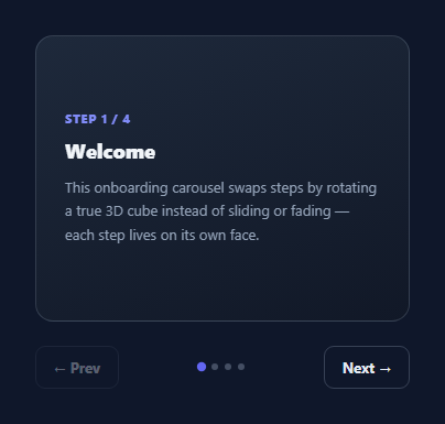
Most "3D" step carousels are really 2D slides with a drop shadow. This snippet builds a genuine 3D cube: four content panels, each glued to a different face of one transform-style: preserve-3d element, rotating in real 3D space via rotateY() to bring the next step to the front — the same technique behind a physical rotating cube, applied to an onboarding flow instead of a decorative spinner.
Building the cube out of four faces
.cube is a position: relative container with transform-style: preserve-3d, which is the single most important property here — without it, child 3D transforms would be flattened into the 2D plane of the parent instead of composing in true 3D space. Each .face is absolutely positioned to fill the cube and given its own transform: front sits at rotateY(0deg) translateZ(150px), right at rotateY(90deg) translateZ(150px), back at rotateY(180deg) translateZ(150px), and left at rotateY(270deg) translateZ(150px). Rotating each face first and then pushing it outward along its *own* new Z-axis with translateZ is what walls the four faces into a real cube shape around a shared center, rather than stacking them flat.
The parent perspective
.scene wraps the cube with perspective: 1400px, which is what makes the 3D rotation actually look three-dimensional instead of a flat squish — perspective must live on an ancestor of the rotating element, not on the element itself, for the vanishing-point math to apply correctly to its children.
Rotating the whole cube to change steps
Advancing a step doesn't move or hide any individual face — it rotates the *entire* .cube element by rotateY(-90deg * currentStep), combined with a fixed translateZ(-150px) that recenters the cube inside .scene so it appears to rotate in place rather than swinging off-screen. Because all four faces are rigidly attached to the cube at their own fixed rotations, rotating the parent by -90° per step reliably brings the next face square to the viewer, in the exact same physical way a real six-sided object would present a new face when you turn it.
backface-visibility: hidden
Every .face sets backface-visibility: hidden, which prevents a face that has rotated to point away from the viewer from rendering "through" the cube — without it, you would see mirrored, backwards text from the opposite face bleeding through during the rotation.
Keyboard and dot navigation
render() is the single function that updates everything derived from the current step index: the cube's rotateY transform, which dot in .dots gets the .active class, whether the Prev button is disabled at step 0, and whether Next reads "Next" or "Finish" on the last step. Arrow-key listeners simply call the same Prev/Next button click handlers, so keyboard and pointer navigation always stay perfectly in sync because they share one code path.
Extending to more or fewer faces
Four faces map cleanly onto four 90° rotations, but the same technique scales to six faces (a literal cube, adding top/bottom at rotateX(90/-90deg) translateZ(150px)) or down to three (rotateY(0/120/240deg) for a triangular prism) — the core recipe of "rotate each face to its resting angle, then translateZ outward by the same fixed distance" stays identical regardless of face count.
Build with AI
Build, Understand, Optimize, and Extend It With AI
Paste this snippet's HTML, CSS, and JS into an AI coding assistant like Claude and ask it to explain why perspective lives on .scene while transform-style: preserve-3d lives on .cube — that split is the part people most often get backwards when building their first CSS 3D transform. Once that clicks, ask the assistant to help you extend the cube to six real faces (top/bottom via rotateX), or to add swipe/drag gesture support so the cube can be rotated with a pointer drag instead of only Prev/Next buttons.
Prompt to recreate it
Copy this into your AI assistant of choice to build the effect from scratch, or as a jumping-off point for your own variant:
Build an onboarding step carousel in plain HTML, CSS, and JavaScript that uses a genuine CSS 3D cube — not a sliding or fading trick — to transition between four content panels.

Requirements:
- Wrap a .cube element in a .scene container with CSS perspective set on .scene (not on the cube itself).
- Give .cube transform-style: preserve-3d and position four .face children absolutely inside it, each with its own fixed transform: rotateY(0/90/180/270deg) followed by translateZ(150px), so the four faces wall into a real cube shape around a shared center.
- Add backface-visibility: hidden to every face so a face rotated away from the viewer does not render mirrored content through the front.
- Write a render() function that rotates the whole .cube element by -90deg times the current step index (plus a fixed translateZ to recenter it inside .scene), and also updates step-indicator dots and disables the Prev button on the first step, renaming Next to Finish on the last step.
- Wire Prev/Next buttons and ArrowLeft/ArrowRight keyboard shortcuts to the same step-changing logic so both stay in sync.
- Each face should contain real heading and paragraph content for a distinct onboarding step, not a placeholder image.
Want to tighten it up first? Run this prompt through the AI Prompt Studio to score it across 8 quality dimensions, catch anti-patterns, and tune the wording for Claude, ChatGPT, or Gemini before you paste it in.
Step by step
How to Use
- 1Click Next / PrevThe whole cube rotates 90 degrees in 3D to bring the next or previous face to the front.
- 2Try arrow keysArrowRight and ArrowLeft trigger the same Next/Prev navigation as the buttons.
- 3Edit each face's contentChange the h3/p text inside .front, .right, .back, .left in the HTML panel — each is a normal content block, not an image.
- 4Change the cube sizeUpdate the 150px translateZ values (must match the .scene half-width) and the .scene height together.
- 5Add a 5th or 6th faceAdd rotateX(90deg)/rotateX(-90deg) faces for top/bottom, or use 60deg increments for six faces around Y instead of four.
- 6Export in your formatClick "HTML" for a standalone file, "JSX" for a React component, or "Tailwind" for a React + Tailwind version.
Real-world uses
Common Use Cases
Got questions?
Frequently Asked Questions
Every face has its own fixed rotateY() plus a translateZ(150px) push outward, and the parent .cube uses transform-style: preserve-3d so those transforms compose in true 3D space instead of flattening. Advancing a step rotates the whole cube by -90deg per step, so the next face swings into view exactly the way a physical rotating cube would.
Without it, a browser flattens all descendant 3D transforms into the 2D plane of the parent, so nested translateZ values would have no visible effect. Setting it on .cube tells the browser to keep the whole subtree in a shared 3D coordinate space, which is required for the face positions to actually wall into a cube shape.
CSS perspective only affects the 3D rendering of an element's children, not the element itself. Placing it on the ancestor .scene container is what gives the child .cube (and its faces) a vanishing point to rotate around, producing real depth instead of a flat squash.
As the cube rotates, a face temporarily points away from the viewer. Without backface-visibility: hidden, that face would still render, but mirrored — text would appear backwards, bleeding through the face that is supposed to be in front.
Add two more .face elements positioned with rotateX(90deg) translateZ(150px) and rotateX(-90deg) translateZ(150px) for the top and bottom, and extend the navigation logic to rotate on the X axis for those two steps instead of Y.
Yes — add pointerdown/pointermove/pointerup listeners that track horizontal drag distance, and call the same render() function with an updated current step once the drag passes a distance threshold, exactly as the button click handlers already do.