You Might Also Like
Learn Coding Visually
Learn to code with interactive, live-preview playgrounds — HTML, CSS, JavaScript, React & more.
 HTML Playground42 lessons · Click-based · Live preview
 CSS PlaygroundLearn CSS with a live editor
 JavaScript Playground60 lessons · DOM · Async · Canvas
 React PlaygroundLearn React with a live code editor
 GSAP PlaygroundLearn GSAP animation interactively
 SVG Playground44 lessons · shapes · paths · animation
 SCSS Playground45 lessons · Sass modules · tokens
 Tailwind PlaygroundLearn Tailwind CSS with a live editor
 Bootstrap 5 Playground50 lessons · live preview
Spotlight Product Card — Free HTML CSS JS Hover Card Snippet
Spotlight Product Card · Cards · Plain HTML, CSS & JS · Live preview
What's included
Features
About this UI Snippet
Spotlight Product Card — A Cursor-Lit E-commerce Card
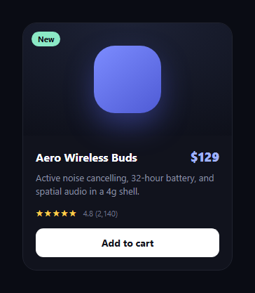
The spotlight product card is the e-commerce card that lights up under your cursor — a soft glow sweeps across the surface and the border itself illuminates where the pointer is, the effect made famous by developer-tool and hardware landing pages. This snippet builds it with plain HTML, CSS, and a four-line JavaScript handler, with no canvas and no library.
Two spotlight layers from one set of variables
A single mousemove handler writes the cursor's position into two CSS custom properties, --mx and --my, on the card. Two pseudo-elements then read those variables: ::before paints a large, soft radial-gradient glow over the card body, and ::after paints a tighter, brighter gradient used for the border. Because both reference the same variables, the surface glow and the border highlight track the cursor in perfect lockstep with only two values updated per frame.
The masked gradient border
The illuminated border is the clever part. The ::after layer fills the whole card with its bright radial gradient, but a CSS mask using mask-composite: exclude (with the -webkit- fallback) cuts out everything except a 1px frame around the edge — so only the border shows the gradient, and it brightens exactly where the cursor is. This is how a border can appear to be lit by a moving light without any extra elements.
Hover-gated opacity
Both spotlight layers sit at opacity: 0 and fade in only on :hover, so the resting card is calm and the light reads as something that switches on as you approach. isolation: isolate and careful z-index ordering keep the glow above the media but below the interactive content, so text and the button stay crisp and clickable.
Pointer-events and layering
Both pseudo-elements are pointer-events: none, so they never intercept clicks — the cursor always reaches the button and links beneath. The card body sits on its own stacking context above the body glow but below the border layer, which keeps the design legible while the light plays over it.
A complete product card
Inside the effect is a real, usable product card: a media area with a tagged badge, a title-and-price row, a description, a star rating, and an add-to-cart button that confirms with a brief "Added ✓" state. The spotlight is decorative polish layered on top of solid commerce markup.
Customizing it
Change the glow colours and radii in the two gradients, adjust the border thickness via the mask padding, or swap the media for a real product image. The whole effect is content-agnostic. Pair it with a product card grid, a tilt glow card, or an add to cart button.
Build with AI
Build, Understand, Optimize, and Extend It With AI
You don't need to work out how one mousemove handler drives two separate pseudo-element gradients by hand. Paste this snippet's HTML, CSS, and JS into an AI coding assistant like Claude and ask it to explain exactly why the ::before glow and ::after border both read the same --mx and --my variables yet look visually distinct, or how the mask-composite exclude rule on the ::after layer isolates just the 1px border from an otherwise full-card gradient fill. The same assistant can help optimize it, for example checking whether writing two CSS custom properties on every mousemove event is cheap enough to avoid throttling even on a page with many of these cards. It's also useful for extending the feature: ask it to swap the placeholder shape in the media area for a real product image with a matching glow tint, add a wishlist heart icon that toggles state, or make the Added confirmation state persist longer if clicked multiple times in a row. Treat the code less like a finished artifact and more like a starting point for a conversation.
Prompt to recreate it
Copy this into your AI assistant of choice to build the effect from scratch, or as a jumping-off point for your own variant:
Build a single e-commerce product card with a cursor-following spotlight glow and a matching illuminated border in plain HTML, CSS, and JavaScript, no libraries.

Requirements:
- A product card with a media area (a placeholder shape or image plus a small badge), a name and price row, a description, a star rating with a review count, and an Add to cart button.
- One mousemove listener on the card must write the cursor's position relative to the card (computed via getBoundingClientRect, not raw clientX/clientY) into two CSS custom properties on the card element.
- A ::before pseudo-element must render a large, soft radial gradient across the whole card surface, centered using those same two custom properties, hidden at rest and fading in only on hover via an opacity transition.
- A separate ::after pseudo-element must render a tighter, brighter radial gradient also centered on the same custom properties, but clipped using a CSS mask so that only a roughly 1px border ring around the card's edge is visible — the interior of the gradient must be invisible, achieved by compositing two stacked masks together rather than by drawing a literal border element.
- Both pseudo-elements must be pointer-events none and must not sit above the card's real content in stacking order, so the Add to cart button and any text remain fully clickable and legible at all times.
- Clicking Add to cart must change its label to a confirmation state for a short duration (roughly 1 to 2 seconds) and then revert automatically to the original label, without needing a page reload or external state.
Want to tighten it up first? Run this prompt through the AI Prompt Studio to score it across 8 quality dimensions, catch anti-patterns, and tune the wording for Claude, ChatGPT, or Gemini before you paste it in.
Step by step
How to Use
- 1Paste HTML, CSS, and JSA product card renders, calm at rest.
- 2Hover the cardA soft spotlight and a lit border fade in.
- 3Move the cursorBoth the glow and border track the pointer.
- 4Click Add to cartThe button confirms with Added ✓ briefly.
- 5Recolor the glowEdit the two radial-gradient colors.
- 6Swap the mediaDrop a product image into the media area.
Real-world uses
Common Use Cases
Got questions?
Frequently Asked Questions
A single mousemove handler writes the pointer position into two CSS custom properties, --mx and --my, on the card. Two pseudo-elements read those same variables — ::before for the surface glow and ::after for the border — so both move in lockstep with only two values updated per frame.
The ::after layer fills the card with a bright radial gradient, then a CSS mask with mask-composite: exclude cuts out everything except a 1px frame around the edge. Only the border shows the gradient, and because the gradient is centred on the cursor variables, it brightens exactly where the pointer is.
Both spotlight pseudo-elements are pointer-events: none, so they never intercept the cursor — clicks pass through to the button and links beneath. isolation: isolate plus z-index ordering keeps the glow above the media but below the interactive content, so everything stays clickable and crisp.
No. Only two CSS variables change per pointer move; the gradients and masks are static. The browser repaints the pseudo-elements but never reflows layout, and the layers fade in only on hover, so the resting card costs nothing. It runs smoothly even in a dense product grid.
Attach an onMouseMove handler that writes --mx and --my to the card via a ref, imperatively, so you do not re-render on every pointer move. Keep the rest as ordinary JSX/template markup. The pseudo-element gradients and mask CSS port unchanged; in Tailwind use arbitrary properties for the mask-composite rule since it has no built-in utility.