


Learn Coding Visually
Learn to code with interactive, live-preview playgrounds — HTML, CSS, JavaScript, React & more.
 HTML Playground42 lessons · Click-based · Live preview
 CSS PlaygroundLearn CSS with a live editor
 JavaScript Playground60 lessons · DOM · Async · Canvas
 React PlaygroundLearn React with a live code editor
 GSAP PlaygroundLearn GSAP animation interactively
 SVG Playground44 lessons · shapes · paths · animation
 SCSS Playground45 lessons · Sass modules · tokens
 Tailwind PlaygroundLearn Tailwind CSS with a live editor
 Bootstrap 5 Playground50 lessons · live preview
Progress Circle Steps — Free HTML CSS JS Step Progress Bar
Progress Circle Steps · Loaders · Plain HTML, CSS & JS · Live preview
What's included
Features
About this UI Snippet
Progress Circle Steps — A Numbered Wizard Progress Bar
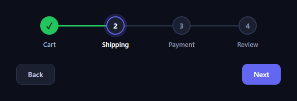
The progress circle steps indicator is the horizontal "1 — 2 — 3 — 4" tracker at the top of checkouts and multi-step forms, where completed steps turn into green check circles and the connector between them fills in as you advance. This snippet builds it with plain HTML, CSS, and a small vanilla JavaScript state machine.
Nodes and connectors
Each step is a flex column holding a circular node and a label. The connecting line is a ::after on every step except the last, positioned absolutely at the node's vertical centre and stretched across the gap behind the circles (z-index: 0 so the nodes sit on top). When a step is marked done, its connector turns green — so the line literally fills up to the current step, giving an at-a-glance sense of progress.
Three node states from classes
A step is in one of three states driven entirely by CSS classes: upcoming (muted circle with its number), current (accent border and a soft focus ring around the node), or done (solid green circle showing a check mark instead of the number). The check is a ::after content swap with the number's font-size set to zero, so the same node element morphs from a digit to a tick without extra markup. Smooth transition: all on the node makes each change animate.
A tiny state machine
JavaScript holds a single current index and a render() function that re-derives every step's classes from it — done if before current, current if equal, upcoming otherwise — plus the button states. This is the cleanest way to drive a stepper: one number is the source of truth, and the whole indicator is a pure function of it, so there's no chance of two steps both appearing current.
Navigation, including back-jumps
Next advances the index (and the final Next becomes "Finish"), Back decrements it and disables at the first step, and clicking any node at or before the current step jumps straight back to it — letting users revisit a completed step without clicking Back repeatedly. Forward jumps to undone steps are blocked, so you can't skip ahead past required steps.
Accessible structure
The labels are real text under each node, so the steps are readable and not conveyed by colour alone. The disabled Back button uses the native disabled attribute, and the markup is plain enough to extend with aria-current="step" on the active step for screen readers.
Customizing it
Add or remove steps freely — the flex layout and index logic adapt — change the accent and done colours, or wire render() to also show the matching form panel for each step. Pair it with a multi-step form, a progress wizard, or a stepper.
Build with AI
Build, Understand, Optimize, and Extend It With AI
You don't have to work out the class-driven state machine by hand. Paste this snippet's HTML, CSS, and JS into an AI coding assistant like Claude and ask it to explain exactly how render() derives is-done, is-current, and the default upcoming state purely from comparing each step's index to the current variable, or how the ::after connector line and the number-to-checkmark swap both key off those same two classes with no extra markup. The same assistant can help optimize it, for example checking whether re-toggling every step's classList on every render call matters once there are dozens of steps, or whether the connector's absolute positioning holds up if labels wrap to two lines. It's just as useful for extending the stepper: ask it to add a shake animation when a forward jump is blocked, persist the current step to the URL or localStorage so a reload resumes progress, or support a vertical orientation for narrow screens. Treat the code less like a finished artifact and more like a starting point for a conversation.
Prompt to recreate it
Copy this into your AI assistant of choice to build the effect from scratch, or as a jumping-off point for your own variant:
Build a horizontal numbered "progress circle steps" indicator in plain HTML, CSS, and JavaScript with no framework and no libraries.

Requirements:
- A row of step elements, each containing a circular numbered node and a text label, laid out with flexbox so each step takes equal width.
- A connecting line between each pair of adjacent nodes, implemented as a pseudo-element positioned behind the nodes (lower z-index) and stretched across the horizontal gap, that changes color to indicate completed progress.
- Exactly one JavaScript variable holds the current step index. A single render function must be the only place that assigns per-step CSS classes: mark a step done if its index is less than current, current if equal, and leave it in a default upcoming state otherwise — never toggle these classes anywhere else in the code.
- A done step's circular node must swap its visible content from the step number to a checkmark using only CSS (for example, zeroing the number's font-size and adding checkmark content via a pseudo-element keyed off the done class) — no DOM element swapping.
- A Next button that advances current by one (relabeling itself "Finish" on the second-to-last step) and a Back button that decrements it and gets the native disabled attribute at the first step.
- Clicking directly on any step's node must jump current to that step's index, but only if that step's index is less than or equal to the current index — clicking a future, not-yet-reached step must do nothing, so users can revisit completed steps but never skip ahead.
Want to tighten it up first? Run this prompt through the AI Prompt Studio to score it across 8 quality dimensions, catch anti-patterns, and tune the wording for Claude, ChatGPT, or Gemini before you paste it in.
Source Code
<div class="ps-wrap">
  <div class="ps-steps" id="psSteps">
    <div class="ps-step is-done" data-label="Cart"><span class="ps-node">1</span><span class="ps-name">Cart</span></div>
    <div class="ps-step is-current" data-label="Shipping"><span class="ps-node">2</span><span class="ps-name">Shipping</span></div>
    <div class="ps-step" data-label="Payment"><span class="ps-node">3</span><span class="ps-name">Payment</span></div>
    <div class="ps-step" data-label="Review"><span class="ps-node">4</span><span class="ps-name">Review</span></div>
  </div>
  <div class="ps-actions">
    <button type="button" class="ps-btn" id="psBack">Back</button>
    <button type="button" class="ps-btn ps-primary" id="psNext">Next</button>
  </div>
</div>*{box-sizing:border-box;margin:0;padding:0}
body{font-family:system-ui,-apple-system,sans-serif;background:#0c0f1a;display:flex;justify-content:center;align-items:center;min-height:100vh;padding:24px}
.ps-wrap{width:min(520px,94vw)}
.ps-steps{display:flex}
.ps-step{flex:1;display:flex;flex-direction:column;align-items:center;gap:10px;position:relative}
/* Connector line between nodes, sitting behind them. */
.ps-step:not(:last-child)::after{content:'';position:absolute;top:17px;left:50%;width:100%;height:3px;background:#262d3f;z-index:0}
.ps-step.is-done:not(:last-child)::after{background:#22c55e}
.ps-node{position:relative;z-index:1;width:36px;height:36px;border-radius:50%;display:flex;align-items:center;justify-content:center;background:#1a2030;border:2px solid #2e3650;color:#7e8aa6;font-size:14px;font-weight:700;transition:all .3s}
.ps-step.is-current .ps-node{border-color:#6366f1;color:#fff;box-shadow:0 0 0 5px rgba(99,102,241,.2)}
.ps-step.is-done .ps-node{background:#22c55e;border-color:#22c55e;color:#06210f;font-size:0}
.ps-step.is-done .ps-node::after{content:'✓';font-size:17px;font-weight:800}
.ps-name{font-size:13px;color:#8b93a8;font-weight:600;transition:color .3s}
.ps-step.is-current .ps-name{color:#fff}
.ps-step.is-done .ps-name{color:#9fb6c8}
.ps-actions{display:flex;justify-content:space-between;margin-top:30px}
.ps-btn{font-family:inherit;font-size:14px;font-weight:600;padding:10px 22px;border-radius:10px;border:1px solid #2c3346;background:#1a2030;color:#c6cde0;cursor:pointer;transition:opacity .15s}
.ps-btn:disabled{opacity:.4;cursor:not-allowed}
.ps-primary{background:#6366f1;border-color:#6366f1;color:#fff}var stepsEl = document.getElementById('psSteps');
var steps = Array.prototype.slice.call(stepsEl.children);
var back = document.getElementById('psBack');
var next = document.getElementById('psNext');
var current = 1; // zero-based index of the current step
function render() {
steps.forEach(function (step, i) {
step.classList.toggle('is-done', i < current);
step.classList.toggle('is-current', i === current);
});
back.disabled = current === 0;
next.textContent = current === steps.length - 1 ? 'Finish' : 'Next';
}
next.addEventListener('click', function () {
if (current < steps.length - 1) { current++; render(); }
});
back.addEventListener('click', function () {
if (current > 0) { current--; render(); }
});
// Let users jump back to any completed step by clicking its node.
steps.forEach(function (step, i) {
step.addEventListener('click', function () {
if (i <= current) { current = i; render(); }
});
});
render();Step by step
How to Use
- 1Paste HTML, CSS, and JSA four-step tracker renders at step two.
- 2Click NextThe current step completes and fills the line.
- 3Reach the endThe Next button label becomes Finish.
- 4Click BackIt steps back and disables at the first step.
- 5Click a past nodeJump straight to any completed step.
- 6Add a stepDrop in another .ps-step — logic adapts.
Real-world uses
Common Use Cases
Got questions?
Frequently Asked Questions
Each step except the last has a ::after line positioned behind the nodes. When a step is marked done its connector turns green, so the line fills up to the current step. Because done is derived from the current index, the fill always matches how far the user has advanced.
The done node keeps the same element but sets the number's font-size to zero and adds a check as ::after content, so the circle morphs from a digit to a tick without extra markup. A transition on the node animates the colour and border change smoothly as a step completes.
A single current index is the source of truth, and a render function re-derives every step's classes from it — done before current, current when equal, upcoming after — plus the button states. Because the whole indicator is a pure function of one number, two steps can never both appear current.
Yes. Clicking any node at or before the current step sets the index to it, so users can revisit a completed step without repeatedly clicking Back. Forward jumps past undone steps are blocked, so the guard prevents skipping required steps while still allowing free backward navigation.
Hold the current step index in state and render each step's done/current classes from it, exactly like the render function. Wire Next and Back to increment and decrement the index, and node clicks to jump back when the index is less than or equal to current. The node, connector, and check CSS port unchanged.