You Might Also Like
Learn Coding Visually
Learn to code with interactive, live-preview playgrounds — HTML, CSS, JavaScript, React & more.
 HTML Playground42 lessons · Click-based · Live preview
 CSS PlaygroundLearn CSS with a live editor
 JavaScript Playground60 lessons · DOM · Async · Canvas
 React PlaygroundLearn React with a live code editor
 GSAP PlaygroundLearn GSAP animation interactively
 SVG Playground44 lessons · shapes · paths · animation
 SCSS Playground45 lessons · Sass modules · tokens
 Tailwind PlaygroundLearn Tailwind CSS with a live editor
 Bootstrap 5 Playground50 lessons · live preview
3D Rotating Cube Loader — Real CSS 3D Cube with Six True Faces
3D Rotating Cube Loader · Loaders · Plain HTML & CSS · Live preview
What's included
Features
About this UI Snippet
3D Rotating Cube Loader — Six Faces, Correctly Positioned in 3D Space
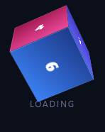
A lot of "3D cube" loaders on the web are actually a single flat square with a fake shadow or a skewed pseudo-element — a 2D illusion, not a real cube. This snippet builds an actual six-sided CSS cube: six real elements, each individually rotated and pushed outward along the Z axis by exactly half the cube's edge length, so they form a genuinely closed 3D box that a perspective-enabled camera can rotate around and view from any angle, in plain HTML and CSS with no JavaScript at all.
Perspective, then a 3D-preserving parent
The outer .cb-scene sets perspective: 600px, which establishes the "camera distance" for everything inside it — without it, all the 3D transforms below would flatten back to 2D. The .cb-cube element inside is given transform-style: preserve-3d, which is what allows its six children to keep their individual 3D positions relative to each other and to the parent's own rotation, instead of each face's transform being flattened independently.
The correct six-face transform math
Every face is a full-size div absolutely positioned to overlap all the others at the cube's center, and each gets exactly two transforms in this order: a rotation, then a translation along Z. The rotation happens first (around the shared center), which reorients that face's own local Z axis; the translateZ(half) that follows then pushes the face outward along that newly-rotated axis, landing it flush against the correct side of the cube rather than at some skewed offset. Concretely: .cb-front needs no rotation, so translateZ(--half) alone pushes it straight toward the viewer. .cb-back is rotated 180° first so its own local Z axis now points away from the viewer, and the same translateZ(--half) push lands it on the opposite side. .cb-right and .cb-left rotate ±90° around Y before translating, and .cb-top/.cb-bottom rotate ±90° around X — six faces, six correctly-oriented pushes, one shared --half distance, forming a real closed cube with no gaps or overlaps.
One CSS variable drives the whole geometry
--size is defined once on .cb-scene, and --half is computed from it with calc(var(--size) / 2). Because every face's translation distance references --half rather than a hardcoded pixel value, changing --size alone rescales the entire cube correctly — every face stays flush with no gaps, since the geometry is expressed as a relationship rather than six independently-tuned numbers.
Spinning on two axes at once
The cube's own @keyframes animates transform: rotateX() rotateY() together from 0deg to 360deg on both axes simultaneously over one loop. Because both rotations run at the same rate, the cube traces a genuinely three-dimensional tumble rather than spinning flatly around a single vertical axis — every face becomes visible from a constantly-changing angle as the loop repeats.
backface-visibility keeps it clean
Each face has backface-visibility: hidden, so a face currently rotated away from the viewer doesn't render its (identical, mirrored) backside poking through — important once the whole cube is tumbling and faces are constantly swinging into and out of view.
Reduced motion
Under prefers-reduced-motion, the animation is disabled and the cube is frozen at a fixed, still genuinely three-dimensional angle (a static rotateX(-20deg) rotateY(35deg)) so users who opt out of motion still see the real 3D shape rather than a flattened front face. Pair it with an orbit loader or a wave loader for a non-3D alternative where perspective support or motion preference makes a real cube less appropriate.
Build with AI
Build, Understand, Optimize, and Extend It With AI
Paste this snippet's HTML and CSS into an AI coding assistant like Claude and ask it to walk through, face by face, exactly why each one needs a rotation applied before its translateZ(var(--half)) rather than after, and why that specific order is what makes six separately-transformed elements form a real closed cube instead of six flat squares stacked in the wrong places. It's worth asking it to verify the geometry explicitly: confirm that .cb-back's rotateY(180deg) plus translateZ(var(--half)) really does land it directly opposite .cb-front, and that .cb-top's rotateX(90deg) plus the same translateZ lands it perpendicular to both, forming a genuinely orthogonal box. For extending it, ask for a version where each face shows real content (an icon or a progress percentage) instead of a static number, a variant where the rotation speed responds to real loading progress, or a way to swap the continuous spin for a one-shot roll-to-a-face reveal once loading completes. Treat the code less like a finished artifact and more like a starting point for a conversation.
Prompt to recreate it
Copy this into your AI assistant of choice to build the effect from scratch, or as a jumping-off point for your own variant:
Build a genuine 3D rotating cube loading indicator in plain HTML and CSS only — six real, individually positioned faces forming an actual cube, not a flat square with a fake shadow or skew trick.

Requirements:
- A scene container with a CSS perspective value set, containing a cube element with transform-style: preserve-3d, which itself contains exactly six identically-sized face elements absolutely positioned to overlap at the cube's center by default.
- Define the cube's edge length as a single CSS custom property, and derive a second custom property equal to exactly half that value using calc(); every face's transform must reference the half-value property, never a separately hardcoded pixel number, so that changing only the edge-length property rescales the entire cube with all six faces still landing flush against each other with no visible gaps.
- Each face must receive exactly two chained transforms in the correct order — a rotation appropriate to that face (none for front, 180 degrees on Y for back, plus or minus 90 degrees on Y for the two side faces, plus or minus 90 degrees on X for top and bottom), followed by a translateZ using the half-edge-length variable — so that after rotating around the shared center, each face is pushed outward along its own newly-rotated local Z axis to the correct side of a real closed cube.
- Apply backface-visibility: hidden to every face so that faces currently rotated away from the viewer do not render their mirrored reverse side showing through the cube.
- Animate the cube element's own transform with a CSS keyframe that rotates it continuously on two axes simultaneously (both X and Y), so the cube visibly tumbles in three dimensions and every face becomes visible at some point during the loop, rather than spinning flatly around a single axis.
- Add a prefers-reduced-motion media query that stops the spin animation and freezes the cube at a fixed, non-zero 3D angle on both axes (not a flattened front-on view), so the six-sided geometry is still visible to users who have that preference set.
Want to tighten it up first? Run this prompt through the AI Prompt Studio to score it across 8 quality dimensions, catch anti-patterns, and tune the wording for Claude, ChatGPT, or Gemini before you paste it in.
Step by step
How to Use
- 1Paste HTML, CSS, and JSA six-sided cube renders and spins continuously on two axes.
- 2Watch every face pass byAs it tumbles, each of the six numbered, differently-coloured faces comes into view.
- 3Inspect the face transformsNote each face is a rotation followed by translateZ(--half) — never a flat 2D trick.
- 4Resize the cubeChange --size on .cb-scene; --half recalculates and every face stays flush.
- 5Change the spin speed or axesEdit the cbSpin keyframe's duration or which axes it rotates.
- 6Recolor the facesEach .cb-face has its own gradient — restyle any or all of them.
Real-world uses
Common Use Cases
Got questions?
Frequently Asked Questions
Each of the six faces is its own element rotated around the cube's shared center and then translated outward along Z by exactly half the cube's edge length, positioned inside a parent with transform-style: preserve-3d and a perspective camera on its ancestor. This produces genuine spatial geometry a viewer can rotate around and see from any angle — a flat 2D trick would typically fake depth with a single skewed pseudo-element and a static shadow, which can't correctly reveal different faces as it turns.
The rotation runs first and reorients that face's own local Z axis to point toward the correct side of the cube; the translateZ that follows then pushes the face outward along that newly-rotated axis, landing it flush against the right side. If the order were reversed, or if translateZ were used without the matching rotation, the faces would translate along the original, un-rotated Z axis and stack incorrectly instead of forming a closed box.
--half is computed from --size with calc(var(--size) / 2), and every single face's translateZ distance references --half rather than a hardcoded value. Since the geometric relationship (each face sits exactly half the cube's own edge length from center) is expressed as a formula, not six independent numbers, changing --size once automatically keeps every face correctly flush against its neighbors at any size.
As the cube tumbles, a face that has rotated to point away from the viewer would otherwise still render — showing its own (identical, mirrored) reverse side bleeding through the cube from the wrong direction. backface-visibility: hidden prevents a face from rendering at all once it's turned away, keeping the cube looking solid and correctly opaque from every viewing angle during the spin.
Render the scene/cube/six-face markup as-is — the entire effect is CSS custom properties and keyframes with no JavaScript dependency, so no lifecycle hooks are required. If you want per-instance sizing, pass --size as an inline style or CSS variable prop on the .cb-scene element; the calc()-derived --half and all six face transforms will recalculate automatically.