You Might Also Like
Learn Coding Visually
Learn to code with interactive, live-preview playgrounds — HTML, CSS, JavaScript, React & more.
 HTML Playground42 lessons · Click-based · Live preview
 CSS PlaygroundLearn CSS with a live editor
 JavaScript Playground60 lessons · DOM · Async · Canvas
 React PlaygroundLearn React with a live code editor
 GSAP PlaygroundLearn GSAP animation interactively
 SVG Playground44 lessons · shapes · paths · animation
 SCSS Playground45 lessons · Sass modules · tokens
 Tailwind PlaygroundLearn Tailwind CSS with a live editor
 Bootstrap 5 Playground50 lessons · live preview
Orbit Loader — Animated Orbiting Dots Spinner
Orbit Loader · Loaders · Plain HTML, CSS & JS · Live preview
What's included
Features
About this UI Snippet
Orbit Loader — Pure-CSS Orbiting Spinner with Speed Control
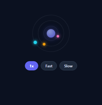
An orbit loader is a loading spinner styled as planets circling a glowing core — a more characterful alternative to a plain ring while staying lightweight and CSS-only. This snippet builds one with three independent orbits, a pulsing core, a speed control via a CSS variable, and reduced-motion support, in plain HTML and CSS with a sprinkle of JavaScript.
Orbits as rotating rings
Each orbit is a circular element that rotates with a CSS @keyframes spin, and a small "planet" dot sits at the top of each ring. Because the planet is a child of the rotating ring, spinning the ring carries the planet around its circular path — no per-frame trigonometry. Nesting three rings at decreasing inset gives concentric orbits, and giving each a different duration (and alternating direction) makes the motion feel organic rather than mechanical.
A pulsing core
In the centre, a radial-gradient core gently scales and fades on its own loop with a glowing box-shadow, anchoring the composition and adding life. The whole loader is built from a handful of divs with no images or SVG, so it's tiny and crisp at any size.
Speed via a CSS variable
All animation durations are expressed as a base time divided by a --spd custom property (e.g. calc(1.6s / var(--spd))). Changing one variable on the loader re-times every orbit and the pulse together, proportionally — so the speed control is a single style.setProperty('--spd', …) call, and a designer can re-tune the whole loader by editing one number. This is a clean demonstration of CSS variables driving coordinated animation.
Accessible and motion-safe
The loader is marked role="status" with an aria-label, so assistive tech announces that content is loading rather than ignoring a decorative spinner. A prefers-reduced-motion media query stops the animation for users who opt out, leaving a static, still-meaningful graphic — the responsible default for any looping animation.
Drop-in and themeable
Colours, sizes, orbit count, and speeds are all CSS, so restyling to match a brand or simplifying to two orbits takes minutes. It's a polished, dependency-free reference for a distinctive loading state that's still feather-light.
Build with AI
Build, Understand, Optimize, and Extend It With AI
You don't need to trace every calc() by hand to see how the timing holds together. Paste this snippet's HTML, CSS, and JS into an AI coding assistant like Claude and ask it to explain precisely how a single --spd custom property, referenced inside calc(1.6s / var(--spd)) on three different orbit rings and the core pulse, keeps every animation proportionally in sync when the speed chips call setProperty, or why the ob-o2 ring adds the reverse keyword while the others don't. The same assistant can help optimize it — ask whether running three concurrent infinite CSS animations is meaningfully cheaper than a single requestAnimationFrame driving all three via transform, especially on lower-powered devices. It's also useful for extending the loader: have it add a fourth orbit with its own inset and duration, wire the core's pulse color to reflect a loading-progress percentage, or expose the speed chips as a prop-driven component instead of hardcoded buttons. Treat the code less like a finished artifact and more like a starting point for a conversation.
Prompt to recreate it
Copy this into your AI assistant of choice to build the effect from scratch, or as a jumping-off point for your own variant:
Build an "orbit loader" spinner in plain HTML, CSS, and a small amount of JavaScript using only CSS keyframe animations and a custom property for speed control — no requestAnimationFrame, no JS-driven positioning math.

Requirements:
- A central pulsing "core" element using a radial-gradient background and a glowing box-shadow, animated with a CSS keyframe that scales it up and fades its opacity partway through the loop and back, set to loop infinitely.
- Three concentric ring elements nested at different inset values (so they form circles of decreasing radius), each with a small colored "planet" dot positioned at the top of the ring via absolute positioning, so that rotating the ring carries its planet around a circular path with zero per-frame JavaScript math.
- Give each ring a different animation duration and have at least one ring rotate in the reverse direction from the others, so the composition doesn't feel mechanically uniform.
- Express every animation's duration as a base time divided by a single shared CSS custom property (e.g. calc(1.6s / var(--spd))) defined once on the loader's root element, so changing that one custom property re-times the core pulse and all three orbit rings together, proportionally.
- Add a small row of speed-selector buttons (e.g. 1x, Fast, Slow) that, on click, mark themselves active and call element.style.setProperty to update the shared speed custom property on the loader.
- Mark the loader element with role="status" and an aria-label describing that content is loading, and add a prefers-reduced-motion media query that disables all the animations for users who have that preference set.
Want to tighten it up first? Run this prompt through the AI Prompt Studio to score it across 8 quality dimensions, catch anti-patterns, and tune the wording for Claude, ChatGPT, or Gemini before you paste it in.
Step by step
How to Use
- 1Paste HTML and CSSAn orbit loader renders with three orbiting dots and a pulsing core.
- 2Drop it inShow it while content or a request is loading.
- 3Set the speedUse the chips, or set the --spd variable from your code.
- 4RecolorChange each planet and the core gradient to match your brand.
- 5Adjust orbitsAdd or remove an orbit ring and tune its duration.
- 6Respect motionIt already stops under prefers-reduced-motion.
Real-world uses
Common Use Cases
Got questions?
Frequently Asked Questions
Each orbit is a ring element that rotates via a CSS keyframe animation, and the planet dot is a child positioned at the top of that ring. When the ring rotates, the child rotates with it around the center, tracing a circle — so the orbit is pure CSS transform, with no requestAnimationFrame or trigonometry. Nesting rings at smaller insets creates concentric orbits.
Every animation duration is written as a base time divided by a --spd CSS variable, like calc(1.6s / var(--spd)). Setting --spd on the loader (the chips call style.setProperty) re-times all orbits and the core pulse together and proportionally, so the whole loader speeds up or slows down in sync from a single value. It is a neat example of variables coordinating multiple animations.
The loader has role="status" and an aria-label, so screen readers announce that something is loading instead of treating it as a meaningless decoration. It also respects prefers-reduced-motion, disabling the animation for users who are sensitive to motion while leaving a static graphic, which is the responsible way to ship any looping animation.
Yes. Add or remove an .ob-orbit element (with its planet) and give it an inset and animation duration; everything is CSS. Colors are set per planet and on the core's radial gradient, so recoloring to a brand palette or simplifying to two orbits takes a few lines and no logic changes.
Render the markup as a small component and toggle it while a loading flag is true. Expose speed as a prop that sets the --spd CSS variable via an inline style. The animations are pure CSS, so they port directly, and prefers-reduced-motion still applies. Tailwind users can apply sizing and colors with utilities and keep the keyframes in the stylesheet.