You Might Also Like
Learn Coding Visually
Learn to code with interactive, live-preview playgrounds — HTML, CSS, JavaScript, React & more.
 HTML Playground42 lessons · Click-based · Live preview
 CSS PlaygroundLearn CSS with a live editor
 JavaScript Playground60 lessons · DOM · Async · Canvas
 React PlaygroundLearn React with a live code editor
 GSAP PlaygroundLearn GSAP animation interactively
 SVG Playground44 lessons · shapes · paths · animation
 SCSS Playground45 lessons · Sass modules · tokens
 Tailwind PlaygroundLearn Tailwind CSS with a live editor
 Bootstrap 5 Playground50 lessons · live preview
Loading Overlay — Free HTML CSS JS Snippet
Loading Overlay · Loaders · Plain HTML, CSS & JS · Live preview
What's included
Features
About this UI Snippet
Loading Overlay — Spinner, Dots & Progress Bar Variants with Blur Backdrop and Opacity Fade
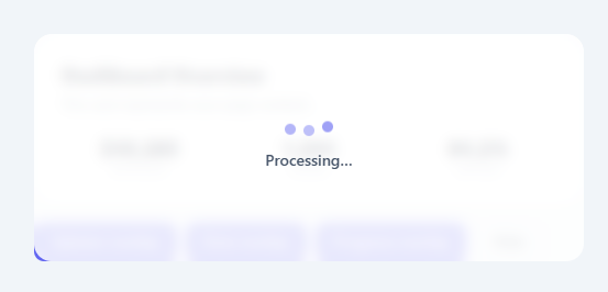
A loading overlay blocks a section or full page during an asynchronous operation — API call, file upload, data processing — to prevent user interaction with partially loaded content and communicate that something is happening. This snippet provides three overlay variants: a classic CSS spinner, bouncing dots, and a simulated progress bar — all with a frosted glass backdrop-filter blur and opacity fade transition.
The overlay backdrop
The overlay uses position: absolute; inset: 0 to cover the parent container entirely. background: rgba(255,255,255,0.85) provides a semi-transparent white tint. backdrop-filter: blur(6px) blurs the content behind the overlay — the frosted glass effect. In the closed state, opacity: 0 and pointer-events: none make the overlay invisible and non-interactive. Adding .visible switches to opacity: 1 and pointer-events: all. The CSS transition: opacity 0.25s fades smoothly.
Spinner variant
The spinner uses border-top-color: #6366f1 on an otherwise light grey bordered circle, rotated continuously via a CSS keyframe animation. The cubic-bezier timing is linear for a consistent revolution speed.
Dots variant
Three bouncing dots use translateY(-10px) at the 50% keyframe with staggered animation-delay (0s, 0.2s, 0.4s). Opacity fades from 0.4 to 1 in sync.
Progress bar variant
A simulated setInterval advances the progress bar by a random amount (2–10%) every 300ms. When it reaches 100%, the interval clears and hideOverlay() fires after a 600ms delay. In production, replace the simulation with a real upload progress event: xhr.upload.onprogress = e => { const pct = e.loaded/e.total*100; updateProgress(pct); }.
Positioning: absolute vs fixed
The overlay uses position: absolute to cover only the parent .page container. For a full-page overlay, change to position: fixed; inset: 0; z-index: 9999 and attach it to the document body instead of a container div. The blur and opacity behaviour is identical — only the covered area changes.
Performance note
backdrop-filter: blur() is GPU-composited but can be expensive on older mobile devices. If performance is a concern, replace backdrop-filter with background: rgba(255,255,255,0.94) without blur. Test with Chrome DevTools Performance to confirm the overlay renders without triggering main-thread layout recalculation. All three loader animations (spinner rotation, dots bounce, progress bar fill) use transform and width — both GPU-safe properties that avoid layout recalculation on each animation frame. For mobile-first projects, always prefer transform-based animations over properties that trigger layout or paint — this principle applies equally to the overlay's loader variants and any other CSS animation throughout the codebase.
Build with AI
Build, Understand, Optimize, and Extend It With AI
You do not have to trace the class toggling across three loader variants by hand. Paste this snippet's HTML, CSS, and JS into an AI coding assistant like Claude and ask it to walk through exactly how showOverlay(type) hides the other two .loader-wrap variants before revealing the requested one, and why clearInterval(progInterval) is called both at the start of showOverlay and inside hideOverlay. The same assistant can help optimize it, for instance asking whether backdrop-filter: blur is worth swapping for a plain semi-transparent background on lower-end mobile devices, given how expensive that filter can be to composite. It is also useful for extending the overlay: ask it to wire the progress variant to a real XMLHttpRequest upload.onprogress event instead of the random-increment simulation, add a fourth "error" loader variant with a retry button, or convert the overlay from position: absolute to position: fixed for a full-page version. Treat the code less like a finished artifact and more like a starting point for a conversation.
Prompt to recreate it
Copy this into your AI assistant of choice to build the effect from scratch, or as a jumping-off point for your own variant:
Build a "loading overlay" component in plain HTML, CSS, and JavaScript with no libraries, supporting three interchangeable loader variants inside one overlay container.

Requirements:
- An overlay element positioned absolutely to cover its nearest positioned ancestor (inset: 0), with a semi-transparent white background and a backdrop-filter: blur applied for a frosted-glass look, hidden by default via opacity: 0 and pointer-events: none, and revealed via a single class toggle that animates opacity to 1 and re-enables pointer-events with a CSS transition.
- Three loader variants living inside the same overlay box, each in its own wrapper element toggled with a hidden class: a rotating CSS-only spinner (border-top-color trick, no SVG), a row of three bouncing dots with staggered animation-delay values, and a progress bar with a percentage label.
- A single JS function that accepts which variant to show, first hides all three variants, then reveals only the requested one and makes the overlay visible — so only one loader is ever shown at a time regardless of call order.
- For the progress variant specifically: a setInterval must advance a percentage by a random increment every 300ms, update both the bar's width and a text percentage label each tick, and when the percentage reaches or exceeds 100, clear the interval, clamp it to exactly 100, and auto-hide the overlay after a short delay.
- A shared hide function must clear any running progress interval and remove the overlay's visible class, and it must be safe to call even if no interval is currently running.
- Document, in a code comment or structure, how to convert the overlay from covering a single container (position: absolute) to covering the full viewport (position: fixed) by changing only the position property and z-index, without altering the loader variants or JS logic.
Want to tighten it up first? Run this prompt through the AI Prompt Studio to score it across 8 quality dimensions, catch anti-patterns, and tune the wording for Claude, ChatGPT, or Gemini before you paste it in.
Step by step
How to Use
- 1Click any trigger button to see the overlay variantSpinner overlay shows for 3 seconds then auto-hides. Dots overlay shows for 3 seconds then auto-hides. Progress overlay simulates a file upload, advancing the bar and auto-closing at 100%.
- 2Wrap your content in a position:relative containerThe overlay covers the nearest position:relative ancestor. Ensure your .page or section container has position: relative set. The overlay uses position: absolute; inset: 0 to fill it exactly.
- 3Wire to a real API call or upload eventShow on fetch start: showOverlay("spinner"). Hide on .then() or .finally(): hideOverlay(). For uploads: show progress variant, then wire xhr.upload.onprogress to updateProgress(pct). Hide on upload complete.
- 4Convert to a full-page overlayChange position: absolute to position: fixed on .overlay. Remove border-radius: 16px. The overlay now covers the entire viewport instead of just the parent container.
- 5Change the overlay opacity and blurUpdate rgba(255,255,255,0.85) to control the backdrop tint opacity. Increase or decrease blur(6px) on backdrop-filter. For dark-themed pages, use rgba(0,0,0,0.6) for a dark overlay with white spinner.
- 6Export in your formatClick "HTML" for a standalone file, "JSX" for a React component with visible/type state managed by useState, or "Tailwind" for a Tailwind CSS version.
Real-world uses
Common Use Cases
Got questions?
Frequently Asked Questions
Replace the setInterval simulation with an XMLHttpRequest upload progress listener: const xhr = new XMLHttpRequest(); xhr.upload.onprogress = e => { if (e.lengthComputable) { const pct = Math.round(e.loaded/e.total*100); document.getElementById("prog-fill").style.width = pct + "%"; document.getElementById("prog-pct").textContent = pct + "%"; if (pct >= 100) setTimeout(hideOverlay, 600); } }; xhr.open("POST", "/upload"); xhr.send(formData). Show the progress overlay before calling xhr.send().
Move the .overlay div to be a direct child of body (not inside the .page container). Change position: absolute to position: fixed in the CSS and remove border-radius: 16px. Now the overlay covers the full viewport. Set z-index: 9999 to ensure it appears above all page content. The opacity fade and blur work identically — only the covered area changes.
Change background: rgba(255,255,255,0.85) to background: rgba(0,0,0,0.6) on .overlay. Change .overlay-msg color to #f1f5f9. Change .spinner border colour to rgba(255,255,255,0.15) and border-top-color to #fff. The dots and progress bar can remain the same since they use the accent colour which reads on dark.
Manage loading state with useState: const [loading, setLoading] = useState({ visible: false, type: "spinner" }). Render the overlay: {loading.visible && <div className="overlay visible">...</div>}. On API call: setLoading({visible:true, type:"spinner"}) before fetch, setLoading({visible:false, type:"spinner"}) in finally(). Pass the loading type to conditionally render the correct variant inside the overlay box.