More Loaders Snippets
Front-End Coding Playgrounds
Learn to code with interactive, live-preview playgrounds — HTML, CSS, JavaScript, React & more.
 HTML Playground42 lessons · Click-based · Live preview
 CSS PlaygroundLearn CSS with a live editor
 JavaScript Playground60 lessons · DOM · Async · Canvas
 React PlaygroundLearn React with a live code editor
 GSAP PlaygroundLearn GSAP animation interactively
 SVG Playground44 lessons · shapes · paths · animation
 SCSS Playground45 lessons · Sass modules · tokens
 Tailwind PlaygroundLearn Tailwind CSS with a live editor
 Bootstrap 5 Playground50 lessons · live preview
Countdown Timer — Free HTML CSS JS Pomodoro Snippet
Countdown Timer · Loaders · Plain HTML, CSS & JS · Live preview
What's included
Features
About this UI Snippet
Countdown Timer — SVG Ring Progress, Pomodoro Modes, Session Dots & Pause/Resume
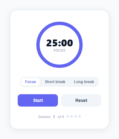
A countdown timer with a circular progress ring is one of the most visually engaging loading and progress components you can build without a library. This snippet implements a complete Pomodoro-style countdown timer: an SVG stroke-dashoffset ring that drains as time passes, three mode tabs (Focus 25min, Short break 5min, Long break 15min), Start/Pause/Resume/Reset controls, a session counter with dot indicators, and a colour change per mode — all in plain HTML, CSS, and vanilla JavaScript.
How the SVG ring countdown works
The ring uses the stroke-dashoffset technique. The circle has a circumference C = 2 × π × radius = 2 × π × 52 ≈ 327px. stroke-dasharray: 327 makes the stroke one continuous dash equal to the full circumference. stroke-dashoffset controls how much of the dash is hidden — setting it to 327 hides the full ring (empty), 0 shows the full ring (complete). As time passes: dashoffset = C × (1 - remaining/total). The CSS transition: stroke-dashoffset 0.5s linear smooths the movement each second.
The Pomodoro mode tabs
Three tabs switch between Focus (25 min, indigo ring), Short break (5 min, green ring), and Long break (15 min, cyan ring). Switching a mode resets the timer, updates the stroke colour via ring.style.stroke, and updates the centre label. The mode button active state uses the same pill tab pattern as the calendar widget.
Start/Pause/Resume logic
A setInterval fires every 1000ms when running. The toggle() function checks the running boolean: if running, it clears the interval, sets running = false, and changes the button to "Resume". If not running, it starts the interval and changes the button to "Pause". The Reset button clears the interval and restores remaining to totalSecs.
Session dot tracker
Four dot indicators track completed focus sessions. Each completed focus session (when the ring reaches 0 in Focus mode) fills one dot with the accent colour and increments the session counter. After 4 sessions, the counter stops at 4 — a visual cue to take a long break.
Tabular number digits
The time display uses font-variant-numeric: tabular-nums — a CSS OpenType feature that makes all digits the same width, preventing the display from shifting width as the time counts down.
Build with AI
Build, Understand, Optimize, and Extend It With AI
You don't have to derive the stroke-dashoffset formula yourself to trust why the ring drains smoothly. Paste this snippet's HTML, CSS, and JS into an AI coding assistant like Claude and ask it to explain exactly how the circle's circumference, the dasharray, and the per-second dashoffset calculation combine to visually represent remaining time as a fraction of a full circle, and why toggle only ever needs one boolean flag to manage start, pause, and resume instead of three separate states. The same assistant can help optimize it — for instance asking whether driving the countdown from setInterval risks drift over a long session compared to computing elapsed time from a stored start timestamp on each tick. It's also useful for extending the timer: ask it to add a real audio chime using the Web Audio API when a session ends, turn the ring red during the final minute of a focus session, or persist the running session and remaining time to sessionStorage so a reload doesn't lose progress. Treat the code less like a finished artifact and more like a starting point for a conversation.
Prompt to recreate it
Copy this into your AI assistant of choice to build the effect from scratch, or as a jumping-off point for your own variant:
Build a Pomodoro-style countdown timer in plain HTML, CSS, and JavaScript with an SVG circular progress ring — no timer library, no frameworks.

Requirements:
- An SVG circle used as a progress ring, where stroke-dasharray is set to the circle's exact circumference (2 times pi times the radius) so the entire stroke forms one continuous dash equal to the ring's full length.
- Every second, recompute stroke-dashoffset as the circumference multiplied by one minus the fraction of time remaining, so the ring visually drains from a complete circle to nothing as the countdown proceeds, with a short CSS transition on that property so the motion isn't a hard jump.
- Three selectable modes (e.g. Focus, Short Break, Long Break), each with its own duration in minutes and its own accent color applied to the ring's stroke, where switching modes stops any running countdown, resets the remaining time to the new mode's duration, and updates the active-tab styling.
- A single boolean flag tracking whether the timer is currently running, used to drive one toggle function that starts a one-second interval when not running (changing the button label to a pause state) and clears that interval when running (changing the button label to a resume state) — do not use three separate states for start/pause/resume.
- A reset control that stops any active interval and restores the remaining time to the current mode's full duration without changing modes.
- A row of session-indicator dots that fill in one at a time specifically when a Focus-mode countdown reaches zero (not when a break ends), up to a maximum of four, with an accompanying session counter.
- Display the remaining time as minutes and seconds, zero-padded to two digits each, using a monospace/tabular numeral style so the digit width never shifts as the numbers change.
Step by step
How to Use
- 1Click Start to begin the countdownThe SVG ring starts draining and the timer counts down. Click Pause to pause mid-session. Click Resume to continue. The button label changes to reflect the current state.
- 2Switch between Focus and break modesClick Focus (25 min), Short break (5 min), or Long break (15 min) to switch modes. The ring colour changes: indigo for Focus, green for Short break, cyan for Long break. Switching resets the timer.
- 3Change the timer durationsIn the JS panel, update the modes object: { focus: N, break: N, long: N } where N is the duration in minutes. Change the onclick values in the HTML mode buttons to match the new durations.
- 4Customize ring coloursIn the JS setMode() function, update the ring.style.stroke values per mode. In the CSS, update .ring-fill stroke and .ctrl-btn background to change the default accent colour.
- 5Add a sound notification on timer endInside the ticker interval, when remaining <= 0, add: const audio = new Audio("bell.mp3"); audio.play(). Or use the Web Audio API to generate a tone: const ctx = new AudioContext(); const osc = ctx.createOscillator(); osc.connect(ctx.destination); osc.start(); setTimeout(() => osc.stop(), 400).
- 6Export in your formatClick "HTML" for a standalone file, "JSX" for a React component using useState for remaining, useEffect for the interval with cleanup, or "Tailwind" for a Tailwind version.
Real-world uses
Common Use Cases
Got questions?
Frequently Asked Questions
The ring uses stroke-dasharray: 327 (the full circumference, computed as 2×π×52) and stroke-dashoffset. When dashoffset = 0, the full ring is visible. When dashoffset = 327, the ring is completely hidden. The formula dashoffset = C × (1 - remaining/total) maps the remaining time fraction to the dashoffset: at full time remaining (remaining/total = 1), dashoffset = 0 (full ring). At time expired (remaining/total = 0), dashoffset = C (empty ring). CSS transition: stroke-dashoffset 0.5s linear smooths the change each second.
In the setInterval callback, when remaining <= 0, use the Web Audio API: const ctx = new (window.AudioContext || window.webkitAudioContext)(); const osc = ctx.createOscillator(); const gain = ctx.createGain(); osc.connect(gain); gain.connect(ctx.destination); osc.frequency.value = 440; gain.gain.setValueAtTime(0.3, ctx.currentTime); gain.gain.exponentialRampToValueAtTime(0.001, ctx.currentTime + 0.8); osc.start(); osc.stop(ctx.currentTime + 0.8). This creates a 440Hz tone that fades out over 0.8 seconds without any audio file.
Inside the ticker setInterval, after decrementing remaining, add a colour warning: if (remaining <= 60 && currentMode === "focus") { document.getElementById("ring").style.stroke = "#ef4444"; } else if (remaining <= 0) { document.getElementById("ring").style.stroke = ""; }. The CSS transition on the stroke property (add transition: stroke 0.3s to .ring-fill) will animate the colour change smoothly.
Click "JSX" to download. Manage remaining, running, currentMode, and session in useState. Run the interval in useEffect: useEffect(() => { if (!running) return; const id = setInterval(() => setRemaining(r => r - 1), 1000); return () => clearInterval(id); }, [running]). Use useEffect to check if remaining reaches 0: useEffect(() => { if (remaining <= 0) { setRunning(false); if (currentMode === "focus") setSession(s => Math.min(4, s+1)); } }, [remaining]).