You Might Also Like
Learn Coding Visually
Learn to code with interactive, live-preview playgrounds — HTML, CSS, JavaScript, React & more.
 HTML Playground42 lessons · Click-based · Live preview
 CSS PlaygroundLearn CSS with a live editor
 JavaScript Playground60 lessons · DOM · Async · Canvas
 React PlaygroundLearn React with a live code editor
 GSAP PlaygroundLearn GSAP animation interactively
 SVG Playground44 lessons · shapes · paths · animation
 SCSS Playground45 lessons · Sass modules · tokens
 Tailwind PlaygroundLearn Tailwind CSS with a live editor
 Bootstrap 5 Playground50 lessons · live preview
Wave Loader — Liquid Fill Loader HTML CSS JS SVG
Wave Loader · Loaders · Plain HTML, CSS & JS · Live preview
What's included
Features
About this UI Snippet
Wave Loader — A Liquid-Fill Orb with Two Animated Sine Waves
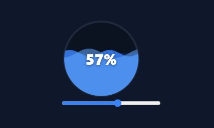
The wave (or liquid-fill) loader shows progress as liquid rising in a container, its surface rippling with animated waves — a richer, more organic alternative to a plain bar or spinner. This snippet builds it in plain HTML, CSS, SVG, and vanilla JavaScript: a circular orb that fills to any percentage with two layered sine waves sliding across the surface — no library.
Waves drawn as sine paths
The wave surface is an SVG path generated from the sine function: wavePath() walks across the width sampling sin() to build the rippled top edge, then closes the path down to the bottom to form a filled body of liquid. The path is drawn twice as wide as the orb (240 across a 120 viewBox) so it can slide a full wavelength and loop seamlessly. Generating the wave from sin() (rather than a static image) means the amplitude, wavelength, and fill level are all parameters you control.
Two layers for depth
Two wave paths are stacked — one taller-amplitude and more opaque, one shorter and translucent — animated at different speeds and opposite directions. This parallax of two offset waves is what makes the liquid look alive and three-dimensional rather than a single flat ripple; it is the same trick used in app liquid-progress widgets. A faint static fill rectangle behind them gives the body colour.
Clipped to the container shape
Everything inside the orb is wrapped in a clipPath of the circle, so the rectangular waves and fill are masked to the round shape — the liquid appears to sit inside the orb with a clean curved edge. Swapping the clip shape (a rounded rect, a logo path) reshapes the container without touching the wave logic, which is the flexibility the clip approach gives.
Level-driven fill
The fill level (0–100%) sets the waves' baseline y — at 100% the surface is at the top, at 0% at the bottom — and a percentage label sits centred over the orb. Here a slider drives the level live so you can see it fill and drain; in real use you would set the level from your actual progress (upload percent, score, capacity). The horizontal sliding is pure CSS animation, independent of the level, so the liquid keeps rippling at any fill.
Drop-in and adaptable
Tune the wave amplitude, wavelength, colours, and speeds, or change the clip shape to fit your design. It is a complete, dependency-free reference for sine-wave path generation, layered wave parallax, and clip-path container masking — the foundation of any liquid-fill loader or gauge. Because update() rewrites the d attribute on every change rather than only animating the CSS slide, regenerating the path is the right place to put any easing if you switch the level from a slider to programmatic progress updates — wrap the level changes in a short transition loop (or animate a JS value over a few hundred milliseconds and call update() each frame) so the surface rises smoothly instead of jumping straight to the new height.
Build with AI
Build, Understand, Optimize, and Extend It With AI
Ask an AI coding assistant like Claude to walk through wavePath()'s two summed sine terms — the primary wave plus a smaller harmonic at 2.3 times its frequency — and explain concretely why a single sine would look mechanical while the sum reads as organic liquid. It's worth an efficiency check too: the path is drawn twice the orb's width so the CSS translate animation can loop seamlessly, so ask what would visually break (a visible seam or jump) if the sample step or the double-width trick were removed. For extending it, ask for a version driven by a smoothly animated JS value instead of an instant slider jump, so the liquid actually rises and falls rather than snapping, a way to reshape the clipPath into a rounded rectangle or custom logo outline, or a color that shifts from red to green as the level crosses a threshold. Treat the code less like a finished artifact and more like a starting point for a conversation.
Prompt to recreate it
Copy this into your AI assistant of choice to build the effect from scratch, or as a jumping-off point for your own variant:
Build a circular liquid-fill "wave loader" in plain HTML, CSS, and SVG using vanilla JavaScript — the fill surface generated from sine math, not a static image.

Requirements:
- An SVG circle acting as the loader's outer ring, with a clipPath matching that same circle shape applied to a group containing the liquid layers, so anything drawn inside is masked to the round outline.
- A function that generates an SVG path string representing a rippled liquid surface: given a fill level (0 to 1), an amplitude, and a wavelength, sample points across a width at least twice as wide as the visible orb, compute each point's y-coordinate as the level's baseline plus a sine function of x scaled by amplitude, then close the path down to the bottom to form a filled shape.
- Render two separate wave paths from that function with different amplitudes, wavelengths, and opacities, and animate them horizontally in opposite directions and at different speeds using CSS keyframe animations, so the two layers create a parallax effect that reads as three-dimensional liquid rather than a flat ripple.
- The horizontal CSS animation must translate each wave path by exactly one orb-width so that when it loops back to its start, the visual pattern is identical and the loop shows no visible seam or jump.
- Add a percentage label centered over the orb showing the current fill level as a number, using a tabular numeral font so the digits don't jitter as the value changes.
- Wire a range slider (or an equivalent programmatic input) that, on every change, recomputes both wave paths' d attributes and a background fill rectangle's height from the new level — the horizontal ripple animation must keep running independently of the level, purely via CSS, while only the level-driven baseline position is recalculated in JavaScript.
Want to tighten it up first? Run this prompt through the AI Prompt Studio to score it across 8 quality dimensions, catch anti-patterns, and tune the wording for Claude, ChatGPT, or Gemini before you paste it in.
Step by step
How to Use
- 1Paste HTML, CSS, and JSA liquid orb renders, filled with two rippling waves, and a slider to set the level.
- 2Drag the sliderChange the fill level 0-100% and watch the liquid rise or drain while the waves ripple.
- 3Drive from real progressSet range.value (or call update with your level) from upload percent, score, or capacity.
- 4Tune the wavesAdjust the amplitude, wavelength, and animation speeds for calmer or choppier liquid.
- 5Reshape the containerChange the clipPath shape to a rounded rect or logo to fill a different outline.
- 6Restyle itEdit the wave colours, body fill, and ring to match your theme.
Real-world uses
Common Use Cases
Got questions?
Frequently Asked Questions
wavePath() walks across the width in small steps, computing each point's y as the fill baseline plus sin(x) × amplitude, building an SVG path of the rippled surface, then closes it down to the bottom to form a filled body. Because it is generated from sin() rather than a fixed image, you control the amplitude (wave height), wavelength, and baseline (fill level) as parameters.
A single ripple looks flat. Stacking two waves — one taller and more opaque, one shorter and translucent — animated at different speeds and opposite directions creates a parallax that reads as real, three-dimensional liquid. This layered-wave technique is what app liquid-progress widgets use to make the fill feel alive at any level.
The wave path is drawn twice as wide as the visible orb (240 across a 120 viewBox). The CSS animation translates it left by exactly one orb-width (120px), so when it resets, the second half of the wave has moved into the position the first half started in — a continuous sine pattern means the wave looks identical, and the loop is seamless.
The fill level comes from the slider's 0-100 value, which sets the wave baseline and the static fill height. In real use, set that level from your actual progress — assign range.value or call update() with your percentage from an upload's loaded/total, a score, or a capacity figure. The wave ripple animation is independent of the level, so it keeps moving as the liquid rises.
Hold the fill level in state and recompute the wave path d attributes from it in the render (or imperatively via a ref). In React use useState and set the paths in an effect or inline; in Vue bind :d with a computed; in Angular bind [attr.d] with a getter. The wavePath() sine math and the CSS ripple animation are framework-agnostic — only the level state moves into the framework.