Skeleton Card Grid — Loading Placeholder HTML CSS JS

Skeleton Card Grid · Loaders · Plain HTML, CSS & JS · Live preview

Share & Support

What's included

Features

Layout-stable placeholders
Skeleton cards match the real cards' size, eliminating layout shift on swap.
Single-gradient shimmer
One animated background-position rule shimmers every placeholder — no extra DOM.
Matching grid
Skeletons share the real grid, so columns and gaps are identical.
Matching count
Renders as many skeletons as expected cards for a realistic placeholder.
Clean one-shot swap
Content replaces all skeletons at once to avoid piecemeal flicker.
Fade-in content
Real cards fade in for a gentle transition from placeholder.
Replayable load cycle
A Reload button re-triggers the loading state on demand.
Drop-in & no library
Pure HTML/CSS/JS skeleton + content rendering with zero dependencies.

About this UI Snippet

Skeleton Card Grid — Shimmering Placeholders That Mirror the Real Cards
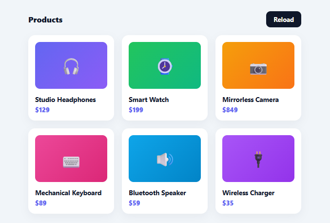
Screenshot of the Skeleton Card Grid snippet rendered live

A skeleton screen shows grey placeholder shapes where content will appear while data loads, instead of a spinner — making the wait feel shorter and the layout feel stable. This snippet builds a skeleton *card grid* in plain HTML, CSS, and vanilla JavaScript: shimmering placeholder cards that match the real cards' dimensions exactly, then swap to content when loaded — no library.

Placeholders that mirror the real layout

The key to a good skeleton is that the placeholder occupies the *same space* as the real content. Here the skeleton card uses the identical card padding, the same thumbnail height, and lines sized to the real title and price — so when content arrives, nothing jumps. This eliminates cumulative layout shift (CLS), the janky reflow you get when a spinner is replaced by content of a different size. The skeleton and real cards share the same grid, so the columns and gaps are identical too.

The shimmer is one moving gradient

Each placeholder shape has a three-stop linear-gradient background sized larger than the element (background-size: 400%), and a keyframe animates its background-position across, producing the highlight that sweeps over the skeleton. Animating background-position (rather than moving a pseudo-element) is the lightweight, widely-used way to get the shimmer with a single rule applied to every placeholder — no extra DOM. The shimmer signals "loading, not broken" far better than static grey blocks.

Matching counts and a clean swap

The grid renders as many skeleton cards as there will be real cards, so the placeholder grid looks like the final grid, not an arbitrary few boxes. When data is ready, the whole grid's content is replaced in one assignment and the real cards fade in. Swapping all at once (rather than card-by-card) avoids a piecemeal flicker, and the fade gives a gentle transition from placeholder to content.

Driven by a load lifecycle

A load() function shows the skeletons, then (here on a timer, in reality on a fetch resolving) swaps to content — and a Reload button replays the cycle so you can see the loading state on demand. In production you'd render the skeletons immediately on mount and replace them in the promise's .then, which is the standard data-loading pattern.

Drop-in and adaptable

Match the skeleton's shapes to your own card (avatar circle, image, lines) and render counts to your expected results, and it drops into any grid that loads asynchronously. It's a clear reference for layout-stable skeleton loading and the single-gradient shimmer technique used across modern apps. Worth adding for real usage: aria-busy="true" on the grid container while skeletons are showing (removed once real content renders), plus aria-live="polite" somewhere announcing "Products loaded" — screen reader users get no visual cue from a shimmering placeholder, so without an explicit announcement they have no way to know when the real content has actually arrived.

Step by step

How to Use

  1. 1
    Paste HTML, CSS, and JSA product grid renders shimmering skeleton cards, then swaps to real cards after a moment.
  2. 2
    Reload to replayClick Reload to show the skeleton loading state again.
  3. 3
    Match your cardAdjust the skeleton shapes (thumb height, line widths) to mirror your real card exactly.
  4. 4
    Set the countRender as many skeletons as expected results so the placeholder grid matches the final one.
  5. 5
    Wire to fetchShow skeletons on mount and swap to content in your fetch().then() instead of the timer.
  6. 6
    Restyle the shimmerTweak the gradient colours or animation speed to fit your theme.

Real-world uses

Common Use Cases

Product and catalog grids
Show placeholders while products load — pair with a product card as the real content.
Dashboards and feeds
Skeleton tiles while widgets fetch, alongside a skeleton dashboard for full layouts.
Search and gallery results
Stable placeholders while results stream in.
Profile and content cards
Avatar/line skeletons for people or article grids.
Anywhere with async cards
Any grid that loads from an API benefits from a matching skeleton.
Learning skeleton loading
A reference for layout-stable skeletons and shimmer — compare with a skeleton loader.

Got questions?

Frequently Asked Questions

A spinner says "something is loading" but gives no sense of what or how the page will look, and when it's replaced by content of a different size the layout jumps. A skeleton shows the shape of the incoming content in the exact space it will occupy, so the wait feels shorter, the page feels stable, and there's no layout shift when content arrives. Research consistently shows skeletons feel faster than spinners.

Each placeholder shape has a three-stop linear-gradient background that's much wider than the element (background-size: 400%). A keyframe animates the background-position across the element, so the lighter middle stop sweeps over it like a highlight. It's a single CSS rule applied to every placeholder — no extra elements or JavaScript — which is why it's the standard skeleton-shimmer technique.

Because if the placeholder is a different size than the content that replaces it, the page reflows when content loads — text shifts, things jump, and you get poor Cumulative Layout Shift (a Core Web Vitals metric). Matching the skeleton's padding, thumbnail height, and line sizes to the real card means the swap is seamless and nothing moves. Layout stability is the main reason skeletons exist.

Render the skeletons immediately (on mount), kick off your fetch, and replace the grid with real cards in the promise's .then() — exactly where the demo's setTimeout swap is. Render as many skeletons as you expect results (or a sensible default). If the fetch can fail, swap to an error/empty state instead. The skeleton-then-content lifecycle is the same; only the trigger changes from a timer to a real response.

Hold a loading boolean and the data in state; render skeleton cards when loading is true and real cards when false. In React, flip loading in a useEffect fetch; in Vue, in onMounted; in Angular, in ngOnInit. The shimmer CSS and matching-layout principle are framework-agnostic — only the loading state and conditional render move into the framework.

Skeleton Card Grid — Export as HTML, React, Vue, Angular & Tailwind

HTML
<!DOCTYPE html>
<html lang="en">
<head>
  <meta charset="UTF-8" />
  <meta name="viewport" content="width=device-width, initial-scale=1.0" />
  <title>Skeleton Card Grid</title>
  <style>
    *{box-sizing:border-box;margin:0;padding:0}
    body{font-family:system-ui,-apple-system,sans-serif;background:#f1f5f9;min-height:100vh;display:flex;align-items:flex-start;justify-content:center;padding:32px 20px}
    
    .skg-wrap{width:100%;max-width:560px}
    .skg-bar{display:flex;align-items:center;justify-content:space-between;margin-bottom:16px}
    .skg-bar h3{font-size:16px;font-weight:800;color:#0f172a}
    .skg-btn{background:#0f172a;color:#fff;border:none;border-radius:9px;padding:8px 15px;font-size:13px;font-weight:700;cursor:pointer;font-family:inherit}
    .skg-btn:hover{background:#1e293b}
    
    .skg-grid{display:grid;grid-template-columns:repeat(auto-fill,minmax(160px,1fr));gap:16px}
    .skg-card{background:#fff;border-radius:14px;padding:14px;box-shadow:0 6px 18px rgba(15,23,42,.05)}
    .skg-thumb{height:96px;border-radius:10px;margin-bottom:12px}
    .skg-line{height:11px;border-radius:6px;margin-bottom:8px}
    .skg-line.w70{width:70%}.skg-line.w40{width:40%}
    
    /* Shimmer: a moving highlight swept across each placeholder via background-position. */
    .skg-sk .skg-thumb,.skg-sk .skg-line{
      background:linear-gradient(90deg,#e9eef5 25%,#f1f5f9 37%,#e9eef5 63%);
      background-size:400% 100%;animation:skgShimmer 1.3s ease-in-out infinite}
    @keyframes skgShimmer{0%{background-position:100% 0}100%{background-position:-100% 0}}
    
    /* Real card content. */
    .skg-real{animation:skgFade .35s ease}
    @keyframes skgFade{from{opacity:0;transform:translateY(6px)}to{opacity:1;transform:none}}
    .skg-img{height:96px;border-radius:10px;margin-bottom:12px;display:flex;align-items:center;justify-content:center;font-size:34px}
    .skg-name{font-size:13.5px;font-weight:700;color:#0f172a;margin-bottom:4px}
    .skg-price{font-size:13px;font-weight:800;color:#6366f1}
  </style>
</head>
<body>
  <div class="skg-wrap">
    <div class="skg-bar"><h3>Products</h3><button type="button" class="skg-btn" id="skgReload">Reload</button></div>
    <div class="skg-grid" id="skgGrid"></div>
  </div>
  <script>
    var PRODUCTS = [
      { name: 'Studio Headphones', price: '$129', emoji: '🎧', c1: '#6366f1', c2: '#8b5cf6' },
      { name: 'Smart Watch', price: '$199', emoji: '⌚', c1: '#22c55e', c2: '#10b981' },
      { name: 'Mirrorless Camera', price: '$849', emoji: '📷', c1: '#f59e0b', c2: '#f97316' },
      { name: 'Mechanical Keyboard', price: '$89', emoji: '⌨️', c1: '#ec4899', c2: '#db2777' },
      { name: 'Bluetooth Speaker', price: '$59', emoji: '🔊', c1: '#0ea5e9', c2: '#0284c7' },
      { name: 'Wireless Charger', price: '$35', emoji: '🔌', c1: '#a855f7', c2: '#9333ea' },
    ];
    
    var grid = document.getElementById('skgGrid');
    
    function skeletons(n) {
      var card = '<div class="skg-card skg-sk">' +
        '<div class="skg-thumb"></div>' +
        '<div class="skg-line w70"></div>' +
        '<div class="skg-line w40"></div></div>';
      return new Array(n).fill(card).join('');
    }
    
    function realCards() {
      return PRODUCTS.map(function (p) {
        return '<div class="skg-card skg-real">' +
          '<div class="skg-img" style="background:linear-gradient(135deg,' + p.c1 + ',' + p.c2 + ')">' + p.emoji + '</div>' +
          '<div class="skg-name">' + p.name + '</div>' +
          '<div class="skg-price">' + p.price + '</div></div>';
      }).join('');
    }
    
    function load() {
      // Show skeletons matching the real layout, then swap in content when "loaded".
      grid.innerHTML = skeletons(PRODUCTS.length);
      setTimeout(function () { grid.innerHTML = realCards(); }, 1600);
    }
    
    document.getElementById('skgReload').addEventListener('click', load);
    load();
  </script>
</body>
</html>
Tailwind
<!DOCTYPE html>
<html lang="en">
<head>
  <meta charset="UTF-8" />
  <meta name="viewport" content="width=device-width, initial-scale=1.0" />
  <title>Skeleton Card Grid</title>
  <!-- Tailwind CSS v3+ — arbitrary value classes (e.g. bg-[#0f172a]) are valid -->
  <script src="https://cdn.tailwindcss.com"></script>
  <style>
    @keyframes skgShimmer{0%{background-position:100% 0}100%{background-position:-100% 0}}

    @keyframes skgFade{from{opacity:0;transform:translateY(6px)}to{opacity:1;transform:none}}

    * {
      box-sizing:border-box;margin:0;padding:0
    }

    body {
      font-family:system-ui,-apple-system,sans-serif;background:#f1f5f9;min-height:100vh;display:flex;align-items:flex-start;justify-content:center;padding:32px 20px
    }

    .skg-bar h3 {
      font-size:16px;font-weight:800;color:#0f172a
    }

    .skg-card {
      background:#fff;border-radius:14px;padding:14px;box-shadow:0 6px 18px rgba(15,23,42,.05)
    }

    .skg-thumb {
      height:96px;border-radius:10px;margin-bottom:12px
    }

    .skg-line {
      height:11px;border-radius:6px;margin-bottom:8px
    }

    .skg-line.w70 {
      width:70%
    }

    .skg-line.w40 {
      width:40%
    }

    .skg-sk .skg-thumb,.skg-sk .skg-line {
      background:linear-gradient(90deg,#e9eef5 25%,#f1f5f9 37%,#e9eef5 63%);
      background-size:400% 100%;animation:skgShimmer 1.3s ease-in-out infinite
    }

    .skg-real {
      animation:skgFade .35s ease
    }

    .skg-img {
      height:96px;border-radius:10px;margin-bottom:12px;display:flex;align-items:center;justify-content:center;font-size:34px
    }

    .skg-name {
      font-size:13.5px;font-weight:700;color:#0f172a;margin-bottom:4px
    }

    .skg-price {
      font-size:13px;font-weight:800;color:#6366f1
    }
  </style>
</head>
<body>
  <div class="w-full max-w-[560px]">
    <div class="skg-bar flex items-center justify-between mb-4"><h3>Products</h3><button type="button" class="bg-[#0f172a] text-[#fff] border-0 rounded-[9px] py-2 px-[15px] text-[13px] font-bold cursor-pointer font-[inherit] hover:bg-[#1e293b]" id="skgReload">Reload</button></div>
    <div class="grid grid-cols-[repeat(auto-fill,minmax(160px,1fr))] gap-4" id="skgGrid"></div>
  </div>
  <script>
    var PRODUCTS = [
      { name: 'Studio Headphones', price: '$129', emoji: '🎧', c1: '#6366f1', c2: '#8b5cf6' },
      { name: 'Smart Watch', price: '$199', emoji: '⌚', c1: '#22c55e', c2: '#10b981' },
      { name: 'Mirrorless Camera', price: '$849', emoji: '📷', c1: '#f59e0b', c2: '#f97316' },
      { name: 'Mechanical Keyboard', price: '$89', emoji: '⌨️', c1: '#ec4899', c2: '#db2777' },
      { name: 'Bluetooth Speaker', price: '$59', emoji: '🔊', c1: '#0ea5e9', c2: '#0284c7' },
      { name: 'Wireless Charger', price: '$35', emoji: '🔌', c1: '#a855f7', c2: '#9333ea' },
    ];
    
    var grid = document.getElementById('skgGrid');
    
    function skeletons(n) {
      var card = '<div class="skg-card skg-sk">' +
        '<div class="skg-thumb"></div>' +
        '<div class="skg-line w70"></div>' +
        '<div class="skg-line w40"></div></div>';
      return new Array(n).fill(card).join('');
    }
    
    function realCards() {
      return PRODUCTS.map(function (p) {
        return '<div class="skg-card skg-real">' +
          '<div class="skg-img" style="background:linear-gradient(135deg,' + p.c1 + ',' + p.c2 + ')">' + p.emoji + '</div>' +
          '<div class="skg-name">' + p.name + '</div>' +
          '<div class="skg-price">' + p.price + '</div></div>';
      }).join('');
    }
    
    function load() {
      // Show skeletons matching the real layout, then swap in content when "loaded".
      grid.innerHTML = skeletons(PRODUCTS.length);
      setTimeout(function () { grid.innerHTML = realCards(); }, 1600);
    }
    
    document.getElementById('skgReload').addEventListener('click', load);
    load();
  </script>
</body>
</html>
React
import React, { useEffect } from 'react';

// CSS — optionally move to SkeletonCardGrid.module.css
const css = `
*{box-sizing:border-box;margin:0;padding:0}
body{font-family:system-ui,-apple-system,sans-serif;background:#f1f5f9;min-height:100vh;display:flex;align-items:flex-start;justify-content:center;padding:32px 20px}

.skg-wrap{width:100%;max-width:560px}
.skg-bar{display:flex;align-items:center;justify-content:space-between;margin-bottom:16px}
.skg-bar h3{font-size:16px;font-weight:800;color:#0f172a}
.skg-btn{background:#0f172a;color:#fff;border:none;border-radius:9px;padding:8px 15px;font-size:13px;font-weight:700;cursor:pointer;font-family:inherit}
.skg-btn:hover{background:#1e293b}

.skg-grid{display:grid;grid-template-columns:repeat(auto-fill,minmax(160px,1fr));gap:16px}
.skg-card{background:#fff;border-radius:14px;padding:14px;box-shadow:0 6px 18px rgba(15,23,42,.05)}
.skg-thumb{height:96px;border-radius:10px;margin-bottom:12px}
.skg-line{height:11px;border-radius:6px;margin-bottom:8px}
.skg-line.w70{width:70%}.skg-line.w40{width:40%}

/* Shimmer: a moving highlight swept across each placeholder via background-position. */
.skg-sk .skg-thumb,.skg-sk .skg-line{
  background:linear-gradient(90deg,#e9eef5 25%,#f1f5f9 37%,#e9eef5 63%);
  background-size:400% 100%;animation:skgShimmer 1.3s ease-in-out infinite}
@keyframes skgShimmer{0%{background-position:100% 0}100%{background-position:-100% 0}}

/* Real card content. */
.skg-real{animation:skgFade .35s ease}
@keyframes skgFade{from{opacity:0;transform:translateY(6px)}to{opacity:1;transform:none}}
.skg-img{height:96px;border-radius:10px;margin-bottom:12px;display:flex;align-items:center;justify-content:center;font-size:34px}
.skg-name{font-size:13.5px;font-weight:700;color:#0f172a;margin-bottom:4px}
.skg-price{font-size:13px;font-weight:800;color:#6366f1}
`;

export default function SkeletonCardGrid() {
  // Auto-generated escape hatch: the original snippet's vanilla JS runs once
  // after mount and queries the rendered DOM. For idiomatic React, lift this
  // into state + handlers.
  useEffect(() => {
    const _listeners = [];
    const _originalAddEventListener = EventTarget.prototype.addEventListener;
    EventTarget.prototype.addEventListener = function(type, listener, options) {
      _listeners.push({ target: this, type, listener, options });
      return _originalAddEventListener.call(this, type, listener, options);
    };
    var PRODUCTS = [
      { name: 'Studio Headphones', price: '$129', emoji: '🎧', c1: '#6366f1', c2: '#8b5cf6' },
      { name: 'Smart Watch', price: '$199', emoji: '⌚', c1: '#22c55e', c2: '#10b981' },
      { name: 'Mirrorless Camera', price: '$849', emoji: '📷', c1: '#f59e0b', c2: '#f97316' },
      { name: 'Mechanical Keyboard', price: '$89', emoji: '⌨️', c1: '#ec4899', c2: '#db2777' },
      { name: 'Bluetooth Speaker', price: '$59', emoji: '🔊', c1: '#0ea5e9', c2: '#0284c7' },
      { name: 'Wireless Charger', price: '$35', emoji: '🔌', c1: '#a855f7', c2: '#9333ea' },
    ];
    
    var grid = document.getElementById('skgGrid');
    
    function skeletons(n) {
      var card = '<div class="skg-card skg-sk">' +
        '<div class="skg-thumb"></div>' +
        '<div class="skg-line w70"></div>' +
        '<div class="skg-line w40"></div></div>';
      return new Array(n).fill(card).join('');
    }
    
    function realCards() {
      return PRODUCTS.map(function (p) {
        return '<div class="skg-card skg-real">' +
          '<div class="skg-img" style="background:linear-gradient(135deg,' + p.c1 + ',' + p.c2 + ')">' + p.emoji + '</div>' +
          '<div class="skg-name">' + p.name + '</div>' +
          '<div class="skg-price">' + p.price + '</div></div>';
      }).join('');
    }
    
    function load() {
      // Show skeletons matching the real layout, then swap in content when "loaded".
      grid.innerHTML = skeletons(PRODUCTS.length);
      setTimeout(function () { grid.innerHTML = realCards(); }, 1600);
    }
    
    document.getElementById('skgReload').addEventListener('click', load);
    load();
    // Cleanup: restore addEventListener and remove all listeners
    return () => {
      EventTarget.prototype.addEventListener = _originalAddEventListener;
      for (const { target, type, listener, options } of _listeners) {
        target.removeEventListener(type, listener, options);
      }
    };
  }, []);

  return (
    <>
      <style>{css}</style>
      <div className="skg-wrap">
        <div className="skg-bar"><h3>Products</h3><button type="button" className="skg-btn" id="skgReload">Reload</button></div>
        <div className="skg-grid" id="skgGrid"></div>
      </div>
    </>
  );
}
React + Tailwind
import React, { useEffect } from 'react';
// Requires Tailwind CSS v3+ — https://tailwindcss.com/docs/installation
// Arbitrary value classes (e.g. bg-[#0f172a]) are valid Tailwind v3+

export default function SkeletonCardGrid() {
  // Auto-generated escape hatch: the original snippet's vanilla JS runs once
  // after mount and queries the rendered DOM. For idiomatic React, lift this
  // into state + handlers.
  useEffect(() => {
    const _listeners = [];
    const _originalAddEventListener = EventTarget.prototype.addEventListener;
    EventTarget.prototype.addEventListener = function(type, listener, options) {
      _listeners.push({ target: this, type, listener, options });
      return _originalAddEventListener.call(this, type, listener, options);
    };
    var PRODUCTS = [
      { name: 'Studio Headphones', price: '$129', emoji: '🎧', c1: '#6366f1', c2: '#8b5cf6' },
      { name: 'Smart Watch', price: '$199', emoji: '⌚', c1: '#22c55e', c2: '#10b981' },
      { name: 'Mirrorless Camera', price: '$849', emoji: '📷', c1: '#f59e0b', c2: '#f97316' },
      { name: 'Mechanical Keyboard', price: '$89', emoji: '⌨️', c1: '#ec4899', c2: '#db2777' },
      { name: 'Bluetooth Speaker', price: '$59', emoji: '🔊', c1: '#0ea5e9', c2: '#0284c7' },
      { name: 'Wireless Charger', price: '$35', emoji: '🔌', c1: '#a855f7', c2: '#9333ea' },
    ];
    
    var grid = document.getElementById('skgGrid');
    
    function skeletons(n) {
      var card = '<div class="skg-card skg-sk">' +
        '<div class="skg-thumb"></div>' +
        '<div class="skg-line w70"></div>' +
        '<div class="skg-line w40"></div></div>';
      return new Array(n).fill(card).join('');
    }
    
    function realCards() {
      return PRODUCTS.map(function (p) {
        return '<div class="skg-card skg-real">' +
          '<div class="skg-img" style="background:linear-gradient(135deg,' + p.c1 + ',' + p.c2 + ')">' + p.emoji + '</div>' +
          '<div class="skg-name">' + p.name + '</div>' +
          '<div class="skg-price">' + p.price + '</div></div>';
      }).join('');
    }
    
    function load() {
      // Show skeletons matching the real layout, then swap in content when "loaded".
      grid.innerHTML = skeletons(PRODUCTS.length);
      setTimeout(function () { grid.innerHTML = realCards(); }, 1600);
    }
    
    document.getElementById('skgReload').addEventListener('click', load);
    load();
    // Cleanup: restore addEventListener and remove all listeners
    return () => {
      EventTarget.prototype.addEventListener = _originalAddEventListener;
      for (const { target, type, listener, options } of _listeners) {
        target.removeEventListener(type, listener, options);
      }
    };
  }, []);

  return (
    <>
      <style>{`
@keyframes skgShimmer{0%{background-position:100% 0}100%{background-position:-100% 0}}

@keyframes skgFade{from{opacity:0;transform:translateY(6px)}to{opacity:1;transform:none}}

* {
  box-sizing:border-box;margin:0;padding:0
}

body {
  font-family:system-ui,-apple-system,sans-serif;background:#f1f5f9;min-height:100vh;display:flex;align-items:flex-start;justify-content:center;padding:32px 20px
}

.skg-bar h3 {
  font-size:16px;font-weight:800;color:#0f172a
}

.skg-card {
  background:#fff;border-radius:14px;padding:14px;box-shadow:0 6px 18px rgba(15,23,42,.05)
}

.skg-thumb {
  height:96px;border-radius:10px;margin-bottom:12px
}

.skg-line {
  height:11px;border-radius:6px;margin-bottom:8px
}

.skg-line.w70 {
  width:70%
}

.skg-line.w40 {
  width:40%
}

.skg-sk .skg-thumb,.skg-sk .skg-line {
  background:linear-gradient(90deg,#e9eef5 25%,#f1f5f9 37%,#e9eef5 63%);
  background-size:400% 100%;animation:skgShimmer 1.3s ease-in-out infinite
}

.skg-real {
  animation:skgFade .35s ease
}

.skg-img {
  height:96px;border-radius:10px;margin-bottom:12px;display:flex;align-items:center;justify-content:center;font-size:34px
}

.skg-name {
  font-size:13.5px;font-weight:700;color:#0f172a;margin-bottom:4px
}

.skg-price {
  font-size:13px;font-weight:800;color:#6366f1
}
      `}</style>
      <div className="w-full max-w-[560px]">
        <div className="skg-bar flex items-center justify-between mb-4"><h3>Products</h3><button type="button" className="bg-[#0f172a] text-[#fff] border-0 rounded-[9px] py-2 px-[15px] text-[13px] font-bold cursor-pointer font-[inherit] hover:bg-[#1e293b]" id="skgReload">Reload</button></div>
        <div className="grid grid-cols-[repeat(auto-fill,minmax(160px,1fr))] gap-4" id="skgGrid"></div>
      </div>
    </>
  );
}
Vue
<template>
  <div class="skg-wrap">
    <div class="skg-bar"><h3>Products</h3><button type="button" class="skg-btn" id="skgReload">Reload</button></div>
    <div class="skg-grid" id="skgGrid"></div>
  </div>
</template>

<script setup>
import { onMounted } from 'vue';

var PRODUCTS = [
  { name: 'Studio Headphones', price: '$129', emoji: '🎧', c1: '#6366f1', c2: '#8b5cf6' },
  { name: 'Smart Watch', price: '$199', emoji: '⌚', c1: '#22c55e', c2: '#10b981' },
  { name: 'Mirrorless Camera', price: '$849', emoji: '📷', c1: '#f59e0b', c2: '#f97316' },
  { name: 'Mechanical Keyboard', price: '$89', emoji: '⌨️', c1: '#ec4899', c2: '#db2777' },
  { name: 'Bluetooth Speaker', price: '$59', emoji: '🔊', c1: '#0ea5e9', c2: '#0284c7' },
  { name: 'Wireless Charger', price: '$35', emoji: '🔌', c1: '#a855f7', c2: '#9333ea' },
];
let grid;
function skeletons(n) {
  var card = '<div class="skg-card skg-sk">' +
    '<div class="skg-thumb"></div>' +
    '<div class="skg-line w70"></div>' +
    '<div class="skg-line w40"></div></div>';
  return new Array(n).fill(card).join('');
}
function realCards() {
  return PRODUCTS.map(function (p) {
    return '<div class="skg-card skg-real">' +
      '<div class="skg-img" style="background:linear-gradient(135deg,' + p.c1 + ',' + p.c2 + ')">' + p.emoji + '</div>' +
      '<div class="skg-name">' + p.name + '</div>' +
      '<div class="skg-price">' + p.price + '</div></div>';
  }).join('');
}
function load() {
  // Show skeletons matching the real layout, then swap in content when "loaded".
  grid.innerHTML = skeletons(PRODUCTS.length);
  setTimeout(function () { grid.innerHTML = realCards(); }, 1600);
}

onMounted(() => {
  grid = document.getElementById('skgGrid');
  document.getElementById('skgReload').addEventListener('click', load);
  load();
});
</script>

<style scoped>
*{box-sizing:border-box;margin:0;padding:0}
body{font-family:system-ui,-apple-system,sans-serif;background:#f1f5f9;min-height:100vh;display:flex;align-items:flex-start;justify-content:center;padding:32px 20px}

.skg-wrap{width:100%;max-width:560px}
.skg-bar{display:flex;align-items:center;justify-content:space-between;margin-bottom:16px}
.skg-bar h3{font-size:16px;font-weight:800;color:#0f172a}
.skg-btn{background:#0f172a;color:#fff;border:none;border-radius:9px;padding:8px 15px;font-size:13px;font-weight:700;cursor:pointer;font-family:inherit}
.skg-btn:hover{background:#1e293b}

.skg-grid{display:grid;grid-template-columns:repeat(auto-fill,minmax(160px,1fr));gap:16px}
.skg-card{background:#fff;border-radius:14px;padding:14px;box-shadow:0 6px 18px rgba(15,23,42,.05)}
.skg-thumb{height:96px;border-radius:10px;margin-bottom:12px}
.skg-line{height:11px;border-radius:6px;margin-bottom:8px}
.skg-line.w70{width:70%}.skg-line.w40{width:40%}

/* Shimmer: a moving highlight swept across each placeholder via background-position. */
.skg-sk .skg-thumb,.skg-sk .skg-line{
  background:linear-gradient(90deg,#e9eef5 25%,#f1f5f9 37%,#e9eef5 63%);
  background-size:400% 100%;animation:skgShimmer 1.3s ease-in-out infinite}
@keyframes skgShimmer{0%{background-position:100% 0}100%{background-position:-100% 0}}

/* Real card content. */
.skg-real{animation:skgFade .35s ease}
@keyframes skgFade{from{opacity:0;transform:translateY(6px)}to{opacity:1;transform:none}}
.skg-img{height:96px;border-radius:10px;margin-bottom:12px;display:flex;align-items:center;justify-content:center;font-size:34px}
.skg-name{font-size:13.5px;font-weight:700;color:#0f172a;margin-bottom:4px}
.skg-price{font-size:13px;font-weight:800;color:#6366f1}
</style>
Angular
// @ts-nocheck
// Note: vanilla JS DOM manipulation is preserved as-is inside ngAfterViewInit().
// For idiomatic Angular, replace document.getElementById() with @ViewChild() refs
// and move state into component properties with two-way binding.
import { Component, AfterViewInit, ViewEncapsulation } from '@angular/core';
import { CommonModule } from '@angular/common';

@Component({
  selector: 'app-skeleton-card-grid',
  standalone: true,
  imports: [CommonModule],
  encapsulation: ViewEncapsulation.None,
  template: `
    <div class="skg-wrap">
      <div class="skg-bar"><h3>Products</h3><button type="button" class="skg-btn" id="skgReload">Reload</button></div>
      <div class="skg-grid" id="skgGrid"></div>
    </div>
  `,
  styles: [`
    *{box-sizing:border-box;margin:0;padding:0}
    body{font-family:system-ui,-apple-system,sans-serif;background:#f1f5f9;min-height:100vh;display:flex;align-items:flex-start;justify-content:center;padding:32px 20px}
    
    .skg-wrap{width:100%;max-width:560px}
    .skg-bar{display:flex;align-items:center;justify-content:space-between;margin-bottom:16px}
    .skg-bar h3{font-size:16px;font-weight:800;color:#0f172a}
    .skg-btn{background:#0f172a;color:#fff;border:none;border-radius:9px;padding:8px 15px;font-size:13px;font-weight:700;cursor:pointer;font-family:inherit}
    .skg-btn:hover{background:#1e293b}
    
    .skg-grid{display:grid;grid-template-columns:repeat(auto-fill,minmax(160px,1fr));gap:16px}
    .skg-card{background:#fff;border-radius:14px;padding:14px;box-shadow:0 6px 18px rgba(15,23,42,.05)}
    .skg-thumb{height:96px;border-radius:10px;margin-bottom:12px}
    .skg-line{height:11px;border-radius:6px;margin-bottom:8px}
    .skg-line.w70{width:70%}.skg-line.w40{width:40%}
    
    /* Shimmer: a moving highlight swept across each placeholder via background-position. */
    .skg-sk .skg-thumb,.skg-sk .skg-line{
      background:linear-gradient(90deg,#e9eef5 25%,#f1f5f9 37%,#e9eef5 63%);
      background-size:400% 100%;animation:skgShimmer 1.3s ease-in-out infinite}
    @keyframes skgShimmer{0%{background-position:100% 0}100%{background-position:-100% 0}}
    
    /* Real card content. */
    .skg-real{animation:skgFade .35s ease}
    @keyframes skgFade{from{opacity:0;transform:translateY(6px)}to{opacity:1;transform:none}}
    .skg-img{height:96px;border-radius:10px;margin-bottom:12px;display:flex;align-items:center;justify-content:center;font-size:34px}
    .skg-name{font-size:13.5px;font-weight:700;color:#0f172a;margin-bottom:4px}
    .skg-price{font-size:13px;font-weight:800;color:#6366f1}
  `]
})
export class SkeletonCardGridComponent implements AfterViewInit {
  ngAfterViewInit(): void {
    var PRODUCTS = [
      { name: 'Studio Headphones', price: '$129', emoji: '🎧', c1: '#6366f1', c2: '#8b5cf6' },
      { name: 'Smart Watch', price: '$199', emoji: '⌚', c1: '#22c55e', c2: '#10b981' },
      { name: 'Mirrorless Camera', price: '$849', emoji: '📷', c1: '#f59e0b', c2: '#f97316' },
      { name: 'Mechanical Keyboard', price: '$89', emoji: '⌨️', c1: '#ec4899', c2: '#db2777' },
      { name: 'Bluetooth Speaker', price: '$59', emoji: '🔊', c1: '#0ea5e9', c2: '#0284c7' },
      { name: 'Wireless Charger', price: '$35', emoji: '🔌', c1: '#a855f7', c2: '#9333ea' },
    ];
    
    var grid = document.getElementById('skgGrid');
    
    function skeletons(n) {
      var card = '<div class="skg-card skg-sk">' +
        '<div class="skg-thumb"></div>' +
        '<div class="skg-line w70"></div>' +
        '<div class="skg-line w40"></div></div>';
      return new Array(n).fill(card).join('');
    }
    
    function realCards() {
      return PRODUCTS.map(function (p) {
        return '<div class="skg-card skg-real">' +
          '<div class="skg-img" style="background:linear-gradient(135deg,' + p.c1 + ',' + p.c2 + ')">' + p.emoji + '</div>' +
          '<div class="skg-name">' + p.name + '</div>' +
          '<div class="skg-price">' + p.price + '</div></div>';
      }).join('');
    }
    
    function load() {
      // Show skeletons matching the real layout, then swap in content when "loaded".
      grid.innerHTML = skeletons(PRODUCTS.length);
      setTimeout(function () { grid.innerHTML = realCards(); }, 1600);
    }
    
    document.getElementById('skgReload').addEventListener('click', load);
    load();

    // Bind inline-handler functions to the component so the template can call them
    Object.assign(this, { skeletons, realCards, load });
  }
}