You Might Also Like
Learn Coding Visually
Learn to code with interactive, live-preview playgrounds — HTML, CSS, JavaScript, React & more.
 HTML Playground42 lessons · Click-based · Live preview
 CSS PlaygroundLearn CSS with a live editor
 JavaScript Playground60 lessons · DOM · Async · Canvas
 React PlaygroundLearn React with a live code editor
 GSAP PlaygroundLearn GSAP animation interactively
 SVG Playground44 lessons · shapes · paths · animation
 SCSS Playground45 lessons · Sass modules · tokens
 Tailwind PlaygroundLearn Tailwind CSS with a live editor
 Bootstrap 5 Playground50 lessons · live preview
Segmented Progress — Multi-Step Progress HTML CSS JS
Segmented Progress · Loaders · Plain HTML, CSS & JS · Live preview
What's included
Features
About this UI Snippet
Segmented Progress — One Fillable Segment Per Step with Active and Cleared States
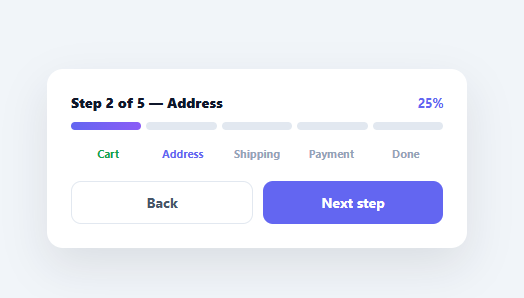
A segmented progress bar breaks a single bar into discrete chunks — one per step or task — that fill as the user advances, so progress through a known, finite sequence reads more clearly than a continuous bar. It's the indicator for checkouts, onboarding, multi-part uploads, and wizards. This snippet builds it in plain HTML, CSS, and vanilla JavaScript, with per-segment fills, step labels that mark active and cleared states, a live percentage, and back/next controls — no library.
Discrete segments, not a continuous bar
The bar is a flex row of equal segments, one per step, with a small gap between them. Each segment fills via a scaleX transform on a pseudo-element (transform-origin: left), so completing a step animates that segment growing left-to-right. Segments are the right choice over a single continuous bar when the total is a small, countable number of steps: the viewer can see *which* steps are done and *how many remain* at a glance, which a smooth bar can't convey.
Active vs. cleared vs. upcoming
The component tracks one current index and derives every visual from it: segments before the current step are filled, step labels before it are marked "cleared" (green), the current label is "active" (accent), and upcoming labels stay muted. Encoding three distinct states — done, here, and not-yet — is what makes a step indicator genuinely informative rather than just decorative; the user always knows exactly where they are in the flow.
Single source of truth
Everything — segment fills, label states, the percentage, the heading, and the disabled state of the buttons — is computed in one render() from the current index. There's no separate bookkeeping to drift out of sync, so advancing or retreating a step updates the whole component consistently. The percentage is derived from the step position, and Back disables at the start while Next becomes "Finish" on the last step and disables at the end.
Smooth, transform-based fills
Filling uses a CSS transition on the transform, so each segment glides as you progress rather than snapping — and because it animates a transform (not width or a layout property), it's GPU-friendly and jank-free. Reversing a step un-fills the relevant segment with the same smooth animation.
Data-driven and drop-in
The steps come from a STEPS array, so changing the flow is editing one list — the bar, labels, percentage, and controls all adapt to any number of steps. Wire current to your real flow state (validated each step) and it becomes the progress header for any wizard or multi-step process. It's a clear reference for segmented, state-aware progress indication. The percentage label is worth a second look too: it's computed as current / (STEPS.length - 1), not current / STEPS.length, so it reaches a clean 100% on the final step instead of stalling at 80% for a 5-step flow — a common off-by-one that makes a progress indicator feel like it never quite finishes.
Build with AI
Build, Understand, Optimize, and Extend It With AI
You don't need to trace how the single render() function keeps everything in sync by hand. Paste this snippet's HTML, CSS, and JS into an AI coding assistant like Claude and ask it to explain exactly why the percentage is computed as current divided by STEPS.length minus one rather than by STEPS.length itself, or why the segment fill animates a scaleX transform on a pseudo-element instead of animating width directly. The same assistant can help optimize it, for example checking whether toggling classes on every segment and label on each render is wasteful for a very long STEPS array and whether only the changed elements should update. It's also useful for extending the feature: ask it to add per-step validation that blocks Next until the current step is valid, support a branching flow where some steps are conditionally skipped, or add a small checkmark icon that fades into cleared step labels. Treat the code less like a finished artifact and more like a starting point for a conversation.
Prompt to recreate it
Copy this into your AI assistant of choice to build the effect from scratch, or as a jumping-off point for your own variant:
Build a segmented, multi-step progress bar in plain HTML, CSS, and JavaScript, no framework, no libraries.

Requirements:
- Render one fillable segment per step in a STEPS array (not one continuous bar), plus one text label per step below the segments, both generated from the same array so adding or removing a step updates everything automatically.
- Each segment must fill using a CSS transform (scaleX with transform-origin: left) on a pseudo-element with a transition, not by animating width or a background-size property.
- Track exactly one current index as the single source of truth. A single render function must derive, purely from that index: which segments are filled (index less than current), which step labels are marked cleared (index less than current) versus active (index equal to current) versus upcoming, the percentage text, the heading text, and the disabled state of Back and Next buttons.
- Compute the percentage as current divided by (STEPS.length - 1), not current divided by STEPS.length, so it reaches exactly 100% on the final step instead of stalling short of it.
- Back must be disabled on the first step. Next must change its label to "Finish" on the second-to-last step and become disabled entirely on the last step.
- Going forward and backward must both be fully reversible: retreating a step must un-fill its segment and revert its label state with the same smooth transition used to fill it.
Want to tighten it up first? Run this prompt through the AI Prompt Studio to score it across 8 quality dimensions, catch anti-patterns, and tune the wording for Claude, ChatGPT, or Gemini before you paste it in.
Step by step
How to Use
- 1Paste HTML, CSS, and JSA segmented progress bar renders for a 5-step checkout with Back/Next controls.
- 2Advance stepsClick Next to fill the next segment, mark the step cleared, and update the percentage.
- 3Go backClick Back to retreat a step; the segment un-fills smoothly.
- 4Change the stepsEdit the STEPS array — the bar, labels, and controls adapt to any number.
- 5Wire to your flowDrive the current index from your real wizard state, advancing only after each step validates.
- 6Restyle itChange the fill gradient, segment height, or label colours to match your design.
Real-world uses
Common Use Cases
Got questions?
Frequently Asked Questions
Use segments when the total is a small, countable number of discrete steps — a checkout, a wizard, a few upload chunks. Segments show which steps are complete and how many remain, which a smooth bar can't convey. Use a continuous bar for fine-grained or unknown-length progress (a file download percentage), where individual steps aren't meaningful.
Animating a transform like scaleX is GPU-accelerated and doesn't trigger layout recalculation, so the fill is smooth and jank-free. Animating width forces the browser to reflow on every frame. The segment uses transform-origin: left so the scale grows from the left edge, giving the natural left-to-right fill while staying on the fast path.
A single current index represents the step in progress. render() derives everything from it: segments with index < current are filled, labels before it are marked cleared, the label at current is active, and the rest are muted. Because one number drives all the visuals, advancing or retreating stays perfectly consistent — there's no separate per-segment state to keep in sync.
Drive the current index from your form's step state, and only increment it after the current step passes validation. Call render() (or, in a framework, update the state) whenever the step changes. The bar is a presentational header — keep your field logic separate and let this reflect the validated step position.
Hold the current step in state and derive the segment fills, label classes, and percentage from it in the render. In React use useState; in Vue a ref with computed classes; in Angular a component property with class bindings. The CSS transitions handle the animation, so only the current index and derived classes move into the framework.