Typing Indicator — Chat "..." Dots HTML CSS JS

Typing Indicator · Loaders · Plain HTML, CSS & JS · Live preview

Share & Support

What's included

Features

Delay-staggered dots
One keyframe plus animation-delay offsets creates the travelling-wave bounce.
Soft organic motion
Easing and a dip to 50% opacity at rest give the dots a natural bounce.
Message-matched bubble
Styled like an incoming message with the squared bottom-left corner and avatar.
Show / hide state
Toggle helpers reveal or collapse the indicator as a real chat would.
Auto-hide on idle
A 4s timer hides the dots if no further typing event arrives — a safety net for dropped events.
Graceful collapse
Hiding fades opacity and height instead of an abrupt display:none, so the list doesn't jump.
Event-ready API
showTyping() is exposed so you can wire it to a WebSocket or presence channel.
Drop-in & no library
A single appendable row in plain HTML/CSS/JS — zero dependencies.

About this UI Snippet

Typing Indicator — Staggered Bouncing Dots in a Chat Bubble
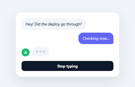
Screenshot of the Typing Indicator snippet rendered live

The three bouncing dots that mean "someone is typing…" are a tiny, universally understood piece of UI — and getting the animation and the show/hide logic right is what makes a chat feel alive. This snippet builds the classic typing indicator in plain HTML, CSS, and vanilla JavaScript: a bubble with three dots animated on a staggered loop, plus the show, hide, and auto-hide-on-idle behaviour a real chat needs — no library.

Three dots, one keyframe, staggered

All three dots share a single @keyframes that lifts a dot up and brightens it, then settles. The illusion of a travelling wave comes entirely from animation-delay: the second dot starts 0.18s after the first, the third 0.36s after, so at any moment they're at different points in the same cycle. This delay-stagger technique — one animation, offset start times — is the elegant way to build any sequential dot or bar loader without writing three separate animations. The easing and the dip-to-50%-opacity at rest give it the soft, organic bounce of the real thing.

A proper chat bubble

The dots sit in a bubble styled exactly like an incoming message — same background, same asymmetric border-radius with the squared bottom-left corner that marks it as "from them" — next to the sender's avatar. Matching the indicator to your message bubbles is what makes it read as "this person is about to send a message" rather than a generic spinner; it occupies the same visual slot the real message will.

Show, hide, and auto-hide-on-idle

A typing indicator isn't just an animation — it's state. The snippet includes the logic a real chat uses: showTyping() reveals the bubble and resets a 4-second idle timer that hides it automatically, so a dropped "stopped typing" event never leaves the dots stuck forever. In production you'd call showTyping() each time a typing event arrives over your socket, and hide it when the actual message lands — the timer is the safety net. Exposing showTyping on window makes it easy to wire to your real-time events.

Graceful hide transition

Hiding collapses the row with opacity and height rather than an abrupt display: none, so the indicator fades out and the conversation closes the gap smoothly — the small polish that keeps the chat from jumping when typing stops. The demo button toggles it so you can see both states immediately.

Drop-in for any chat

The markup is just a row you append to your message list, so it drops into any chat UI. Swap the avatar and bubble colours to match your theme, wire showTyping() to your WebSocket or presence channel, and you have the complete typing-indicator behaviour. It's also a clear reference for the delay-stagger animation pattern used across loaders and sequential effects.

Step by step

How to Use

  1. 1
    Paste HTML, CSS, and JSA mini chat renders with two messages and a typing indicator (three bouncing dots).
  2. 2
    Toggle itClick the button to hide or show the typing bubble and see the fade transition.
  3. 3
    Call showTyping() on eventsIn a real app, call showTyping() each time a "typing" event arrives over your socket.
  4. 4
    Let it auto-hideIf no further typing event arrives within 4s, the indicator hides itself automatically.
  5. 5
    Theme the bubbleMatch the avatar and bubble colours and radius to your chat's message styling.
  6. 6
    Drop into your listAppend the row to your message list and remove it when the real message arrives.

Real-world uses

Common Use Cases

Chat and messaging apps
Show when the other person is typing — pair with a chat UI for the full thread.
AI assistant interfaces
Indicate the assistant is composing a reply next to an AI chat interface.
Support and live chat widgets
Reassure users an agent is responding, alongside a floating chat widget.
Comment and reply threads
Show live composing state in a comment thread.
Collaborative editors
Signal that a collaborator is typing a message or note.
Learning staggered animation
A reference for delay-staggered loops — compare with a dots loader.

Got questions?

Frequently Asked Questions

All three dots share the same @keyframes (lift up and brighten, then settle), but each starts at a different time via animation-delay — 0s, 0.18s, 0.36s. Because they're offset within the same cycle, at any instant they're at different phases, producing a travelling wave. This one-animation-plus-staggered-delays technique avoids writing three separate animations and is the standard way to build sequential dot loaders.

Typing indicators are driven by events — "started typing" and "stopped typing" / message-sent. If the stop event is dropped (flaky network, closed tab), the dots can get stuck on forever. A short idle timer that hides the indicator unless refreshed by a new typing event is the safety net every robust chat uses: showTyping() resets the timer each call, so the dots persist only while typing events keep arriving.

Call showTyping() whenever a typing event arrives over your WebSocket or presence channel (it reveals the bubble and resets the idle timer), and hide the row when the actual message arrives or the user goes idle. The snippet exposes showTyping() on window for easy wiring; in a framework you'd call a component method instead. The animation and bubble are purely presentational.

display:none removes the element instantly, which makes the message list jump as the gap closes abruptly. Animating opacity and collapsing the height (with overflow hidden and negative margin) lets the indicator fade out smoothly and the conversation close the space gracefully — the small polish that keeps the chat from feeling jumpy when typing stops.

Render the bubble conditionally on an isTyping state. In React, set isTyping from your socket handler and clear it with a useEffect timeout; in Vue, use a ref with a watcher or timeout; in Angular, a component property with a timer. The dot animation is pure CSS and ports unchanged — only the show/hide state and idle timer move into the framework.

Typing Indicator — Export as HTML, React, Vue, Angular & Tailwind

HTML
<!DOCTYPE html>
<html lang="en">
<head>
  <meta charset="UTF-8" />
  <meta name="viewport" content="width=device-width, initial-scale=1.0" />
  <title>Typing Indicator</title>
  <style>
    *{box-sizing:border-box;margin:0;padding:0}
    body{font-family:system-ui,-apple-system,sans-serif;background:#f1f5f9;min-height:100vh;display:flex;align-items:center;justify-content:center;padding:24px}
    
    .ty-chat{background:#fff;border-radius:18px;padding:20px;width:100%;max-width:360px;box-shadow:0 18px 44px rgba(15,23,42,.1);display:flex;flex-direction:column;gap:10px}
    .ty-msg{max-width:78%;padding:10px 14px;font-size:13.5px;line-height:1.45;border-radius:16px}
    .ty-them{align-self:flex-start;background:#f1f5f9;color:#0f172a;border-bottom-left-radius:5px}
    .ty-me{align-self:flex-end;background:#6366f1;color:#fff;border-bottom-right-radius:5px}
    
    .ty-row{display:flex;align-items:flex-end;gap:8px;align-self:flex-start;transition:opacity .2s}
    .ty-row.ty-hidden{opacity:0;pointer-events:none;height:0;overflow:hidden;margin:-5px 0}
    .ty-avatar{width:28px;height:28px;border-radius:50%;background:linear-gradient(135deg,#22c55e,#10b981);color:#fff;font-size:12px;font-weight:800;display:flex;align-items:center;justify-content:center;flex-shrink:0}
    .ty-bubble{background:#f1f5f9;border-radius:16px;border-bottom-left-radius:5px;padding:13px 14px;display:flex;gap:5px;align-items:center}
    .ty-dot{width:7px;height:7px;border-radius:50%;background:#94a3b8;animation:tyBounce 1.3s infinite ease-in-out}
    .ty-dot:nth-child(2){animation-delay:.18s}
    .ty-dot:nth-child(3){animation-delay:.36s}
    @keyframes tyBounce{0%,60%,100%{transform:translateY(0);opacity:.5}30%{transform:translateY(-6px);opacity:1}}
    
    .ty-controls{margin-top:6px}
    .ty-btn{width:100%;background:#0f172a;color:#fff;border:none;border-radius:10px;padding:9px;font-size:13px;font-weight:700;cursor:pointer;font-family:inherit}
    .ty-btn:hover{background:#1e293b}
  </style>
</head>
<body>
  <div class="ty-chat">
    <div class="ty-msg ty-them">Hey! Did the deploy go through?</div>
    <div class="ty-msg ty-me">Checking now…</div>
  
    <div class="ty-row" id="tyRow">
      <div class="ty-avatar">A</div>
      <div class="ty-bubble" aria-label="Contact is typing">
        <span class="ty-dot"></span><span class="ty-dot"></span><span class="ty-dot"></span>
      </div>
    </div>
  
    <div class="ty-controls">
      <button type="button" class="ty-btn" id="tyToggle">Stop typing</button>
    </div>
  </div>
  <script>
    var row = document.getElementById('tyRow');
    var toggle = document.getElementById('tyToggle');
    
    // Demo control: show/hide the indicator. In a real app, show it when a
    // "typing" event arrives over your socket and hide it on the message or a timeout.
    toggle.addEventListener('click', function () {
      var hidden = row.classList.toggle('ty-hidden');
      toggle.textContent = hidden ? 'Show typing' : 'Stop typing';
    });
    
    // Example of the real-world pattern: auto-hide after inactivity.
    var hideTimer = null;
    function showTyping() {
      row.classList.remove('ty-hidden');
      toggle.textContent = 'Stop typing';
      clearTimeout(hideTimer);
      hideTimer = setTimeout(function () {
        row.classList.add('ty-hidden');
        toggle.textContent = 'Show typing';
      }, 4000);
    }
    // Expose so you can call showTyping() whenever a typing event fires.
    window.showTyping = showTyping;
  </script>
</body>
</html>
Tailwind
<!DOCTYPE html>
<html lang="en">
<head>
  <meta charset="UTF-8" />
  <meta name="viewport" content="width=device-width, initial-scale=1.0" />
  <title>Typing Indicator</title>
  <!-- Tailwind CSS v3+ — arbitrary value classes (e.g. bg-[#0f172a]) are valid -->
  <script src="https://cdn.tailwindcss.com"></script>
  <style>
    @keyframes tyBounce{0%,60%,100%{transform:translateY(0);opacity:.5}30%{transform:translateY(-6px);opacity:1}}

    * {
      box-sizing:border-box;margin:0;padding:0
    }

    body {
      font-family:system-ui,-apple-system,sans-serif;background:#f1f5f9;min-height:100vh;display:flex;align-items:center;justify-content:center;padding:24px
    }

    .ty-row.ty-hidden {
      opacity:0;pointer-events:none;height:0;overflow:hidden;margin:-5px 0
    }

    .ty-dot:nth-child(2) {
      animation-delay:.18s
    }

    .ty-dot:nth-child(3) {
      animation-delay:.36s
    }
  </style>
</head>
<body>
  <div class="bg-[#fff] rounded-[18px] p-5 w-full max-w-[360px] shadow-[0_18px_44px_rgba(15,23,42,.1)] flex flex-col gap-2.5">
    <div class="max-w-[78%] py-2.5 px-3.5 text-[13.5px] leading-[1.45] rounded-2xl self-start bg-[#f1f5f9] text-[#0f172a] rounded-bl-[5px]">Hey! Did the deploy go through?</div>
    <div class="max-w-[78%] py-2.5 px-3.5 text-[13.5px] leading-[1.45] rounded-2xl self-end bg-[#6366f1] text-[#fff] rounded-br-[5px]">Checking now…</div>
  
    <div class="ty-row flex items-end gap-2 self-start [transition:opacity_.2s]" id="tyRow">
      <div class="w-7 h-7 rounded-full [background:linear-gradient(135deg,#22c55e,#10b981)] text-[#fff] text-xs font-extrabold flex items-center justify-center shrink-0">A</div>
      <div class="bg-[#f1f5f9] rounded-2xl rounded-bl-[5px] py-[13px] px-3.5 flex gap-[5px] items-center" aria-label="Contact is typing">
        <span class="ty-dot w-[7px] h-[7px] rounded-full bg-[#94a3b8] [animation:tyBounce_1.3s_infinite_ease-in-out]"></span><span class="ty-dot w-[7px] h-[7px] rounded-full bg-[#94a3b8] [animation:tyBounce_1.3s_infinite_ease-in-out]"></span><span class="ty-dot w-[7px] h-[7px] rounded-full bg-[#94a3b8] [animation:tyBounce_1.3s_infinite_ease-in-out]"></span>
      </div>
    </div>
  
    <div class="mt-1.5">
      <button type="button" class="w-full bg-[#0f172a] text-[#fff] border-0 rounded-[10px] p-[9px] text-[13px] font-bold cursor-pointer font-[inherit] hover:bg-[#1e293b]" id="tyToggle">Stop typing</button>
    </div>
  </div>
  <script>
    var row = document.getElementById('tyRow');
    var toggle = document.getElementById('tyToggle');
    
    // Demo control: show/hide the indicator. In a real app, show it when a
    // "typing" event arrives over your socket and hide it on the message or a timeout.
    toggle.addEventListener('click', function () {
      var hidden = row.classList.toggle('ty-hidden');
      toggle.textContent = hidden ? 'Show typing' : 'Stop typing';
    });
    
    // Example of the real-world pattern: auto-hide after inactivity.
    var hideTimer = null;
    function showTyping() {
      row.classList.remove('ty-hidden');
      toggle.textContent = 'Stop typing';
      clearTimeout(hideTimer);
      hideTimer = setTimeout(function () {
        row.classList.add('ty-hidden');
        toggle.textContent = 'Show typing';
      }, 4000);
    }
    // Expose so you can call showTyping() whenever a typing event fires.
    window.showTyping = showTyping;
  </script>
</body>
</html>
React
import React, { useEffect } from 'react';

// CSS — optionally move to TypingIndicator.module.css
const css = `
*{box-sizing:border-box;margin:0;padding:0}
body{font-family:system-ui,-apple-system,sans-serif;background:#f1f5f9;min-height:100vh;display:flex;align-items:center;justify-content:center;padding:24px}

.ty-chat{background:#fff;border-radius:18px;padding:20px;width:100%;max-width:360px;box-shadow:0 18px 44px rgba(15,23,42,.1);display:flex;flex-direction:column;gap:10px}
.ty-msg{max-width:78%;padding:10px 14px;font-size:13.5px;line-height:1.45;border-radius:16px}
.ty-them{align-self:flex-start;background:#f1f5f9;color:#0f172a;border-bottom-left-radius:5px}
.ty-me{align-self:flex-end;background:#6366f1;color:#fff;border-bottom-right-radius:5px}

.ty-row{display:flex;align-items:flex-end;gap:8px;align-self:flex-start;transition:opacity .2s}
.ty-row.ty-hidden{opacity:0;pointer-events:none;height:0;overflow:hidden;margin:-5px 0}
.ty-avatar{width:28px;height:28px;border-radius:50%;background:linear-gradient(135deg,#22c55e,#10b981);color:#fff;font-size:12px;font-weight:800;display:flex;align-items:center;justify-content:center;flex-shrink:0}
.ty-bubble{background:#f1f5f9;border-radius:16px;border-bottom-left-radius:5px;padding:13px 14px;display:flex;gap:5px;align-items:center}
.ty-dot{width:7px;height:7px;border-radius:50%;background:#94a3b8;animation:tyBounce 1.3s infinite ease-in-out}
.ty-dot:nth-child(2){animation-delay:.18s}
.ty-dot:nth-child(3){animation-delay:.36s}
@keyframes tyBounce{0%,60%,100%{transform:translateY(0);opacity:.5}30%{transform:translateY(-6px);opacity:1}}

.ty-controls{margin-top:6px}
.ty-btn{width:100%;background:#0f172a;color:#fff;border:none;border-radius:10px;padding:9px;font-size:13px;font-weight:700;cursor:pointer;font-family:inherit}
.ty-btn:hover{background:#1e293b}
`;

export default function TypingIndicator() {
  // Auto-generated escape hatch: the original snippet's vanilla JS runs once
  // after mount and queries the rendered DOM. For idiomatic React, lift this
  // into state + handlers.
  useEffect(() => {
    const _listeners = [];
    const _originalAddEventListener = EventTarget.prototype.addEventListener;
    EventTarget.prototype.addEventListener = function(type, listener, options) {
      _listeners.push({ target: this, type, listener, options });
      return _originalAddEventListener.call(this, type, listener, options);
    };
    var row = document.getElementById('tyRow');
    var toggle = document.getElementById('tyToggle');
    
    // Demo control: show/hide the indicator. In a real app, show it when a
    // "typing" event arrives over your socket and hide it on the message or a timeout.
    toggle.addEventListener('click', function () {
      var hidden = row.classList.toggle('ty-hidden');
      toggle.textContent = hidden ? 'Show typing' : 'Stop typing';
    });
    
    // Example of the real-world pattern: auto-hide after inactivity.
    var hideTimer = null;
    function showTyping() {
      row.classList.remove('ty-hidden');
      toggle.textContent = 'Stop typing';
      clearTimeout(hideTimer);
      hideTimer = setTimeout(function () {
        row.classList.add('ty-hidden');
        toggle.textContent = 'Show typing';
      }, 4000);
    }
    // Expose so you can call showTyping() whenever a typing event fires.
    window.showTyping = showTyping;
    // Cleanup: restore addEventListener and remove all listeners
    return () => {
      EventTarget.prototype.addEventListener = _originalAddEventListener;
      for (const { target, type, listener, options } of _listeners) {
        target.removeEventListener(type, listener, options);
      }
    };
  }, []);

  return (
    <>
      <style>{css}</style>
      <div className="ty-chat">
        <div className="ty-msg ty-them">Hey! Did the deploy go through?</div>
        <div className="ty-msg ty-me">Checking now…</div>
      
        <div className="ty-row" id="tyRow">
          <div className="ty-avatar">A</div>
          <div className="ty-bubble" aria-label="Contact is typing">
            <span className="ty-dot"></span><span className="ty-dot"></span><span className="ty-dot"></span>
          </div>
        </div>
      
        <div className="ty-controls">
          <button type="button" className="ty-btn" id="tyToggle">Stop typing</button>
        </div>
      </div>
    </>
  );
}
React + Tailwind
import React, { useEffect } from 'react';
// Requires Tailwind CSS v3+ — https://tailwindcss.com/docs/installation
// Arbitrary value classes (e.g. bg-[#0f172a]) are valid Tailwind v3+

export default function TypingIndicator() {
  // Auto-generated escape hatch: the original snippet's vanilla JS runs once
  // after mount and queries the rendered DOM. For idiomatic React, lift this
  // into state + handlers.
  useEffect(() => {
    const _listeners = [];
    const _originalAddEventListener = EventTarget.prototype.addEventListener;
    EventTarget.prototype.addEventListener = function(type, listener, options) {
      _listeners.push({ target: this, type, listener, options });
      return _originalAddEventListener.call(this, type, listener, options);
    };
    var row = document.getElementById('tyRow');
    var toggle = document.getElementById('tyToggle');
    
    // Demo control: show/hide the indicator. In a real app, show it when a
    // "typing" event arrives over your socket and hide it on the message or a timeout.
    toggle.addEventListener('click', function () {
      var hidden = row.classList.toggle('ty-hidden');
      toggle.textContent = hidden ? 'Show typing' : 'Stop typing';
    });
    
    // Example of the real-world pattern: auto-hide after inactivity.
    var hideTimer = null;
    function showTyping() {
      row.classList.remove('ty-hidden');
      toggle.textContent = 'Stop typing';
      clearTimeout(hideTimer);
      hideTimer = setTimeout(function () {
        row.classList.add('ty-hidden');
        toggle.textContent = 'Show typing';
      }, 4000);
    }
    // Expose so you can call showTyping() whenever a typing event fires.
    window.showTyping = showTyping;
    // Cleanup: restore addEventListener and remove all listeners
    return () => {
      EventTarget.prototype.addEventListener = _originalAddEventListener;
      for (const { target, type, listener, options } of _listeners) {
        target.removeEventListener(type, listener, options);
      }
    };
  }, []);

  return (
    <>
      <style>{`
@keyframes tyBounce{0%,60%,100%{transform:translateY(0);opacity:.5}30%{transform:translateY(-6px);opacity:1}}

* {
  box-sizing:border-box;margin:0;padding:0
}

body {
  font-family:system-ui,-apple-system,sans-serif;background:#f1f5f9;min-height:100vh;display:flex;align-items:center;justify-content:center;padding:24px
}

.ty-row.ty-hidden {
  opacity:0;pointer-events:none;height:0;overflow:hidden;margin:-5px 0
}

.ty-dot:nth-child(2) {
  animation-delay:.18s
}

.ty-dot:nth-child(3) {
  animation-delay:.36s
}
      `}</style>
      <div className="bg-[#fff] rounded-[18px] p-5 w-full max-w-[360px] shadow-[0_18px_44px_rgba(15,23,42,.1)] flex flex-col gap-2.5">
        <div className="max-w-[78%] py-2.5 px-3.5 text-[13.5px] leading-[1.45] rounded-2xl self-start bg-[#f1f5f9] text-[#0f172a] rounded-bl-[5px]">Hey! Did the deploy go through?</div>
        <div className="max-w-[78%] py-2.5 px-3.5 text-[13.5px] leading-[1.45] rounded-2xl self-end bg-[#6366f1] text-[#fff] rounded-br-[5px]">Checking now…</div>
      
        <div className="ty-row flex items-end gap-2 self-start [transition:opacity_.2s]" id="tyRow">
          <div className="w-7 h-7 rounded-full [background:linear-gradient(135deg,#22c55e,#10b981)] text-[#fff] text-xs font-extrabold flex items-center justify-center shrink-0">A</div>
          <div className="bg-[#f1f5f9] rounded-2xl rounded-bl-[5px] py-[13px] px-3.5 flex gap-[5px] items-center" aria-label="Contact is typing">
            <span className="ty-dot w-[7px] h-[7px] rounded-full bg-[#94a3b8] [animation:tyBounce_1.3s_infinite_ease-in-out]"></span><span className="ty-dot w-[7px] h-[7px] rounded-full bg-[#94a3b8] [animation:tyBounce_1.3s_infinite_ease-in-out]"></span><span className="ty-dot w-[7px] h-[7px] rounded-full bg-[#94a3b8] [animation:tyBounce_1.3s_infinite_ease-in-out]"></span>
          </div>
        </div>
      
        <div className="mt-1.5">
          <button type="button" className="w-full bg-[#0f172a] text-[#fff] border-0 rounded-[10px] p-[9px] text-[13px] font-bold cursor-pointer font-[inherit] hover:bg-[#1e293b]" id="tyToggle">Stop typing</button>
        </div>
      </div>
    </>
  );
}
Vue
<template>
  <div class="ty-chat">
    <div class="ty-msg ty-them">Hey! Did the deploy go through?</div>
    <div class="ty-msg ty-me">Checking now…</div>
  
    <div class="ty-row" id="tyRow">
      <div class="ty-avatar">A</div>
      <div class="ty-bubble" aria-label="Contact is typing">
        <span class="ty-dot"></span><span class="ty-dot"></span><span class="ty-dot"></span>
      </div>
    </div>
  
    <div class="ty-controls">
      <button type="button" class="ty-btn" id="tyToggle">Stop typing</button>
    </div>
  </div>
</template>

<script setup>
import { onMounted } from 'vue';

let row;
let toggle;
// Example of the real-world pattern: auto-hide after inactivity.
var hideTimer = null;
function showTyping() {
  row.classList.remove('ty-hidden');
  toggle.textContent = 'Stop typing';
  clearTimeout(hideTimer);
  hideTimer = setTimeout(function () {
    row.classList.add('ty-hidden');
    toggle.textContent = 'Show typing';
  }, 4000);
}

onMounted(() => {
  row = document.getElementById('tyRow');
  toggle = document.getElementById('tyToggle');
  // Demo control: show/hide the indicator. In a real app, show it when a
  // "typing" event arrives over your socket and hide it on the message or a timeout.
  toggle.addEventListener('click', function () {
    var hidden = row.classList.toggle('ty-hidden');
    toggle.textContent = hidden ? 'Show typing' : 'Stop typing';
  });
  // Expose so you can call showTyping() whenever a typing event fires.
  window.showTyping = showTyping;
});
</script>

<style scoped>
*{box-sizing:border-box;margin:0;padding:0}
body{font-family:system-ui,-apple-system,sans-serif;background:#f1f5f9;min-height:100vh;display:flex;align-items:center;justify-content:center;padding:24px}

.ty-chat{background:#fff;border-radius:18px;padding:20px;width:100%;max-width:360px;box-shadow:0 18px 44px rgba(15,23,42,.1);display:flex;flex-direction:column;gap:10px}
.ty-msg{max-width:78%;padding:10px 14px;font-size:13.5px;line-height:1.45;border-radius:16px}
.ty-them{align-self:flex-start;background:#f1f5f9;color:#0f172a;border-bottom-left-radius:5px}
.ty-me{align-self:flex-end;background:#6366f1;color:#fff;border-bottom-right-radius:5px}

.ty-row{display:flex;align-items:flex-end;gap:8px;align-self:flex-start;transition:opacity .2s}
.ty-row.ty-hidden{opacity:0;pointer-events:none;height:0;overflow:hidden;margin:-5px 0}
.ty-avatar{width:28px;height:28px;border-radius:50%;background:linear-gradient(135deg,#22c55e,#10b981);color:#fff;font-size:12px;font-weight:800;display:flex;align-items:center;justify-content:center;flex-shrink:0}
.ty-bubble{background:#f1f5f9;border-radius:16px;border-bottom-left-radius:5px;padding:13px 14px;display:flex;gap:5px;align-items:center}
.ty-dot{width:7px;height:7px;border-radius:50%;background:#94a3b8;animation:tyBounce 1.3s infinite ease-in-out}
.ty-dot:nth-child(2){animation-delay:.18s}
.ty-dot:nth-child(3){animation-delay:.36s}
@keyframes tyBounce{0%,60%,100%{transform:translateY(0);opacity:.5}30%{transform:translateY(-6px);opacity:1}}

.ty-controls{margin-top:6px}
.ty-btn{width:100%;background:#0f172a;color:#fff;border:none;border-radius:10px;padding:9px;font-size:13px;font-weight:700;cursor:pointer;font-family:inherit}
.ty-btn:hover{background:#1e293b}
</style>
Angular
// @ts-nocheck
// Note: vanilla JS DOM manipulation is preserved as-is inside ngAfterViewInit().
// For idiomatic Angular, replace document.getElementById() with @ViewChild() refs
// and move state into component properties with two-way binding.
import { Component, AfterViewInit, ViewEncapsulation } from '@angular/core';
import { CommonModule } from '@angular/common';

@Component({
  selector: 'app-typing-indicator',
  standalone: true,
  imports: [CommonModule],
  encapsulation: ViewEncapsulation.None,
  template: `
    <div class="ty-chat">
      <div class="ty-msg ty-them">Hey! Did the deploy go through?</div>
      <div class="ty-msg ty-me">Checking now…</div>
    
      <div class="ty-row" id="tyRow">
        <div class="ty-avatar">A</div>
        <div class="ty-bubble" aria-label="Contact is typing">
          <span class="ty-dot"></span><span class="ty-dot"></span><span class="ty-dot"></span>
        </div>
      </div>
    
      <div class="ty-controls">
        <button type="button" class="ty-btn" id="tyToggle">Stop typing</button>
      </div>
    </div>
  `,
  styles: [`
    *{box-sizing:border-box;margin:0;padding:0}
    body{font-family:system-ui,-apple-system,sans-serif;background:#f1f5f9;min-height:100vh;display:flex;align-items:center;justify-content:center;padding:24px}
    
    .ty-chat{background:#fff;border-radius:18px;padding:20px;width:100%;max-width:360px;box-shadow:0 18px 44px rgba(15,23,42,.1);display:flex;flex-direction:column;gap:10px}
    .ty-msg{max-width:78%;padding:10px 14px;font-size:13.5px;line-height:1.45;border-radius:16px}
    .ty-them{align-self:flex-start;background:#f1f5f9;color:#0f172a;border-bottom-left-radius:5px}
    .ty-me{align-self:flex-end;background:#6366f1;color:#fff;border-bottom-right-radius:5px}
    
    .ty-row{display:flex;align-items:flex-end;gap:8px;align-self:flex-start;transition:opacity .2s}
    .ty-row.ty-hidden{opacity:0;pointer-events:none;height:0;overflow:hidden;margin:-5px 0}
    .ty-avatar{width:28px;height:28px;border-radius:50%;background:linear-gradient(135deg,#22c55e,#10b981);color:#fff;font-size:12px;font-weight:800;display:flex;align-items:center;justify-content:center;flex-shrink:0}
    .ty-bubble{background:#f1f5f9;border-radius:16px;border-bottom-left-radius:5px;padding:13px 14px;display:flex;gap:5px;align-items:center}
    .ty-dot{width:7px;height:7px;border-radius:50%;background:#94a3b8;animation:tyBounce 1.3s infinite ease-in-out}
    .ty-dot:nth-child(2){animation-delay:.18s}
    .ty-dot:nth-child(3){animation-delay:.36s}
    @keyframes tyBounce{0%,60%,100%{transform:translateY(0);opacity:.5}30%{transform:translateY(-6px);opacity:1}}
    
    .ty-controls{margin-top:6px}
    .ty-btn{width:100%;background:#0f172a;color:#fff;border:none;border-radius:10px;padding:9px;font-size:13px;font-weight:700;cursor:pointer;font-family:inherit}
    .ty-btn:hover{background:#1e293b}
  `]
})
export class TypingIndicatorComponent implements AfterViewInit {
  ngAfterViewInit(): void {
    var row = document.getElementById('tyRow');
    var toggle = document.getElementById('tyToggle');
    
    // Demo control: show/hide the indicator. In a real app, show it when a
    // "typing" event arrives over your socket and hide it on the message or a timeout.
    toggle.addEventListener('click', function () {
      var hidden = row.classList.toggle('ty-hidden');
      toggle.textContent = hidden ? 'Show typing' : 'Stop typing';
    });
    
    // Example of the real-world pattern: auto-hide after inactivity.
    var hideTimer = null;
    function showTyping() {
      row.classList.remove('ty-hidden');
      toggle.textContent = 'Stop typing';
      clearTimeout(hideTimer);
      hideTimer = setTimeout(function () {
        row.classList.add('ty-hidden');
        toggle.textContent = 'Show typing';
      }, 4000);
    }
    // Expose so you can call showTyping() whenever a typing event fires.
    window.showTyping = showTyping;

    // Bind inline-handler functions to the component so the template can call them
    Object.assign(this, { showTyping });
  }
}