You Might Also Like
Learn Coding Visually
Learn to code with interactive, live-preview playgrounds — HTML, CSS, JavaScript, React & more.
 HTML Playground42 lessons · Click-based · Live preview
 CSS PlaygroundLearn CSS with a live editor
 JavaScript Playground60 lessons · DOM · Async · Canvas
 React PlaygroundLearn React with a live code editor
 GSAP PlaygroundLearn GSAP animation interactively
 SVG Playground44 lessons · shapes · paths · animation
 SCSS Playground45 lessons · Sass modules · tokens
 Tailwind PlaygroundLearn Tailwind CSS with a live editor
 Bootstrap 5 Playground50 lessons · live preview
Circular Progress Ring — SVG HTML CSS JS Snippet
Circular Progress Ring · Loaders · Plain HTML, CSS & JS · Live preview
What's included
Features
About this UI Snippet
Circular Progress Ring — SVG stroke-dashoffset Technique
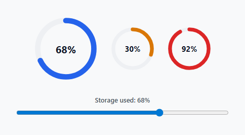
A circular progress ring shows completion as an arc filling around a circle rather than a horizontal bar — used for storage quotas, upload progress, goal completion, and dashboard KPI tiles where a compact round shape fits better than a linear one. This snippet builds the ring from two stacked SVG circles and animates the fill purely by rewriting one stroke property.
Two stacked circles
Each ring is an <svg> containing a .ring-track circle (the full gray background ring) and a .ring-fill circle drawn directly on top of it with an accent color. Both share the same cx, cy, and r — only the fill circle's stroke properties change to represent progress.
stroke-dasharray and stroke-dashoffset
stroke-dasharray is set to the circle's full circumference (2 × π × r, or 326.7 for r=52), which turns the stroke into one dash exactly as long as the circle itself — visually indistinguishable from a solid stroke at rest. stroke-dashoffset then shifts where that dash starts drawing from. Setting the offset equal to the full circumference makes the dash start exactly one full lap away, so none of the stroke is visible; setting it to circumference × (1 − pct/100) reveals exactly pct% of the ring. This is the standard SVG technique for drawable progress rings and expanding donut charts alike, and it needs no <canvas>, no clip-path, and no JavaScript-driven redraw loop.
Why the SVG is rotated -90deg
An SVG circle's stroke naturally starts drawing from the 3 o'clock position and proceeds clockwise. transform: rotate(-90deg) on the whole <svg> rotates that starting point to 12 o'clock, which is the conventional "empty to full, starting at the top" reading direction users expect from a progress ring.
Animating the fill
The CSS transition: stroke-dashoffset 0.5s cubic-bezier(.4,0,.2,1) means any JavaScript update to the offset animates smoothly rather than jumping instantly — setRing() only ever sets the target strokeDashoffset value once per call; the browser's compositor handles interpolating between the old and new value.
Percentage math lives in one function
setRing(el, valueEl, pct) is the single place that converts a percentage into a dashoffset and updates the paired numeric label — every ring on the page, regardless of size or color, calls the same function, so the circumference constant (CIRCUMFERENCE = 2 * Math.PI * 52) only needs to match the r value used in the SVG markup, and changing the ring's radius means updating exactly one number.
Threshold-based coloring
The three demo rings use three color modifier classes — .ring-fill (blue, default), .ring-warn (amber), .ring-danger (red) — applied as a plain class swap. In a real dashboard, choose the class based on the value itself (for example, red above 90%, amber above 70%, blue otherwise) so the ring communicates urgency without the user needing to read the number.
Sizing variants
The .ring-wrap.sm modifier only changes the container's width/height and the label's font size — because the SVG uses a viewBox rather than fixed pixel dimensions, it scales cleanly to any container size without recalculating the stroke width or dash values, though very small rings may need a thinner stroke-width to avoid the ring looking disproportionately thick.
Live updates from real data
The slider in the demo stands in for any real value source — replace its input event with a fetch response handler, a WebSocket message, or a polling interval, and call setRing() with the new percentage each time new data arrives.
See also the gauge chart for a half-circle variant of the same technique, and the quota usage meter for a linear-bar alternative to this ring.
Build with AI
Build, Understand, Optimize, and Extend It With AI
Paste this progress ring's HTML, CSS, and JS into an AI coding assistant like Claude and ask it to explain how stroke-dasharray and stroke-dashoffset combine to reveal a specific arc length, and why the whole SVG is rotated -90 degrees to make the fill start from the top. It's a good snippet to hand to an assistant for wiring to real data — describe your actual progress source (a file upload's progress event, a fetch stream, a WebSocket) and have it replace the demo slider with genuine live updates. Beyond that, ask it to add an indeterminate loading variant for when the total duration is unknown, or a multi-segment ring showing several categories' shares of a whole, similar to a donut chart but built on this same stroke technique.
Prompt to recreate it
Copy this into your AI assistant of choice to build the effect from scratch, or as a jumping-off point for your own variant:
Build an animated SVG circular progress ring in plain HTML, CSS, and JavaScript, no framework, no libraries.

Requirements:
- Each ring must be built from two overlapping SVG circles sharing the same center and radius inside one <svg> element: a plain gray background track circle, and a colored foreground circle whose visible arc length represents a percentage value.
- The foreground circle's progress must be controlled purely through the stroke-dasharray and stroke-dashoffset CSS/SVG properties, calculated from the circle's true circumference, not through clip-path, canvas drawing, or conic-gradient.
- The whole SVG must be rotated so the arc visibly starts filling from the top of the circle (12 o'clock) and proceeds clockwise, rather than starting from the SVG's default 3 o'clock position.
- Changing the dashoffset value must animate smoothly via a CSS transition rather than jumping instantly, so any JavaScript update to the percentage produces a smooth fill animation.
- A single reusable JavaScript function must take a percentage value, the ring element, and a label element, and update both the ring's visual fill and a numeric percentage label displayed at the ring's center in one call.
- Demonstrate at least three rings on the page: one large ring controlled live by a range slider input, and two smaller static rings using different accent colors to represent a warning and a danger threshold state, showing the same technique works at multiple sizes and colors without changing the underlying math.
Want to tighten it up first? Run this prompt through the AI Prompt Studio to score it across 8 quality dimensions, catch anti-patterns, and tune the wording for Claude, ChatGPT, or Gemini before you paste it in.
Step by step
How to Use
- 1Copy one ring-wrap blockEach ring is a .ring-wrap div containing an SVG with a .ring-track and .ring-fill circle, plus a .ring-label overlay for the numeric text.
- 2Match the circumference constant to your radiusIf you change the circle's r attribute from 52, recompute CIRCUMFERENCE as 2 * Math.PI * yourRadius and update stroke-dasharray in the CSS to match.
- 3Call setRing with a percentagesetRing(fillCircleElement, labelElement, percentage) updates both the ring's fill and its numeric label in one call — use it for both the initial render and any live updates.
- 4Pick a color based on the valueSwap the ring-warn or ring-danger class onto .ring-fill when a value crosses your thresholds, so color communicates urgency without extra text.
- 5Resize with .ring-wrap.sm or your own variantAdd a size modifier class changing only the wrapper's width/height and label font-size — the SVG viewBox handles the rest automatically.
Real-world uses
Common Use Cases
Got questions?
Frequently Asked Questions
Adjust stroke-width on both .ring-track and .ring-fill — keep them equal so the fill sits centered over the track. A thicker stroke may need a slightly larger radius to avoid the ring looking cramped inside its viewBox.
An SVG circle's stroke starts drawing at the 3 o'clock position by default. Rotating the whole SVG -90 degrees moves that starting point to 12 o'clock, which matches how progress rings are conventionally read — starting at the top and filling clockwise.
Listen to your upload mechanism's progress event (for example XMLHttpRequest's progress event with loaded/total, or a streamed fetch reader) and call setRing(fillEl, labelEl, (loaded/total)*100) on each update — the same function used for the demo slider.
Yes — remove the dashoffset percentage logic, set stroke-dasharray to roughly 25% of the circumference so only a partial arc is visible, and add a CSS animation that rotates the whole ring continuously, similar to a classic spinner but ring-shaped.
Open the Export menu on the snippet page for a React component computing dashoffset from a percentage prop, a React + Tailwind version, a Vue 3 SFC, or an Angular standalone component with an @Input() percentage — all preserve the SVG structure and the animated transition.