Source Code
<div class="asc-stage">
  <div class="asc-card" id="ascCard">
    <svg class="asc-mark" viewBox="0 0 52 52" id="ascMark">
      <circle class="asc-circle" cx="26" cy="26" r="24" fill="none"/>
      <path class="asc-check" fill="none" d="M14 27l8 8 16-16"/>
    </svg>
    <h3>Payment successful</h3>
    <p>Your order is confirmed — a receipt is on its way to your inbox.</p>
  </div>

  <button type="button" class="asc-replay" id="ascReplay">↻ Replay animation</button>
</div>*{box-sizing:border-box;margin:0;padding:0}
body{font-family:system-ui,-apple-system,sans-serif;background:#f1f5f9;min-height:100vh;display:flex;align-items:center;justify-content:center;padding:24px}
.asc-stage{display:flex;flex-direction:column;align-items:center;gap:20px}
.asc-card{background:#fff;border-radius:18px;padding:34px 30px;width:300px;text-align:center;box-shadow:0 18px 44px rgba(15,23,42,.12)}
.asc-card h3{font-size:18px;font-weight:800;color:#0f172a;margin:18px 0 8px;opacity:0;transform:translateY(8px);animation:ascText .4s ease .5s forwards}
.asc-card p{font-size:13px;color:#64748b;line-height:1.55;opacity:0;transform:translateY(8px);animation:ascText .4s ease .62s forwards}
@keyframes ascText{to{opacity:1;transform:translateY(0)}}
.asc-mark{width:84px;height:84px;display:block;margin:0 auto}
.asc-circle{stroke:#22c55e;stroke-width:3;stroke-dasharray:151;stroke-dashoffset:151;
animation:ascCircle .55s cubic-bezier(.65,0,.45,1) forwards}
.asc-check{stroke:#22c55e;stroke-width:4;stroke-linecap:round;stroke-linejoin:round;stroke-dasharray:40;stroke-dashoffset:40;
animation:ascCheck .35s cubic-bezier(.65,0,.45,1) .5s forwards}
@keyframes ascCircle{to{stroke-dashoffset:0}}
@keyframes ascCheck{to{stroke-dashoffset:0}}
/* Soft expanding ring that pulses once when the check lands */
.asc-card{position:relative}
.asc-pulse{position:absolute;top:34px;left:50%;width:84px;height:84px;margin-left:-42px;border-radius:50%;border:2px solid #22c55e;opacity:0;pointer-events:none}
.asc-pulse.go{animation:ascPulse .6s ease-out .62s}
@keyframes ascPulse{0%{opacity:.5;transform:scale(.6)}100%{opacity:0;transform:scale(1.5)}}
.asc-replay{background:#fff;border:1.5px solid #e2e8f0;border-radius:9px;padding:9px 16px;font-size:12.5px;font-weight:700;color:#475569;cursor:pointer;transition:border-color .15s}
.asc-replay:hover{border-color:#cbd5e1}var card = document.getElementById('ascCard');
// Add the one-shot pulse ring element (kept out of HTML so replay is a clean reset).
var pulse = document.createElement('span');
pulse.className = 'asc-pulse';
card.appendChild(pulse);
function play() {
// Cloning the SVG gives the browser a fresh element, which restarts its
// stroke-draw animations from scratch (CSS animations only run once per load).
var mark = document.getElementById('ascMark');
mark.parentNode.replaceChild(mark.cloneNode(true), mark);
// Re-trigger the pulse ring with the forced-reflow restart pattern.
pulse.classList.remove('go');
void pulse.offsetWidth;
pulse.classList.add('go');
}
document.getElementById('ascReplay').addEventListener('click', play);
// Kick the pulse on first load to sync with the CSS animation.
requestAnimationFrame(function () { pulse.classList.add('go'); });Learn Coding Visually
Learn to code with interactive, live-preview playgrounds — HTML, CSS, JavaScript, React & more.
 HTML Playground42 lessons · Click-based · Live preview
 CSS PlaygroundLearn CSS with a live editor
 JavaScript Playground60 lessons · DOM · Async · Canvas
 React PlaygroundLearn React with a live code editor
 GSAP PlaygroundLearn GSAP animation interactively
 SVG Playground44 lessons · shapes · paths · animation
 SCSS Playground45 lessons · Sass modules · tokens
 Tailwind PlaygroundLearn Tailwind CSS with a live editor
 Bootstrap 5 Playground50 lessons · live preview
Animated Success Checkmark — SVG Draw HTML CSS
Animated Success Checkmark · Animations · Plain HTML, CSS & JS · Live preview
What's included
Features
About this UI Snippet
Animated Success Checkmark — Stroke-Drawn SVG Tick with Pulse Ring
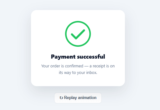
The animated green checkmark that draws itself after a successful payment, signup, or save is a tiny moment of delight that makes a confirmation feel earned rather than abrupt. This snippet builds that effect with pure SVG and CSS — no library, no images — using the classic stroke-dash drawing technique, plus a soft pulse ring and staggered text reveal, wrapped in a confirmation card with a replay button.
How the draw-on effect works
The checkmark is a single SVG with two shapes: a <circle> and a <path> for the tick. Both are animated with the stroke-dasharray / stroke-dashoffset technique — the foundation of every "self-drawing" SVG. stroke-dasharray is set to the shape's total length (151 for the circle's circumference, ~40 for the tick path), which turns the stroke into a single dash exactly as long as the line. stroke-dashoffset starts equal to that length, pushing the entire dash out of view, and animates to zero — which slides the dash into place, making the line appear to draw itself from start to end. The circle draws first; the tick starts at a 0.5s delay so it lands *after* the circle completes, reading as "outline, then confirm."
Easing that feels physical
Both animations use cubic-bezier(.65,0,.45,1) — a smooth ease that accelerates into the draw and settles at the end, which feels more deliberate than a linear sweep. The tick uses stroke-linecap: round and stroke-linejoin: round so the drawn line has soft ends, matching the rounded aesthetic of modern confirmation UIs.
The pulse ring and text stagger
When the tick lands, a faint green ring scales up and fades out once (ascPulse), giving the checkmark a subtle "pop" of emphasis at exactly the moment of completion. The heading and description fade and rise in just after (ascText at 0.5s and 0.62s delays), so the eye follows the sequence: circle draws → tick draws → ring pulses → text appears. This choreography is what separates a polished confirmation from a static green icon.
Replaying a CSS animation cleanly
CSS animations only run once on load, so re-triggering them is the tricky part. The replay button clones the SVG and replaces the original — a fresh element restarts its animations from scratch — and re-triggers the pulse and text with the forced-reflow pattern (void element.offsetWidth between removing and re-adding the class), which flushes the style change so the browser treats the re-added animation as new. This is the standard, reliable way to restart a CSS animation on demand.
Why SVG stroke animation over a GIF or Lottie
A stroke-animated SVG is a few lines of markup, scales crisply to any size, inherits color from CSS, weighs nothing, and needs no runtime library — unlike a GIF (fixed resolution, large file, no transparency control) or a Lottie JSON (requires a player library). For a simple checkmark, the native technique is the right tool, and it's trivial to recolor (swap the green) or resize (the viewBox keeps it sharp) for any brand.
Build with AI
Build, Understand, Optimize, and Extend It With AI
You don't have to work out the stroke-length math by hand — paste this snippet's HTML, CSS, and JS into an AI coding assistant like Claude and ask it to explain exactly why the circle's stroke-dasharray is set to roughly 151 while the check path's is around 40, and how those specific numbers relate to the actual geometry (the circle's circumference versus the check path's drawn length) rather than being arbitrary. The same assistant is useful for optimizing it — asking whether the clone-and-replace technique used to replay the SVG has any downsides versus using the Web Animations API's own restart capabilities. It's just as good for extending it: ask it to add a subtle confetti burst timed to the pulse ring, generalize the component so the same choreography works for an error or warning variant with a different icon path, or wire the replay trigger to fire automatically whenever a real async success event resolves instead of only via the manual button. Treat the code less like a finished artifact and more like a starting point for a conversation.
Prompt to recreate it
Copy this into your AI assistant of choice to build the effect from scratch, or as a jumping-off point for your own variant:
Build an "animated success checkmark" confirmation card in plain HTML, CSS, and JavaScript — no libraries, using SVG stroke-drawing, a one-shot pulse ring, and a clean replay mechanism.

Requirements:
- A card containing an SVG success mark made of a circle and a checkmark path, plus a heading and description text, and a separate "replay" button outside the card.
- Set each SVG shape's stroke-dasharray to match its own real length (the circle's circumference for the circle, the path's drawn length for the check) and its stroke-dashoffset to start at that same value so the shape is fully hidden, then animate stroke-dashoffset to zero via CSS keyframes so each shape appears to draw itself on. The circle must finish drawing before the checkmark path begins, using a deliberate animation-delay on the check so the sequence reads as outline-then-tick, not both at once.
- Add a separate ring element, initially invisible, positioned concentrically around the mark, that plays a single keyframe animation scaling up from a slightly-shrunk state to a slightly-enlarged state while fading its opacity from partial to zero, timed to start right as the checkmark finishes drawing, giving a one-time "pulse" effect. This ring must be created and appended via JavaScript (not present in the initial HTML) so that replaying the sequence is a clean reset.
- Fade and slide the heading and description into view with their own staggered delays, timed to happen just after the pulse starts, so the full sequence is: circle draws, checkmark draws, pulse ring plays, then text settles in.
- Implement a replay function that: clones the SVG element and replaces the original in the DOM (since CSS animations do not restart merely by toggling a class) to restart the stroke-drawing keyframes from scratch, and separately restarts the pulse ring's animation using the forced-reflow pattern (remove its trigger class, read a layout property like offsetWidth to force a reflow, then re-add the class).
- Trigger the pulse (but not a full replay) automatically once via requestAnimationFrame right after the page loads, so the first playthrough is synced correctly with the CSS keyframes without needing a manual click.
Want to tighten it up first? Run this prompt through the AI Prompt Studio to score it across 8 quality dimensions, catch anti-patterns, and tune the wording for Claude, ChatGPT, or Gemini before you paste it in.
Step by step
How to Use
- 1Paste HTML, CSS, and JSA confirmation card renders and immediately plays: the circle draws, the tick draws, a ring pulses, and the text fades in.
- 2Watch the sequenceNote the choreography — circle outline first, then the checkmark, then the pulse and staggered heading/description.
- 3Replay itClick "Replay animation" to restart the whole sequence cleanly from the beginning.
- 4Recolor itChange the green (#22c55e) on the circle, check, and pulse to match your brand's success color.
- 5Resize itAdjust the .asc-mark width/height — the SVG viewBox keeps the stroke crisp at any size.
- 6Trigger it on a real eventShow the card (or call the play() function) after a successful API response — a payment, signup, or save.
Real-world uses
Common Use Cases
Got questions?
Frequently Asked Questions
Each shape's stroke-dasharray is set to its total length, turning the outline into one dash exactly as long as the line. stroke-dashoffset starts at that same length (pushing the dash out of sight) and animates to 0, which slides the dash into view so the line appears to draw itself. The circle's length is its circumference (2πr ≈ 151 for r=24) and the tick's is its path length (~40).
Hide the card initially, then reveal it (or mount the component) when your success event fires — a successful fetch response, a completed payment webhook, a saved form. Because CSS animations run on element insertion/load, showing the card plays the sequence; to replay without remounting, call the play() function which restarts the animations.
CSS animations only run once per element load and don't restart on a class toggle alone. Replacing the element with a fresh clone gives the browser a new element that runs its animations from scratch. For the non-SVG parts (pulse, text) the forced-reflow trick — remove class, read offsetWidth, re-add class — flushes styles so the re-added animation is treated as new.
Recolor by changing #22c55e on the .asc-circle, .asc-check, and .asc-pulse to your success color. Resize via the .asc-mark width/height — the SVG viewBox ("0 0 52 52") keeps the stroke crisp at any scale. If you change the circle radius, recompute its dasharray to the new circumference (2πr).
In React, render the SVG in JSX and key it on a success counter so a new key remounts and replays the animation; in Vue, use a :key bound to a trigger ref; in Angular, use *ngIf to mount on success or a key-like trick. The CSS and stroke-dash technique are framework-agnostic — only the replay/remount mechanism uses each framework's reconciliation.