Source Code
<div class="page" id="page">
  <header>
    <span class="logo">Acme</span>
    <button class="toggle-btn" id="toggleBtn" aria-label="Toggle dark mode">
      <svg id="sunMoon" viewBox="0 0 24 24" width="20" height="20" fill="none" stroke="currentColor" stroke-width="2" stroke-linecap="round">
        <circle cx="12" cy="12" r="5"></circle>
        <line x1="12" y1="1" x2="12" y2="3"></line>
        <line x1="12" y1="21" x2="12" y2="23"></line>
        <line x1="4.2" y1="4.2" x2="5.6" y2="5.6"></line>
        <line x1="18.4" y1="18.4" x2="19.8" y2="19.8"></line>
        <line x1="1" y1="12" x2="3" y2="12"></line>
        <line x1="21" y1="12" x2="23" y2="12"></line>
        <line x1="4.2" y1="19.8" x2="5.6" y2="18.4"></line>
        <line x1="18.4" y1="5.6" x2="19.8" y2="4.2"></line>
      </svg>
    </button>
  </header>

  <main>
    <h1>Native circular reveal</h1>
    <p>Click the sun/moon button. In Chromium browsers (Chrome, Edge, Opera) this uses <code>document.startViewTransition</code> to wipe the new theme in as an expanding circle from the button. Everywhere else it falls back to an instant, still-smooth class toggle.</p>
    <div class="cards">
      <div class="card">Card A</div>
      <div class="card">Card B</div>
      <div class="card">Card C</div>
    </div>
  </main>
</div>
* { box-sizing: border-box; margin: 0; padding: 0; }
html, body { height: 100%; }
body { font-family: system-ui, sans-serif; }
.page {
min-height: 100vh; background: #f8fafc; color: #0f172a;
transition: background 0.2s, color 0.2s;
}
.page.dark { background: #0f172a; color: #e2e8f0; }
header {
display: flex; align-items: center; justify-content: space-between;
padding: 18px 26px; border-bottom: 1px solid rgba(148,163,184,0.25);
}
.logo { font-weight: 800; font-size: 16px; }
.toggle-btn {
width: 38px; height: 38px; border-radius: 50%; border: 1.5px solid rgba(148,163,184,0.4);
background: transparent; color: inherit; cursor: pointer;
display: flex; align-items: center; justify-content: center;
transition: border-color 0.2s, transform 0.15s;
}
.toggle-btn:hover { border-color: #6366f1; }
.toggle-btn:active { transform: scale(0.92); }
main { max-width: 480px; margin: 0 auto; padding: 48px 24px; }
h1 { font-size: 24px; font-weight: 800; margin-bottom: 12px; }
p { font-size: 14px; line-height: 1.7; opacity: 0.8; margin-bottom: 24px; }
code { background: rgba(148,163,184,0.2); padding: 1px 6px; border-radius: 5px; font-size: 12.5px; }
.cards { display: grid; gap: 12px; }
.card {
padding: 18px; border-radius: 12px; font-weight: 700; font-size: 13.5px;
background: rgba(148,163,184,0.12); border: 1px solid rgba(148,163,184,0.25);
}
/* --- View Transitions API circular reveal --- */
::view-transition-old(root),
::view-transition-new(root) {
animation: none;
mix-blend-mode: normal;
}
::view-transition-old(root) { z-index: 1; }
::view-transition-new(root) { z-index: 2; }
.dark-transition::view-transition-new(root) {
animation: circle-reveal 0.55s ease-in forwards;
}
.light-transition::view-transition-new(root) {
animation: circle-reveal 0.55s ease-in forwards;
}
@keyframes circle-reveal {
from { clip-path: circle(0% at var(--x, 50%) var(--y, 50%)); }
to { clip-path: circle(150% at var(--x, 50%) var(--y, 50%)); }
}const page = document.getElementById('page');
const btn = document.getElementById('toggleBtn');
function applyTheme(isDark) {
page.classList.toggle('dark', isDark);
}
btn.addEventListener('click', (e) => {
const goingDark = !page.classList.contains('dark');
const rect = btn.getBoundingClientRect();
const x = rect.left + rect.width / 2;
const y = rect.top + rect.height / 2;
// Feature-detect the native View Transitions API. It currently ships in
// Chromium-based browsers (Chrome, Edge, Opera); Firefox and Safari do
// not yet support document.startViewTransition, so those browsers fall
// straight to the plain, still-animated class toggle below.
if (!document.startViewTransition) {
applyTheme(goingDark);
return;
}
document.documentElement.style.setProperty('--x', x + 'px');
document.documentElement.style.setProperty('--y', y + 'px');
document.documentElement.classList.add(goingDark ? 'dark-transition' : 'light-transition');
const transition = document.startViewTransition(() => {
applyTheme(goingDark);
});
transition.finished.finally(() => {
document.documentElement.classList.remove('dark-transition', 'light-transition');
});
});Learn Coding Visually
Learn to code with interactive, live-preview playgrounds — HTML, CSS, JavaScript, React & more.
 HTML Playground42 lessons · Click-based · Live preview
 CSS PlaygroundLearn CSS with a live editor
 JavaScript Playground60 lessons · DOM · Async · Canvas
 React PlaygroundLearn React with a live code editor
 GSAP PlaygroundLearn GSAP animation interactively
 SVG Playground44 lessons · shapes · paths · animation
 SCSS Playground45 lessons · Sass modules · tokens
 Tailwind PlaygroundLearn Tailwind CSS with a live editor
 Bootstrap 5 Playground50 lessons · live preview
View Transitions API Dark Mode — Circular Reveal
Circular Reveal Theme Toggle (View Transitions API) · Animations · Plain HTML, CSS & JS · Live preview
What's included
Features
About this UI Snippet
View Transitions API Dark Mode Toggle — Circular Reveal from the Click Point
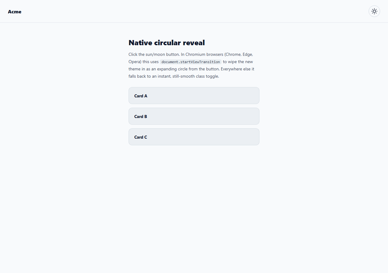
The circular-reveal theme toggle is one of the signature demos of the native View Transitions API: click a sun/moon icon and the new theme wipes across the screen as an expanding circle centered on the button you clicked, rather than an instant flash or a plain crossfade. This snippet builds the effect with the real document.startViewTransition API and a small clip-path keyframe animation — no page framework, no transition library.
How the View Transitions API works here
Calling document.startViewTransition(callback) tells the browser: take a screenshot of the current page, run callback (which makes the actual DOM/class change), take a screenshot of the resulting new state, and then let you animate between the two screenshots with CSS. The browser exposes the old page as ::view-transition-old(root) and the new page as ::view-transition-new(root), both real pseudo-elements you can target directly in CSS. This snippet's callback is just applyTheme(goingDark), which toggles a single .dark class on #page — all of the visual choreography lives in CSS, not in the callback.
The circular clip-path reveal
The actual "circle expanding outward" look comes from a @keyframes circle-reveal animation applied to ::view-transition-new(root): it animates clip-path from circle(0% at var(--x) var(--y)) to circle(150% at var(--x) var(--y)). Because ::view-transition-new(root) is the *new* theme's screenshot sitting on top of the old one, clipping it to a growing circle makes the new theme appear to wipe in from a single point — the exact center of the button that was clicked — while the old theme stays visible everywhere the circle has not yet reached.
Positioning the circle at the click point
Before calling startViewTransition, the code reads btn.getBoundingClientRect() to find the button's center coordinates and writes them to CSS custom properties --x and --y on documentElement. The keyframe animation references var(--x, 50%) and var(--y, 50%), so the circle always originates exactly where the user clicked, with a sensible 50% 50% (page-center) fallback if the variables are ever unset.
Direction-aware transition classes
Two near-identical CSS animation triggers — .dark-transition and .light-transition — are added to documentElement just before starting the transition and removed once transition.finished resolves. Splitting them lets you give the light-to-dark and dark-to-light wipes independent timing or easing later, even though both currently share the same circle-reveal keyframes.
Honest browser support and the fallback path
The View Transitions API (document.startViewTransition) currently ships only in Chromium-based browsers — Chrome, Edge, Opera, and other Chromium derivatives. Firefox and Safari do not yet expose the function. The snippet feature-detects this with a simple if (!document.startViewTransition) guard: unsupported browsers skip straight to applyTheme(goingDark), so the theme still switches correctly everywhere, just without the circular wipe animation. This is the intended, spec-recommended pattern — treat the API as a progressive enhancement layered on top of a toggle that already works everywhere.
Reusing this pattern beyond dark mode
The same getBoundingClientRect → CSS custom property → clip-path circle-from-a-point recipe works for any full-page state change you want to "wipe in" from a specific origin — a locale switcher, an accent-color theme picker, or a full layout swap — by replacing applyTheme with whatever DOM mutation represents your new state.
Build with AI
Build, Understand, Optimize, and Extend It With AI
Paste this snippet into an AI coding assistant like Claude and ask it to explain the exact sequence document.startViewTransition follows — screenshotting the old state, running your callback, screenshotting the new state, then handing you two pseudo-elements to animate between. That mental model makes it much easier to extend. Ask the assistant to help you add view-transition-name to specific elements (like a card or avatar) for a true shared-element morph instead of a whole-page circle wipe, or to add a prefers-reduced-motion branch that skips straight to the instant fallback even in supporting browsers.
Prompt to recreate it
Copy this into your AI assistant of choice to build the effect from scratch, or as a jumping-off point for your own variant:
Build a dark mode toggle button in plain HTML, CSS, and JavaScript that uses the native View Transitions API to wipe in the new theme as an expanding circle centered on the clicked button, with a working fallback for browsers that do not support it.

Requirements:
- A toggle button with a sun/moon icon and a page container whose background/text colors change based on a "dark" class.
- On click, compute the button's center coordinates with getBoundingClientRect and store them in --x and --y CSS custom properties on the document root.
- Feature-detect document.startViewTransition. If it is unavailable, apply the theme class change directly with no special animation.
- If it is available, call document.startViewTransition with a callback that toggles the dark class, and use CSS to animate ::view-transition-new(root) with a clip-path circle() keyframe that grows from 0% to well past 100% at the var(--x) var(--y) point, so the new theme visibly wipes outward from the click location.
- Clean up any transition-tracking classes once the transition's finished promise resolves.
- Add a code comment stating plainly which browser engines currently support this API and that others receive the instant fallback.
Want to tighten it up first? Run this prompt through the AI Prompt Studio to score it across 8 quality dimensions, catch anti-patterns, and tune the wording for Claude, ChatGPT, or Gemini before you paste it in.
Step by step
How to Use
- 1Click the sun/moon buttonIn a Chromium browser you will see the new theme expand outward from the button as a circle. In Firefox/Safari the theme switches instantly.
- 2Change the circle easing/durationEdit the 0.55s ease-in values on the circle-reveal animation in the CSS panel.
- 3Change what gets clippedSwap ::view-transition-new(root) for ::view-transition-old(root) to reveal the OLD theme shrinking away instead of the new one expanding in.
- 4Style the actual dark themeEdit the .page.dark rule and any nested dark-mode overrides to match your product's real dark palette.
- 5Add a reduced-motion guardWrap the startViewTransition call in a prefers-reduced-motion check and call applyTheme() directly for users who opt out of motion.
- 6Export in your formatClick "HTML" for a standalone file, "JSX" for a React component, or "Tailwind" for a React + Tailwind version.
Real-world uses
Common Use Cases
Got questions?
Frequently Asked Questions
Chromium-based browsers — Chrome, Edge, Opera, and other Chromium derivatives — support it today. Firefox and Safari do not yet expose document.startViewTransition, so this snippet feature-detects it and falls back to an instant (but still functional) theme toggle in those browsers.
The if (!document.startViewTransition) check catches it and calls applyTheme(goingDark) directly, so the class toggle and its own CSS background/color transition still run — users just do not see the circular wipe animation.
The button element's getBoundingClientRect() gives its center coordinates, which are written to --x and --y CSS custom properties on documentElement right before startViewTransition runs. The circle-reveal keyframes read those variables as the clip-path circle() origin.
Clipping the NEW theme's screenshot to a growing circle makes the new theme appear to wipe in and cover the old one. Clipping ::view-transition-old(root) to a SHRINKING circle instead would make the old theme peel away, revealing the new theme underneath everywhere else — a different but equally valid look you can switch to.
Yes — the same document.startViewTransition wrapper works for any DOM update, including full page content swaps in an SPA. Pair it with view-transition-name on specific elements for shared-element morphs between views.
Yes. The ::view-transition-old/new(root) selectors and the circle-reveal keyframes are plain CSS and can live in a global stylesheet even if the rest of your component styling uses Tailwind utility classes.