You Might Also Like
Learn Coding Visually
Learn to code with interactive, live-preview playgrounds — HTML, CSS, JavaScript, React & more.
 HTML Playground42 lessons · Click-based · Live preview
 CSS PlaygroundLearn CSS with a live editor
 JavaScript Playground60 lessons · DOM · Async · Canvas
 React PlaygroundLearn React with a live code editor
 GSAP PlaygroundLearn GSAP animation interactively
 SVG Playground44 lessons · shapes · paths · animation
 SCSS Playground45 lessons · Sass modules · tokens
 Tailwind PlaygroundLearn Tailwind CSS with a live editor
 Bootstrap 5 Playground50 lessons · live preview
CSS aspect-ratio Playground — Free HTML CSS JS Snippet
CSS aspect-ratio Playground · Layouts · Plain HTML, CSS & JS · Live preview
What's included
Features
About this UI Snippet
CSS aspect-ratio Playground — Modern Ratio Boxes vs the Legacy Padding-Top Hack
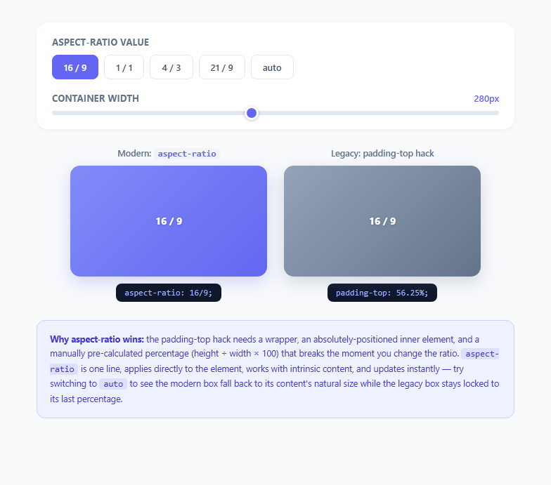
Maintaining a fixed width-to-height ratio on an element — a video embed, a thumbnail, a card image — used to require one of CSS's cleverest, and ugliest, workarounds. The aspect-ratio property, standardized in CSS Box Sizing Module Level 4 and supported in every major browser since 2021, replaces that entire workaround with a single declaration. This playground puts both techniques side by side so you can see exactly what problem aspect-ratio solves and why it was worth waiting for.
The old problem: percentages in CSS are relative to width, not height
Historically there was no way to say "make this box's height a fraction of its width" directly. The workaround exploited a specific, slightly obscure quirk of the CSS box model: when you set padding-top (or padding-bottom) as a percentage, that percentage is always resolved against the element's own width, never its height, even for vertical padding. Developers hijacked this quirk to build a fixed-ratio box: wrap the ratio target in an empty div, give that div padding-top: 56.25% (the height-to-width ratio of 16:9, i.e. 9 ÷ 16 × 100), and the padding itself becomes exactly the right height because it's a percentage of the parent's width. Since padding takes up space but isn't itself content, you then need a second, absolutely-positioned inner wrapper (position: absolute; inset: 0) to actually hold your real content on top of that padding, with the outer element set to position: relative; overflow: hidden. That's a minimum of three nested elements and one manually pre-calculated percentage just to get a 16:9 box.
Why the hack is fragile
Every time the target ratio changes, someone has to recompute the percentage by hand — height / width * 100 — and there's no way to express "auto" or "fall back to natural size" once the hack is in place; the box stays locked to whatever percentage was last set, permanently divorced from the element's actual content. It also doesn't compose well with intrinsic sizing: if the box needs to size itself from its content in some states and hold a fixed ratio in others, you need JavaScript to toggle inline styles, because the CSS itself has no escape hatch.
How aspect-ratio actually works
aspect-ratio: 16 / 9 (or the equivalent unitless aspect-ratio: 1.7778) tells the browser directly: derive this dimension from that one using the given ratio. It participates in the browser's normal sizing algorithm as a preferred aspect ratio — if you specify an explicit width, the browser computes height from the ratio; if you specify height, width is derived instead; if neither is constrained, both come from content as usual. Critically, aspect-ratio: auto is a real, valid value meaning "no forced ratio, size from content or replaced-element intrinsics" (this is actually the property's default, and it's why <img> and <video> elements already respect their natural width/height ratio without any extra CSS). This single declaration replaces the entire three-element hack, requires no manual percentage math, and updates instantly if you change the ratio via a CSS custom property, a media query, or JavaScript — no absolute positioning, no wrapper divs, no overflow: hidden needed just to keep clipped padding under control.
What this playground demonstrates
Five preset buttons switch a live media box between 16/9, 1/1, 4/3, 21/9, and auto, applying the value directly via element.style.aspectRatio and echoing the exact CSS declaration as text. A width slider resizes the box's container in real time so you can see the height recompute automatically at every width, exactly the behavior a responsive image grid or video gallery relies on. Beside it, a second box built with the classic padding-top technique mirrors the same ratio, with its percentage recalculated on every button click via (height / width) * 100, so you can watch both approaches update side by side — and notice that switching the modern box to auto lets it snap to a natural content height, while the legacy box has no equivalent state and simply keeps whatever percentage it was last given.
When you still need the fallback
aspect-ratio support (Chrome 88+, Firefox 89+, Safari 15+) covers effectively all production browser traffic as of 2025/2026, so the padding-top hack is now legacy knowledge worth understanding for maintaining older codebases rather than a pattern to reach for in new work.
Build with AI
Build, Understand, Optimize, and Extend It With AI
Paste this snippet's HTML, CSS, and JS into an AI coding assistant like Claude and ask it to explain step by step why the legacy padding-top box needs three nested elements while the modern aspect-ratio box needs only one, referencing the specific ratioToPaddingPercent() calculation used here. You could also ask it to add a sixth custom ratio option driven by two number inputs (width units and height units) that builds an arbitrary aspect-ratio: W / H string dynamically. It's also useful for extension: ask the assistant to add object-fit: cover behavior with a real background image so the demo more closely mirrors a production video thumbnail, or to add a CSS custom property (like --ratio) so both the modern and legacy boxes could theoretically share a single source of truth. Use the code as a live reference to question and build on, not a finished black box.
Prompt to recreate it
Copy this into your AI assistant of choice to build the effect from scratch, or as a jumping-off point for your own variant:
Build an interactive playground in plain HTML, CSS, and JavaScript comparing the modern CSS aspect-ratio property against the classic padding-top percentage hack.

Requirements:
- A row of preset buttons for common ratios (16/9, 1/1, 4/3, 21/9) plus an "auto" option, where clicking a button applies that value live to a "modern" box using element.style.aspectRatio and marks the button active.
- A text readout that always shows the exact currently-applied aspect-ratio CSS declaration as literal copyable code.
- A second "legacy" box built using the real three-part padding-top technique: an outer relatively-positioned wrapper, an inner empty element whose padding-top percentage is manually computed in JavaScript from the same selected ratio (height divided by width, times 100), and an absolutely-positioned content layer on top holding the visible label.
- A width slider that resizes both boxes' containers simultaneously in real time, so the user can see the modern box's height recompute automatically at every width with no JavaScript height calculation, while the legacy box's percentage-based padding also resolves correctly against its new width.
- Selecting "auto" must visibly demonstrate the key behavioral difference: the modern box falls back to a natural, content-derived size, while the legacy box has no equivalent state and simply retains whatever percentage was last computed.
- A short written explanation on the page describing, in plain language, why percentage padding-top is relative to an element's width (not height) and how that quirk was historically exploited to fake aspect ratios before the aspect-ratio property existed.
Want to tighten it up first? Run this prompt through the AI Prompt Studio to score it across 8 quality dimensions, catch anti-patterns, and tune the wording for Claude, ChatGPT, or Gemini before you paste it in.
Step by step
How to Use
- 1Switch between ratio presetsClick any button in #ratio-buttons (16/9, 1/1, 4/3, 21/9, or auto). The applyRatio() function sets mediaBox.style.aspectRatio to that exact string and updates the #css-line text to show the literal CSS declaration being applied.
- 2Drag the width sliderThe #width-slider input, ranging 120px to 480px, sets both box-card widths live via an input event listener. Watch the modern aspect-ratio box recompute its height automatically at every width value with no JavaScript height calculation needed.
- 3Compare against the legacy padding-top boxThe second card reproduces the classic hack: an empty .legacy-pad element whose padding-top percentage is recalculated in JS via ratioToPaddingPercent() every time you change the ratio, and a separately positioned .legacy-content layer holds the visible label on top of it.
- 4Select "auto" to see the key differenceClicking the auto button sets the modern box to aspect-ratio: auto and gives it an explicit fallback height to represent natural content sizing, while the legacy box has no equivalent concept of auto and simply retains whatever padding percentage was last computed.
- 5Read the generated CSS stringsBoth .css-line elements always mirror the exact, currently active declaration — aspect-ratio: 16 / 9; on the modern box and padding-top: 56.25%; on the legacy box — so you can copy either directly into a stylesheet or compare their literal syntax weight.
- 6Apply the pattern to real mediaIn production, replace the gradient placeholder in .media-box with a real <img> or <video> and add object-fit: cover so the media fills the ratio box without distortion, which is the standard combination for responsive video embeds and image galleries.
Real-world uses
Common Use Cases
Got questions?
Frequently Asked Questions
aspect-ratio has shipped in Chrome/Edge since version 88 (January 2021), Firefox since version 89 (June 2021), and Safari since version 15 (September 2021), giving it effectively universal coverage in production traffic as of 2025/2026. No vendor prefix or fallback is required for modern projects; the padding-top hack is now only relevant for maintaining pre-2021-era codebases.
Setting fixed width and height locks both dimensions absolutely, which breaks responsiveness — the box can't shrink proportionally in a fluid layout. aspect-ratio instead lets you constrain just one dimension explicitly (or neither) and derives the other automatically, so a box with width: 100% and aspect-ratio: 16/9 keeps a correct height at every possible container width, which is exactly what the width slider in this demo illustrates.
Yes, and it is one of the most valuable uses: applying aspect-ratio (matching the image's natural intrinsic ratio, or a custom crop ratio) directly to an <img> tag, combined with object-fit: cover, reserves the correct layout space before the image downloads and finishes decoding, which is a standard technique for eliminating layout shift and improving Core Web Vitals' Cumulative Layout Shift metric.
auto is the property's default value and means the element uses its natural, content-derived size with no ratio constraint imposed — for replaced elements like <img> or <video> that means their intrinsic width-to-height ratio, and for other elements it means ordinary content-based sizing. This demo's auto preset shows the modern box falling back to a natural size, in contrast with the legacy padding-top box, which has no concept of "auto" and simply keeps its last manually-computed percentage forever.
Yes — if both an explicit aspect-ratio and a conflicting min-height or max-height apply, the browser resolves the conflict by respecting the min/max constraint first and using aspect-ratio only for the dimension left unconstrained, which is useful for a hero banner that should hold a 21/9 ratio on wide screens but never exceed a fixed max-height on very large viewports.