You Might Also Like
Learn Coding Visually
Learn to code with interactive, live-preview playgrounds — HTML, CSS, JavaScript, React & more.
 HTML Playground42 lessons · Click-based · Live preview
 CSS PlaygroundLearn CSS with a live editor
 JavaScript Playground60 lessons · DOM · Async · Canvas
 React PlaygroundLearn React with a live code editor
 GSAP PlaygroundLearn GSAP animation interactively
 SVG Playground44 lessons · shapes · paths · animation
 SCSS Playground45 lessons · Sass modules · tokens
 Tailwind PlaygroundLearn Tailwind CSS with a live editor
 Bootstrap 5 Playground50 lessons · live preview
Fluid Typography with CSS clamp() — Free Snippet Demo
Fluid Typography with CSS clamp() Demo · Layouts · Plain HTML, CSS & JS · Live preview
What's included
Features
About this UI Snippet
Fluid Typography with CSS clamp() — Building and Understanding Responsive font-size Without Media Queries
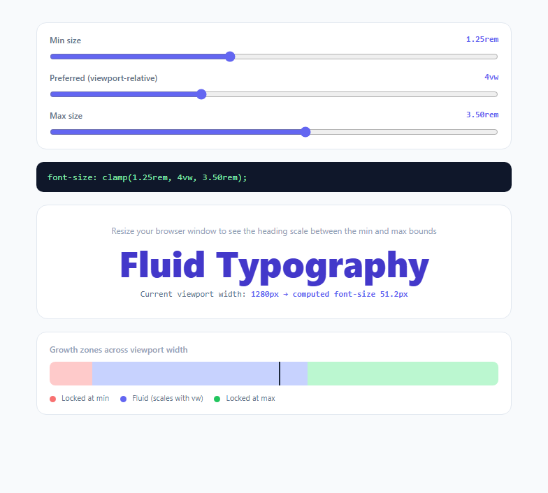
Before clamp(), fluid typography required either a fixed font-size per breakpoint (a stair-step effect, jumping abruptly at each @media boundary) or a raw viewport-relative unit like 4vw with no bounds, which reads beautifully on a laptop but becomes illegibly tiny on a phone and absurdly oversized on an ultrawide monitor. CSS's clamp(min, preferred, max) function solves both problems in a single declaration, and this snippet is an interactive builder that lets you construct one live, see its exact generated CSS string, and visualize precisely where on the viewport-width axis it switches between its three behavior zones.
How clamp() actually resolves three arguments
clamp(MIN, PREFERRED, MAX) takes three comma-separated values and returns whichever satisfies: the middle "preferred" value, unless it would fall below MIN (in which case MIN is used) or above MAX (in which case MAX is used). The critical detail is that only the *preferred* argument is typically expressed in a fluid, viewport-relative unit like vw; MIN and MAX are normally fixed units like rem, acting as hard floors and ceilings. In this demo, moving the "Preferred" slider changes the vw value passed to clamp() — the middle argument, e.g. 4vw — while the min and max sliders set the two rem-based bounds, exactly mirroring the three-argument structure of the real CSS function.
Why rem for the bounds and vw for the middle
Using rem for MIN and MAX (rather than px) means both bounds respect the user's browser font-size setting, which matters for accessibility — a user who has increased their default browser font size for readability should see that preference reflected even at the clamped floor and ceiling. The middle argument uses vw (1% of viewport width) specifically because it is the term that needs to move continuously with window size; this demo computes it directly from your Preferred slider value as a percentage, and the code panel always shows the exact resulting string, e.g. clamp(1.25rem, 4vw, 3.5rem), ready to paste into a stylesheet.
Finding the crossover viewport widths — the real math behind the ruler
The most educational part of this demo is the "Growth zones" ruler beneath the preview. It answers a question most fluid-typography tutorials never actually compute: *at what exact viewport width does the value stop being MIN and start scaling, and at what width does it stop scaling and become MAX?* Since the preferred value is prefVw% of viewport width, solving minPx = (prefVw / 100) * viewportWidth for viewportWidth gives the exact pixel width where the curve crosses from the min-locked zone into the fluid zone: viewportWidth = minPx * 100 / prefVw. The same algebra with maxPx gives the crossover into the max-locked zone. This demo's crossoverWidths() function performs exactly that calculation, and the ruler visually maps those two crossover widths onto a reference 320px–2200px scale, coloring the red zone (locked at min), the indigo zone (actively fluid), and the green zone (locked at max) — with a live marker showing where your actual current browser width currently sits.
Why this beats hand-picking breakpoint font sizes
A traditional approach — three or four fixed font-size declarations inside @media queries — produces visible, discrete jumps as the viewport crosses each breakpoint, and requires maintaining N separate values that must be kept visually consistent by hand. A single clamp() declaration replaces all of that with one line that scales continuously and smoothly across every viewport width in between, with genuinely zero jump discontinuities, while still guaranteeing the text never becomes illegibly small or absurdly large at the extremes — the two failure modes of raw unbounded vw sizing.
Browser support and where this pattern is heading
clamp(), along with its siblings min() and max(), has been supported in all major browsers since 2020, making it entirely production-safe in 2025/2026 with no fallback needed. The same three-argument pattern demonstrated here for font-size composes directly with newer relative units — swapping the vw middle argument for a cqi container query unit, as explored in the companion Container Query Units demo, produces fluid typography that scales relative to a component's container rather than the whole viewport, which is increasingly the preferred approach for reusable, drop-anywhere component libraries.
Build with AI
Build, Understand, Optimize, and Extend It With AI
Paste this snippet into an AI coding assistant like Claude and ask it to walk through the algebra in crossoverWidths() line by line — solving for the exact viewport width where a clamp() value transitions between its locked and fluid zones is a genuinely useful skill to internalize, not just something to copy. You could also ask it to extend the ruler to plot a second, comparison clamp() value alongside the first so you can visually compare two type-scale choices at once, or to add a toggle that swaps the middle argument's unit from vw to cqi and updates all the crossover math to use a container width input instead of window.innerWidth. It's also worth asking it to generate a full six-level heading type scale (h1 through h6) as a set of CSS custom properties, each using this same clamp() pattern with proportionally related min/max bounds.
Prompt to recreate it
Copy this into your AI assistant of choice to build the effect from scratch, or as a jumping-off point for your own variant:
Build an interactive CSS clamp() fluid typography builder in plain HTML, CSS, and JavaScript — no libraries.

Requirements:
- Three range sliders controlling the three arguments of a font-size: clamp(min, preferred, max) declaration: a minimum bound in a unit that respects the user's root font-size (e.g. rem, converted from a pixel-based slider), a preferred value expressed as a raw vw percentage, and a maximum bound in the same rem-based unit as the minimum.
- A live, read-only text output showing the exact generated CSS string (e.g. font-size: clamp(1.25rem, 4vw, 3.5rem);) that updates immediately as any slider moves.
- A visible heading element whose actual font-size is set to the live clamp() value (not simulated), so resizing the real browser window visibly changes its size according to true CSS clamp() behavior, bounded correctly at the extremes.
- A live numeric readout showing the current real viewport width and the resulting computed font-size in pixels at that width, updated via a window resize listener (not just on slider change).
- A visual "ruler" or bar, spanning a reasonable reference viewport-width range (e.g. 320px to 2200px), split into three colored zones — locked-at-minimum, actively fluid, and locked-at-maximum — with the two zone boundaries computed algebraically from the current min/preferred/max values (solve for the viewport width at which the vw-based preferred value equals the min bound, and separately equals the max bound).
- A marker on the ruler indicating where the browser's actual current width currently falls among the three zones, updated on resize.
- Clearly explain, either in a comment or on-page, why the min/max bounds use a relative unit like rem instead of a fixed px value.
Want to tighten it up first? Run this prompt through the AI Prompt Studio to score it across 8 quality dimensions, catch anti-patterns, and tune the wording for Claude, ChatGPT, or Gemini before you paste it in.
Step by step
How to Use
- 1Adjust the min size sliderSets the first clamp() argument, converted from pixels to rem via pxToRem() so the floor respects the user's root font-size setting. This is the smallest the heading will ever render, no matter how narrow the viewport gets.
- 2Adjust the preferred (vw) sliderSets the middle clamp() argument as a raw vw percentage — this is the only fluid term, and it is what makes the heading continuously resize as you change your browser window width, computed live as (prefVw / 100) * window.innerWidth.
- 3Adjust the max size sliderSets the third clamp() argument, the ceiling. Once the vw-based preferred value would exceed this, the heading locks at this size no matter how wide the viewport becomes — try a small gap between min and max to see the fluid zone narrow dramatically on the ruler.
- 4Read the generated CSS stringThe dark code panel always shows the exact font-size: clamp(...) declaration your three sliders currently produce, in the same rem/vw/rem format you would hand-write in a stylesheet — copy it directly.
- 5Resize your actual browser windowThe live heading and the "computed font-size" readout both update in response to real window resize events, not just slider input — this is the only way to see the fluid scaling behavior itself, since the sliders only change the clamp() parameters, not the viewport.
- 6Read the growth-zone rulerThe colored ruler bar shows, across a 320px-2200px reference scale, exactly which viewport widths lock to min (red), scale fluidly (indigo), or lock to max (green) for your current three values — computed by solving for the exact crossover width algebraically in crossoverWidths(), with a marker showing where your real current window width sits.
Real-world uses
Common Use Cases
Got questions?
Frequently Asked Questions
clamp(MIN, PREFERRED, MAX) evaluates all three and returns PREFERRED unless it falls outside the MIN-MAX range, in which case the nearest bound wins. MIN and MAX are typically fixed values (this demo uses rem so they respect the user's font-size setting), while PREFERRED is typically a fluid, relative value like vw so the result actually changes continuously with viewport width between the two bounds.
Since the preferred term is (vwPercentage / 100) times the viewport width in pixels, solve minPx = (vwPercentage / 100) * width for width to get width = minPx * 100 / vwPercentage — that is exactly the calculation this demo's crossoverWidths() function performs, and it is the same math you would use to hand-derive the crossover point for any clamp() value you find in production CSS.
vw scales against the full browser viewport width regardless of where the element sits in the page. cqi (container query inline-size) instead scales against the nearest ancestor with container-type: inline-size set, making it the better choice for reusable components that may render inside a narrow sidebar or a wide main column — swap the middle argument's unit and the rest of the clamp() bounds logic in this demo is unchanged, as shown in the Container Query Units demo.
rem is relative to the root element's font-size, which by default is the browser's font-size setting (commonly 16px, but user-adjustable in accessibility settings). Using rem for the min and max bounds means a user who has increased their browser's default text size for readability still sees a proportionally larger floor and ceiling, whereas hardcoded px bounds would ignore that preference entirely — an important accessibility consideration for fluid type scales.
Yes — clamp(), along with min() and max(), has been supported in all major evergreen browsers (Chrome, Edge, Firefox, Safari) since 2020, making it fully production-ready with no polyfill or fallback needed as of 2025/2026. It is one of the most broadly supported modern CSS functions in active use for responsive design.