You Might Also Like
Learn Coding Visually
Learn to code with interactive, live-preview playgrounds — HTML, CSS, JavaScript, React & more.
 HTML Playground42 lessons · Click-based · Live preview
 CSS PlaygroundLearn CSS with a live editor
 JavaScript Playground60 lessons · DOM · Async · Canvas
 React PlaygroundLearn React with a live code editor
 GSAP PlaygroundLearn GSAP animation interactively
 SVG Playground44 lessons · shapes · paths · animation
 SCSS Playground45 lessons · Sass modules · tokens
 Tailwind PlaygroundLearn Tailwind CSS with a live editor
 Bootstrap 5 Playground50 lessons · live preview
:focus-visible vs :focus Demo — Free HTML CSS JS Snippet
:focus-visible vs :focus Explainer · Forms · Plain HTML, CSS & JS · Live preview
What's included
Features
About this UI Snippet
:focus-visible vs :focus — Interactive CSS Pseudo-Class Explainer with Live Interaction Logging
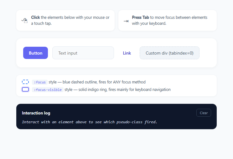
Focus styling is one of the most frequently botched pieces of accessible UI on the web. For years, developers had exactly one option — the :focus pseudo-class — which fires the moment ANY element receives keyboard input focus, including when a user simply clicks a button with a mouse. Because default browser focus rings (that blue glow around a clicked button) looked visually noisy to many designers, an enormous number of sites shipped *:focus { outline: none; } globally, silently stripping keyboard focus indication sitewide and making the page unusable for keyboard and switch-device users. :focus-visible, standardized in the CSS Selectors Level 4 spec and shipped natively in all major browsers since 2020-2021, fixes this by letting the browser itself decide, using its own heuristics, whether a focus event was likely triggered by keyboard/assistive-technology navigation (show a ring) versus a direct pointer interaction (usually suppress it).
The actual browser heuristic
:focus-visible is not simply "keyboard = true, mouse = false." The specification defines heuristics that browsers implement slightly differently but converge on in practice: a <button>, <a>, or a plain <div tabindex="0"> clicked directly with a mouse generally does NOT match :focus-visible (because the user can already see what they clicked, a ring adds little value), but that same click on a <button> still matches :focus. Meanwhile a text <input> clicked with a mouse DOES typically still match :focus-visible, because focusing a text field is itself an implicit signal you're about to type and the insertion point benefits from a clear visual anchor. Any focus reached via Tab, Shift+Tab, arrow-key navigation inside composite widgets, or a screen reader's virtual cursor reliably matches :focus-visible across every interactive element type. Programmatic focus via el.focus() in JavaScript inherits the visibility state of whatever interaction triggered it, with document-level heuristics as a fallback.
Why this distinction matters for real products
Before :focus-visible existed, teams had to choose between two bad options: leave the default mouse-triggered focus ring in place (which many stakeholders reject as "ugly," clicking any button leaves a visible blue box) or strip focus outlines entirely with outline: none (which is a WCAG 2.4.7 "Focus Visible" failure and breaks the product for keyboard-only and switch-device users, a legally significant accessibility gap under ADA/Section 508 in many jurisdictions). :focus-visible resolves the tension natively, with zero JavaScript: style :focus-visible with your polished, prominent focus ring, and optionally leave a lighter or absent :focus style for pointer interactions, letting the browser's own input-method detection do the work that used to require third-party libraries like the old focus-visible polyfill (a JS library shimming this exact behavior before native support existed).
What this playground demonstrates
Four different interactive elements — a <button>, a text <input>, an <a> link, and a plain <div tabindex="0"> — are each styled with two competing rules: .demo-el:focus applies a dashed blue outline unconditionally, and .demo-el:focus-visible applies a solid indigo ring with a soft glow that visually wins whenever it also matches (later rule, higher specificity of the more precise selector in practice, though both are single pseudo-classes here so declaration order decides). Click each element with your mouse, then Tab through them with your keyboard, and watch the live interaction log at the bottom record, in real time, whether :focus-visible matched for that exact focus event — captured by calling element.matches(':focus-visible') inside a focusin listener. You'll observe the button, link, and custom div suppress the indigo ring on a raw mouse click while the text input keeps it, exactly matching the spec's documented heuristic, and every Tab-driven focus event shows the ring regardless of element type.
Implementation notes for your own components
Because :focus-visible needs no JavaScript feature detection or event listener to use in production CSS — the interaction log here is purely a teaching aid, not a requirement — you can adopt it today by simply replacing outline: none reset rules with a deliberate :focus-visible ring and, if you want a subtler acknowledgment for pointer users, a lighter :focus:not(:focus-visible) style. Support has existed in Chrome/Edge since 86, Firefox since 85, and Safari since 15.4, so no polyfill is needed in 2025/2026 codebases.
Build with AI
Build, Understand, Optimize, and Extend It With AI
Paste this snippet's HTML, CSS, and JS into an AI coding assistant like Claude and ask it to explain exactly why clicking the button and the div suppress the :focus-visible ring while clicking the text input does not — the assistant can walk through the underlying browser heuristic in more depth than a comment can. You could also ask it to add a fifth interactive element, like a custom radio-button group built from divs, and predict how the log would behave for it before you test. It's a good candidate for extension too: ask the assistant to add a running tally counting how many times each pseudo-class fired, or to add a :focus:not(:focus-visible) style showing the subtler "acknowledgment only" pattern recommended for production use. Treat the demo as a live reference to interrogate, not just a finished artifact.
Prompt to recreate it
Copy this into your AI assistant of choice to build the effect from scratch, or as a jumping-off point for your own variant:
Build an interactive explainer comparing the CSS :focus and :focus-visible pseudo-classes in plain HTML, CSS, and JavaScript.

Requirements:
- At least four differently-typed focusable elements in a row: a native button, a native text input, a native anchor link, and a plain div with tabindex="0", so the browser's per-element-type focus-visible heuristic is visible.
- Two competing CSS focus styles on every element: one rule keyed on :focus that always applies a visible outline regardless of interaction method, and a second rule keyed on :focus-visible with a visually distinct, more prominent ring plus a soft box-shadow glow that only applies when the browser determines the focus event should be visually indicated.
- On-screen instructions telling the user to first click each element with a mouse, then separately Tab through them with a keyboard, so they can directly compare the two interaction methods.
- A live, scrolling interaction log that records, for every focus event, which element was focused and whether element.matches(':focus-visible') returned true, using a focusin listener on each element rather than polling.
- Color-coded log entries so a :focus-visible match and a :focus-only (not visible) match are visually distinguishable at a glance.
- A clear-log button that resets the log panel to an empty placeholder state.
- No JavaScript polyfill for the pseudo-class itself — rely entirely on native browser :focus-visible support, using JavaScript only to observe and log the result via matches().
Want to tighten it up first? Run this prompt through the AI Prompt Studio to score it across 8 quality dimensions, catch anti-patterns, and tune the wording for Claude, ChatGPT, or Gemini before you paste it in.
Step by step
How to Use
- 1Click each element with your mouseClick the Button, the Input, the Link, and the custom Div in the .element-row one at a time. Watch the log panel record whether :focus-visible matched — notice the button, link, and div typically log "not visible" while the text input still logs "visible", exactly following the spec heuristic.
- 2Tab through the same elements with your keyboardClick somewhere neutral first (like the page background) to remove focus, then press Tab repeatedly to move focus through #el-button, #el-input, #el-link, and #el-div in order. Every element should log "visible" in the interaction panel this time, since keyboard-driven focus always matches :focus-visible.
- 3Read the live interaction logEach focusin listener calls element.matches(":focus-visible") the instant focus lands, and addLogEntry() pushes a new entry to the top of #log-list tagged either ":focus-visible" (indigo) or ":focus (not visible)" (blue), letting you correlate your exact interaction with the resulting pseudo-class match.
- 4Inspect the competing CSS rulesIn the CSS panel, compare .demo-el:focus (a 3px dashed #3b82f6 outline that fires unconditionally) against .demo-el:focus-visible (a 3px solid #6366f1 ring plus a soft box-shadow glow) to see exactly how the two rules are declared and why the more specific-looking :focus-visible style visually wins whenever both apply simultaneously.
- 5Adapt the pattern for outline: none resetsIn your own stylesheet, never write a bare *:focus { outline: none; } reset. Instead write *:focus-visible { outline: 3px solid var(--focus-color); } and, if you still want pointer users to get some acknowledgment, add *:focus:not(:focus-visible) { outline: 1px solid transparent; } so mouse clicks stay visually quiet without breaking keyboard accessibility.
- 6Test with assistive technologyBeyond mouse and keyboard, verify your real components with a screen reader's virtual cursor (NVDA, JAWS, VoiceOver) — focus-visible-matched styles should appear whenever the virtual cursor lands on a focusable element, confirming your ring is genuinely serving assistive technology users, not just sighted keyboard users.
Real-world uses
Common Use Cases
Got questions?
Frequently Asked Questions
:focus matches an element the instant it receives focus, regardless of how — mouse click, touch tap, keyboard Tab, or JavaScript el.focus() all trigger it identically. :focus-visible matches only when the browser's own heuristic determines a visible indicator would help the user, which in practice means keyboard/assistive-tech-driven focus events almost always match, while direct mouse or touch clicks on buttons, links, and generic tabindex elements usually do NOT match (though clicking a text input still does, since typing intent is always relevant there).
No — :focus-visible is a native CSS pseudo-class with full support in Chrome/Edge 86+, Firefox 85+, and Safari 15.4+, so plain CSS selectors like .btn:focus-visible { outline: ... } work with zero JavaScript in production. This snippet only uses JavaScript (element.matches(":focus-visible") inside a focusin listener) to build the educational interaction log, not to make the styling itself function.
That is the intended, spec-defined behavior: clicking a button with a mouse is not considered a case where the user needs an additional visual indicator, since the sighted user already knows exactly what they clicked. Tab to the same button with your keyboard instead and it will show the ring, because keyboard-driven focus does not carry the same implicit visual confirmation.
Yes, always replace outline: none resets with a deliberate :focus-visible style rather than removing focus indication outright. A bare *:focus { outline: none; } (with no :focus-visible replacement) is a common and serious accessibility regression that fails WCAG 2.4.7 and makes your site effectively unusable for keyboard-only and switch-device users, since they lose all visual confirmation of where focus currently is.
Yes, and it is a common pattern: use :focus-visible for your prominent, high-contrast ring, and optionally add a :focus:not(:focus-visible) rule for a much subtler acknowledgment (or none at all) on pointer-triggered focus, so mouse users get a clean interface while keyboard and assistive-technology users still get a clear, unmissable indicator.