You Might Also Like
Learn Coding Visually
Learn to code with interactive, live-preview playgrounds — HTML, CSS, JavaScript, React & more.
 HTML Playground42 lessons · Click-based · Live preview
 CSS PlaygroundLearn CSS with a live editor
 JavaScript Playground60 lessons · DOM · Async · Canvas
 React PlaygroundLearn React with a live code editor
 GSAP PlaygroundLearn GSAP animation interactively
 SVG Playground44 lessons · shapes · paths · animation
 SCSS Playground45 lessons · Sass modules · tokens
 Tailwind PlaygroundLearn Tailwind CSS with a live editor
 Bootstrap 5 Playground50 lessons · live preview
Typography Scale Preview — Free Live Type Scale Reference
Typography Scale Preview · Layouts · Plain HTML, CSS & JS · Live preview
What's included
Features
About this UI Snippet
Typography Scale Preview — Live Samples at Every Step of the Scale
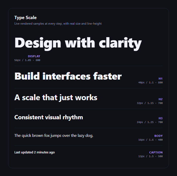
The typography scale preview is the reference every design system doc needs alongside its color and spacing tokens: a vertical stack of text samples, each one actually rendered at its real font-size, line-height, and weight, with those exact values labeled beside it. This snippet builds one in plain HTML, CSS, and JavaScript, driven entirely by a single data array.
Live rendering, not a mockup
Each row's sample text has its font-size, line-height, and font-weight set directly as inline styles pulled straight from the scale array — sample.style.fontSize = step.size + 'px'. That means what you see is exactly what those values produce in a real browser, including how the font's actual metrics affect line spacing, not a static image or a pre-rendered screenshot standing in for the type.
Six standard steps
The default scale covers Display, H1, H2, H3, Body, and Caption — the steps most design systems define — each with distinct size, line-height, and weight combinations. Larger headline steps use tighter line-heights (1.05–1.15) since large text needs less vertical breathing room, while Body uses a generous 1.6 for readability in paragraphs.
Exact values labeled
Beside every sample, a monospace label prints the precise size / line-height · weight combination, so a developer implementing the scale in CSS doesn't have to reverse-engineer it from the visual alone — the numbers are right there.
Why a single array matters
Because every row is generated from one scale array, adding a new step (say, an "Overline" or "H4") or adjusting an existing size is a one-line change — the rendering, labeling, and layout all stay in sync automatically.
Customizing it
Swap the sample copy for your own brand voice, change the font family via the card's font-family, add more steps, or connect it to real CSS custom properties with getComputedStyle. Pair it with a spacing scale visualizer for a complete type-and-space design tokens reference.
Build with AI
Build, Understand, Optimize, and Extend It With AI
Type scales look simple until the line-heights stop feeling right at different sizes, so it's worth pasting this snippet's HTML, CSS, and JS into an AI coding assistant like Claude and asking it to explain why the scale array pairs larger font-sizes with tighter line-heights and smaller sizes with looser ones, and whether the specific ratios here (1.05 at 56px vs. 1.6 at 16px) match established typographic conventions or could be tuned further for your specific typeface. It's also a useful sounding board for extending the demo: ask it to generate the scale programmatically from a base size and a ratio (a modular scale) instead of hardcoding each step, to add a responsive variant that shows how each step's clamp() value should look across viewport widths, or to wire the font-family to a live Google Fonts picker so you can A/B compare typefaces across the whole scale at once.
Prompt to recreate it
Copy this into your AI assistant of choice to build the effect from scratch, or as a jumping-off point for your own variant:
Build a "typography scale preview" in plain HTML, CSS, and JavaScript — no dependencies, no CDN.

Requirements:
- Define a single array of type scale steps, each with a name (Display, H1, H2, H3, Body, Caption), sample text, a font-size in px, a line-height, and a font-weight.
- Render each step as a row: the sample text actually rendered LIVE at that step's exact font-size, line-height, and font-weight via inline styles (not an image or static mockup), with the step's name and its exact size/line-height/weight values labeled beside it in a readable format.
- Larger heading steps should use tighter line-heights than body text, reflecting real typographic practice.
- Keep everything driven by the single data array — adding, removing, or editing a step should require no other code changes.
- Style it as a clean vertical stack with dividers between rows, dark-theme friendly, with the metadata label right-aligned and in a monospace font.
Want to tighten it up first? Run this prompt through the AI Prompt Studio to score it across 8 quality dimensions, catch anti-patterns, and tune the wording for Claude, ChatGPT, or Gemini before you paste it in.
Step by step
How to Use
- 1Paste HTML, CSS, and JSA live sample renders for every step in the scale.
- 2Read each rowSample text on the left, exact size/line-height/weight on the right.
- 3Compare rhythmSee how each step's proportions relate to its neighbors.
- 4Edit the scale arrayAdd steps or change values — samples re-render live.
- 5Swap the font familyChange .tsp-card's font-family to preview your real typeface.
Real-world uses
Common Use Cases
Got questions?
Frequently Asked Questions
Real rendering. Each sample's font-size, line-height, and font-weight are set as inline styles directly from the scale array's values, so what you see is the browser's actual text layout at those exact numbers — not a screenshot or a pre-rendered image standing in for it.
Change the font-family on .tsp-card (or add a @font-face and reference it) — every sample inherits it since they don't set their own font-family, so the whole scale updates to your typeface at once.
Yes — add another object to the scale array with a name, text, size, lh, and weight. It renders automatically in the same list with no other code changes.
Larger text needs proportionally less line-height to look balanced — a 1.6 line-height at 56px would create huge gaps between lines, while the same 1.6 is exactly right for comfortable paragraph reading at 16px. The scale's per-step lh values reflect that relationship.
Move the scale array into a constant, map over it in your template, and bind size/lh/weight to inline styles or CSS custom properties per sample the same way. No DOM-specific logic needs to change.