You Might Also Like
Learn Coding Visually
Learn to code with interactive, live-preview playgrounds — HTML, CSS, JavaScript, React & more.
 HTML Playground42 lessons · Click-based · Live preview
 CSS PlaygroundLearn CSS with a live editor
 JavaScript Playground60 lessons · DOM · Async · Canvas
 React PlaygroundLearn React with a live code editor
 GSAP PlaygroundLearn GSAP animation interactively
 SVG Playground44 lessons · shapes · paths · animation
 SCSS Playground45 lessons · Sass modules · tokens
 Tailwind PlaygroundLearn Tailwind CSS with a live editor
 Bootstrap 5 Playground50 lessons · live preview
CSS Box Model Inspector — Free HTML CSS JS Snippet
CSS Box Model Inspector · Animations · Plain HTML, CSS & JS · Live preview
What's included
Features
About this UI Snippet
CSS Box Model Inspector — Animated Content, Padding, Border & Margin Layers with box-sizing Comparison in Vanilla JS
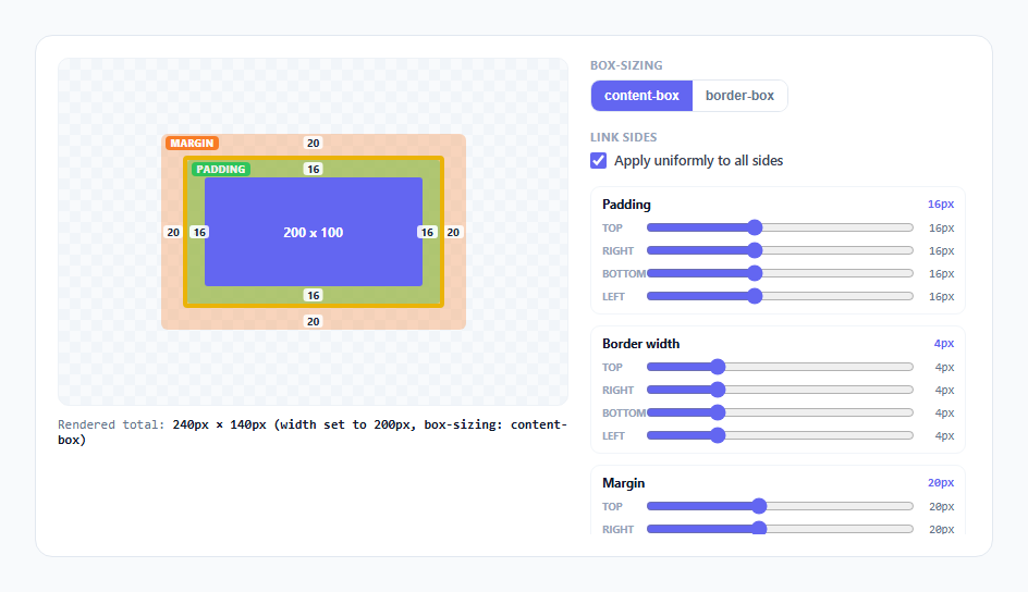
The CSS box model is one of those things every developer technically knows and regularly gets wrong anyway, usually because the effect of a padding or border change on the element's final rendered size is invisible until you actually measure it in DevTools. This snippet turns the box model into something you manipulate directly: four nested, color-coded layers — content, padding, border, margin — each with independent per-side sliders, animated transitions between values, and a live toggle between box-sizing: content-box and border-box so the single most common source of layout bugs becomes something you can watch happen instead of something you have to remember.
Structure: nested divs mirror the spec's own model
The DOM is four literally nested <div> elements — .margin-layer wraps .border-layer wraps .padding-layer wraps .content-box — which mirrors how the CSS spec itself describes the box model as a set of concentric edges (margin edge, border edge, padding edge, content edge) around a single element. Rather than drawing four separate rectangles with manual math, each "layer" is simply the previous layer's padding: the orange margin layer uses its own CSS padding property to create visible space before the yellow border layer begins, the yellow layer uses border-width to create the border band, and the green padding layer uses padding again before the indigo content box. This means the browser's own layout engine is doing all the geometry — the script only ever sets style.padding and style.borderWidth in pixels per side, and CSS lays out the rest.
The color convention is deliberately borrowed from DevTools
Content renders indigo/blue, padding green, border gold/yellow, margin orange — the same four-color convention Chrome, Firefox, and Safari all use in their built-in box-model inspector overlays. This is not arbitrary; matching the browser's own convention means the mental model you build here transfers directly the next time you open DevTools and hover an element, instead of teaching you a second color scheme to translate from.
Per-side sliders and the "link sides" toggle
Each of the three groups (padding, border, margin) renders four range inputs, one per side (top, right, bottom, left), built programmatically in buildSliders() rather than hand-written four times over — a single groups array drives the DOM generation, so extending the max range or adding a fourth group needs one array edit, not four copy-pasted blocks. A "link sides" checkbox controls whether dragging one slider updates all four sides of that layer at once (the common case, uniform spacing) or just the one side you touched (for exploring asymmetric layouts, like a card with extra top padding). The linked/unlinked logic lives entirely in onSlide(), which either broadcasts the new value to all four SIDES or writes to a single one, then calls render().
Why the layers visibly animate instead of snapping
Every layer's CSS declares transition: padding 0.28s, border-width 0.28s, width 0.28s, height 0.28s with a cubic-bezier(0.4,0,0.2,1) ease — the same "standard" easing curve Material Design uses for size changes. Because padding and border-width are both natively animatable CSS properties, dragging a slider doesn't need a JavaScript animation loop at all: the script just writes the new pixel value to style.padding on every input event, and the browser's compositor interpolates the visual change smoothly between the old and new value. This is a deliberate choice over animating with requestAnimationFrame — CSS transitions here are simpler, smoother, and free of frame-timing bugs, because the property itself is what's changing, not an unrelated transform standing in for it.
box-sizing: content-box vs border-box, made visibly concrete
This is the part that actually resolves real confusion. The content box has a fixed base size (CONTENT_W = 200, CONTENT_H = 100) representing a CSS width/height declaration. In content-box mode (the CSS default), that 200px width describes the content area only — padding and border are added on top, so the total rendered footprint grows every time you increase padding or border. In border-box mode, the exact same 200px width is reinterpreted as the *total* footprint including padding and border, so render() subtracts the current padding and border from 200 to compute the shrunken content box width (clamped to a 20px floor so it never inverts). Toggling the segmented control replays both interpretations against the identical padding/border values you've already dialed in, and the "Rendered total" readout below the stage prints the actual final footprint in both modes — the exact number a real layout bug report would hinge on.
Live pixel labels instead of a separate readout panel
Each layer overlays four small absolutely-positioned .val spans, one per side, showing that side's current pixel value directly on the layer itself (top value at the top edge, left value at the left edge, and so on) rather than in a separate legend the user has to cross-reference. This keeps the spatial relationship between "this number" and "this visible band of color" immediate, which matters because the entire point of the component is connecting a slider value to where it physically shows up on screen.
Build with AI
Build, Understand, Optimize, and Extend It With AI
Paste this snippet's JavaScript into an AI assistant like Claude and ask it to walk through exactly why render() only needs to subtract padding and border from 200px in border-box mode, and why margin never enters that calculation. It's also worth asking why CSS transitions were chosen over a requestAnimationFrame loop for the resizing animation. Good extensions to request: an outline layer outside margin, a corner-specific border-radius control, or a "measure" mode that overlays the exact numbers DevTools would report for the current state.
Prompt to recreate it
Copy this into your AI assistant of choice to build the effect from scratch, or as a jumping-off point for your own variant:
Build an interactive, animated CSS box model inspector in plain HTML, CSS, and JavaScript — no frameworks, no libraries.

Requirements:
- Four nested divs representing margin, border, padding, and content, color-coded to match the browser DevTools box-model convention (blue/indigo content, green padding, gold/yellow border, orange margin), with each outer layer using its own CSS padding or border-width property to create the visible space for the layer inside it (not hand-computed rectangle positions).
- Independent range-slider controls for each side (top/right/bottom/left) of padding, border-width, and margin, generated from a single data-driven array rather than duplicated markup, plus a "link sides" checkbox that switches between updating all four sides uniformly and updating only the one side being dragged.
- CSS transitions (not a JavaScript animation loop) on padding, border-width, width, and height so every slider change animates smoothly rather than snapping instantly.
- A segmented toggle between box-sizing: content-box and box-sizing: border-box that, using the same padding/border values already applied, recomputes and animates the content box's actual rendered size — shrinking it in border-box mode so the total footprint stays constant, growing the total footprint in content-box mode instead.
- A live readout showing the true final rendered width and height in pixels for the current box-sizing mode, plus small pixel-value labels overlaid directly on each layer at the edge they describe.
- Clamp the content box to a sensible minimum size in border-box mode so heavy padding/border values cannot invert or negative-size it.
Want to tighten it up first? Run this prompt through the AI Prompt Studio to score it across 8 quality dimensions, catch anti-patterns, and tune the wording for Claude, ChatGPT, or Gemini before you paste it in.
Step by step
How to Use
- 1Drag any padding, border, or margin sliderThe matching colored layer (green padding, gold border, orange margin) animates smoothly to its new thickness, and the pixel label on that edge updates in real time.
- 2Uncheck "Apply uniformly to all sides"Now each of the four sliders in a group (top/right/bottom/left) controls only that one side, letting you build asymmetric spacing like extra top padding on a card header.
- 3Watch the indigo content box and the "Rendered total" readoutThe content box stays a fixed 200x100px in content-box mode while the overall footprint grows as you add padding or border — the readout below the stage prints the exact final width and height.
- 4Click the border-box segment in the box-sizing toggleWith the same padding and border values still applied, the content box itself now visibly shrinks so the total footprint holds steady at 200px wide — the core content-box vs border-box distinction, side by side.
- 5Toggle box-sizing back and forth without changing any sliderThis isolates the box-sizing effect from any padding/border change, making it unambiguous that the same CSS width value produces two different rendered sizes purely based on this one property.
- 6Push padding or border to their maximum valuesIn border-box mode the content box shrinks toward its 20px floor and stops changing, demonstrating the real-world edge case where padding and border can consume the entire declared width.
Real-world uses
Common Use Cases
Got questions?
Frequently Asked Questions
Yes. Move the padding/border/margin numbers into component state (useState in React, a reactive ref in Vue, or a component property in Angular) and bind each slider's value and input/change handler to update that state. Because the actual size change is a CSS transition on padding/border-width/width, not a requestAnimationFrame loop, there is no animation frame to clean up in useEffect/onUnmounted/ngOnDestroy — you only need to make sure your framework re-renders the inline styles (or CSS custom properties, if you switch to that pattern) whenever state changes. The box-sizing toggle is just a class or inline style bound to a boolean/string in state.
That is the entire point of border-box: the declared width (200px here) is redefined by the spec to mean the total rendered footprint including padding and border, rather than just the content area. Since the total must stay at 200px, the browser has no choice but to shrink the content area by however much padding and border you have added. This snippet's render() function performs that exact subtraction (CONTENT_W minus padding and border on each side) to mirror what the browser itself computes internally.
Browsers clamp the content box at a minimum size rather than letting it go negative; this snippet mirrors that with a 20px floor (Math.max(20, ...)) so the content box never inverts or disappears. In real layouts this is the scenario behind many "why is my button's text overflowing" bugs — heavy padding or a thick border silently eating almost all of a narrow declared width.
Because that mirrors the real CSS properties involved: padding is genuinely implemented with the padding property on the margin and padding layer divs, and the border band is genuinely implemented with border-width and border-color on the border layer div. Nothing here is faked with manually-sized colored rectangles — every layer thickness you see is the literal CSS property applied to a literal nested element, so the behavior you learn transfers directly to writing real CSS.
Add an outline-layer div outside the margin layer (outlines are drawn outside the border box and, unlike margin, do not affect layout) with its own outline-width slider, plus an outline-offset slider if you want to demonstrate the gap between border and outline. Border-radius can be added as one more per-corner slider group following the exact same buildSliders() pattern used for padding, border, and margin.