Learn Coding Visually
Learn to code with interactive, live-preview playgrounds — HTML, CSS, JavaScript, React & more.
 HTML Playground42 lessons · Click-based · Live preview
 CSS PlaygroundLearn CSS with a live editor
 JavaScript Playground60 lessons · DOM · Async · Canvas
 React PlaygroundLearn React with a live code editor
 GSAP PlaygroundLearn GSAP animation interactively
 SVG Playground44 lessons · shapes · paths · animation
 SCSS Playground45 lessons · Sass modules · tokens
 Tailwind PlaygroundLearn Tailwind CSS with a live editor
 Bootstrap 5 Playground50 lessons · live preview
Flex Grow and Shrink Visualizer — See How Flexbox Distributes Space
Flex Grow and Shrink Space Distribution Visualizer · Visualizers · Plain HTML, CSS & JS · Live preview
What's included
Features
About this UI Snippet
Flexbox Space Distribution — The Math Behind flex-grow and flex-shrink
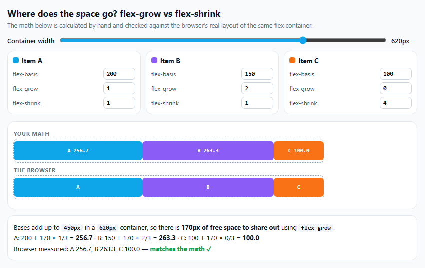
Most people learn that flex-grow: 2 means "gets twice as much". That's only half true, and flex-shrink works differently again, which is why flex layouts sometimes do surprising things. This visualizer calculates the distribution by hand, following the algorithm in the CSS Flexbox specification, and renders a real flex container next to it so you can check the math against the browser.
Start from the bases
Every item starts at its flex-basis. Adding them up and comparing with the container width gives either positive free space (the container is bigger) or negative free space (the content overflows).
Growing: split the leftover space
With positive free space, each item gets a share proportional to its flex-grow: basis + free × grow / Σgrow. So flex-grow: 2 means twice the share of the *extra* space, not twice the size. An item with grow 0 keeps its basis. If the grow factors add up to less than 1, only that fraction of the free space is handed out.
Shrinking: weighted by size
With negative free space, the reduction is shared in proportion to flex-shrink × flex-basis, not flex-shrink alone. A 400px item with shrink 1 gives up twice as much as a 200px item with shrink 1. This rule prevents small items from collapsing to nothing before large ones have shrunk at all.
Freezing and re-sharing
If the calculation pushes an item below zero, the spec freezes it at its minimum and runs the distribution again among the remaining items. Try a high flex-shrink on a small item in a narrow container to see an item clamped and the others adjusted.
Why min-width: 0
Real flex items default to min-width: auto, which stops them shrinking below their content. The demo sets min-width: 0 on the real items so the browser uses the same pure formula as the math. In your own layouts, that default is often why an item refuses to shrink.
Checked against the browser
The browser's measured widths are printed under the explanation with a match indicator.
Build with AI
Build, Understand, Optimize, and Extend It With AI
Paste this visualizer into an AI assistant like Claude and ask it to explain, with your current numbers, why flex-shrink is weighted by flex-basis. Ask it to add max-width constraints (which also freeze items), min-width: auto behaviour using real text content, gaps between items, or a mode for flex-basis: 0 versus auto. It can also help debug a real layout by modelling your items here first.
Prompt to recreate it
Copy this into your AI assistant of choice to build the effect from scratch, or as a jumping-off point for your own variant:
Build a flexbox space distribution visualizer in plain HTML, CSS and JavaScript.

Requirements:
- A container width slider and three items, each with editable flex-basis, flex-grow and flex-shrink.
- Calculate each item's final width by hand following the CSS Flexbox flexible length algorithm with min sizes of 0: positive free space is shared by flex-grow (handing out only the fraction equal to the sum of grow factors if it is below 1); negative free space is removed in proportion to flex-shrink × flex-basis; items that would go below 0 are frozen at 0 and the remaining space is re-shared.
- Draw the calculated widths as positioned bars, and below them render a real flex container of the same width whose items use the same flex values with min-width: 0.
- Measure the real items with getBoundingClientRect and show whether they match the calculation.
- Explain the result in words with the actual numbers and formula used, including any clamped items.
Want to tighten it up first? Run this prompt through the AI Prompt Studio to score it across 8 quality dimensions, catch anti-patterns, and tune the wording for Claude, ChatGPT, or Gemini before you paste it in.
Source Code
<div class="fx">
  <div class="fx-top">
    <h2>Where does the space go? flex-grow vs flex-shrink</h2>
    <p>The math below is calculated by hand and checked against the browser's real layout of the same flex container.</p>
  </div>
  <label class="fx-width">Container width <input type="range" id="fxW" min="200" max="760" value="620"><output id="fxWOut"></output></label>
  <div class="fx-items" id="fxItems"></div>
  <div class="fx-stage">
    <div class="fx-label">Your math</div>
    <div class="fx-calc" id="fxCalc"></div>
    <div class="fx-label">The browser</div>
    <div class="fx-real" id="fxReal"></div>
  </div>
  <div class="fx-explain" id="fxExplain" aria-live="polite"></div>
</div>*{box-sizing:border-box;margin:0;padding:0}
body{font-family:system-ui,-apple-system,sans-serif;background:#f8fafc;color:#0f172a;min-height:100vh;display:flex;align-items:center;justify-content:center;padding:20px}
.fx{width:100%;max-width:820px}
.fx h2{font-size:18px}
.fx-top p{font-size:12.5px;color:#64748b;margin-top:4px}
.fx-width{display:flex;align-items:center;gap:10px;font-size:13px;font-weight:600;margin-top:14px}
.fx-width input{flex:1;accent-color:#0ea5e9}
.fx-width output{font-variant-numeric:tabular-nums;width:52px}
.fx-items{display:grid;grid-template-columns:repeat(3,1fr);gap:10px;margin-top:12px}
@media (max-width:640px){.fx-items{grid-template-columns:1fr}}
.fx-item{background:#fff;border:1px solid #e2e8f0;border-radius:12px;padding:10px;font-size:12px}
.fx-item b{display:flex;align-items:center;gap:6px;font-size:13px;margin-bottom:6px}
.fx-item b i{width:12px;height:12px;border-radius:4px}
.fx-item label{display:flex;justify-content:space-between;align-items:center;gap:8px;margin-top:5px;color:#475569}
.fx-item input{width:64px;border:1px solid #cbd5e1;border-radius:7px;padding:4px 6px;font:600 12px ui-monospace,monospace}
.fx-stage{margin-top:14px;background:#fff;border:1px solid #e2e8f0;border-radius:14px;padding:12px}
.fx-label{font-size:11px;font-weight:700;color:#64748b;text-transform:uppercase;letter-spacing:.06em;margin:4px 0}
/* outline, not border: a border would sit inside the border-box width and
steal 2px from the space being distributed, so the check would fail. */
.fx-calc,.fx-real{position:relative;height:46px;background:repeating-linear-gradient(90deg,#f1f5f9 0 1px,transparent 1px 20px);outline:1px dashed #94a3b8;border-radius:8px;margin-bottom:8px}
.fx-calc span{position:absolute;top:4px;bottom:4px;border-radius:6px;display:flex;align-items:center;justify-content:center;font:700 11px ui-monospace,monospace;color:#fff;overflow:hidden;white-space:nowrap}
/* The real flex container. min-width:0 disables the automatic minimum
(min-content) so the browser uses the same pure formula as the math. */
.fx-real{display:flex;gap:0;overflow:hidden}
.fx-real div{min-width:0;border-radius:6px;margin:4px 0;display:flex;align-items:center;justify-content:center;font:700 11px ui-monospace,monospace;color:#fff;overflow:hidden;white-space:nowrap}
.fx-explain{margin-top:12px;background:#fff;border:1px solid #e2e8f0;border-radius:12px;padding:12px;font-size:13px;line-height:1.65}
.fx-explain code{font:600 12px ui-monospace,monospace;background:#f1f5f9;padding:1px 5px;border-radius:4px}
.fx-explain .ok{color:#16a34a;font-weight:700}.fx-explain .bad{color:#dc2626;font-weight:700}var items = [
{ name: 'A', basis: 200, grow: 1, shrink: 1, color: '#0ea5e9' },
{ name: 'B', basis: 150, grow: 2, shrink: 1, color: '#8b5cf6' },
{ name: 'C', basis: 100, grow: 0, shrink: 4, color: '#f97316' },
];
function renderInputs() {
document.getElementById('fxItems').innerHTML = items.map(function (it, i) {
return '<div class="fx-item"><b><i style="background:' + it.color + '"></i>Item ' + it.name + '</b>' +
['basis', 'grow', 'shrink'].map(function (k) {
return '<label>flex-' + k + ' <input type="number" min="0" step="' + (k === 'basis' ? 10 : 1) + '" value="' + it[k] + '" data-i="' + i + '" data-k="' + k + '"></label>';
}).join('') + '</div>';
}).join('');
}
// The flexible-length resolution algorithm from the CSS Flexbox spec (9.7),
// with min sizes of 0 and no max sizes. Items that would go below 0 are
// frozen at 0 and the remaining space is shared again among the others.
function resolve(width) {
var sizes = items.map(function (it) { return it.basis; });
var frozen = items.map(function () { return false; });
var growing = width - sizes.reduce(function (a, b) { return a + b; }, 0) >= 0;
var steps = [];
for (var round = 0; round < items.length; round++) {
var used = 0;
items.forEach(function (it, i) { used += frozen[i] ? sizes[i] : it.basis; });
var free = width - used;
var active = items.map(function (_, i) { return i; }).filter(function (i) { return !frozen[i]; });
if (!active.length) break;
if (growing) {
var sumGrow = active.reduce(function (s, i) { return s + items[i].grow; }, 0);
// If the grow factors add up to less than 1, only that fraction of
// the free space is handed out.
var share = sumGrow < 1 ? free * sumGrow : free;
active.forEach(function (i) { sizes[i] = items[i].basis + (sumGrow ? share * items[i].grow / sumGrow : 0); });
steps.push({ free: free, sum: sumGrow, grow: true });
break;
}
// Shrinking is weighted by shrink × basis, not by shrink alone: big
// items give up more space than small ones with the same factor.
var sumScaled = active.reduce(function (s, i) { return s + items[i].shrink * items[i].basis; }, 0);
var sumShrink = active.reduce(function (s, i) { return s + items[i].shrink; }, 0);
var take = sumShrink < 1 ? free * sumShrink : free;
var violated = false;
active.forEach(function (i) {
var target = items[i].basis + (sumScaled ? take * (items[i].shrink * items[i].basis) / sumScaled : 0);
sizes[i] = target;
if (target < 0) violated = true;
});
steps.push({ free: free, sum: sumScaled, grow: false });
if (!violated) break;
active.forEach(function (i) { if (sizes[i] < 0) { sizes[i] = 0; frozen[i] = true; } });
}
return { sizes: sizes, growing: growing, steps: steps, frozen: frozen };
}
function draw() {
var width = Number(document.getElementById('fxW').value);
document.getElementById('fxWOut').textContent = width + 'px';
var calc = document.getElementById('fxCalc');
var real = document.getElementById('fxReal');
calc.style.width = width + 'px';
real.style.width = width + 'px';
var r = resolve(width);
var x = 0;
calc.innerHTML = items.map(function (it, i) {
var w = r.sizes[i];
var html = '<span style="left:' + x + 'px;width:' + Math.max(0, w) + 'px;background:' + it.color + '">' + it.name + ' ' + w.toFixed(1) + '</span>';
x += w;
return html;
}).join('');
real.innerHTML = items.map(function (it) {
return '<div style="flex:' + it.grow + ' ' + it.shrink + ' ' + it.basis + 'px;background:' + it.color + '">' + it.name + '</div>';
}).join('');
// Measure the browser's own result and compare.
var measured = Array.prototype.map.call(real.children, function (el) { return el.getBoundingClientRect().width; });
var match = measured.every(function (m, i) { return Math.abs(m - r.sizes[i]) < 0.6; });
var s = r.steps[r.steps.length - 1];
var basisSum = items.reduce(function (a, it) { return a + it.basis; }, 0);
var h = 'Bases add up to <code>' + basisSum + 'px</code> in a <code>' + width + 'px</code> container, so there is <b>' +
(r.growing ? (width - basisSum) + 'px of free space to share out</b> using <code>flex-grow</code>.' : Math.abs(width - basisSum) + 'px too much content to remove</b> using <code>flex-shrink</code>.') + '<br>';
if (r.growing) {
h += items.map(function (it) { return it.name + ': ' + it.basis + ' + ' + s.free + ' × ' + it.grow + '/' + s.sum + ' = <b>' + r.sizes[items.indexOf(it)].toFixed(1) + '</b>'; }).join(' · ');
} else {
h += 'Each item shrinks in proportion to <code>shrink × basis</code> (total ' + s.sum + '): ' +
items.map(function (it, i) { return it.name + ' weight ' + it.shrink + '×' + it.basis + ' → <b>' + r.sizes[i].toFixed(1) + '</b>' + (r.frozen[i] ? ' (clamped at 0, space re-shared)' : ''); }).join(' · ');
}
h += '<br>Browser measured: ' + measured.map(function (m, i) { return items[i].name + ' ' + m.toFixed(1); }).join(', ') +
' — <span class="' + (match ? 'ok">matches the math ✓' : 'bad">differs') + '</span>';
document.getElementById('fxExplain').innerHTML = h;
}
document.getElementById('fxItems').addEventListener('input', function (e) {
var i = e.target.dataset.i, k = e.target.dataset.k;
if (i === undefined) return;
var v = Math.max(0, Number(e.target.value) || 0);
items[i][k] = v;
draw();
});
document.getElementById('fxW').addEventListener('input', draw);
renderInputs();
draw();Step by step
How to Use
- 1Drag the container widthSwitch between growing and shrinking by making it larger or smaller than the bases.
- 2Edit each itemChange flex-basis, flex-grow and flex-shrink.
- 3Read the mathThe explanation shows the formula with your numbers.
- 4CompareThe real flex container below should match the calculated one.
- 5Force a clampGive a small item a large shrink in a narrow container.
Real-world uses
Common Use Cases
Got questions?
Frequently Asked Questions
The free space (container size minus the sum of flex-basis values) is divided in proportion to each item's flex-grow value and added to its basis. flex-grow: 2 gets twice the share of the extra space, not twice the final size.
When items overflow, the overflow is removed in proportion to flex-shrink multiplied by flex-basis. Larger items therefore shrink more than smaller items with the same flex-shrink value.
Flex items default to min-width: auto, which prevents them from shrinking below their minimum content size. Set min-width: 0 (or overflow: hidden) on the item to allow it to shrink further.
Only that fraction of the free space is distributed. For example, two items with flex-grow 0.25 each receive half of the free space between them, and the rest stays empty.
It is shorthand for flex-grow: 1, flex-shrink: 1 and flex-basis: 0%. With a zero basis, all space is free space, so items with flex: 1 end up equal in size regardless of content (subject to minimum sizes).