You Might Also Like
Learn Coding Visually
Learn to code with interactive, live-preview playgrounds — HTML, CSS, JavaScript, React & more.
 HTML Playground42 lessons · Click-based · Live preview
 CSS PlaygroundLearn CSS with a live editor
 JavaScript Playground60 lessons · DOM · Async · Canvas
 React PlaygroundLearn React with a live code editor
 GSAP PlaygroundLearn GSAP animation interactively
 SVG Playground44 lessons · shapes · paths · animation
 SCSS Playground45 lessons · Sass modules · tokens
 Tailwind PlaygroundLearn Tailwind CSS with a live editor
 Bootstrap 5 Playground50 lessons · live preview
prefers-reduced-motion Demo — Free HTML CSS JS Snippet
prefers-reduced-motion Accessibility Demo · Animations · Plain HTML, CSS & JS · Live preview
What's included
Features
About this UI Snippet
prefers-reduced-motion Accessibility Demo — Simulated Toggle Plus Live OS-Level Detection
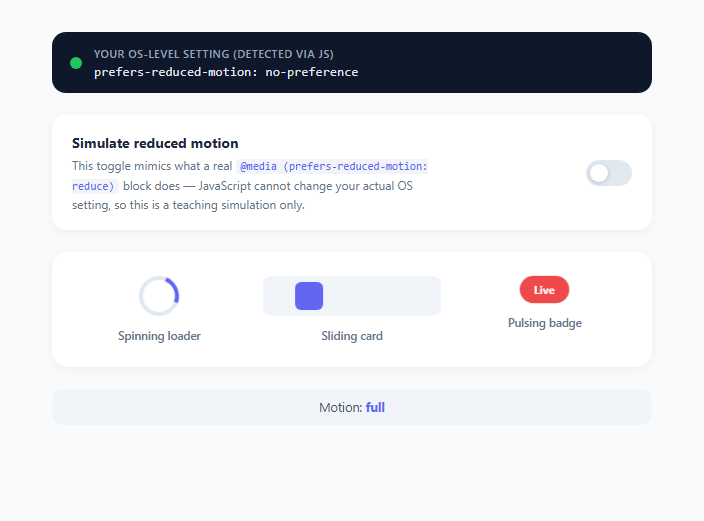
Motion on the web isn't just decorative — for a meaningful share of users it's a genuine barrier. People with vestibular disorders, migraine conditions, or certain forms of motion sensitivity can experience real physical symptoms (dizziness, nausea, headaches) from parallax scrolling, spinning loaders, sliding transitions, and other animated UI. The prefers-reduced-motion media feature, part of the CSS Media Queries Level 5 spec, lets users declare this preference once at the operating system level (macOS: Accessibility > Display > Reduce Motion; Windows: Settings > Accessibility > Visual Effects > Animation Effects; iOS/Android have equivalent toggles) and have every website that respects the media query honor it automatically, with zero site-specific configuration.
The critical constraint this demo is built around
There is no JavaScript API to change a user's OS-level motion preference — and there shouldn't be, because it's a system-wide accessibility setting the user controls once, outside any individual website's authority. The only thing JavaScript can do is read the current value via window.matchMedia('(prefers-reduced-motion: reduce)').matches, which returns true or false reflecting the live OS setting, and optionally subscribe to future changes with matchMedia(...).addEventListener('change', callback) if the user toggles the OS setting while the page is open. This snippet makes that constraint explicit and honest: the toggle switch you interact with does not touch the real setting at all — it only adds and removes a .reduced-motion class on a wrapper element, purely to simulate, for teaching purposes, what your real production CSS should do automatically via a native @media block. Meanwhile, a separate readout at the top independently reports your browser's actual, live matchMedia() result, so you can compare the simulation against ground truth.
How real production code should be structured
In a real site, you would never rely on a JS-driven class toggle to reduce motion — you'd write the reduction directly into your CSS using the media query itself: @media (prefers-reduced-motion: reduce) { .spinner, .slide-card, .badge { animation: none; } }. The browser evaluates this at the OS level with zero JavaScript required, applies it before your JS even runs, and updates live if the user changes the setting while your tab is open, exactly matching how any other media query (like prefers-color-scheme for dark mode) behaves. This snippet's .reduced-motion class rules are written as a deliberate stand-in for that media query, using an identical rule shape, so that flipping between "read the real API" and "simulate the CSS effect" is a one-line change in a real codebase: swap the class selector for the media query and delete the toggle.
Why full removal of animation isn't always right
The WCAG 2.3.3 (AAA) success criterion and general best practice recommend reducing rather than always fully eliminating motion — replacing large, sweeping transforms with subtle opacity crossfades preserves perceivable state changes (like "this loading indicator is active") without the vestibular trigger of large-scale movement. This demo takes the simpler, fully-off approach for clarity (animation: none), but production code often swaps a spin/slide keyframe animation for a gentler opacity pulse instead of removing feedback entirely, so users still get a sense that something is happening.
What the three demo elements represent
The spinning loader represents infinite-loop UI feedback (loading spinners, progress indicators) — a common vestibular trigger because of its continuous rotational motion. The sliding card represents transform-based transitions (carousels, tab switches, drawer animations) — large translateX/translateY movements are specifically called out in accessibility guidance as high-risk. The pulsing badge represents scale/opacity "attention" animations (notification badges, live indicators) — a milder case, useful for showing that even small looping animations should still respect the preference. Each is driven by a standard CSS @keyframes animation that gets neutralized by the same .reduced-motion ancestor class, demonstrating a scalable pattern: put the "calm" override rules together in one place rather than duplicating animation: none overrides scattered throughout a stylesheet.
Build with AI
Build, Understand, Optimize, and Extend It With AI
Paste this snippet's HTML, CSS, and JS into an AI coding assistant like Claude and ask it to explain precisely why the simulation toggle only adds a CSS class rather than actually changing your OS setting, and how that maps onto the real @media (prefers-reduced-motion: reduce) block a production site should use instead. You could also ask it to convert the demo's "full removal" approach on the pulsing badge into the AAA-recommended "reduce, don't eliminate" pattern using a subtler opacity-only keyframe. It's a good candidate for extension too: ask the assistant to add a fourth animated element like a parallax-scrolling background, or to add a code panel showing the equivalent production @media block generated live from the current simulation state. Treat the demo as a working reference to interrogate and adapt, not a finished black box.
Prompt to recreate it
Copy this into your AI assistant of choice to build the effect from scratch, or as a jumping-off point for your own variant:
Build an educational demo in plain HTML, CSS, and JavaScript explaining the prefers-reduced-motion CSS media feature, clearly separating a teaching simulation from real OS-level detection.

Requirements:
- A live, read-only readout at the top of the page reporting the user's actual operating-system-level motion preference, obtained via window.matchMedia('(prefers-reduced-motion: reduce)').matches, that updates automatically if the user changes their OS setting while the page stays open (using a change listener on the MediaQueryList, not polling).
- An in-page toggle switch clearly labeled as a simulation, explaining in visible text that JavaScript cannot alter the real OS setting, and that the toggle only demonstrates the visual effect a real @media (prefers-reduced-motion: reduce) block would apply automatically in production.
- At least three differently-animated elements representing common vestibular-trigger UI patterns: a continuously rotating loading spinner, a translating/sliding element, and a scaling or pulsing badge, each driven by a standard CSS @keyframes animation.
- Toggling the simulation must add or remove a single ancestor class that neutralizes all three animations at once via descendant selector overrides, mirroring how a real media query would scope its overrides, rather than toggling each element's animation individually in JavaScript.
- A status line reflecting whether the simulated mode is currently "full motion" or "reduced motion".
- Written, on-page explanation of the distinction between detecting and simulating this preference, and a note about why reducing motion (subtler alternatives) is sometimes preferable to fully removing it for accessibility best practice.
Want to tighten it up first? Run this prompt through the AI Prompt Studio to score it across 8 quality dimensions, catch anti-patterns, and tune the wording for Claude, ChatGPT, or Gemini before you paste it in.
Step by step
How to Use
- 1Check your real OS-level setting firstLook at the readout at the top of the demo, populated by reportOsPreference() calling window.matchMedia('(prefers-reduced-motion: reduce)').matches. The dot turns amber and the text reads "reduce" if your operating system already has reduced motion enabled, or green with "no-preference" otherwise — this value is live and independent of anything else on the page.
- 2Flip the simulation toggleToggle #sim-toggle to add or remove the .reduced-motion class on the page wrapper via applySimulation(). This does NOT change your OS setting or the readout above — it only demonstrates, in-page, the visual effect that a real @media (prefers-reduced-motion: reduce) block would apply automatically and instantly for users who have the OS setting enabled.
- 3Observe each animated element respondWith the simulation on, the spinning loader's animation: spin rule is overridden to animation: none, the sliding card snaps to a centered static position instead of animating with alternate, and the pulsing badge stops its scale/opacity keyframe — all three respond to the same single ancestor class, showing the scalable "one class, many overrides" pattern.
- 4Change your actual OS setting to see it live-updateOpen your operating system's accessibility settings (macOS: Accessibility > Display > Reduce Motion; Windows: Settings > Accessibility > Visual effects) and toggle it while this page stays open. The motionQuery.addEventListener('change', ...) listener will fire immediately and update the OS readout at the top without a page reload, proving the API is genuinely live, not just read once on load.
- 5Port the simulation class to a real media queryIn production CSS, delete the JS toggle entirely and rename every .reduced-motion ancestor-class selector to be wrapped in @media (prefers-reduced-motion: reduce) { ... } instead — the rule bodies themselves (animation: none, the repositioned .slide-card) can be copied verbatim, since the simulation was deliberately written to mirror the real media query's effect.
- 6Consider reducing instead of removing for AAA-level complianceFor elements that convey meaningful state (like the spinner indicating active loading), consider swapping the keyframe animation for a subtler opacity-only pulse rather than animation: none entirely, so users with motion sensitivity still receive the "something is happening" signal without a vestibular trigger.
Real-world uses
Common Use Cases
Got questions?
Frequently Asked Questions
No. window.matchMedia('(prefers-reduced-motion: reduce)').matches is strictly read-only — it reports the user's current OS-level accessibility preference but provides no API to set or override it. That decision belongs entirely to the user's operating system settings, which is why this demo's in-page toggle is explicitly labeled as a simulation that only demonstrates the CSS effect a real media query would produce, without touching the actual setting.
The toggle lets you interactively preview what a reduced-motion experience would look like even if your own OS doesn't currently have the setting enabled, which is useful for development and testing. The separate, always-live OS readout keeps that simulation honest by continuously reporting ground truth via matchMedia, so you can never mistake the simulated state for your actual system preference.
Wrap your motion-reducing overrides in a real media query: @media (prefers-reduced-motion: reduce) { .spinner { animation: none; } .slide-card { animation: none; } } with no JavaScript required at all — the browser evaluates this automatically based on the OS setting, before your styles even paint, and re-evaluates live if the user changes the setting while the page is open.
WCAG 2.3.3 (AAA) and general accessibility guidance favor reducing over eliminating: swap large-scale transform animations (sliding, zooming, parallax) for a much subtler opacity crossfade rather than removing all feedback, since users with vestibular disorders are specifically sensitive to large or fast movement, not to all visual change. This demo uses full animation: none for clarity, but production code often keeps a toned-down opacity-only transition instead.
Yes — this demo attaches a change listener directly to the MediaQueryList object returned by window.matchMedia(), via motionQuery.addEventListener('change', reportOsPreference), which fires immediately whenever the OS-level setting changes while the tab remains open, updating the readout live with no page reload or polling required.