Learn Coding Visually
Learn to code with interactive, live-preview playgrounds — HTML, CSS, JavaScript, React & more.
 HTML Playground42 lessons · Click-based · Live preview
 CSS PlaygroundLearn CSS with a live editor
 JavaScript Playground60 lessons · DOM · Async · Canvas
 React PlaygroundLearn React with a live code editor
 GSAP PlaygroundLearn GSAP animation interactively
 SVG Playground44 lessons · shapes · paths · animation
 SCSS Playground45 lessons · Sass modules · tokens
 Tailwind PlaygroundLearn Tailwind CSS with a live editor
 Bootstrap 5 Playground50 lessons · live preview
Feedback Tab Widget — Docked Side Panel HTML CSS JS
Feedback Tab Widget · Modals · Plain HTML, CSS & JS · Live preview
What's included
Features
About this UI Snippet
Feedback Tab Widget — Docked Tab, Mood Rating & Slide-Out Panel
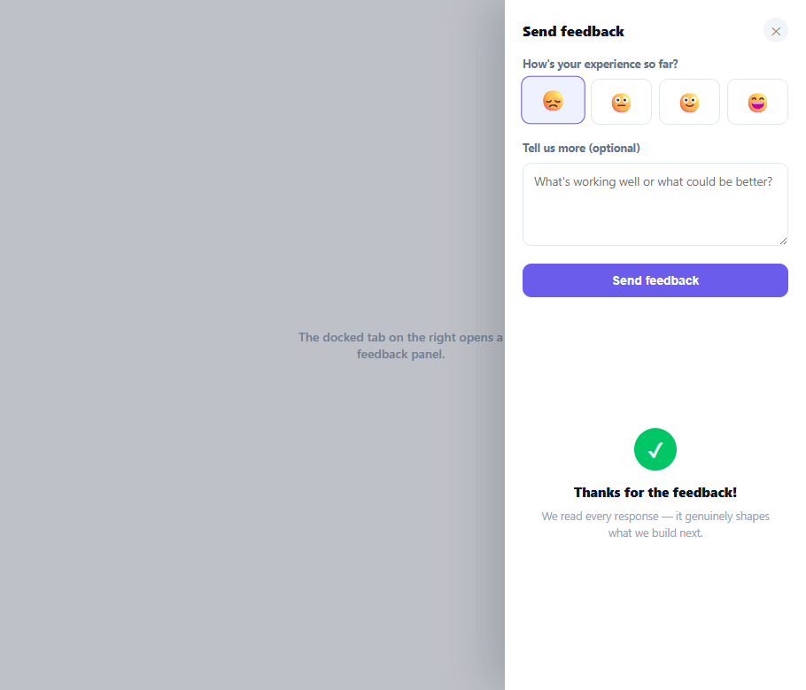
The little vertical "Feedback" tab clinging to the edge of the screen is one of the most common, lowest-friction feedback-collection patterns on the web — always visible, never blocking content, and a single click away from a real response. This snippet builds the complete widget: a rotated docked tab, a slide-out panel with an emoji mood scale and optional comment, and a thank-you confirmation state.
A genuinely rotated tab, not a sideways label
The tab button is rotated -90° with transform: rotate(-90deg) and a transform-origin anchored to its right edge, then nudged back into the viewport with a paired translateY. This two-step transform (rotate, then translate in the *original* axis before rotation takes effect) is the standard trick for a vertical edge tab whose text reads top-to-bottom while the button itself still occupies normal horizontal layout space before rotation — get the order wrong and the tab flies off-screen.
Mood scale before the comment box
Four emoji buttons (😞 😐 🙂 😄) let a user register a quick sentiment in one tap, with the submit button staying disabled until a mood is picked — the comment textarea is explicitly optional, since requiring free-text feedback is the single biggest reason these widgets get ignored. Picking a mood lifts and scales the chosen button slightly and tints its border, giving immediate visual confirmation of the selection.
Slide-out panel, not a centered modal
The panel itself slides in from the right edge with transform: translateX(100%) → translateX(0) on a cubic-bezier ease, rather than appearing as a centered dialog — this keeps it visually tethered to the docked tab it came from, reinforcing where it will return to on close, and avoids fully obscuring the page the way a centered modal would.
A real thank-you state, not just a closed panel
Submitting swaps the form body for a checkmark and thank-you message *inside the still-open panel* for 1.7 seconds before the panel closes and silently resets behind the scenes — so the user gets confirmation their feedback was received, rather than the panel just vanishing the instant they click Send, which would read as if nothing happened.
Escape key and backdrop dismissal
Both a backdrop click and the Escape key close the panel via the same closePanel() function used by the explicit close button, keeping every dismissal path consistent and giving keyboard users a way out without hunting for the small ✕ button.
Why a docked tab beats a delayed popup
Many feedback tools instead show an unannounced modal a few seconds after page load, which reads as an interruption and gets reflexively closed. A persistent, low-profile docked tab puts the same control within reach without ever demanding attention — it's there when a user wants it and invisible to their workflow otherwise, which is why this pattern shows up across documentation sites, SaaS dashboards, and support widgets that care about response rate without being intrusive.
Build with AI
Build, Understand, Optimize, and Extend It With AI
You don't have to work through the transform order by trial and error. Paste this snippet's HTML, CSS, and JS into an AI coding assistant like Claude and ask it to explain exactly why the docked tab needs a rotate followed by a translateY in that specific order (and why reversing them would send the tab off-screen), and how the transform-origin setting interacts with that sequence. The same assistant can help optimize it — ask whether the nested setTimeout chain that shows the thank-you state, then closes the panel, then resets the form is fragile if a user reopens the panel mid-sequence, and how to guard against that race condition. It's also useful for extending the widget: ask it to persist a "already submitted this session" flag so the tab doesn't invite repeat submissions, add a lightweight screenshot-attachment capability, or reposition the same docked-tab pattern to the bottom of the screen for a different layout. Treat the code less like a finished artifact and more like a starting point for a conversation.
Prompt to recreate it
Copy this into your AI assistant of choice to build the effect from scratch, or as a jumping-off point for your own variant:
Build a docked "Feedback" tab that slides out a feedback panel in plain HTML, CSS, and JavaScript — no library.

Requirements:
- A button fixed to the right edge of the viewport, vertically centered, that reads top-to-bottom as a genuinely rotated vertical tab rather than a sideways label — achieved with a combined CSS transform of a negative 90-degree rotation and a translateY, in the correct order, anchored with a transform-origin at its right edge, so the tab lands correctly docked to the edge instead of flying off-screen.
- Clicking the tab must slide a panel in from the same right edge using a transform from translateX(100%) to translateX(0) with an easing curve, not a centered modal, so the panel stays visually tethered to the tab it came from.
- Inside the panel, a row of several emoji "mood" buttons where picking one visually lifts and highlights the chosen button and enables an otherwise-disabled submit button; a comment textarea must be present but explicitly optional and must never gate the submit button on its own.
- Submitting must not immediately close the panel. Instead, swap the form body out for a thank-you confirmation view containing a checkmark and message, displayed inside the still-open panel for a couple of seconds, before the panel then closes and the form silently resets behind the scenes so it's ready fresh next time it opens.
- A backdrop element, an explicit close button, and the Escape key must all trigger the exact same single close function, so every dismissal path behaves identically.
- The panel's slide transition must only animate the transform property (not width, height, or position) to stay smooth and GPU-friendly across every export target.
Want to tighten it up first? Run this prompt through the AI Prompt Studio to score it across 8 quality dimensions, catch anti-patterns, and tune the wording for Claude, ChatGPT, or Gemini before you paste it in.
Step by step
How to Use
- 1Paste HTML, CSS, and JSA page renders with a rotated "Feedback" tab docked to the right edge of the viewport.
- 2Click the tabA panel slides in from the right with a four-emoji mood scale and an optional comment textarea.
- 3Pick a moodTap an emoji to register your sentiment — it lifts and highlights, and the Send button becomes enabled.
- 4Add a comment (optional) and submitType anything you like, then click "Send feedback" to see the thank-you confirmation appear in place.
- 5Watch it auto-close and resetAfter showing the thank-you message briefly, the panel closes and silently resets for the next visit.
- 6Wire up the real submissionSend moodValue and the textarea's value to your feedback or analytics endpoint inside the submit handler, before showing the thank-you state.
Real-world uses
Common Use Cases
Got questions?
Frequently Asked Questions
Inside the submit click handler, before swapping to the thank-you view, send moodValue and document.getElementById('ftwText').value in a fetch POST to your feedback API or analytics tool — keep the UI swap so users get confirmation even while the request is in flight.
Add a "Attach screenshot" button that calls a capture library (or the experimental getDisplayMedia API) on click, store the resulting image/blob, and attach it to the same submission payload alongside the mood and comment.
For the left edge, change right:0 to left:0 and flip the rotation to rotate(90deg) with a matching transform-origin adjustment; for the bottom, drop the rotation entirely and position the tab with bottom:0 and an upward-sliding panel instead.
After a successful submit, store a flag in sessionStorage (or localStorage for persistence across sessions) and check it on load — if set, you can hide the tab entirely or show a "You already gave feedback — thanks!" state instead of the form.
In React, track panelOpen, mood, and submitted in useState and conditionally render the body vs. thank-you view; in Vue, use ref()/reactive(); in Angular, use component fields with *ngIf. The rotate+translate tab styling and slide-panel transform are pure CSS and need no changes across frameworks.