

Learn Coding Visually
Learn to code with interactive, live-preview playgrounds — HTML, CSS, JavaScript, React & more.
 HTML Playground42 lessons · Click-based · Live preview
 CSS PlaygroundLearn CSS with a live editor
 JavaScript Playground60 lessons · DOM · Async · Canvas
 React PlaygroundLearn React with a live code editor
 GSAP PlaygroundLearn GSAP animation interactively
 SVG Playground44 lessons · shapes · paths · animation
 SCSS Playground45 lessons · Sass modules · tokens
 Tailwind PlaygroundLearn Tailwind CSS with a live editor
 Bootstrap 5 Playground50 lessons · live preview
Parallax Tilt Product Card — Free HTML CSS JS Snippet
Parallax Tilt Product Card · Cards · Plain HTML, CSS & JS · Live preview
What's included
Features
About this UI Snippet
Parallax Tilt Product Card — 3D Hover Tilt With an Opposing Parallax Icon Layer

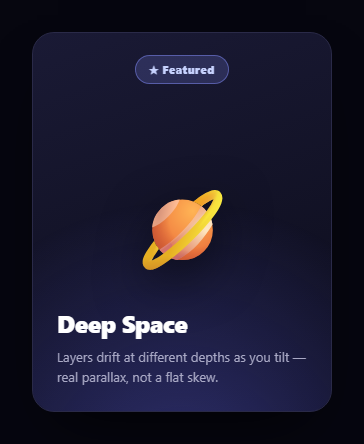
This card combines two closely related but distinct hover techniques: a 3D tilt that follows the cursor across the card's surface, and a parallax shift on an inner icon layer that moves in the opposite direction — a detail that sells the illusion of the icon actually floating above the card's surface rather than being flat on it.
The 3D tilt
On mousemove, the cursor's position within the card is normalized to a 0-1 range (px, py). That position is mapped to rotateX and rotateY angles — moving the cursor toward the right edge rotates the card around its vertical axis, moving toward the top rotates it around its horizontal axis — with maxTilt capping how extreme the rotation can get. A CSS perspective on the parent .tc-stage container is what gives the rotateX/rotateY transforms actual 3D depth instead of looking like a flat skew.
The opposing parallax icon layer
The .parallax-icon element (the badge icon inside the card) gets its own translate transform, computed with the sign flipped relative to the cursor's offset from center: as the card tilts toward the cursor, the icon shifts slightly away from it. This mimics how a raised, physically separate layer would appear to move relative to its background under a shifting viewpoint — the same principle behind mouse-parallax hero sections, just applied to one small internal element instead of full-page background layers.
Fast tracking, smooth return
While actively hovering, the .tc-hovering class swaps the card's transition to a near-instant 0.05s linear timing so the tilt tracks the cursor immediately with no lag. On mouseleave, that class is removed, reverting to a slower 0.5s cubic-bezier transition — so the card doesn't snap back to flat instantly but eases back to rest, which reads as more natural than an abrupt reset.
A shine highlight for extra polish
A radial-gradient .tc-shine overlay fades in only while hovering, positioned to simulate a light source glinting off the top of the card as it tilts — a purely cosmetic touch that reinforces the sense of a physical, glossy surface catching light.
Build with AI
Build, Understand, Optimize, and Extend It With AI
Hand this snippet's HTML, CSS, and JavaScript to an AI coding assistant like Claude and ask it to adapt "Parallax Tilt Product Card" to your project — restyle it to match your design system, wire it up to real data instead of the static example, or port it to the framework you're building in.
Prompt to recreate it
Copy this into your AI assistant of choice to build the effect from scratch, or as a jumping-off point for your own variant:
Build a cards component called "Parallax Tilt Product Card" using plain HTML, CSS, and vanilla JavaScript — no framework, no build step.

Requirements:
- Match the structure and behavior of the "Parallax Tilt Product Card" snippet from the UI Snippets Library.
- Keep the markup semantic and the styling self-contained (no external dependencies beyond what the original snippet uses).
- Keep the JavaScript vanilla, with no framework runtime required.
- Make it easy to restyle via CSS custom properties or class overrides so it can be dropped into a real project.
Want to tighten it up first? Run this prompt through the AI Prompt Studio to score it across 8 quality dimensions, catch anti-patterns, and tune the wording for Claude, ChatGPT, or Gemini before you paste it in.
Source Code
<div class="tc-stage">
  <div class="tc-card" id="tcCard">
    <div class="tc-shine" id="tcShine"></div>
    <div class="parallax-icon tc-icon" id="tcIcon">
      <svg width="56" height="56" viewBox="0 0 24 24" fill="none" stroke="#fff" stroke-width="1.6" stroke-linecap="round" stroke-linejoin="round"><path d="M12 2l3 7h7l-5.5 4.5L18.5 21 12 16.5 5.5 21l2-7.5L2 9h7z"/></svg>
    </div>
    <h3>Aurora Headphones</h3>
    <p>Studio-grade wireless sound</p>
    <div class="tc-price">$249</div>
  </div>
</div>*{box-sizing:border-box}
body{font-family:system-ui,-apple-system,sans-serif;background:#0b0d14;min-height:100vh;display:flex;align-items:center;justify-content:center;padding:24px}
.tc-stage{perspective:900px}
.tc-card{
width:260px;padding:32px 24px;border-radius:20px;text-align:center;color:#fff;
background:linear-gradient(160deg,#312e81,#1e1b4b);
position:relative;overflow:hidden;
transform:rotateX(0deg) rotateY(0deg) scale(1);
transition:transform .5s cubic-bezier(.23,1,.32,1);
box-shadow:0 20px 50px rgba(0,0,0,.4);
}
.tc-card.tc-hovering{transition:transform .05s linear}
.tc-shine{
position:absolute;inset:0;
background:radial-gradient(circle at 50% 0%,rgba(255,255,255,.25),transparent 60%);
opacity:0;transition:opacity .3s;pointer-events:none;
}
.tc-card.tc-hovering .tc-shine{opacity:1}
.parallax-icon{
width:88px;height:88px;margin:0 auto 18px;border-radius:50%;
background:linear-gradient(135deg,#6366f1,#a855f7);
display:flex;align-items:center;justify-content:center;
transition:transform .5s cubic-bezier(.23,1,.32,1);
}
.tc-card.tc-hovering .parallax-icon{transition:transform .05s linear}
.tc-card h3{font-size:18px;font-weight:800;margin:0 0 4px}
.tc-card p{font-size:12.5px;color:#c7cbe0;margin:0 0 16px}
.tc-price{font-size:22px;font-weight:800;color:#a5b4fc}var card = document.getElementById('tcCard');
var icon = document.getElementById('tcIcon');
var maxTilt = 14;
var maxIconShift = 10;
function onMouseMove(e) {
var rect = card.getBoundingClientRect();
var px = (e.clientX - rect.left) / rect.width;
var py = (e.clientY - rect.top) / rect.height;
var rotateY = (px - 0.5) * maxTilt * 2;
var rotateX = (0.5 - py) * maxTilt * 2;
card.classList.add('tc-hovering');
card.style.transform = 'rotateX(' + rotateX.toFixed(2) + 'deg) rotateY(' + rotateY.toFixed(2) + 'deg) scale(1.04)';
// Icon shifts opposite to the tilt direction to fake extra parallax depth
var iconShiftX = -(px - 0.5) * maxIconShift * 2;
var iconShiftY = -(py - 0.5) * maxIconShift * 2;
icon.style.transform = 'translate(' + iconShiftX.toFixed(2) + 'px,' + iconShiftY.toFixed(2) + 'px)';
}
function onMouseLeave() {
card.classList.remove('tc-hovering');
card.style.transform = 'rotateX(0deg) rotateY(0deg) scale(1)';
icon.style.transform = 'translate(0,0)';
}
card.addEventListener('mousemove', onMouseMove);
card.addEventListener('mouseleave', onMouseLeave);Step by step
How to Use
- 1Load the snippetClick "Parallax Tilt Product Card" in the sidebar to load its HTML, CSS, and JS into the editor panels. The preview updates instantly.
- 2Edit the codeModify any panel — HTML, CSS, or JS. The preview refreshes as you type. Use Reset in each panel header to restore the original.
- 3Preview on devicesClick the Mobile (375px), Tablet (768px), or Desktop buttons in the preview header to check responsiveness.
- 4Export in your formatClick "HTML" to download a standalone file, "JSX" for a React component, "Tailwind" for a React + Tailwind CSS component, "Tailwind HTML" for a standalone HTML file with Tailwind CDN, "Vue" for a Vue 3 SFC with <template>/<script setup>/<style scoped>, or "Angular" for a standalone Angular .component.ts file. "Copy all" copies the full code to clipboard.
- 5Save your versionClick "Save as", type a name, and press Enter. Your snippet saves to IndexedDB and appears in the Saved tab.
Real-world uses
Common Use Cases
Got questions?
Frequently Asked Questions
Moving the icon opposite to the tilt direction mimics how a physically raised, separate layer would shift relative to its background as your viewpoint changes — the same principle behind larger-scale mouse-parallax effects, applied to one small element to fake extra depth on the card.
Without a perspective value on an ancestor element, rotateX/rotateY transforms render as a flat skew with no sense of depth. Setting perspective (here 900px) on the parent container gives the child's 3D rotation actual visual depth, as if viewed through a camera at that distance.
While actively hovering, a fast 0.05s linear transition lets the tilt track the cursor with minimal lag. On mouseleave, the class controlling that fast transition is removed, reverting to a slower, eased 0.5s transition so the card settles back to flat smoothly instead of snapping instantly.