You Might Also Like
Learn Coding Visually
Learn to code with interactive, live-preview playgrounds — HTML, CSS, JavaScript, React & more.
 HTML Playground42 lessons · Click-based · Live preview
 CSS PlaygroundLearn CSS with a live editor
 JavaScript Playground60 lessons · DOM · Async · Canvas
 React PlaygroundLearn React with a live code editor
 GSAP PlaygroundLearn GSAP animation interactively
 SVG Playground44 lessons · shapes · paths · animation
 SCSS Playground45 lessons · Sass modules · tokens
 Tailwind PlaygroundLearn Tailwind CSS with a live editor
 Bootstrap 5 Playground50 lessons · live preview
Parallax Tilt Card — Free HTML CSS JS Depth Hover Snippet
Parallax Tilt Card · Cards · Plain HTML, CSS & JS · Live preview
What's included
Features
About this UI Snippet
Parallax Tilt Card — Multi-Layer Depth That Reacts to the Cursor
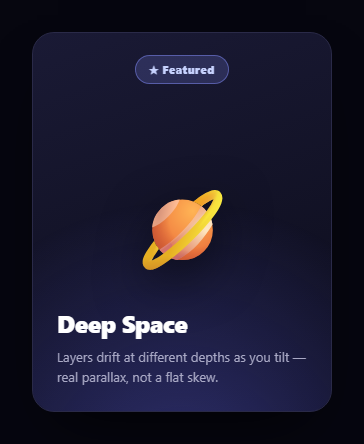
The parallax tilt card goes beyond a simple 3D tilt: as the card leans toward your cursor, its stacked content layers each shift by a different amount based on their assigned depth, so the badge, artwork, and text float at visibly different distances — real parallax rather than a flat plane being skewed. This snippet builds it with plain HTML, CSS, and one vanilla JavaScript pointer handler.
Depth-tagged layers
The card contains several absolutely-positioned layers — a background glow, a badge, a large emblem, and the foreground text — each carrying a data-depth value (6, 18, 34, 50). That number is how far the layer should move relative to the cursor: small for the deep background, large for the foreground. Storing depth as a data attribute keeps the parallax declarative — you tune the layering by editing numbers in the HTML, not the script.
Tilt plus per-layer shift
On pointermove, the handler converts the cursor position to -0.5…0.5 fractions. It applies a rotateY/rotateX tilt to the whole card (inside a perspective: 1000px stage with preserve-3d), then loops the layers and translates each by -px * depth, -py * depth. Because the translation is proportional to depth, foreground layers slide much further than background ones for the same cursor movement — which is exactly how parallax works in the real world, where near objects appear to move more than far ones. The opposite-direction shift (negative) makes the layers counter the tilt, deepening the 3D.
The soft-light shine
A .pt-shine layer is a radial highlight whose center follows the cursor via --sx/--sy custom properties, set from the same handler. It uses mix-blend-mode: soft-light so the highlight brightens the card's existing colors like a real reflection rather than overlaying opaque white, and it fades in on hover. This adds a glossy sheen that reads as light catching the tilted surface.
Smooth, GPU-friendly motion
Every animated element — the card and each layer — has a short transition and will-change: transform, so the motion eases rather than jitters with each raw pointer event, and the transforms are composited on the GPU. On pointerleave the card and all layers reset to neutral, springing back to flat.
Why depth attributes beat hard-coding
Driving the parallax from a per-layer data-depth means the same short loop handles any number of layers at any depths. Add a fourth content layer, give it a depth, and it joins the parallax automatically — no new code. It also makes the effect easy to tune: nudge the numbers to exaggerate or flatten the sense of space.
Customizing it
Adjust the tilt multiplier (16) for a stronger or gentler lean, change each layer's data-depth to restage the parallax, recolor the glow and shine, or swap the emoji emblem for an image or icon. Replace the content with a real product or collectible. Pair it with a glare card or a pin card for a set of dimensional cards.
Build with AI
Build, Understand, Optimize, and Extend It With AI
You don't need to reverse-engineer the depth math by eye. Paste this snippet's HTML, CSS, and JS into an AI coding assistant like Claude and ask it to walk through exactly why each layer's translation is the negative of the cursor offset times its data-depth value, and how that combines with the card's own rotateY/rotateX to create the layered parallax rather than a single flat tilt. The same assistant can help optimize it, for example checking whether writing four separate style.transform strings per pointermove event causes layout thrashing on lower-powered devices, or whether the shine's CSS custom properties could be batched with the layer updates in one animation frame. It is also useful for extending the effect: ask it to add spring-based easing so the card settles instead of snapping, support touch devices with a gyroscope-driven tilt, or generalize the depth loop to any number of layers read from a data attribute. Treat the code less like a finished artifact and more like a starting point for a conversation.
Prompt to recreate it
Copy this into your AI assistant of choice to build the effect from scratch, or as a jumping-off point for your own variant:
Build a 3D parallax tilt card in plain HTML, CSS, and vanilla JavaScript using only CSS 3D transforms (perspective, preserve-3d, rotateX/rotateY) and one pointermove handler — no libraries, no canvas.

Requirements:
- A card element sitting inside a container with CSS perspective, and the card itself using transform-style: preserve-3d.
- At least four absolutely-positioned content layers inside the card (for example: a background glow, a badge, a large emblem, and foreground text), each carrying its own numeric depth value stored as a data attribute.
- On pointermove over the card, compute the pointer position as a -0.5 to 0.5 fraction of the card's width and height, then apply a rotateY/rotateX tilt to the whole card proportional to that fraction.
- In the same handler, loop over every depth-tagged layer and translate each one by the negative of the pointer fraction times its own depth value, so layers with a larger depth number visibly shift further than layers with a smaller one — true per-layer parallax, not a single skewed plane.
- Add a radial "shine" layer whose highlight position is set via CSS custom properties updated from the same pointer fraction, using mix-blend-mode: soft-light so it brightens the card's existing colors rather than painting flat white over them.
- On pointerleave, reset the card's rotation and every layer's translation back to their neutral zero state, with a short CSS transition so the return is eased rather than instant.
- Keep the depth values purely declarative in the HTML (data-depth attributes) so adding a new layer requires no new JavaScript.
Want to tighten it up first? Run this prompt through the AI Prompt Studio to score it across 8 quality dimensions, catch anti-patterns, and tune the wording for Claude, ChatGPT, or Gemini before you paste it in.
Step by step
How to Use
- 1Paste HTML, CSS, and JSA layered card renders flat at rest.
- 2Move the pointer over itThe card tilts toward your cursor.
- 3Watch the layersForeground elements drift more than background ones.
- 4Note the shineA soft highlight follows the cursor like a reflection.
- 5Restage the depthEdit each layer's data-depth value.
- 6Swap the contentReplace the emblem and text with your own.
Real-world uses
Common Use Cases
Got questions?
Frequently Asked Questions
A normal tilt rotates a single flat plane. Here the card also has several content layers, each tagged with a data-depth, and on pointer move every layer is translated by an amount proportional to its depth. So foreground elements slide further than background ones, producing genuine parallax between the layers rather than a single skewed surface.
It keeps the parallax declarative and generic. The script reads each layer's data-depth and shifts it by that factor, so one short loop handles any number of layers at any depths. To restage the effect you just edit the numbers in the HTML — add a layer with a depth and it joins the parallax with no code change.
The translation uses the negative of the cursor offset times depth, so layers shift against the direction the card leans. That counter-motion exaggerates the separation between depths and deepens the 3D illusion, making near layers feel like they're popping toward you while far ones recede.
The shine is a radial highlight centered on the cursor via CSS variables, set to mix-blend-mode: soft-light. soft-light brightens the card's existing colors based on what's underneath, like light catching a surface, instead of painting opaque white on top. It fades in on hover so the card is calm at rest.
Render the layers with their depth as a prop or data attribute, keep the perspective and preserve-3d CSS, and handle pointermove/pointerleave with framework events that write the card and layer transforms via refs so they don't trigger re-renders. In Tailwind, use perspective and transform utilities and apply the per-layer translate and the shine variables through inline styles updated in the handler.