
Learn Coding Visually
Learn to code with interactive, live-preview playgrounds — HTML, CSS, JavaScript, React & more.
 HTML Playground42 lessons · Click-based · Live preview
 CSS PlaygroundLearn CSS with a live editor
 JavaScript Playground60 lessons · DOM · Async · Canvas
 React PlaygroundLearn React with a live code editor
 GSAP PlaygroundLearn GSAP animation interactively
 SVG Playground44 lessons · shapes · paths · animation
 SCSS Playground45 lessons · Sass modules · tokens
 Tailwind PlaygroundLearn Tailwind CSS with a live editor
 Bootstrap 5 Playground50 lessons · live preview
Expandable Card — Free HTML CSS JS Shared-Layout Snippet
Expandable Card · Cards · Plain HTML, CSS & JS · Live preview
What's included
Features
About this UI Snippet
Expandable Card — FLIP Animation From List Item to Modal
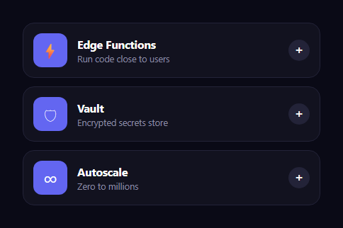
The expandable card is the polished interaction — popularized by the macOS App Store and shared-layout animations — where clicking a compact list card makes it grow smoothly from its spot into a centered modal showing full content, then shrink back into place when dismissed. This snippet implements that shared-element transition with plain HTML, CSS, and vanilla JavaScript using the FLIP technique.
The FLIP technique
FLIP stands for First, Last, Invert, Play, and it's how you animate between two layouts smoothly. Here, when a card is clicked, the code reads its current position and size with getBoundingClientRect (the First state), creates a fixed-position clone placed exactly over it, then on the next frame sets the clone's target position and size to a centered modal (the Last state). Because the clone has a CSS transition: all, the browser animates from First to Last automatically — the card appears to lift off the page and expand into a dialog. On close, the same process runs in reverse: the clone animates back to the original card's current rect, then is removed.
Hidden content in a template
Each card carries its expanded content inside a <template> element, which the browser never renders. On expand, that template's HTML is injected into the clone, so the compact card stays lightweight while the full description, feature list, and call-to-action only exist when needed. This keeps the list clean and avoids rendering heavy content for cards nobody has opened.
Source card hidden during expansion
When the clone takes over, the original card is set visibility: hidden so you don't see a duplicate behind the modal — but it keeps its space in the layout, so on collapse the clone has a correct rect to animate back into. Restoring visibility after the collapse transition completes hands the spot back to the real card seamlessly.
A blurred backdrop and full dismissal
Opening shows a blurred, dimmed overlay (backdrop-filter: blur) that transitions opacity and visibility together so it's non-interactive when closed. The modal can be dismissed by its close button, by clicking the overlay, or with the Escape key — all routed to the same collapse() function. An active guard prevents opening a second card while one is already expanded.
Keyboard accessible
Cards have tabindex="0" and respond to Enter and Space to expand, and Escape to close, so the whole interaction works without a mouse. Each card's accent color flows through a --c variable into the thumbnail, the expand button on hover, the feature checkmarks, and the CTA, so the modal is themed per card automatically.
Customizing it
Adjust the modal's target width and vertical position, change the transition duration and easing, restyle the expanded content, or theme each card via its data-color. Swap the emoji thumbnails for icons or images. Pair it with a bento grid of features or an Instagram gallery for a rich, interactive page.
Build with AI
Build, Understand, Optimize, and Extend It With AI
You don't have to work through the FLIP math from scratch. Paste this snippet's HTML, CSS, and JS into an AI coding assistant like Claude and ask it to explain exactly what the First, Last, Invert, Play sequence is doing in the expand function, and why the clone's position is set with getBoundingClientRect before it's appended rather than after. The same assistant can help optimize it — ask whether creating and destroying a whole new DOM clone on every expand and collapse is efficient enough for a grid with dozens of cards, or whether a single reusable modal element with repositioned content would perform better. It's also useful for extending the interaction: ask it to support swiping between expanded cards without fully collapsing first, add a shared image element that also FLIPs alongside the text content, or persist the expanded card's id in the URL so a direct link opens straight into the expanded view. Treat the code less like a finished artifact and more like a starting point for a conversation.
Prompt to recreate it
Copy this into your AI assistant of choice to build the effect from scratch, or as a jumping-off point for your own variant:
Build an expandable card grid in plain HTML, CSS, and JavaScript using the FLIP animation technique (First, Last, Invert, Play) — no animation library.

Requirements:
- A vertical list of compact cards, each with a thumbnail, a title, and a short description, and each card carrying its full expanded content (a longer description, a feature list, and a link) inside a hidden template element so that content adds no weight to the initial page render.
- On click, read the clicked card's current bounding rectangle with getBoundingClientRect, then create a new fixed-position element sized and positioned to exactly match that rectangle (the First state), inject the card's template content into it, and append it to the document body.
- On the next animation frame (not immediately), change that fixed element's position, size, and opacity to a centered modal layout (the Last state), relying on a CSS transition on the element to animate smoothly between the two states without any manual keyframe interpolation.
- Hide the original source card with visibility hidden (not display none) while its clone is expanded, so the card keeps its layout space and provides a valid rectangle to animate back into when collapsing.
- Implement collapse as the exact reverse: read the source card's current rectangle, animate the expanded clone back down to that size and position with opacity fading to zero, then after the transition duration completes, remove the clone from the DOM and restore the source card's visibility.
- Show a blurred, dimmed backdrop behind the expanded card that fades in and out, and support closing via a close button, clicking the backdrop, and pressing Escape, all routed through the same collapse function.
- Ensure only one card can be expanded at a time by tracking the currently active expansion in a shared variable and ignoring new expand attempts while one is already open.
- Make the whole interaction keyboard accessible: cards must be focusable and expand on Enter or Space.
Want to tighten it up first? Run this prompt through the AI Prompt Studio to score it across 8 quality dimensions, catch anti-patterns, and tune the wording for Claude, ChatGPT, or Gemini before you paste it in.
Source Code
<div class="xc-grid" id="xcGrid">
  <article class="xc-card" tabindex="0" data-color="#6366f1"><div class="xc-thumb">⚡</div><div class="xc-info"><h3>Edge Functions</h3><p>Run code close to users</p></div><button class="xc-go" aria-label="Expand">+</button>
    <template><h2>Edge Functions</h2><p>Deploy serverless functions to 30+ regions and execute them within milliseconds of every visitor. Cold starts are eliminated by keeping a warm pool at each edge node, so even the first request feels instant.</p><ul><li>Sub-50ms global latency</li><li>Zero cold starts</li><li>Streaming responses</li></ul><a class="xc-cta" href="#">Read the docs →</a></template>
  </article>
  <article class="xc-card" tabindex="0" data-color="#ec4899"><div class="xc-thumb">🛡</div><div class="xc-info"><h3>Vault</h3><p>Encrypted secrets store</p></div><button class="xc-go" aria-label="Expand">+</button>
    <template><h2>Vault</h2><p>Store API keys, tokens, and certificates with envelope encryption and granular access policies. Secrets are decrypted only in memory at runtime and never written to disk or logs.</p><ul><li>Zero-knowledge storage</li><li>Audit log of every read</li><li>Automatic rotation</li></ul><a class="xc-cta" href="#">Read the docs →</a></template>
  </article>
  <article class="xc-card" tabindex="0" data-color="#34d399"><div class="xc-thumb">∞</div><div class="xc-info"><h3>Autoscale</h3><p>Zero to millions</p></div><button class="xc-go" aria-label="Expand">+</button>
    <template><h2>Autoscale</h2><p>Capacity follows demand automatically — scale from zero to millions of concurrent requests and back without provisioning a thing. You pay only for what executes, billed by the millisecond.</p><ul><li>Scale-to-zero idle cost</li><li>Per-millisecond billing</li><li>No config required</li></ul><a class="xc-cta" href="#">Read the docs →</a></template>
  </article>
</div>
<div class="xc-overlay" id="xcOverlay" aria-hidden="true"></div>*{box-sizing:border-box;margin:0;padding:0}
body{font-family:system-ui,-apple-system,sans-serif;background:#0a0a16;color:#fff;display:flex;justify-content:center;align-items:center;min-height:100vh;padding:24px}
.xc-grid{display:flex;flex-direction:column;gap:12px;width:100%;max-width:420px}
.xc-card{position:relative;display:flex;align-items:center;gap:14px;padding:14px;border-radius:16px;background:#12121f;border:1px solid #232338;cursor:pointer;transition:background .2s}
.xc-card:hover{background:#171727}
.xc-card template{display:none}
.xc-thumb{width:48px;height:48px;border-radius:12px;background:var(--c,#6366f1);display:flex;align-items:center;justify-content:center;font-size:22px;flex-shrink:0}
.xc-info{flex:1}
.xc-info h3{font-size:15.5px;font-weight:700}
.xc-info p{font-size:12.5px;color:#8b8ba3;margin-top:2px}
.xc-go{width:30px;height:30px;border-radius:50%;border:none;background:#232338;color:#fff;font-size:18px;cursor:pointer;flex-shrink:0;transition:background .2s,transform .2s}
.xc-card:hover .xc-go{background:var(--c,#6366f1)}
.xc-overlay{position:fixed;inset:0;z-index:40;background:rgba(6,6,12,.7);backdrop-filter:blur(5px);-webkit-backdrop-filter:blur(5px);opacity:0;visibility:hidden;transition:opacity .25s,visibility .25s}
.xc-overlay.show{opacity:1;visibility:visible}
/* The expanded card is a clone promoted to fixed position, animated from the
clicked card's rect to a centered modal via a FLIP-style transition. */
.xc-expanded{position:fixed;z-index:50;border-radius:18px;background:#14142a;border:1px solid #2a2a44;overflow:hidden;box-shadow:0 40px 100px -30px rgba(0,0,0,.8);transition:all .4s cubic-bezier(.4,0,.2,1)}
.xc-expanded .xc-pad{padding:24px}
.xc-expanded h2{font-size:24px;font-weight:900;letter-spacing:-.02em;margin-bottom:10px}
.xc-expanded p{font-size:14px;color:#c4c4da;line-height:1.6;margin-bottom:16px}
.xc-expanded ul{list-style:none;display:flex;flex-direction:column;gap:8px;margin-bottom:18px}
.xc-expanded li{font-size:13.5px;color:#d4d4e4;padding-left:22px;position:relative}
.xc-expanded li::before{content:'✓';position:absolute;left:0;color:var(--c);font-weight:900}
.xc-cta{display:inline-block;background:var(--c);color:#fff;text-decoration:none;font-size:13.5px;font-weight:700;padding:10px 18px;border-radius:10px}
.xc-close{position:absolute;top:14px;right:14px;width:32px;height:32px;border-radius:50%;border:none;background:rgba(255,255,255,.12);color:#fff;font-size:15px;cursor:pointer}var grid = document.getElementById('xcGrid');
var overlay = document.getElementById('xcOverlay');
var active = null;
function expand(card) {
var color = card.getAttribute('data-color');
var rect = card.getBoundingClientRect();
// Build the expanded clone at the exact position/size of the source card.
var box = document.createElement('div');
box.className = 'xc-expanded';
box.style.setProperty('--c', color);
box.style.left = rect.left + 'px';
box.style.top = rect.top + 'px';
box.style.width = rect.width + 'px';
box.style.height = rect.height + 'px';
box.innerHTML = '<button class="xc-close" aria-label="Close">✕</button><div class="xc-pad">' +
card.querySelector('template').innerHTML + '</div>';
box.style.opacity = '0';
document.body.appendChild(box);
overlay.classList.add('show');
// Next frame: animate to a centered modal size (FLIP — last frame).
requestAnimationFrame(function () {
var w = Math.min(440, window.innerWidth - 32);
box.style.opacity = '1';
box.style.left = (window.innerWidth - w) / 2 + 'px';
box.style.top = Math.max(20, window.innerHeight / 2 - 220) + 'px';
box.style.width = w + 'px';
box.style.height = 'auto';
});
box.querySelector('.xc-close').addEventListener('click', collapse);
active = { box: box, card: card };
card.style.visibility = 'hidden';
}
function collapse() {
if (!active) return;
var rect = active.card.getBoundingClientRect();
var box = active.box;
box.style.height = rect.height + 'px';
box.style.width = rect.width + 'px';
box.style.left = rect.left + 'px';
box.style.top = rect.top + 'px';
box.style.opacity = '0';
overlay.classList.remove('show');
var card = active.card;
setTimeout(function () { box.remove(); card.style.visibility = ''; }, 400);
active = null;
}
grid.addEventListener('click', function (e) {
var card = e.target.closest('.xc-card');
if (card && !active) expand(card);
});
grid.addEventListener('keydown', function (e) {
if ((e.key === 'Enter' || e.key === ' ') && e.target.classList.contains('xc-card')) {
e.preventDefault(); if (!active) expand(e.target);
}
});
overlay.addEventListener('click', collapse);
document.addEventListener('keydown', function (e) { if (e.key === 'Escape') collapse(); });Step by step
How to Use
- 1Paste HTML, CSS, and JSA list of compact feature cards renders.
- 2Click a cardIt grows smoothly from its spot into a centered modal.
- 3Read the detailFull content from a hidden template appears in the modal.
- 4Dismiss itClick the backdrop, the X, or press Escape to shrink it back.
- 5Use the keyboardTab to a card and press Enter to expand it.
- 6Theme each cardSet each card's data-color accent.
Real-world uses
Common Use Cases
Got questions?
Frequently Asked Questions
FLIP — First, Last, Invert, Play — animates between two layouts. The code reads the card's current rect (First), creates a fixed clone over it, then on the next frame sets the clone's centered-modal position and size (Last). A CSS transition: all on the clone plays the animation from First to Last automatically, so the card appears to expand into a dialog and shrink back on close.
A <template> element is never rendered by the browser, so each card's full description, feature list, and CTA add no weight until needed. On expand, the template's HTML is injected into the clone. This keeps the compact list lightweight and avoids rendering heavy content for cards the user never opens.
When the clone takes over, the source card is set visibility: hidden so there's no duplicate behind the modal — but it keeps its layout space, so on collapse the clone has a valid rect to animate back into. Restoring its visibility after the collapse transition hands the spot back seamlessly.
All dismissal paths route to one collapse() function: the close button, clicking the blurred overlay, and pressing Escape. collapse() animates the clone back to the source card's current rect, fades the overlay, then removes the clone and restores the card. An active guard also prevents opening another card while one is expanded.
You can reproduce FLIP manually with refs and getBoundingClientRect in a layout effect, or use a shared-layout library (Framer Motion's layoutId in React, AutoAnimate or the View Transitions API in Vue/Angular). Keep an expanded-id in state, render the modal content conditionally, and animate between the card and modal rects. The backdrop and dismissal logic port directly.