Source Code
<div class="icg-wrap">
  <div class="icg-top">
    <div>
      <h2>Integrations</h2>
      <p>Connect the tools your team already uses.</p>
    </div>
    <div class="icg-filter" id="icgFilter">
      <button type="button" class="icg-chip active" data-f="all">All</button>
      <button type="button" class="icg-chip" data-f="connected">Connected</button>
    </div>
  </div>

  <div class="icg-grid" id="icgGrid"></div>
</div>*{box-sizing:border-box;margin:0;padding:0}
body{font-family:system-ui,-apple-system,sans-serif;background:#f8fafc;min-height:100vh;display:flex;align-items:flex-start;justify-content:center;padding:40px 24px}
.icg-wrap{width:100%;max-width:620px}
.icg-top{display:flex;align-items:flex-start;justify-content:space-between;gap:16px;margin-bottom:18px}
.icg-top h2{font-size:20px;font-weight:800;color:#0f172a}
.icg-top p{font-size:13px;color:#64748b;margin-top:3px}
.icg-filter{display:inline-flex;background:#fff;border:1px solid #e2e8f0;border-radius:9px;padding:3px;flex-shrink:0}
.icg-chip{border:none;background:none;padding:6px 13px;border-radius:7px;font-size:12.5px;font-weight:700;color:#64748b;cursor:pointer}
.icg-chip.active{background:#0f172a;color:#fff}
.icg-grid{display:grid;grid-template-columns:repeat(auto-fill,minmax(280px,1fr));gap:13px}
.icg-item{background:#fff;border:1px solid #e2e8f0;border-radius:13px;padding:16px;transition:border-color .15s,box-shadow .15s}
.icg-item.connected{border-color:#bbf7d0;background:#f7fef9}
.icg-item-top{display:flex;align-items:flex-start;gap:12px;margin-bottom:11px}
.icg-logo{width:42px;height:42px;border-radius:11px;display:flex;align-items:center;justify-content:center;font-size:20px;color:#fff;flex-shrink:0}
.icg-info{flex:1;min-width:0}
.icg-name{display:flex;align-items:center;gap:7px;font-size:14.5px;font-weight:800;color:#0f172a}
.icg-tick{width:15px;height:15px;border-radius:50%;background:#22c55e;color:#fff;font-size:9px;display:none;align-items:center;justify-content:center}
.icg-item.connected .icg-tick{display:flex}
.icg-cat{font-size:11px;color:#94a3b8;font-weight:600;margin-top:1px}
.icg-desc{font-size:12.5px;color:#64748b;line-height:1.5;margin-bottom:13px;min-height:36px}
.icg-foot{display:flex;align-items:center;justify-content:space-between}
.icg-status{font-size:11.5px;font-weight:700;color:#94a3b8}
.icg-item.connected .icg-status{color:#16a34a}
.icg-btn{border:1.5px solid #e2e8f0;background:#fff;color:#1e293b;border-radius:8px;padding:7px 15px;font-size:12.5px;font-weight:700;cursor:pointer;transition:background .15s,border-color .15s,color .15s}
.icg-btn:hover{border-color:#6366f1;color:#6366f1}
.icg-item.connected .icg-btn{border-color:#fecaca;color:#dc2626}
.icg-item.connected .icg-btn:hover{background:#fef2f2}
.icg-empty{grid-column:1/-1;text-align:center;padding:30px 0;color:#94a3b8;font-size:13.5px}var INTEGRATIONS = [
{ id: 'slack', name: 'Slack', cat: 'Communication', desc: 'Send alerts and updates to your channels.', icon: '💬', bg: '#4a154b', on: true },
{ id: 'github', name: 'GitHub', cat: 'Development', desc: 'Link pull requests and sync issue status.', icon: '🐙', bg: '#24292e', on: true },
{ id: 'gdrive', name: 'Google Drive', cat: 'Storage', desc: 'Attach and back up files automatically.', icon: '📁', bg: '#1a73e8', on: false },
{ id: 'stripe', name: 'Stripe', cat: 'Payments', desc: 'Sync invoices and subscription events.', icon: '💳', bg: '#635bff', on: false },
{ id: 'notion', name: 'Notion', cat: 'Productivity', desc: 'Push docs and tasks to your workspace.', icon: '📝', bg: '#0f0f0f', on: true },
{ id: 'figma', name: 'Figma', cat: 'Design', desc: 'Embed live design previews in projects.', icon: '🎨', bg: '#f24e1e', on: false },
];
var grid = document.getElementById('icgGrid');
var filter = 'all';
function render() {
var list = INTEGRATIONS.filter(function (i) { return filter === 'all' || i.on; });
if (!list.length) { grid.innerHTML = '<p class="icg-empty">No connected integrations yet.</p>'; return; }
grid.innerHTML = list.map(function (i) {
return '<div class="icg-item' + (i.on ? ' connected' : '') + '" data-id="' + i.id + '">' +
'<div class="icg-item-top">' +
'<span class="icg-logo" style="background:' + i.bg + '">' + i.icon + '</span>' +
'<div class="icg-info">' +
'<span class="icg-name">' + i.name + '<span class="icg-tick">✓</span></span>' +
'<span class="icg-cat">' + i.cat + '</span>' +
'</div>' +
'</div>' +
'<p class="icg-desc">' + i.desc + '</p>' +
'<div class="icg-foot">' +
'<span class="icg-status">' + (i.on ? '● Connected' : 'Not connected') + '</span>' +
'<button type="button" class="icg-btn" data-toggle="' + i.id + '">' + (i.on ? 'Disconnect' : 'Connect') + '</button>' +
'</div>' +
'</div>';
}).join('');
}
grid.addEventListener('click', function (e) {
var btn = e.target.closest('[data-toggle]');
if (!btn) return;
var integ = INTEGRATIONS.filter(function (i) { return i.id === btn.dataset.toggle; })[0];
if (integ) {
integ.on = !integ.on;
// In a real app: start the OAuth connect flow, or call your disconnect endpoint.
render();
}
});
document.getElementById('icgFilter').addEventListener('click', function (e) {
var chip = e.target.closest('.icg-chip');
if (!chip) return;
filter = chip.dataset.f;
document.querySelectorAll('.icg-chip').forEach(function (c) { c.classList.toggle('active', c === chip); });
render();
});
render();Learn Coding Visually
Learn to code with interactive, live-preview playgrounds — HTML, CSS, JavaScript, React & more.
 HTML Playground42 lessons · Click-based · Live preview
 CSS PlaygroundLearn CSS with a live editor
 JavaScript Playground60 lessons · DOM · Async · Canvas
 React PlaygroundLearn React with a live code editor
 GSAP PlaygroundLearn GSAP animation interactively
 SVG Playground44 lessons · shapes · paths · animation
 SCSS Playground45 lessons · Sass modules · tokens
 Tailwind PlaygroundLearn Tailwind CSS with a live editor
 Bootstrap 5 Playground50 lessons · live preview
Integration Cards — Connect Apps Grid HTML CSS JS
Integration Cards · Cards · Plain HTML, CSS & JS · Live preview
What's included
Features
About this UI Snippet
Integration Cards — App Connection Grid with Connect/Disconnect State
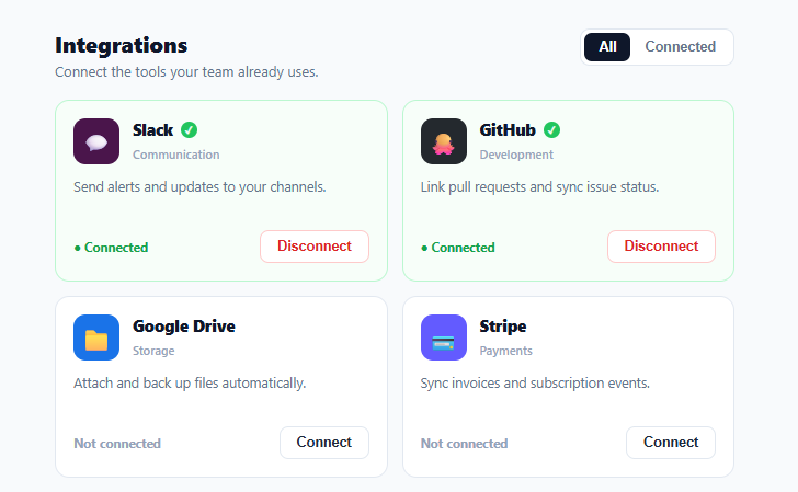
The integrations or "connected apps" page — a grid of cards for Slack, GitHub, Stripe, and the rest, each with a Connect or Disconnect button — is a standard part of every SaaS product's settings. This snippet builds that grid in plain HTML, CSS, and vanilla JavaScript: branded app logos, a clear connected state, category labels, a filter between all and connected apps, and a toggle that flips each card between connect and disconnect.
A card that reflects its connection state
Each integration card shows the app's logo (on its brand color), name, category, and a short description of what connecting does. The card's entire appearance responds to whether it's connected: a connected card gets a green-tinted border and background, a checkmark next to its name, a green "● Connected" status, and its action button becomes a red "Disconnect" — while a disconnected card is neutral with a "Connect" button. This whole-card state change makes it instantly scannable which apps are active, far clearer than a small toggle alone, and it follows the convention users know from GitHub, Slack, and Zapier's app directories.
Connect and disconnect from one toggle
The action button flips the integration's on flag and re-renders, so the same button connects a disconnected app and disconnects a connected one, with its label and styling updating to match. In a real app this is where you'd start the provider's OAuth connect flow (for connecting) or call your disconnect endpoint (for disconnecting) — the demo toggles state locally so the full interaction is visible. Making disconnect a distinct red action (not a quiet toggle) is deliberate: disconnecting often stops data syncing, so it should look like a considered action.
Filtering all vs. connected
A filter switches between showing every available integration and only the connected ones — the two views users actually want ("what can I connect?" and "what's already connected?"). The filter re-renders from the same data, and when "Connected" is selected with nothing connected, an empty state explains why the grid is blank rather than leaving it confusingly empty. This is the standard two-tab pattern for an integrations directory.
Data-driven and category-organized
Every card comes from an INTEGRATIONS array (id, name, category, description, icon, brand color, connected flag), so the catalog is a data edit — add an app, change a description, or mark one connected by editing one entry. Each card's category label ("Communication," "Development," "Payments") helps users scan a long directory; in a larger catalog you'd extend the filter to category tabs, which the same render supports.
Responsive grid, drop-in ready
The cards sit in an auto-fill grid that reflows from two or three columns down to one on narrow screens, so the directory works on any device. Because it's entirely data-driven and self-contained, you populate INTEGRATIONS from your backend (which apps exist and which the current account has connected), wire the buttons to your OAuth and disconnect flows, and the grid renders the rest. The same component works for any "connect external services" surface, not just a settings page.
Build with AI
Build, Understand, Optimize, and Extend It With AI
You do not have to trace the render and filter interplay entirely on your own. Paste this snippet's HTML, CSS, and JS into an AI coding assistant like Claude and ask it to explain exactly how the render function rebuilds the whole grid's innerHTML from the INTEGRATIONS array on every filter change and every toggle click, or why the same button element is reused for both connecting and disconnecting instead of being two separate buttons. The same assistant can help you optimize it — ask whether rebuilding the entire grid's innerHTML on every single toggle is wasteful once the catalog grows to dozens of integrations, and whether a more targeted DOM update (patching just the toggled card) would scale better. It is just as useful for extending the directory: ask it to add a real OAuth redirect flow in the toggle handler instead of the local on flag flip, a search box that filters INTEGRATIONS by name alongside the existing all/connected chips, or a confirmation dialog before disconnecting an integration that has active automations. Treat the code less like a finished artifact and more like a starting point for a conversation.
Prompt to recreate it
Copy this into your AI assistant of choice to build the effect from scratch, or as a jumping-off point for your own variant:
Build a SaaS integrations directory grid in plain HTML, CSS, and JavaScript, data-driven from a single array — no libraries.

Requirements:
- An INTEGRATIONS array where each entry has an id, display name, category, short description, icon, brand color, and a boolean connected flag.
- A render function that filters the array based on a current filter mode (all integrations, or only connected ones), rebuilds the grid's markup from the filtered list, and shows a distinct empty-state message when the connected filter yields zero results.
- Each rendered card's entire visual state must depend on its connected flag: a connected card gets a tinted border and background, a checkmark badge next to its name, a green "Connected" status label, and its action button reads "Disconnect" styled as a deliberate red/destructive action; a disconnected card is neutral with a "Connect" button.
- A single toggle click handler, delegated at the grid container level, that finds the clicked integration by its id, flips its connected flag, and calls render again — so the same button and same handler both connect and disconnect depending on current state.
- Two filter chip buttons (All, Connected) that update the current filter mode and re-render, with the active chip visually distinguished.
- A responsive grid using CSS grid-template-columns with auto-fill and minmax so cards reflow from multiple columns down to one as the viewport narrows.
- Leave a clear comment in the toggle handler indicating that a real implementation would start an OAuth connect flow or call a disconnect API endpoint at that point, rather than only flipping local state.
Want to tighten it up first? Run this prompt through the AI Prompt Studio to score it across 8 quality dimensions, catch anti-patterns, and tune the wording for Claude, ChatGPT, or Gemini before you paste it in.
Step by step
How to Use
- 1Paste HTML, CSS, and JSAn integrations grid renders with apps like Slack, GitHub, and Stripe; connected ones are green-tinted.
- 2Connect an appClick "Connect" on a neutral card — it turns green with a checkmark, a "Connected" status, and a red Disconnect button.
- 3Disconnect an appClick "Disconnect" on a connected card — it returns to the neutral, not-connected state.
- 4Filter the viewSwitch to "Connected" to see only active integrations; an empty state shows if none are connected.
- 5Edit the catalogAdd or change entries in the INTEGRATIONS array (name, category, description, icon, color, on).
- 6Wire up real flowsIn the toggle handler, start the provider's OAuth connect flow or call your disconnect endpoint.
Real-world uses
Common Use Cases
Got questions?
Frequently Asked Questions
In the toggle handler, branch on the current state: to connect, start the provider's OAuth flow (redirect to your /connect/slack route or open their OAuth popup), and mark the integration connected on a successful callback; to disconnect, call your backend's disconnect/revoke endpoint and mark it disconnected on success. Show a loading state on the button during the request, and only flip the card's appearance once the operation actually succeeds.
Fetch the account's connected integrations from your backend on load and set each INTEGRATIONS entry's on flag accordingly (match by id). The catalog of available apps can be static or also come from your API; the connected state should always come from the server so it reflects reality across devices and sessions, not just local toggles.
Disconnecting an integration usually stops data syncing or removes access, which can have real consequences (lost automation, broken workflows). Styling it as a deliberate red action — rather than a quiet toggle that looks the same as connecting — signals weight and reduces accidental disconnects. For high-impact integrations, add a confirmation dialog before disconnecting.
Extend the filter from all/connected to category tabs (Communication, Development, Payments…) driven by the cat field, add a search box that filters the INTEGRATIONS array by name, and paginate or lazy-render if the catalog is large. The render is already data-driven, so these are additions to the filtering step, not changes to the card itself.
In React, hold the integrations (with connected flags) and filter in useState, derive the visible list, and call your connect/disconnect API in the toggle handler; in Vue, use a reactive array with a computed filtered list; in Angular, use a component array and a getter. The card rendering and state logic port directly — only the async connect/disconnect calls move into the framework's effects.