Source Code
<div class="fpc-card" id="fpcCard">
  <div class="fpc-inner" id="fpcInner">
    <!-- Front face -->
    <div class="fpc-face fpc-front">
      <span class="fpc-badge">Most popular</span>
      <h3 class="fpc-plan">Pro</h3>
      <p class="fpc-tagline">For growing teams that need more room.</p>
      <div class="fpc-price"><span class="fpc-currency">$</span><span class="fpc-amount">24</span><span class="fpc-period">/mo</span></div>
      <p class="fpc-billing">Billed monthly · cancel anytime</p>
      <button class="fpc-cta" type="button">Start free trial</button>
      <button class="fpc-flip" type="button" id="fpcToFeatures">
        See all features
        <svg viewBox="0 0 24 24" aria-hidden="true"><polyline points="9 18 15 12 9 6"/></svg>
      </button>
    </div>

    <!-- Back face -->
    <div class="fpc-face fpc-back">
      <h3 class="fpc-plan">Pro includes</h3>
      <ul class="fpc-features">
        <li><svg viewBox="0 0 24 24" aria-hidden="true"><polyline points="20 6 9 17 4 12"/></svg>Unlimited projects</li>
        <li><svg viewBox="0 0 24 24" aria-hidden="true"><polyline points="20 6 9 17 4 12"/></svg>25 team members</li>
        <li><svg viewBox="0 0 24 24" aria-hidden="true"><polyline points="20 6 9 17 4 12"/></svg>100 GB storage</li>
        <li><svg viewBox="0 0 24 24" aria-hidden="true"><polyline points="20 6 9 17 4 12"/></svg>Advanced analytics</li>
        <li><svg viewBox="0 0 24 24" aria-hidden="true"><polyline points="20 6 9 17 4 12"/></svg>Priority support</li>
        <li><svg viewBox="0 0 24 24" aria-hidden="true"><polyline points="20 6 9 17 4 12"/></svg>Custom integrations</li>
      </ul>
      <button class="fpc-cta" type="button">Start free trial</button>
      <button class="fpc-flip" type="button" id="fpcToFront">
        <svg viewBox="0 0 24 24" aria-hidden="true"><polyline points="15 18 9 12 15 6"/></svg>
        Back to pricing
      </button>
    </div>
  </div>
</div>
* { box-sizing: border-box; margin: 0; padding: 0; }
body { font-family: system-ui, -apple-system, sans-serif; background: #0f172a; min-height: 100vh; display: flex; align-items: center; justify-content: center; padding: 32px; }
.fpc-card {
width: 320px;
height: 440px;
perspective: 1400px;
}
.fpc-inner {
position: relative;
width: 100%; height: 100%;
transition: transform 0.7s cubic-bezier(0.4, 0.2, 0.2, 1);
transform-style: preserve-3d;
}
.fpc-card.flipped .fpc-inner { transform: rotateY(180deg); }
.fpc-face {
position: absolute;
inset: 0;
display: flex;
flex-direction: column;
padding: 30px 28px;
background: #fff;
border: 1px solid #e2e8f0;
border-radius: 18px;
box-shadow: 0 24px 60px rgba(0, 0, 0, 0.35);
-webkit-backface-visibility: hidden;
backface-visibility: hidden;
}
.fpc-front { border-top: 4px solid #6366f1; }
.fpc-back { transform: rotateY(180deg); border-top: 4px solid #6366f1; }
.fpc-badge {
align-self: flex-start;
padding: 4px 12px;
background: rgba(99, 102, 241, 0.1);
color: #6366f1;
font-size: 11px; font-weight: 700; letter-spacing: 0.04em; text-transform: uppercase;
border-radius: 999px;
margin-bottom: 16px;
}
.fpc-plan { font-size: 21px; font-weight: 800; color: #0f172a; }
.fpc-tagline { font-size: 13.5px; color: #64748b; line-height: 1.5; margin-top: 6px; }
.fpc-price { display: flex; align-items: baseline; margin-top: 22px; }
.fpc-currency { font-size: 22px; font-weight: 700; color: #0f172a; align-self: flex-start; margin-top: 6px; }
.fpc-amount { font-size: 52px; font-weight: 800; color: #0f172a; line-height: 1; letter-spacing: -0.02em; }
.fpc-period { font-size: 15px; font-weight: 600; color: #94a3b8; margin-left: 4px; }
.fpc-billing { font-size: 12px; color: #94a3b8; margin-top: 8px; }
.fpc-cta {
margin-top: auto;
padding: 13px;
background: #6366f1;
color: #fff;
border: none; border-radius: 11px;
font-size: 14.5px; font-weight: 700; cursor: pointer; font-family: inherit;
transition: background 0.18s, transform 0.1s;
}
.fpc-cta:hover { background: #4f46e5; }
.fpc-cta:active { transform: scale(0.98); }
.fpc-flip {
margin-top: 12px;
display: flex; align-items: center; justify-content: center; gap: 6px;
padding: 8px;
background: none; border: none;
color: #6366f1; font-size: 13px; font-weight: 600; cursor: pointer; font-family: inherit;
}
.fpc-flip svg { width: 14px; height: 14px; fill: none; stroke: currentColor; stroke-width: 2.5; stroke-linecap: round; stroke-linejoin: round; }
.fpc-flip:hover { text-decoration: underline; }
.fpc-features { list-style: none; margin: 18px 0 0; display: flex; flex-direction: column; gap: 13px; }
.fpc-features li { display: flex; align-items: center; gap: 10px; font-size: 14px; color: #334155; font-weight: 500; }
.fpc-features svg { width: 18px; height: 18px; flex-shrink: 0; padding: 3px; fill: none; stroke: #fff; stroke-width: 3; stroke-linecap: round; stroke-linejoin: round; background: #22c55e; border-radius: 50%; }const card = document.getElementById('fpcCard');
document.getElementById('fpcToFeatures').addEventListener('click', () => {
card.classList.add('flipped');
});
document.getElementById('fpcToFront').addEventListener('click', () => {
card.classList.remove('flipped');
});Learn Coding Visually
Learn to code with interactive, live-preview playgrounds — HTML, CSS, JavaScript, React & more.
 HTML Playground42 lessons · Click-based · Live preview
 CSS PlaygroundLearn CSS with a live editor
 JavaScript Playground60 lessons · DOM · Async · Canvas
 React PlaygroundLearn React with a live code editor
 GSAP PlaygroundLearn GSAP animation interactively
 SVG Playground44 lessons · shapes · paths · animation
 SCSS Playground45 lessons · Sass modules · tokens
 Tailwind PlaygroundLearn Tailwind CSS with a live editor
 Bootstrap 5 Playground50 lessons · live preview
Flip Pricing Card — Free HTML CSS JS 3D Snippet
Flip Pricing Card · Pricing · Plain HTML, CSS & JS · Live preview
What's included
Features
About this UI Snippet
Flip Pricing Card — 3D Flip to Reveal Features with CSS preserve-3d
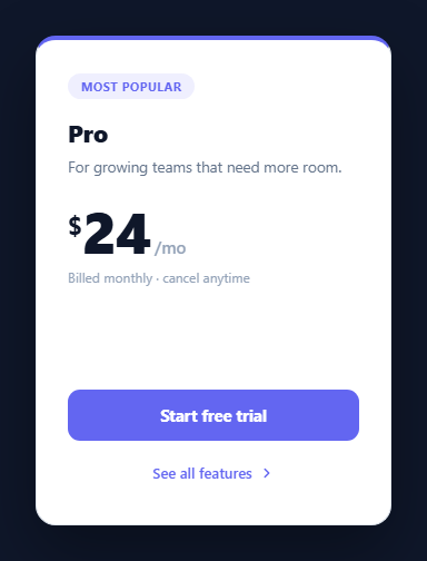
Pricing cards face a constant tension: marketers want a clean, scannable front with just the plan name, price, and a call to action, but buyers comparing plans want the full feature list. The flip pricing card resolves that tension by putting the headline pricing on the front and the complete feature breakdown on the back, joined by a smooth 3D flip animation. The buyer sees an uncluttered card first, then flips it over when they want detail — all without a modal, a tooltip, or leaving the page. This component is built with pure CSS 3D transforms and a few lines of JavaScript that only toggle a class.
The 3D flip mechanism
The flip relies on three coordinated CSS properties. The outer .fpc-card sets perspective: 1400px, which defines how much depth the 3D scene has — a smaller value exaggerates the perspective, a larger one flattens it. The .fpc-inner wrapper sets transform-style: preserve-3d so its children exist in the same 3D space rather than being flattened, and it carries the transition that animates the rotation. Adding the .flipped class rotates the inner wrapper with transform: rotateY(180deg), swinging it around its vertical axis like a turning page.
Hiding the back of each face
Both faces are stacked on top of each other with position: absolute; inset: 0. The key to a clean flip is backface-visibility: hidden on each face, which makes a face invisible when it is rotated away from the viewer. The front face sits at 0 degrees and the back face is pre-rotated with transform: rotateY(180deg) so that, when the wrapper flips, the back face rotates into the 0-degree viewing position and becomes visible while the front rotates away and disappears. Without backface-visibility: hidden you would see a mirrored, reversed copy of the front through the back.
Why the animation is GPU-accelerated and smooth
Because the flip animates only the transform property — never width, height, top, or left — the browser can hand the entire animation to the GPU compositor. No layout or paint work happens during the 0.7-second transition, so it stays at 60fps even on modest hardware. The timing function cubic-bezier(0.4, 0.2, 0.2, 1) gives the flip a slight ease-in and a soft settle at the end, which reads as more physical than a linear rotation.
The JavaScript: just a class toggle
All the JavaScript does is add or remove the .flipped class on the card in response to the two flip buttons — "See all features" on the front and "Back to pricing" on the back. The animation, the face-hiding, and the perspective all live in CSS, so the script is three lines. This separation means you can trigger the flip from anything: a hover (@media (hover: hover)), a parent toggle, or a framework state change, without touching the visual logic.
Both faces are fully styled cards
Each face is a complete pricing card in its own right — the front has a "Most popular" badge, the plan name, a tagline, a large price with a superscript currency symbol and a /mo period, billing fine print, and a primary CTA pinned to the bottom with margin-top: auto. The back has the plan name, a six-item feature list with green circular checkmark icons, the same CTA, and a button to flip back. Because the CTA appears on both faces, a buyer can convert whether they are looking at the price or the features. The shared #6366f1 accent and the 4px top border tie the two faces together visually.
Customisation
To adapt the card, edit the plan name, price, tagline, and the feature <li> items. Swap the #6366f1 accent (used by the badge, the top border, the CTA, and the flip links) for your brand colour. Change the flip duration by editing the transition on .fpc-inner, and adjust perspective on .fpc-card to make the flip feel deeper or flatter. To build a full pricing table, render three of these cards in a CSS grid and flip them independently — each manages its own .flipped state.
Build with AI
Build, Understand, Optimize, and Extend It With AI
You don't need to puzzle out the 3D stacking order on your own. Paste this snippet's HTML, CSS, and JS into an AI coding assistant like Claude and ask it to explain exactly why the back face needs its own rotateY(180deg) baked in at rest, on top of the wrapper's flip, and what specifically backface-visibility hidden is hiding when the flipped class is applied. The same assistant can help optimize it — ask whether the perspective value of 1400px is doing anything meaningful at this card's size, or whether the transition's cubic-bezier could be swapped for a spring-based easing without breaking the GPU-only transform animation. It's also a good way to extend the card: have it add a hover-triggered flip behind a prefers-reduced-motion check, wire the flip to a parent-controlled state so three pricing tiers flip in sync, or animate the price number counting up when the front face becomes visible again. Treat the code less like a finished artifact and more like a starting point for a conversation.
Prompt to recreate it
Copy this into your AI assistant of choice to build the effect from scratch, or as a jumping-off point for your own variant:
Build a pricing card that flips in real 3D to reveal a full feature list on its back face, in plain HTML, CSS, and JavaScript — no libraries, and the JavaScript may only toggle a single class.

Requirements:
- An outer fixed-size card element with CSS perspective set on it (not on its children), establishing the 3D viewing depth for everything inside.
- An inner wrapper inside the card with transform-style: preserve-3d and a transition on transform only, so its rotation can be GPU-accelerated with no layout or paint cost.
- Two full face elements (front and back) stacked with absolute positioning filling the wrapper. Both faces must have backface-visibility hidden. The front face sits at its natural 0-degree rotation; the back face must be pre-rotated to rotateY(180deg) at rest so it only becomes upright and visible once the wrapper itself is rotated 180 degrees.
- A single class on the outer card (e.g. "flipped") that, when present, rotates the inner wrapper to rotateY(180deg) — this one class toggle must be the only thing JavaScript does; all animation, depth, and face-hiding logic must live entirely in CSS.
- The front face must show a plan name, a "most popular" style badge, a large price with a smaller currency symbol and billing period, a short tagline, and a call-to-action button, plus a button that adds the flip class. The back face must show a scrollable or fixed list of at least five features each with a checkmark icon, the same call-to-action button, and a button that removes the flip class.
- Use an easing curve on the transform transition that gives the rotation a slight ease-in and a soft settle rather than linear motion, and keep the total flip duration in the 0.6-0.8 second range.
Want to tighten it up first? Run this prompt through the AI Prompt Studio to score it across 8 quality dimensions, catch anti-patterns, and tune the wording for Claude, ChatGPT, or Gemini before you paste it in.
Step by step
How to Use
- 1Paste the HTML, CSS, and JSA pricing card renders showing the Pro plan, price, and a "See all features" button.
- 2Click "See all features"The card rotates 180 degrees in 3D over 0.7 seconds to reveal the full feature list on the back face.
- 3Click "Back to pricing"The card flips back to the front, returning to the headline price and CTA.
- 4Edit the plan and priceChange the plan name, currency symbol, amount, period, and tagline on the front face, and the <li> feature items on the back.
- 5Recolour the accentReplace #6366f1 (badge, top border, CTA, flip links) with your brand colour; the green checkmark colour is set separately on .fpc-features svg.
- 6Build a pricing rowDuplicate the card three times inside a CSS grid for a multi-tier table — each card flips independently via its own .flipped class.
Real-world uses
Common Use Cases
Got questions?
Frequently Asked Questions
That happens when backface-visibility: hidden is missing or when the back face is not pre-rotated. Each .fpc-face needs backface-visibility: hidden (with the -webkit- prefix for Safari), and the back face must have transform: rotateY(180deg) so it faces forward only after the wrapper flips. Without both, you see a mirror image of the front bleeding through.
Add a CSS rule .fpc-card:hover .fpc-inner { transform: rotateY(180deg) } and remove or keep the buttons as you like. Wrap it in @media (hover: hover) so touch devices, which cannot hover, still use the button to flip. Hover flips work well on desktop but always keep a click/tap path for touch and keyboard users.
Depth comes from the perspective property on the parent .fpc-card and transform-style: preserve-3d on .fpc-inner. If perspective is missing the rotation looks like a flat 2D mirror; if preserve-3d is missing the faces flatten into the same plane. Lower the perspective value (e.g. 900px) to exaggerate the depth, or raise it (e.g. 2000px) to flatten it.
Yes — increase the height on .fpc-card. Because the faces use inset: 0 (absolute positioning filling the card), both faces resize together and stay aligned. For very long lists, set overflow-y: auto on .fpc-features so it scrolls within the fixed card height instead of overflowing the back face.
Store a boolean like flipped in state and bind it to the .flipped class — useState in React (className with a conditional), a ref in Vue (:class binding), or a property in Angular ([class.flipped]). The flip buttons call setFlipped(true/false) or toggle the property. All the CSS (perspective, preserve-3d, backface-visibility, the rotateY transform) ports unchanged; only the class toggle moves into the framework.