Source Code
<div class="sps-wrap">
  <div class="sps-card">
    <div class="sps-top">
      <span class="sps-badge">Simple, all-inclusive pricing</span>
      <h2 class="sps-title">One plan. Everything included.</h2>
      <p class="sps-desc">No tiers to compare, no features locked behind an upsell. Every customer gets the full product.</p>
    </div>

    <div class="sps-toggle">
      <button type="button" class="sps-opt active" data-period="monthly">Monthly</button>
      <button type="button" class="sps-opt" data-period="annual">Annual <span class="sps-save">Save 20%</span></button>
    </div>

    <div class="sps-price-row">
      <span class="sps-currency">$</span>
      <span class="sps-amount" id="spsAmount">29</span>
      <span class="sps-period" id="spsPeriod">/ month</span>
    </div>
    <p class="sps-note" id="spsNote">Billed monthly, cancel anytime.</p>

    <ul class="sps-features">
      <li>Unlimited projects and team members</li>
      <li>Real-time collaboration and version history</li>
      <li>Priority email + chat support</li>
      <li>API access and webhooks</li>
      <li>Custom domains and white-labeling</li>
      <li>SOC 2 Type II compliant infrastructure</li>
    </ul>

    <button type="button" class="sps-cta">Start 14-day free trial</button>
    <p class="sps-guarantee">🛡️ 30-day money-back guarantee, no questions asked</p>

    <div class="sps-quote">
      <p>"We stopped comparing tiers and just started using the product. That alone was worth switching for."</p>
      <span>— Priya Nair, Ops Lead at Fernwood</span>
    </div>
  </div>
</div>*{box-sizing:border-box;margin:0;padding:0}
body{font-family:system-ui,-apple-system,sans-serif;background:#f1f5f9;min-height:100vh;display:flex;align-items:center;justify-content:center;padding:32px}
.sps-wrap{width:100%;display:flex;justify-content:center}
.sps-card{background:#fff;border-radius:22px;padding:38px 36px;width:100%;max-width:440px;box-shadow:0 26px 64px rgba(15,23,42,.12);border:1px solid #e2e8f0;text-align:center}
.sps-badge{display:inline-block;font-size:11.5px;font-weight:800;text-transform:uppercase;letter-spacing:.05em;color:#6366f1;background:#eef2ff;padding:5px 13px;border-radius:999px;margin-bottom:14px}
.sps-title{font-size:23px;font-weight:800;color:#0f172a;margin-bottom:8px;letter-spacing:-.01em}
.sps-desc{font-size:14px;color:#64748b;line-height:1.6;max-width:340px;margin:0 auto 24px}
.sps-toggle{display:inline-flex;background:#f1f5f9;border-radius:999px;padding:4px;margin-bottom:22px;gap:2px}
.sps-opt{border:none;background:none;font-family:inherit;font-size:13px;font-weight:700;color:#64748b;padding:9px 16px;border-radius:999px;cursor:pointer;display:flex;align-items:center;gap:6px;transition:background .2s,color .2s}
.sps-opt.active{background:#fff;color:#0f172a;box-shadow:0 2px 6px rgba(15,23,42,.08)}
.sps-save{font-size:10.5px;font-weight:800;color:#16a34a;background:#dcfce7;padding:2px 6px;border-radius:6px}
.sps-price-row{display:flex;align-items:flex-start;justify-content:center;gap:2px;margin-bottom:4px}
.sps-currency{font-size:22px;font-weight:800;color:#0f172a;margin-top:6px}
.sps-amount{font-size:52px;font-weight:800;color:#0f172a;font-variant-numeric:tabular-nums;line-height:1}
.sps-period{font-size:14px;font-weight:600;color:#94a3b8;margin-top:16px}
.sps-note{font-size:12.5px;color:#94a3b8;margin-bottom:24px}
.sps-features{list-style:none;text-align:left;display:flex;flex-direction:column;gap:11px;margin-bottom:26px;padding:20px;background:#f8fafc;border-radius:14px}
.sps-features li{font-size:13.5px;font-weight:600;color:#334155;padding-left:24px;position:relative}
.sps-features li::before{content:'✓';position:absolute;left:0;color:#16a34a;font-weight:800}
.sps-cta{width:100%;background:#6366f1;color:#fff;border:none;border-radius:12px;padding:15px;font-size:15px;font-weight:700;cursor:pointer;font-family:inherit;transition:background .15s,transform .15s;box-shadow:0 10px 26px rgba(99,102,241,.28)}
.sps-cta:hover{background:#4f46e5;transform:translateY(-1px)}
.sps-guarantee{font-size:12px;color:#94a3b8;margin-top:12px}
.sps-quote{margin-top:26px;padding-top:22px;border-top:1px solid #f1f5f9;text-align:left}
.sps-quote p{font-size:13px;font-style:italic;color:#475569;line-height:1.6;margin-bottom:8px}
.sps-quote span{font-size:12px;font-weight:700;color:#94a3b8}// Real price math driven off one source of truth — no separate hardcoded annual price
// to keep in sync. The monthly rate and the discount percentage are the only two inputs.
var MONTHLY_PRICE = 29;
var ANNUAL_DISCOUNT_PCT = 20;
var opts = document.querySelectorAll('.sps-opt');
var amountEl = document.getElementById('spsAmount');
var periodEl = document.getElementById('spsPeriod');
var noteEl = document.getElementById('spsNote');
function annualMonthlyEquivalent() {
var fullYear = MONTHLY_PRICE * 12;
var discounted = fullYear * (1 - ANNUAL_DISCOUNT_PCT / 100);
return discounted / 12;
}
function render(period) {
if (period === 'annual') {
var perMonth = annualMonthlyEquivalent();
var yearTotal = perMonth * 12;
amountEl.textContent = perMonth.toFixed(0);
periodEl.textContent = '/ month';
noteEl.textContent = 'Billed as $' + yearTotal.toFixed(0) + ' per year — save ' + ANNUAL_DISCOUNT_PCT + '%.';
} else {
amountEl.textContent = MONTHLY_PRICE.toFixed(0);
periodEl.textContent = '/ month';
noteEl.textContent = 'Billed monthly, cancel anytime.';
}
}
opts.forEach(function (btn) {
btn.addEventListener('click', function () {
opts.forEach(function (b) { b.classList.remove('active'); });
btn.classList.add('active');
render(btn.dataset.period);
});
});Learn Coding Visually
Learn to code with interactive, live-preview playgrounds — HTML, CSS, JavaScript, React & more.
 HTML Playground42 lessons · Click-based · Live preview
 CSS PlaygroundLearn CSS with a live editor
 JavaScript Playground60 lessons · DOM · Async · Canvas
 React PlaygroundLearn React with a live code editor
 GSAP PlaygroundLearn GSAP animation interactively
 SVG Playground44 lessons · shapes · paths · animation
 SCSS Playground45 lessons · Sass modules · tokens
 Tailwind PlaygroundLearn Tailwind CSS with a live editor
 Bootstrap 5 Playground50 lessons · live preview
Single-Plan Spotlight Pricing Card — Free Snippet
Single-Plan Spotlight Pricing Card · Pricing · Plain HTML, CSS & JS · Live preview
What's included
Features
About this UI Snippet
Single-Plan Spotlight Pricing Card — One Focused Card, No Tier Grid to Compare
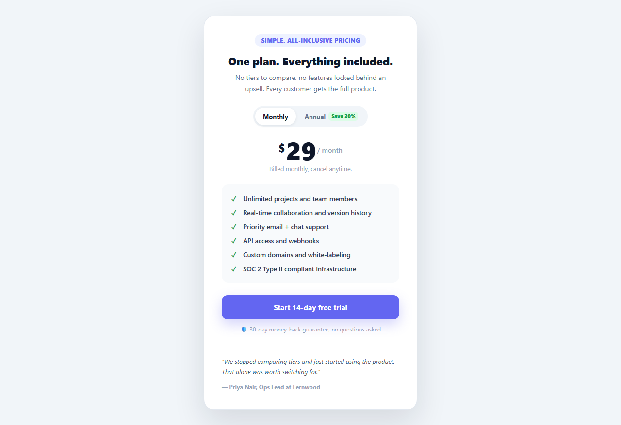
A three- or four-column pricing grid forces every visitor to do comparison work before they can act — which tier, which features, what's the catch on the cheap one. Products with a single plan (or a strong "everyone should be on the top tier anyway" default) are often better served by dropping the grid entirely and presenting one confident, focused card: no decision paralysis, just what's included and the price.
One price, computed, not two hardcoded numbers
A common mistake in monthly/annual toggles is hardcoding both prices separately, which silently drifts out of sync the moment the monthly price changes and someone forgets to update the annual number to match. This snippet instead defines exactly two inputs — MONTHLY_PRICE and ANNUAL_DISCOUNT_PCT — and annualMonthlyEquivalent() derives the discounted monthly-equivalent rate by multiplying the monthly price by 12, applying the discount, and dividing back down to a monthly figure. Change MONTHLY_PRICE once and both the monthly and annual views update correctly with no second number to remember to touch.
The toggle swaps price, period label, and note together
Clicking a .sps-opt button calls render(period), which updates three elements in one pass: the big .sps-amount number, the / month label, and a small note beneath the price. On monthly, the note reads "Billed monthly, cancel anytime." On annual, it computes and displays the actual year total (perMonth * 12) rather than leaving the visitor to do that multiplication themselves — showing both the monthly-equivalent rate and the real annual charge is what actually earns trust in a discount claim.
Why the annual price is shown as a monthly-equivalent number
Displaying "$23/month" for the annual plan (rather than a much larger annual lump sum as the headline number) keeps the visual weight of the price consistent between the two toggle states — the big number doesn't visually jump by 12x when switching tabs, which would read as jarring even though the actual value proposition (paying less overall) is positive. The true annual charge is still shown, just in the smaller supporting note rather than as the dominant figure.
The features list lives in a shaded panel
Unlike a multi-column comparison table where checkmarks and X marks visually differentiate tiers, every item in .sps-features is a plain checkmark — there's nothing to compare, only to confirm what's included. Framing the list inside a subtly shaded rounded panel (background: #f8fafc) visually separates "here's what's included" from the price and CTA above and below it.
The guarantee line and embedded quote build one-sided trust
Because there's no second, cheaper tier to fall back on if a visitor is hesitant, the card compensates with a money-back guarantee line directly under the CTA and a short customer quote at the bottom. Both exist to answer the same underlying objection — "what if this doesn't work out for us" — without needing to introduce a second pricing option that would undercut the "one plan" positioning.
Adapting the discount percentage
Change ANNUAL_DISCOUNT_PCT to whatever your actual annual discount is — the toggle's "Save X%" badge text in the HTML should be updated to match, since it's currently a static label rather than JavaScript-generated, to keep the displayed badge and the computed price in agreement.
When a single-plan card is the wrong choice
If your product genuinely has meaningfully different tiers with different limits or audiences, a grid or comparison table communicates that difference better than this card can — this pattern is specifically for products confident enough in one offering to skip the comparison altogether.
Build with AI
Build, Understand, Optimize, and Extend It With AI
Rather than debugging price-toggle math by hand, paste this snippet's HTML, CSS, and JS into an AI coding assistant like Claude and ask it to explain why annualMonthlyEquivalent() derives the discounted price from a single MONTHLY_PRICE constant and a discount percentage instead of the more common pattern of hardcoding a separate annual price — and what specific bug that hardcoded approach is prone to when prices change later. The same assistant is useful for extending the card: ask it to add a third billing cadence like quarterly, generate the "Save X%" badge text dynamically from ANNUAL_DISCOUNT_PCT instead of leaving it as static HTML that could drift out of sync with the computed price, or convert the vanilla toggle into a controlled React component with the active period held in state. It can also help you think through whether a single-plan card or a comparison grid better fits your actual product's tier structure. Treat the code less like a finished artifact and more like a starting point for a conversation.
Prompt to recreate it
Copy this into your AI assistant of choice to build the effect from scratch, or as a jumping-off point for your own variant:
Build a single, focused pricing card in plain HTML, CSS, and vanilla JavaScript — not a multi-column comparison grid — for a product with one all-inclusive plan, with a monthly/annual billing toggle, no library.

Requirements:
- One large centered card containing a small eyebrow badge, a title, a short description, a segmented Monthly/Annual toggle, a large price display, a supporting note beneath the price, a checkmark feature list in a shaded panel, a primary call-to-action button, a money-back guarantee line, and a short customer quote at the bottom.
- Define exactly two JavaScript constants: a monthly price and an annual discount percentage. Write a function that derives the discounted monthly-equivalent annual price mathematically from those two constants (multiply the monthly price by 12, apply the discount, divide back to a monthly figure) rather than hardcoding a second, separate annual price number — explain in a comment why deriving it this way avoids the two numbers drifting out of sync if the price changes later.
- Clicking the Annual toggle option should update the large price number to the computed monthly-equivalent figure (so the headline number's visual scale stays consistent between the two toggle states) while a smaller note beneath it shows the real total amount charged per year, computed from the same derived value.
- Clicking Monthly should restore the original monthly price and a note stating it is billed monthly and cancellable anytime.
- The active toggle option should have a distinct visual state (background and text color change) from the inactive one.
Want to tighten it up first? Run this prompt through the AI Prompt Studio to score it across 8 quality dimensions, catch anti-patterns, and tune the wording for Claude, ChatGPT, or Gemini before you paste it in.
Step by step
How to Use
- 1Toggle Monthly / AnnualThe price, period label, and billing note update together, computed from one monthly price and one discount percentage.
- 2Edit the base priceChange the MONTHLY_PRICE constant in the JS panel — the annual-equivalent price recalculates automatically.
- 3Change the annual discountEdit ANNUAL_DISCOUNT_PCT in JS, and update the matching "Save X%" label text in the HTML toggle button.
- 4Edit the feature listAdd, remove, or reorder <li> items inside .sps-features — every item renders with the same checkmark styling.
- 5Swap the guarantee and quoteUpdate the .sps-guarantee text and the .sps-quote block with your own policy and customer quote.
- 6Export in your formatClick "HTML" for a standalone file, "JSX" for a React component, or "Tailwind" for a React + Tailwind version.
Real-world uses
Common Use Cases
Got questions?
Frequently Asked Questions
Hardcoding both a monthly and an annual number means they can silently drift out of sync — someone updates MONTHLY_PRICE for a price change and forgets the annual figure, and the discount percentage becomes wrong without anyone noticing. Deriving the annual-equivalent price from MONTHLY_PRICE and ANNUAL_DISCOUNT_PCT in annualMonthlyEquivalent() means there is only one number to update, and the relationship between the two prices is always mathematically correct.
Showing a small monthly-equivalent number keeps the visual weight of the headline price consistent whichever toggle option is active — switching to annual does not make the large digits suddenly balloon to a number 12 times bigger. The actual amount charged per year is still shown, just in the smaller supporting note beneath the price rather than as the dominant figure.
Edit the ANNUAL_DISCOUNT_PCT constant in the JS panel — the computed price and the generated year-total note update automatically. You also need to manually update the "Save 20%" text inside the HTML toggle button, since that label is currently static text rather than generated by JavaScript, so it stays in agreement with the computed discount.
This pattern is intended for products where every customer effectively gets the same thing — a single tier, possibly with a free trial handled elsewhere. Removing the multi-column comparison eliminates the decision-paralysis of "which tier do I need" and lets the card focus entirely on making the single offer feel complete and low-risk.
With no cheaper fallback tier to offer a hesitant visitor, the card leans on trust signals instead — a money-back guarantee directly under the CTA and a short, specific customer quote at the bottom, both aimed at addressing the same underlying "what if this doesn't work out" hesitation that a tier grid would otherwise resolve by offering a smaller commitment.
Yes. Add a third .sps-opt button with data-period="quarterly", extend render() with an else-if branch computing the quarterly-equivalent price the same way annualMonthlyEquivalent() does for annual (multiply MONTHLY_PRICE by 3, apply whatever quarterly discount you offer, divide by 3), and widen the .sps-toggle pill to fit three options.