Source Code
<div class="bslogin-wrap">
  <div class="card bslogin-card">
    <div class="card-body p-4 p-sm-5">
      <h1 class="bslogin-title">Welcome back</h1>
      <p class="bslogin-sub">Sign in to your account to continue.</p>

      <form id="bsloginForm" novalidate>
        <div class="mb-3">
          <label for="bsloginEmail" class="form-label small fw-semibold">Email address</label>
          <input type="email" class="form-control" id="bsloginEmail" placeholder="you@company.com" required>
          <div class="invalid-feedback">Enter a valid email address.</div>
        </div>
        <div class="mb-2">
          <label for="bsloginPassword" class="form-label small fw-semibold">Password</label>
          <div class="input-group">
            <input type="password" class="form-control" id="bsloginPassword" placeholder="At least 8 characters" minlength="8" required>
            <button class="btn btn-outline-secondary" type="button" id="bsloginToggle" aria-label="Show password">
              <svg width="16" height="16" viewBox="0 0 24 24" fill="none" stroke="currentColor" stroke-width="2" stroke-linecap="round" stroke-linejoin="round"><path d="M1 12s4-8 11-8 11 8 11 8-4 8-11 8-11-8-11-8z"/><circle cx="12" cy="12" r="3"/></svg>
            </button>
            <div class="invalid-feedback">Password must be at least 8 characters.</div>
          </div>
        </div>

        <div class="d-flex justify-content-between align-items-center mb-3">
          <div class="form-check">
            <input class="form-check-input" type="checkbox" id="bsloginRemember">
            <label class="form-check-label small" for="bsloginRemember">Remember me</label>
          </div>
          <a href="javascript:void(0)" class="small">Forgot password?</a>
        </div>

        <button type="submit" class="btn btn-primary w-100 fw-bold" id="bsloginSubmit">Sign in</button>
        <div class="bslogin-status mt-3" id="bsloginStatus"></div>
      </form>
    </div>
  </div>
</div>
body {
background: #f6f7f9;
min-height: 100vh;
display: flex;
}
.bslogin-wrap {
width: 100%;
display: flex;
align-items: center;
justify-content: center;
padding: 40px 16px;
}
.bslogin-card {
width: 100%;
max-width: 400px;
border: 1px solid #eceef1;
border-radius: 14px;
box-shadow: 0 20px 44px rgba(15,23,42,.06);
}
.bslogin-title { font-weight: 800; letter-spacing: -0.01em; margin-bottom: 4px; }
.bslogin-sub { color: #6b7280; font-size: 13.5px; margin-bottom: 24px; }
.bslogin-status {
min-height: 20px;
font-size: 13px;
font-weight: 600;
text-align: center;
}
.bslogin-status.text-danger::before { content: '⚠ '; }
.bslogin-status.text-success::before { content: '✓ '; }
#bsloginSubmit.bslogin-loading { pointer-events: none; opacity: .75; }const form = document.getElementById('bsloginForm');
const email = document.getElementById('bsloginEmail');
const password = document.getElementById('bsloginPassword');
const toggleBtn = document.getElementById('bsloginToggle');
const submitBtn = document.getElementById('bsloginSubmit');
const status = document.getElementById('bsloginStatus');
// Validate a single field on blur, so an error appears the moment someone
// leaves a bad field rather than only after a failed full-form submit.
function validateField(input) {
input.classList.toggle('is-invalid', !input.checkValidity());
input.classList.toggle('is-valid', input.checkValidity() && input.value !== '');
}
email.addEventListener('blur', () => validateField(email));
password.addEventListener('blur', () => validateField(password));
email.addEventListener('input', () => { if (email.classList.contains('is-invalid')) validateField(email); });
password.addEventListener('input', () => { if (password.classList.contains('is-invalid')) validateField(password); });
toggleBtn.addEventListener('click', () => {
const showing = password.type === 'text';
password.type = showing ? 'password' : 'text';
toggleBtn.setAttribute('aria-label', showing ? 'Show password' : 'Hide password');
});
form.addEventListener('submit', e => {
e.preventDefault();
validateField(email);
validateField(password);
if (!form.checkValidity()) {
status.textContent = 'Please fix the highlighted fields.';
status.className = 'bslogin-status mt-3 text-danger';
return;
}
// Simulated network delay so the loading state is actually visible —
// a real app would await a fetch()/axios call here instead.
submitBtn.classList.add('bslogin-loading');
submitBtn.textContent = 'Signing in…';
status.textContent = '';
status.className = 'bslogin-status mt-3';
setTimeout(() => {
submitBtn.classList.remove('bslogin-loading');
submitBtn.textContent = 'Sign in';
status.textContent = 'Signed in as ' + email.value;
status.className = 'bslogin-status mt-3 text-success';
}, 900);
});Learn Coding Visually
Learn to code with interactive, live-preview playgrounds — HTML, CSS, JavaScript, React & more.
 HTML Playground42 lessons · Click-based · Live preview
 CSS PlaygroundLearn CSS with a live editor
 JavaScript Playground60 lessons · DOM · Async · Canvas
 React PlaygroundLearn React with a live code editor
 GSAP PlaygroundLearn GSAP animation interactively
 SVG Playground44 lessons · shapes · paths · animation
 SCSS Playground45 lessons · Sass modules · tokens
 Tailwind PlaygroundLearn Tailwind CSS with a live editor
 Bootstrap 5 Playground50 lessons · live preview
Bootstrap Login Form with Live Validation — Free Snippet
Bootstrap Login Form with Live Validation · Forms · Plain HTML, CSS & JS · Live preview
What's included
Features
About this UI Snippet
Bootstrap Login Form with Live Validation — HTML, CSS & JavaScript
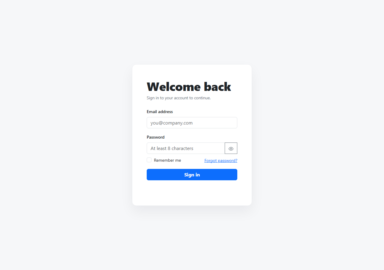
A login form is the first real interaction most users have with a product, and a form that only tells you something is wrong after a failed full-page submit feels dated. This snippet builds a login form on real Bootstrap 5.3 — the actual .form-control, .input-group, and validation state classes loaded from the CDN — with validation that runs per field, on blur, a working show/hide password toggle, and a genuine (simulated) loading state on submit.
Validate on blur, re-validate on input
Rather than waiting for a full form submission to show any errors, each field calls checkValidity() and toggles Bootstrap's .is-invalid/.is-valid classes the moment the user leaves it (blur). Once a field has been marked invalid, its input listener re-checks it on every keystroke — so the error clears the instant the fix is typed, rather than lingering until the next blur. That asymmetry (validate on leave, but clear on type) matches how validation actually feels helpful rather than naggy.
The password visibility toggle
The eye-icon button next to the password field flips password.type between "password" and "text", and updates its own aria-label between "Show password" and "Hide password" so the control's purpose is announced correctly to screen reader users at every state — a detail that's easy to skip when building this pattern from scratch.
A submit that actually waits
Clicking "Sign in" on a valid form doesn't just alert() and stop — the button gets a .bslogin-loading class (dimming it and disabling further clicks via pointer-events: none) and its text changes to "Signing in…" for roughly 900ms via setTimeout, standing in for a real network request, before showing a success message. That's the shape any real integration needs: swap the setTimeout for an await fetch(...) and the loading/success/error states are already wired correctly.
Build with AI
Build, Understand, Optimize, and Extend It With AI
Hand this snippet's HTML, CSS, and JS to an AI coding assistant like Claude and ask it to wire the submit handler to a real authentication endpoint with fetch(), including a distinct error state (invalid credentials) alongside the existing success state — versus the current setTimeout simulation. It's also a good exercise to ask the assistant to add a password-strength indicator that updates live as the user types, or to convert the form into a two-step flow (email first, then password) similar to how Google's sign-in works.
Prompt to recreate it
Copy this into your AI assistant of choice to build the effect from scratch, or as a jumping-off point for your own variant:
Build a Bootstrap 5.3 login form with real per-field validation, using the real Bootstrap CDN framework (bootstrap.min.css and bootstrap.bundle.min.js), not custom CSS made to resemble Bootstrap.

Requirements:
- A centered card containing an email field and a password field, both using Bootstrap's form-control classes, plus a "Remember me" checkbox, a "Forgot password?" link, and a submit button.
- Each field must validate using the native checkValidity() API on blur, toggling Bootstrap's is-invalid/is-valid classes and showing the matching invalid-feedback message. Once a field is marked invalid, it must re-check and clear its error live as the user types a fix, without requiring another blur.
- The password field must have a show/hide toggle button (an eye icon) that switches its input type between "password" and "text", and updates its own aria-label between "Show password" and "Hide password" to match its current state.
- On submit, re-validate both fields; if either is invalid, show a general error message and stop. If both are valid, put the submit button into a disabled, dimmed loading state with different button text for roughly one second (simulating a network request with setTimeout) before showing a success message.
- The layout must be fully responsive and centered vertically and horizontally on the page.
Want to tighten it up first? Run this prompt through the AI Prompt Studio to score it across 8 quality dimensions, catch anti-patterns, and tune the wording for Claude, ChatGPT, or Gemini before you paste it in.
Step by step
How to Use
- 1Load the snippetClick "Bootstrap Login Form with Live Validation" in the sidebar Library tab. The preview loads a centered login card with empty fields.
- 2Tab through without typingClick into the email field, then tab or click away without typing — it turns red with an inline error, since it's empty and required.
- 3Type an invalid emailType something without an @ symbol and blur the field — same red invalid state, with the specific error message shown.
- 4Fix it and watch it clearStart typing a valid email while the field is still marked invalid — the red state clears as soon as the value becomes valid, without needing to blur again.
- 5Toggle password visibilityClick the eye icon next to the password field to reveal the typed characters, then click again to hide them.
- 6Submit a valid formFill both fields correctly and click "Sign in" — the button shows a brief loading state before confirming with a success message.
Real-world uses
Common Use Cases
Got questions?
Frequently Asked Questions
It uses Bootstrap's validation-state CSS classes (is-invalid, is-valid, invalid-feedback) applied via JavaScript that calls the browser's native checkValidity() — this is the standard, correct way to pair Bootstrap styling with HTML5 form validation.
A field is checked when the user leaves it (blur), not only on submit — so an empty or invalid field shows its error as soon as you tab or click away from it, and clicking Sign in also re-validates both fields in case they were never individually blurred.
Once a field is marked invalid, an input listener re-runs the validity check on every keystroke, so the red state and message disappear the instant the value becomes valid — you don't need to blur and re-focus the field.
Yes — clicking it updates its aria-label between "Show password" and "Hide password" to match its current action, so screen reader users hear the correct description of what the button will do next.
No — this is a front-end demo. The submit handler simulates a network delay with setTimeout and then shows a success message. Replace that setTimeout with a real fetch() call to your authentication API to make it functional.
Yes — duplicate the password field's markup and add a custom validity check in JavaScript comparing its value to the original password field, then call setCustomValidity() to hook it into the same checkValidity()-based flow.