


Learn Coding Visually
Learn to code with interactive, live-preview playgrounds — HTML, CSS, JavaScript, React & more.
 HTML Playground42 lessons · Click-based · Live preview
 CSS PlaygroundLearn CSS with a live editor
 JavaScript Playground60 lessons · DOM · Async · Canvas
 React PlaygroundLearn React with a live code editor
 GSAP PlaygroundLearn GSAP animation interactively
 SVG Playground44 lessons · shapes · paths · animation
 SCSS Playground45 lessons · Sass modules · tokens
 Tailwind PlaygroundLearn Tailwind CSS with a live editor
 Bootstrap 5 Playground50 lessons · live preview
Bootstrap Social Login Buttons — Free HTML CSS JS Snippet
Bootstrap Social Login Buttons · Forms · Plain HTML, CSS & JS · Live preview
What's included
Features
About this UI Snippet
Bootstrap Social Login Buttons — HTML, CSS & JavaScript
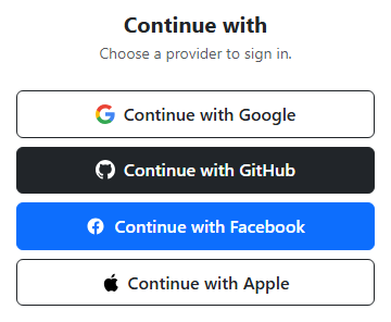
Each provider button here is a genuine Bootstrap btn — btn-outline-dark for Google and Apple, btn-dark for GitHub, btn-primary for Facebook — stacked full-width inside a d-grid gap-2 container, which is Bootstrap's own recommended pattern for evenly spaced stacked buttons rather than manual margins. Each brand icon is inline <svg> markup with the provider's real multi-color paths (Google's four-color mark, GitHub's octocat silhouette, Facebook's "f", and Apple's logo), so nothing depends on an external icon font or image request — the icons render immediately and scale cleanly at any size.
The interactive piece is the loading state. Every button already contains a Bootstrap spinner-border spinner-border-sm element with d-none applied, so it exists in the DOM from the start but stays invisible until needed. A single click handler is attached to all four buttons in a loop; on click it reads the provider name from a data-provider attribute, swaps the button's .bssoc-label text to "Connecting to Google…" (using the real provider name, not a generic placeholder), removes d-none from that button's spinner, and — importantly — sets disabled = true on every button in the group, not just the one clicked. That prevents a user from starting a second, competing auth attempt with a different provider while the first is still "in flight," which would be a realistic bug in a naive implementation that only disabled the clicked button.
After a setTimeout of 1600ms simulates the redirect round-trip, the handler restores the original label text (captured up front as originalText before it was overwritten, rather than hardcoding the string back), re-hides the spinner, re-enables all four buttons, and writes a success message into #bssocStatus naming the exact provider that was used. Using the captured originalText variable instead of retyping "Continue with Google" avoids a subtle bug where a copy-paste change to the button's label in HTML would silently desync from a hardcoded revert string in the JS.
Styling stays intentionally light: .bssoc-btn only adds position: relative (so a future absolutely-positioned spinner overlay would have a containing block) and font-weight/padding tweaks, and .bssoc-icon svg { display: block } removes the small inline-baseline gap browsers add under inline SVGs so the icon sits centered against the text. Everything else — colors, borders, spacing, the spinner animation itself — is stock Bootstrap.
The click handler is attached once, in a single buttons.forEach(btn => btn.addEventListener(...)) loop, rather than four separate near-duplicate handlers written out individually for Google, GitHub, Facebook, and Apple. That structure is what makes the "disable every button, not just the clicked one" behavior trivial to implement correctly: inside the shared handler, buttons.forEach(b => (b.disabled = true)) runs against the same array the loop was built from, so adding a fifth provider button later automatically participates in the same disable-all/re-enable-all logic with zero additional JavaScript. Each button's own querySelector('.bssoc-label') and querySelector('.spinner-border') calls scope the DOM lookups to that specific button rather than the whole document, which avoids a subtle bug where a naive document.querySelector call would always find and animate the first spinner in the page regardless of which button was actually clicked.
Build with AI
Build, Understand, Optimize, and Extend It With AI
Hand this snippet's HTML, CSS, and JS to an AI coding assistant like Claude and ask it to wire the buttons to real OAuth redirect URLs, or to add an error state that shows a red inline message if the simulated sign-in fails. It's also worth asking for a "last used" badge that remembers and highlights whichever provider was clicked most recently.
Prompt to recreate it
Copy this into your AI assistant of choice to build the effect from scratch, or as a jumping-off point for your own variant:
Build a set of Bootstrap 5.3 full-width social login buttons, using the real Bootstrap CDN framework (bootstrap.min.css and bootstrap.bundle.min.js), not custom CSS made to resemble Bootstrap.

Requirements:
- Four stacked full-width Bootstrap buttons for Google, GitHub, Facebook, and Apple, using real Bootstrap button classes (e.g. btn-outline-dark, btn-dark, btn-primary) and Bootstrap's d-grid gap-2 for spacing.
- Each button must include an inline SVG icon matching that provider's real brand mark, plus a label like "Continue with Google".
- Each button must contain a Bootstrap spinner-border element, hidden by default with d-none.
- Clicking a button must: disable every button in the group (not just the clicked one), change the clicked button's label to a "Connecting to <Provider>…" message, and reveal its spinner.
- After roughly 1.5 seconds (simulating an OAuth redirect with setTimeout), all buttons must re-enable, the clicked button's original label text must be restored exactly, its spinner must hide again, and a status message naming the provider should confirm the simulated sign-in.
Want to tighten it up first? Run this prompt through the AI Prompt Studio to score it across 8 quality dimensions, catch anti-patterns, and tune the wording for Claude, ChatGPT, or Gemini before you paste it in.
Source Code
<div class="container py-5 d-flex justify-content-center">
<div class="card bssoc-card">
<div class="card-body p-4">
<h5 class="fw-bold mb-1 text-center">Continue with</h5>
<p class="text-muted small mb-4 text-center">Choose a provider to sign in.</p>
<div class="d-grid gap-2">
<button class="btn btn-outline-dark bssoc-btn d-flex align-items-center justify-content-center" data-provider="Google">
<span class="bssoc-icon me-2">
<svg width="18" height="18" viewBox="0 0 18 18"><path fill="#4285F4" d="M17.64 9.2c0-.64-.06-1.25-.16-1.84H9v3.48h4.84a4.14 4.14 0 0 1-1.8 2.72v2.26h2.91c1.7-1.57 2.69-3.88 2.69-6.62z"/><path fill="#34A853" d="M9 18c2.43 0 4.47-.8 5.96-2.18l-2.91-2.26c-.81.54-1.84.86-3.05.86-2.34 0-4.33-1.58-5.04-3.71H.94v2.33A9 9 0 0 0 9 18z"/><path fill="#FBBC05" d="M3.96 10.71A5.4 5.4 0 0 1 3.68 9c0-.59.1-1.17.28-1.71V4.96H.94A9 9 0 0 0 0 9c0 1.45.35 2.83.94 4.04l3.02-2.33z"/><path fill="#EA4335" d="M9 3.58c1.32 0 2.5.45 3.44 1.35l2.58-2.58C13.46.89 11.43 0 9 0A9 9 0 0 0 .94 4.96l3.02 2.33C4.67 5.16 6.66 3.58 9 3.58z"/></svg>
</span>
<span class="bssoc-label">Continue with Google</span>
<span class="spinner-border spinner-border-sm ms-2 d-none" role="status" aria-hidden="true"></span>
</button>
<button class="btn btn-dark bssoc-btn d-flex align-items-center justify-content-center" data-provider="GitHub">
<span class="bssoc-icon me-2">
<svg width="18" height="18" viewBox="0 0 16 16" fill="#fff"><path d="M8 0C3.58 0 0 3.58 0 8c0 3.54 2.29 6.53 5.47 7.59.4.07.55-.17.55-.38 0-.19-.01-.82-.01-1.49-2.01.37-2.53-.49-2.69-.94-.09-.23-.48-.94-.82-1.13-.28-.15-.68-.52-.01-.53.63-.01 1.08.58 1.23.82.72 1.21 1.87.87 2.33.66.07-.52.28-.87.51-1.07-1.78-.2-3.64-.89-3.64-3.95 0-.87.31-1.59.82-2.15-.08-.2-.36-1.02.08-2.12 0 0 .67-.21 2.2.82a7.6 7.6 0 0 1 4 0c1.53-1.04 2.2-.82 2.2-.82.44 1.1.16 1.92.08 2.12.51.56.82 1.27.82 2.15 0 3.07-1.87 3.75-3.65 3.95.29.25.54.73.54 1.48 0 1.07-.01 1.93-.01 2.2 0 .21.15.46.55.38A8.01 8.01 0 0 0 16 8c0-4.42-3.58-8-8-8z"/></svg>
</span>
<span class="bssoc-label">Continue with GitHub</span>
<span class="spinner-border spinner-border-sm ms-2 d-none" role="status" aria-hidden="true"></span>
</button>
<button class="btn btn-primary bssoc-btn d-flex align-items-center justify-content-center" data-provider="Facebook">
<span class="bssoc-icon me-2">
<svg width="18" height="18" viewBox="0 0 24 24" fill="#fff"><path d="M22 12.06C22 6.5 17.52 2 12 2S2 6.5 2 12.06c0 5 3.66 9.15 8.44 9.94v-7.03H7.9v-2.91h2.54V9.85c0-2.51 1.49-3.9 3.77-3.9 1.09 0 2.24.2 2.24.2v2.47h-1.26c-1.24 0-1.63.77-1.63 1.56v1.88h2.78l-.44 2.91h-2.34V22c4.78-.79 8.44-4.94 8.44-9.94z"/></svg>
</span>
<span class="bssoc-label">Continue with Facebook</span>
<span class="spinner-border spinner-border-sm ms-2 d-none" role="status" aria-hidden="true"></span>
</button>
<button class="btn btn-outline-dark bssoc-btn d-flex align-items-center justify-content-center" data-provider="Apple">
<span class="bssoc-icon me-2">
<svg width="16" height="18" viewBox="0 0 14 18" fill="#000"><path d="M11.6 9.5c-.02-2 1.63-2.96 1.7-3.01-.93-1.36-2.38-1.55-2.9-1.57-1.23-.13-2.4.72-3.03.72-.62 0-1.58-.7-2.6-.68-1.34.02-2.57.78-3.26 1.98-1.4 2.42-.36 6 1 7.97.67.96 1.46 2.04 2.5 2 1-.04 1.38-.65 2.6-.65 1.21 0 1.55.65 2.6.63 1.08-.02 1.76-.98 2.42-1.95.76-1.12 1.08-2.2 1.09-2.26-.02-.01-2.1-.81-2.12-3.18zM9.87 3.35c.55-.67.92-1.6.82-2.53-.79.03-1.75.53-2.32 1.19-.51.59-.96 1.54-.84 2.44.88.07 1.79-.44 2.34-1.1z"/></svg>
</span>
<span class="bssoc-label">Continue with Apple</span>
<span class="spinner-border spinner-border-sm ms-2 d-none" role="status" aria-hidden="true"></span>
</button>
</div>
<p class="small text-center mt-3 mb-0" id="bssocStatus"> </p>
</div>
</div>
</div>.bssoc-card { width: 380px; border: 1px solid #eceef1; border-radius: 14px; }
.bssoc-btn { position: relative; font-weight: 600; padding: .55rem 1rem; }
.bssoc-btn:disabled { opacity: .85; }
.bssoc-icon svg { display: block; }const buttons = Array.from(document.querySelectorAll('.bssoc-btn'));
const status = document.getElementById('bssocStatus');
// Clicking one provider button disables all of them for the duration of the
// simulated redirect, so a user can't fire off two competing auth flows.
buttons.forEach(btn => {
btn.addEventListener('click', () => {
const provider = btn.dataset.provider;
const label = btn.querySelector('.bssoc-label');
const spinner = btn.querySelector('.spinner-border');
const originalText = label.textContent;
buttons.forEach(b => (b.disabled = true));
label.textContent = 'Connecting to ' + provider + '…';
spinner.classList.remove('d-none');
status.textContent = '\u00a0';
setTimeout(() => {
buttons.forEach(b => (b.disabled = false));
label.textContent = originalText;
spinner.classList.add('d-none');
status.textContent = 'Simulated ' + provider + ' sign-in complete.';
status.className = 'small text-center mt-3 mb-0 text-success';
}, 1600);
});
});Step by step
How to Use
- 1Load the snippetFour full-width buttons appear stacked in a card: Google, GitHub, Facebook, and Apple, each with its real brand icon.
- 2Click "Continue with Google"That button's text changes to "Connecting to Google…" and a small spinner appears inside it next to the label.
- 3Try clicking a different button while it spinsEvery button is disabled during the simulated redirect, so no other provider can be started at the same time.
- 4Wait about 1.6 secondsThe spinner disappears, the button label reverts to its original text, and all buttons re-enable.
- 5Check the status line below the buttonsIt confirms which provider "completed" sign-in, naming the exact provider you clicked.
Real-world uses
Common Use Cases
Got questions?
Frequently Asked Questions
No — this is a front-end demo that simulates the loading state with a setTimeout. In production, the click handler would redirect to the provider's real OAuth authorization URL or open a popup, and the spinner would stay visible until that flow actually returns.
Yes. In React, track a loading provider in useState and render the spinner conditionally instead of toggling d-none directly; in Vue, use a reactive loading ref with v-if on the spinner; in Angular, bind [disabled] and *ngIf to a component property set inside the click handler, calling your real auth service instead of setTimeout.
To prevent starting two competing authentication redirects at once — if only the clicked button were disabled, a user could click a second provider mid-flow, which would be confusing and could leave the app in an inconsistent auth state.
They are inline SVG paths matching each provider's actual brand mark (Google's four-color G, GitHub's mark, Facebook's f, and Apple's logo), so they render crisply at any size with zero external requests and no icon-font dependency.
Keep the HTML structure and JS logic as-is, then replace the Bootstrap btn/btn-outline-dark/btn-dark/btn-primary classes with Tailwind utilities like w-full flex items-center justify-center rounded-lg border px-4 py-2 font-semibold, and swap spinner-border for a Tailwind-based spin animation.
Yes — duplicate one of the existing button blocks, swap in the provider's SVG icon and data-provider value, and the shared click handler (attached via a loop over .bssoc-btn) will automatically pick up the new button with no other JS changes.