Source Code
<div class="dd-app">
<div class="dd-panels" id="ddPanels">
<div class="dd-panel" data-panel="root" data-depth="0">
<div class="dd-panel-header">
<span class="dd-panel-title">Settings</span>
</div>
<button class="dd-row" data-target="account">
<span>Account</span>
<span class="dd-chevron">›</span>
</button>
<button class="dd-row" data-target="notifications">
<span>Notifications</span>
<span class="dd-chevron">›</span>
</button>
<button class="dd-row" data-target="privacy">
<span>Privacy & Security</span>
<span class="dd-chevron">›</span>
</button>
<button class="dd-row" data-leaf="1">
<span>About</span>
</button>
</div>
<div class="dd-panel" data-panel="account" data-depth="1">
<div class="dd-panel-header">
<button class="dd-back" data-back="1">‹ Settings</button>
<span class="dd-panel-title">Account</span>
</div>
<button class="dd-row" data-target="account-profile">
<span>Profile</span>
<span class="dd-chevron">›</span>
</button>
<button class="dd-row" data-leaf="1"><span>Change password</span></button>
<button class="dd-row" data-leaf="1"><span>Linked devices</span></button>
</div>
<div class="dd-panel" data-panel="account-profile" data-depth="2">
<div class="dd-panel-header">
<button class="dd-back" data-back="1">‹ Account</button>
<span class="dd-panel-title">Profile</span>
</div>
<button class="dd-row" data-leaf="1"><span>Display name</span></button>
<button class="dd-row" data-leaf="1"><span>Avatar</span></button>
<button class="dd-row" data-leaf="1"><span>Bio</span></button>
</div>
<div class="dd-panel" data-panel="notifications" data-depth="1">
<div class="dd-panel-header">
<button class="dd-back" data-back="1">‹ Settings</button>
<span class="dd-panel-title">Notifications</span>
</div>
<button class="dd-row" data-leaf="1"><span>Email</span></button>
<button class="dd-row" data-leaf="1"><span>Push</span></button>
<button class="dd-row" data-leaf="1"><span>SMS</span></button>
</div>
<div class="dd-panel" data-panel="privacy" data-depth="1">
<div class="dd-panel-header">
<button class="dd-back" data-back="1">‹ Settings</button>
<span class="dd-panel-title">Privacy & Security</span>
</div>
<button class="dd-row" data-leaf="1"><span>Two-factor authentication</span></button>
<button class="dd-row" data-leaf="1"><span>Active sessions</span></button>
<button class="dd-row" data-leaf="1"><span>Data export</span></button>
</div>
</div>
<p class="dd-crumb" id="ddCrumb">Settings</p>
</div>* { box-sizing: border-box; margin: 0; padding: 0; }
body { font-family: system-ui, sans-serif; background: #f8fafc; display: flex; justify-content: center; padding: 40px 20px; }
.dd-app { width: 100%; max-width: 340px; }
.dd-panels { position: relative; height: 320px; background: #fff; border: 1px solid #e2e8f0; border-radius: 14px; overflow: hidden; box-shadow: 0 8px 24px rgba(15,23,42,0.06); }
.dd-panel {
position: absolute; inset: 0; display: flex; flex-direction: column;
padding: 6px; background: #fff;
transform: translateX(100%); transition: transform 0.28s cubic-bezier(0.4,0,0.2,1);
overflow-y: auto;
}
.dd-panel[data-depth="0"] { transform: translateX(0); }
.dd-panel.active { transform: translateX(0); z-index: 2; }
.dd-panel.behind { transform: translateX(-30%); z-index: 1; }
.dd-panel-header { display: flex; align-items: center; gap: 8px; padding: 10px 10px 12px; }
.dd-panel-title { font-size: 14.5px; font-weight: 800; color: #1e293b; }
.dd-back {
background: none; border: none; color: #6366f1; font-size: 12.5px; font-weight: 700;
cursor: pointer; font-family: inherit; padding: 4px 6px 4px 0;
}
.dd-back:hover { text-decoration: underline; }
.dd-row {
display: flex; align-items: center; justify-content: space-between;
width: 100%; background: none; border: none; text-align: left;
padding: 12px 10px; font-size: 13.5px; font-weight: 600; color: #334155;
cursor: pointer; font-family: inherit; border-radius: 8px; transition: background 0.12s;
}
.dd-row:hover { background: #f1f5f9; }
.dd-chevron { color: #94a3b8; font-size: 16px; }
.dd-crumb { margin-top: 10px; font-size: 11px; color: #94a3b8; font-weight: 600; text-align: center; }const panels = document.querySelectorAll('.dd-panel');
const panelMap = new Map();
panels.forEach((p) => panelMap.set(p.dataset.panel, p));
let stack = ['root'];
function crumbTrail() {
return stack
.map((name) => panelMap.get(name).querySelector('.dd-panel-title').textContent)
.join(' \u2039 ');
}
function render() {
const current = stack[stack.length - 1];
panels.forEach((p) => {
p.classList.remove('active', 'behind');
if (p.dataset.panel === current) {
p.classList.add('active');
} else if (stack.includes(p.dataset.panel)) {
p.classList.add('behind');
}
});
document.getElementById('ddCrumb').textContent = crumbTrail();
}
function goTo(name) {
if (!panelMap.has(name)) return;
stack.push(name);
render();
}
function goBack() {
if (stack.length > 1) {
stack.pop();
render();
}
}
document.getElementById('ddPanels').addEventListener('click', (e) => {
const backBtn = e.target.closest('[data-back]');
if (backBtn) {
goBack();
return;
}
const row = e.target.closest('.dd-row');
if (row && row.dataset.target) {
goTo(row.dataset.target);
}
});
render();Learn Coding Visually
Learn to code with interactive, live-preview playgrounds — HTML, CSS, JavaScript, React & more.
 HTML Playground42 lessons · Click-based · Live preview
 CSS PlaygroundLearn CSS with a live editor
 JavaScript Playground60 lessons · DOM · Async · Canvas
 React PlaygroundLearn React with a live code editor
 GSAP PlaygroundLearn GSAP animation interactively
 SVG Playground44 lessons · shapes · paths · animation
 SCSS Playground45 lessons · Sass modules · tokens
 Tailwind PlaygroundLearn Tailwind CSS with a live editor
 Bootstrap 5 Playground50 lessons · live preview
Drill-Down Settings Navigation — Free iOS-Style Panel Nav JS Snippet
Drill-Down Settings Navigation · Navigation · Plain HTML, CSS & JS · Live preview
What's included
Features
About this UI Snippet
Drill-Down Settings Navigation — Push/Pop Panel Stack, iOS Settings Style
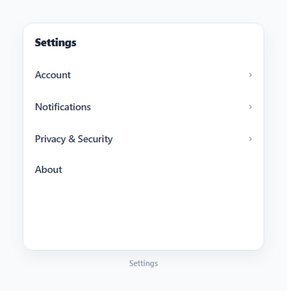
A drill-down navigation is the pattern behind the iOS Settings app and countless mobile-style preference screens: tapping a row slides in a deeper panel from the right, and a Back button at the top slides it back out, building up a stack of nested categories rather than expanding everything inline in a tree. This snippet implements the pattern as a genuine navigation stack in vanilla JavaScript — an array of panel names, push and pop operations, and CSS transforms that animate whichever panel just became active.
A plain array as the navigation stack
The entire navigation state is one array, stack, initialized to ['root']. goTo(name) pushes a new panel name onto the end; goBack() pops the last entry off. There is no router, no history API, and no framework state management involved — the current screen is always stack[stack.length - 1], and the full path the user took to get there is the array itself, which crumbTrail() joins into a breadcrumb string for display.
Three CSS states instead of one active flag
render() doesn't just show the current panel and hide everything else — it assigns one of three states to every panel element. The current panel gets .active (translateX(0), fully in view). Any panel still present somewhere earlier in stack gets .behind (translateX(-30%), partially visible off to the left, mimicking iOS's parallax-peek of the previous screen). Everything else keeps its default translateX(100%), parked off-screen to the right, ready to slide in when it's next pushed. This three-state system is what makes both forward and backward navigation feel directional rather than like a hard cut.
Delegated click handling for both actions
A single click listener on the #ddPanels container handles two different actions by checking what was actually clicked: e.target.closest('[data-back]') catches any Back button regardless of which panel it lives in, and e.target.closest('.dd-row') catches any navigable row, reading its target from a data-target attribute. Rows without a data-target (marked data-leaf="1" for clarity) are terminal settings items — clicking them does nothing in this demo, which is exactly where you'd hook in opening a detail screen, a modal, or a toggle.
Why this differs from an expand/collapse tree
A nested sidebar with active-path highlighting keeps the whole hierarchy visible at once and shows depth via indentation — appropriate for desktop, where screen space is abundant. Drill-down navigation instead shows exactly one level of the hierarchy at a time, at full width, which is the right trade-off on narrow viewports where indentation quickly runs out of room and a full list of every nested option would require constant scrolling.
Build with AI
Build, Understand, Optimize, and Extend It With AI
Paste this snippet's HTML, CSS, and JS into an AI coding assistant like Claude and ask it to explain exactly how the three-state CSS transform system (active, behind, default off-screen) produces a convincing forward-and-backward slide animation from nothing but a plain array stack. It's also a strong candidate for extension — ask the assistant to sync the stack with the browser's History API so the back button and page reloads respect the current drill-down depth, add swipe-to-go-back gesture support on touch devices, or add a search box at the root level that flattens all nested settings into a filterable list.
Prompt to recreate it
Copy this into your AI assistant of choice to build the effect from scratch, or as a jumping-off point for your own variant:
Build a drill-down settings navigation menu in plain HTML, CSS, and JavaScript, in the style of the iOS Settings app — no libraries, no router.

Requirements:
- A set of stacked panel elements, each representing one settings category, laid over each other inside a fixed-height container. Every panel except the root has a header containing a Back button and the panel's title.
- Model the current navigation state as a single array acting as a stack of panel identifiers, starting with just the root panel. Provide a function to push a new panel identifier onto the stack (drill deeper) and a function to pop the last one off (go back).
- Rows inside a panel that link to a deeper panel must carry a reference to that panel's identifier; clicking such a row pushes it onto the stack. Rows with no such reference are terminal settings items and should do nothing by default when clicked.
- On every stack change, update each panel's visual state based on its position relative to the stack: the panel matching the top of the stack must be fully visible via a slide-in transform, any panel still present earlier in the stack must be partially visible off to one side (to visually hint at the previous screen), and every other panel must sit fully off-screen, ready to slide in later.
- Clicking a Back button in any panel's header must pop the stack by one level and animate back to the previous panel.
- Use a single delegated click listener on the shared container to handle both Back button clicks and forward-navigation row clicks, rather than attaching separate listeners to every individual row.
- Display a live breadcrumb trail beneath the panel container showing the title of every panel currently in the stack, from root to the current screen.
Want to tighten it up first? Run this prompt through the AI Prompt Studio to score it across 8 quality dimensions, catch anti-patterns, and tune the wording for Claude, ChatGPT, or Gemini before you paste it in.
Step by step
How to Use
- 1Click any row with a chevronRows with a data-target attribute call goTo(name), pushing that panel onto the stack and sliding it in from the right.
- 2Click Back to go up one levelThe Back button in each panel header calls goBack(), popping the stack and sliding the previous panel back into view.
- 3Watch the breadcrumb trail updateThe line beneath the panel container shows crumbTrail() — every panel title currently in the stack, joined with a small arrow.
- 4Add a new nested panelAdd a new .dd-panel element with a unique data-panel name, then add a row anywhere with a matching data-target to link into it.
- 5Wire up leaf rowsRows marked data-leaf="1" have no data-target and do nothing on click by default — attach your own click handling for opening a modal, toggling a setting, or navigating to a full page.
- 6Adjust the animation feelChange the 0.28s duration or the -30% "behind" offset in the CSS panel to make the slide faster or show more or less of the previous screen.
Real-world uses
Common Use Cases
Got questions?
Frequently Asked Questions
The entire navigation state is one plain array called stack. The current screen is always stack[stack.length - 1]. goTo(name) pushes a new panel name onto it; goBack() pops the last one off. There is no separate index variable or router involved.
render() assigns .active to the current top-of-stack panel (fully visible), .behind to any panel still present earlier in the stack (partially visible via a -30% translateX, mimicking the iOS peek-of-previous-screen effect), and leaves every other panel at its default off-screen-right position, ready to slide in next. This three-state system is what makes forward and backward navigation both feel directional.
Add a new element with class dd-panel and a unique data-panel attribute (matching the target name), including a .dd-panel-header with a Back button and a title. Then add a row anywhere else in the markup with a data-target attribute matching that same panel name.
A row with a data-target attribute calls goTo() when clicked, pushing a new panel onto the stack. A row marked data-leaf="1" has no data-target and does nothing by default in this demo — it represents a terminal setting like a toggle or a text field, where you would attach your own click handling instead of further navigation.
No, this demo keeps navigation state entirely in the in-memory stack array with no URL or history integration. To support the browser back button or deep-linking, you would push a history.pushState() entry alongside each goTo() call and read the current panel from the URL on popstate.
Yes. Keep the stack array in component state (or a simple store), derive the current panel from its last element, and render each panel's CSS class (active/behind/default) based on its position relative to the stack, exactly as render() does here — the push/pop logic itself needs no changes.