Source Code
<section class="hero">
<div class="card">
<div class="status-dot"></div>
<div class="av-wrap">
<div class="av">PS</div>
<span class="av-badge">✦ Open to work</span>
</div>
<h1 class="name">Puneet Sharma</h1>
<p class="role">Full-Stack Developer & UI Designer</p>
<p class="bio">I build fast, accessible web products — from design system tokens to production APIs. Currently based in London, UK. Available for freelance and full-time roles.</p>
<div class="tags">
<span class="tag">React</span>
<span class="tag">Next.js</span>
<span class="tag">TypeScript</span>
<span class="tag">Node.js</span>
<span class="tag">Figma</span>
</div>
<div class="stats-row">
<div class="stat"><strong>6+</strong> Years exp.</div>
<div class="stat-div"></div>
<div class="stat"><strong>40+</strong> Projects</div>
<div class="stat-div"></div>
<div class="stat"><strong>12</strong> Happy clients</div>
</div>
<div class="cta-row">
<a href="#" class="btn-primary">View my work</a>
<a href="#" class="btn-secondary">Download CV</a>
</div>
<div class="social-row">
<!-- GitHub -->
<a href="#" class="soc" aria-label="GitHub">
<svg width="18" height="18" viewBox="0 0 24 24" fill="currentColor"><path d="M12 2C6.477 2 2 6.484 2 12.017c0 4.425 2.865 8.18 6.839 9.504.5.092.682-.217.682-.483 0-.237-.008-.868-.013-1.703-2.782.605-3.369-1.343-3.369-1.343-.454-1.158-1.11-1.466-1.11-1.466-.908-.62.069-.608.069-.608 1.003.07 1.531 1.032 1.531 1.032.892 1.53 2.341 1.088 2.91.832.092-.647.35-1.088.636-1.338-2.22-.253-4.555-1.113-4.555-4.951 0-1.093.39-1.988 1.029-2.688-.103-.253-.446-1.272.098-2.65 0 0 .84-.27 2.75 1.026A9.564 9.564 0 0 1 12 6.844a9.59 9.59 0 0 1 2.504.337c1.909-1.296 2.747-1.027 2.747-1.027.546 1.379.202 2.398.1 2.651.64.7 1.028 1.595 1.028 2.688 0 3.848-2.339 4.695-4.566 4.943.359.309.678.92.678 1.855 0 1.338-.012 2.419-.012 2.747 0 .268.18.58.688.482A10.02 10.02 0 0 0 22 12.017C22 6.484 17.522 2 12 2z"/></svg>
</a>
<!-- LinkedIn -->
<a href="#" class="soc" aria-label="LinkedIn">
<svg width="18" height="18" viewBox="0 0 24 24" fill="currentColor"><path d="M20.447 20.452h-3.554v-5.569c0-1.328-.027-3.037-1.852-3.037-1.853 0-2.136 1.445-2.136 2.939v5.667H9.351V9h3.414v1.561h.046c.477-.9 1.637-1.85 3.37-1.85 3.601 0 4.267 2.37 4.267 5.455v6.286zM5.337 7.433a2.062 2.062 0 0 1-2.063-2.065 2.064 2.064 0 1 1 2.063 2.065zm1.782 13.019H3.555V9h3.564v11.452zM22.225 0H1.771C.792 0 0 .774 0 1.729v20.542C0 23.227.792 24 1.771 24h20.451C23.2 24 24 23.227 24 22.271V1.729C24 .774 23.2 0 22.222 0h.003z"/></svg>
</a>
<!-- X / Twitter -->
<a href="#" class="soc" aria-label="X (Twitter)">
<svg width="18" height="18" viewBox="0 0 24 24" fill="currentColor"><path d="M18.244 2.25h3.308l-7.227 8.26 8.502 11.24H16.17l-4.714-6.231-5.401 6.231H2.744l7.73-8.835L1.254 2.25H8.08l4.253 5.622 5.911-5.622zm-1.161 17.52h1.833L7.084 4.126H5.117z"/></svg>
</a>
<!-- Dribbble -->
<a href="#" class="soc" aria-label="Dribbble">
<svg width="18" height="18" viewBox="0 0 24 24" fill="currentColor"><path d="M12 2C6.48 2 2 6.48 2 12s4.48 10 10 10 10-4.48 10-10S17.52 2 12 2zm6.605 4.61a8.502 8.502 0 0 1 1.93 5.314c-.281-.054-3.101-.629-5.943-.271-.065-.141-.12-.293-.184-.445a25.416 25.416 0 0 0-.564-1.236c3.145-1.28 4.577-3.124 4.761-3.362zM12 3.475c2.17 0 4.154.813 5.662 2.148-.152.216-1.443 1.941-4.48 3.08-1.399-2.57-2.95-4.675-3.189-5A8.687 8.687 0 0 1 12 3.475zm-3.633.803a53.896 53.896 0 0 1 3.167 4.935c-3.992 1.063-7.517 1.04-7.896 1.04a8.581 8.581 0 0 1 4.729-5.975zM3.453 12.01v-.26c.37.01 4.512.065 8.775-1.215.25.477.477.965.694 1.453-.109.033-.228.065-.336.098-4.404 1.42-6.747 5.303-6.942 5.629a8.522 8.522 0 0 1-2.19-5.705zM12 20.547a8.482 8.482 0 0 1-5.239-1.8c.152-.315 1.888-3.656 6.703-5.337.022-.01.033-.01.054-.022a35.318 35.318 0 0 1 1.823 6.475 8.4 8.4 0 0 1-3.341.684zm4.761-1.465c-.086-.52-.542-3.015-1.659-6.084 2.679-.423 5.022.271 5.314.369a8.468 8.468 0 0 1-3.655 5.715z"/></svg>
</a>
</div>
</div>
</section>* { box-sizing: border-box; margin: 0; padding: 0; }
body { font-family: system-ui, sans-serif; background: linear-gradient(135deg, #f8fafc 0%, #f0f4ff 100%); min-height: 100vh; display: flex; align-items: center; justify-content: center; padding: 32px 20px; }
.hero { width: 100%; max-width: 520px; }
.card { background: #fff; border-radius: 24px; padding: 40px 36px; box-shadow: 0 4px 40px rgba(0,0,0,0.08); border: 1px solid rgba(99,102,241,0.08); position: relative; display: flex; flex-direction: column; align-items: center; text-align: center; gap: 20px; }
.status-dot { position: absolute; top: 20px; right: 20px; width: 10px; height: 10px; border-radius: 50%; background: #22c55e; box-shadow: 0 0 0 3px rgba(34,197,94,0.2); animation: blink 2.5s ease infinite; }
@keyframes blink { 0%,100%{opacity:1} 50%{opacity:0.4} }
.av-wrap { display: flex; flex-direction: column; align-items: center; gap: 10px; }
.av { width: 88px; height: 88px; border-radius: 50%; background: linear-gradient(135deg, #6366f1, #a78bfa); color: #fff; font-size: 24px; font-weight: 800; display: flex; align-items: center; justify-content: center; box-shadow: 0 8px 24px rgba(99,102,241,0.3); }
.av-badge { background: rgba(34,197,94,0.1); color: #16a34a; font-size: 11px; font-weight: 700; padding: 4px 12px; border-radius: 20px; border: 1px solid rgba(34,197,94,0.2); }
.name { font-size: 26px; font-weight: 900; color: #0f172a; letter-spacing: -0.4px; }
.role { font-size: 14px; color: #6366f1; font-weight: 600; margin-top: -12px; }
.bio { font-size: 13px; color: #64748b; line-height: 1.75; max-width: 380px; }
.tags { display: flex; flex-wrap: wrap; gap: 8px; justify-content: center; }
.tag { background: #f1f5f9; color: #475569; font-size: 12px; font-weight: 600; padding: 5px 12px; border-radius: 8px; }
.stats-row { display: flex; align-items: center; gap: 16px; }
.stat { font-size: 13px; color: #64748b; }
.stat strong { color: #0f172a; font-size: 18px; display: block; }
.stat-div { width: 1px; height: 28px; background: #e2e8f0; }
.cta-row { display: flex; gap: 10px; width: 100%; }
.btn-primary { flex: 1; background: #6366f1; color: #fff; font-size: 14px; font-weight: 700; padding: 12px; border-radius: 10px; text-decoration: none; text-align: center; transition: background 0.15s; }
.btn-primary:hover { background: #4f46e5; }
.btn-secondary { flex: 1; background: #f8fafc; color: #475569; font-size: 14px; font-weight: 600; padding: 12px; border-radius: 10px; text-decoration: none; text-align: center; border: 1.5px solid #e2e8f0; transition: border-color 0.15s; }
.btn-secondary:hover { border-color: #6366f1; color: #6366f1; }
.social-row { display: flex; gap: 10px; }
.soc { display: flex; align-items: center; justify-content: center; width: 40px; height: 40px; border-radius: 10px; background: #f1f5f9; color: #475569; text-decoration: none; transition: background 0.15s, color 0.15s; }
.soc:hover { background: #6366f1; color: #fff; }Learn Coding Visually
Learn to code with interactive, live-preview playgrounds — HTML, CSS, JavaScript, React & more.
 HTML Playground42 lessons · Click-based · Live preview
 CSS PlaygroundLearn CSS with a live editor
 JavaScript Playground60 lessons · DOM · Async · Canvas
 React PlaygroundLearn React with a live code editor
 GSAP PlaygroundLearn GSAP animation interactively
 SVG Playground44 lessons · shapes · paths · animation
 SCSS Playground45 lessons · Sass modules · tokens
 Tailwind PlaygroundLearn Tailwind CSS with a live editor
 Bootstrap 5 Playground50 lessons · live preview
Portfolio Hero — Free HTML CSS Developer Snippet
Portfolio Hero · Heroes · Plain HTML & CSS · Live preview
What's included
Features
About this UI Snippet
Portfolio Hero — Personal Branding Card with Avatar, Open-to-Work Badge, Skills & Social Links
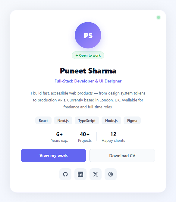
If you are building a personal portfolio site or developer profile page and need an above-the-fold hero that communicates your identity, skills, and availability quickly, this snippet gives you a complete card-style personal hero: gradient avatar with initials, open-to-work status badge, name, role title, bio paragraph, skill tags, experience stats, dual CTA buttons, and four social media icon links — all in a centred card layout with no JavaScript required.
The status indicator system
A pulsing green dot in the top-right corner of the card signals current availability — a pattern borrowed from messaging apps (Discord, Slack). The .status-dot uses box-shadow: 0 0 0 3px rgba(34,197,94,0.2) for the glow ring, and a blink keyframe animates opacity between 1 and 0.4. The "✦ Open to work" badge below the avatar reinforces this with a green tinted pill — providing two availability signals at different visual weights.
The gradient avatar
The avatar uses gradient initials — the same pattern as the Profile Card snippet but at a larger size (88px) for a hero context. The gradient (indigo → purple) plus box-shadow: 0 8px 24px rgba(99,102,241,0.3) gives it lift and visual weight as the primary focal point. Replace with an img element for a real photo.
Skill tags and stats
The .tags flex row wraps skill labels in muted grey chips — easy to scan and update. The .stats-row shows years of experience, project count, and client count in a horizontal strip separated by 1px dividers. Both sections communicate professional depth at a glance before the visitor reads the bio.
Social icon links
Four social platform icons (GitHub, LinkedIn, X/Twitter, Dribbble) use inline SVG paths — no icon library. Each .soc link is a 40px square with a border-radius, a neutral grey default state, and a brand-coloured hover state (indigo fill, white icon). ARIA labels make them accessible to screen readers.
Customising for your profile
Change the avatar initials and gradient. Update name, role, bio, and skill tags. Update the stats numbers. Wire the CTA buttons to your portfolio page and CV file. Set the social link href values to your actual profile URLs.
Deploying as a personal domain page
Publish the portfolio hero as a standalone page at your-name.dev or via GitHub Pages (place the HTML export in a docs/ folder of a public repo and enable Pages in settings). Link the page from your LinkedIn profile URL, GitHub profile README, and email signature. For a full portfolio site, nest this hero above a Projects section (CSS Grid Cards) and a Contact section with a contact form.
Build with AI
Build, Understand, Optimize, and Extend It With AI
You don't have to figure out every visual layering decision by staring at the CSS. Paste this snippet's HTML, CSS, and JS into an AI coding assistant like Claude and ask it to explain exactly how the status-dot's box-shadow glow ring combines with the blink keyframe's opacity animation to read as a live availability indicator, and why the component ships with zero JavaScript despite looking dynamic. The same assistant can help you optimize it, for example checking whether the gradient avatar and box-shadow values render consistently across browsers, or whether the four inline SVG social icons could be deduplicated into a single reusable icon component if you convert this to a framework. It's also useful for extending the effect: ask it to swap the initials avatar for a real photo with a graceful fallback to initials if the image fails to load, add a copy-to-clipboard email button, or make the availability status (green/amber/red) driven by a single JavaScript variable instead of manually edited CSS. Treat the code less like a finished artifact and more like a starting point for a conversation.
Prompt to recreate it
Copy this into your AI assistant of choice to build the effect from scratch, or as a jumping-off point for your own variant:
Build a personal portfolio hero card in plain HTML and CSS only, with no JavaScript required for the base version.

Requirements:
- A centered card containing: a small pulsing status dot in the corner signaling live availability, a circular gradient avatar showing initials (sized to be the clear focal point), an "open to work" badge pill below the avatar, a name, a role/title line, and a short 2-3 sentence bio paragraph.
- The pulsing status dot must combine a colored box-shadow glow ring around it with a CSS keyframe animation that cycles its opacity between fully visible and partially faded, looping indefinitely, so it reads as "live" rather than static.
- A row of skill/technology tag chips that wraps naturally on narrow screens, followed by a stats row (for example years of experience, project count, client count) with thin vertical divider lines between each stat.
- Two call-to-action buttons side by side — one filled/solid as the primary action and one outlined/secondary — and below them a row of at least four social platform icon links, each built from an inline SVG path (not an icon font or image), with a neutral default color that switches to a solid brand-accent background and white icon color on hover.
- Make sure the entire component degrades gracefully with zero JavaScript: all interactive-looking states (hover colors, the pulse animation) must be achievable through CSS alone, and the avatar element should be structured so it could be swapped for a real img element with object-fit: cover without changing any of the surrounding sizing or shadow CSS.
Want to tighten it up first? Run this prompt through the AI Prompt Studio to score it across 8 quality dimensions, catch anti-patterns, and tune the wording for Claude, ChatGPT, or Gemini before you paste it in.
Step by step
How to Use
- 1Update your name, role, and bioIn the HTML panel, edit the .name h1, .role paragraph, and .bio paragraph. Keep the bio to 2–3 sentences — enough to communicate who you are and what you do, short enough to read in 5 seconds.
- 2Add your actual avatar photoReplace the .av div with <img class="av" src="photo.jpg" alt="Your Name" style="object-fit:cover"> and add object-fit: cover to the .av CSS rule. The existing border-radius, size, and box-shadow apply automatically to the img element.
- 3Update skill tags and statsIn the HTML, edit the .tag span elements to list your actual tech stack. Update the three .stat elements with your real years of experience, project count, and client count.
- 4Wire the CTA buttons and social linksSet href="#" on .btn-primary to your portfolio or projects page URL. Set .btn-secondary href to your CV file (hosted on Google Drive, Dropbox, or your own server). Update all four .soc anchor href values to your actual social profile URLs.
- 5Change the availability statusIf you are not currently available, remove the .av-badge "Open to work" element and change the .status-dot background to #f59e0b (yellow for "busy") or #ef4444 (red for "not available"). Update the blink keyframe opacity values to match.
- 6Export in your formatClick "HTML" for a standalone file to paste into your portfolio site, "JSX" for a React component, or "Tailwind" for a Tailwind CSS version.
Real-world uses
Common Use Cases
Got questions?
Frequently Asked Questions
Replace the .av div element with an img tag: <img class="av" src="your-photo.jpg" alt="Your Name" />. In the CSS, add object-fit: cover to the .av rule so the photo fills the circle without distortion. The existing width: 88px, height: 88px, border-radius: 50%, and box-shadow apply automatically to the img element. For best results, use a square photo (1:1 ratio) at at least 176×176px (2× for Retina screens).
Duplicate a .soc anchor element in the social-row div. Find the SVG icon for your platform (SVG Repo, Heroicons, or the platform's own brand kit). Paste the SVG path inside a 24-viewBox SVG tag with fill="currentColor". Adjust the width and height attributes on the SVG to 18px. The hover style (background: #6366f1, color: #fff) applies automatically from the .soc:hover rule.
Find #6366f1 in the CSS panel and replace all instances with your brand hex. This updates the avatar gradient, the role text colour, the primary CTA button, and the social icon hover state simultaneously. For the avatar, also update the second gradient colour (#a78bfa). For the box-shadow, update the rgba() values to match your new hex (use an online hex-to-rgba converter for the glow colour).
Yes. Click "JSX" to download a React component. Since this snippet uses no JavaScript, no useState or useEffect is needed — it can be a pure Server Component in Next.js App Router (no "use client" directive). Export it as the default function from app/page.tsx for a single-page portfolio site. For a multi-page site, use it as the first section in app/page.tsx above a projects section and a contact section.