Circular Step Indicator — Free HTML CSS JS Snippet

Circular Step Indicator · Navigation · Plain HTML, CSS & JS · Live preview

Share & Support

What's included

Features

SVG stroke-dashoffset rings
Each step circle uses an SVG <circle> with animated stroke-dashoffset driven by CSS transitions — no canvas, no icon font, pure SVG math.
Three visual states
Inactive (grey, empty ring), active (indigo, 75% ring), and done (green, full ring + check icon) — each with distinct colour and icon transitions.
Animated check-mark crossfade
The step number and check icon share the same circle space. On completion, the number fades out while the SVG polyline check scales in via a compound CSS transition.
Colour-coded connector lines
Connector divs between steps change from grey to indigo with a background CSS transition as steps complete, giving a visual trail of progress.
Animated panel transitions
Each content panel enters with a fadeUp keyframe animation (opacity + translateY), creating a smooth forward-motion feel as users progress.
Back and Next navigation
The Back button is disabled on step 1 and re-enables once you advance. The Next button transforms into "Finish" on the last step.
Zero dependencies
Pure HTML, CSS, and vanilla JS — no React, no Vue, no animation library. The complete ring math is a single formula: C * (1 - fraction).
Accessible markup
Steps use data attributes for state; panels are plain divs. Extend with aria-current="step" on the active step and role="tabpanel" on panels for full ARIA support.

About this UI Snippet

Circular Step Indicator — SVG Ring Progress, Animated Connectors & Multi-Step Wizard in Vanilla JS
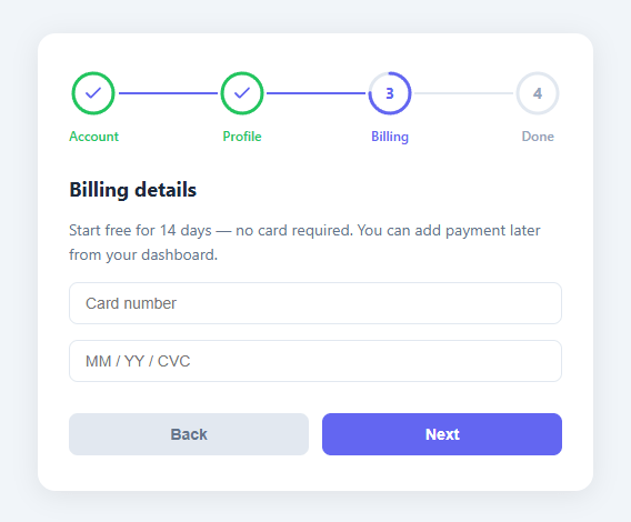
Screenshot of the Circular Step Indicator snippet rendered live

A multi-step wizard tells users exactly where they are in a process, how far they've come, and what remains — reducing drop-offs on long registration, checkout, and onboarding flows by giving a visual contract up front. This snippet delivers a polished four-step wizard with circular SVG ring progress indicators, animated fill arcs, check-mark transitions, colour-coded connector lines, and a slide-in panel system — all in plain HTML, CSS, and vanilla JavaScript with zero dependencies.

A multi-step wizard is one of the highest-value UI components in any product that involves user data entry. When users can see that they're on step 2 of 4, completion rates measurably increase compared to a single long form — the progress indicator converts an open-ended task into a finite sequence. This snippet delivers a polished four-step wizard with circular SVG ring progress indicators, animated stroke arcs, check-mark reveal transitions, colour-changing connector lines between steps, content panel switching, and Back/Next navigation — all built in plain HTML, CSS, and vanilla JavaScript with zero dependencies.

SVG stroke-dasharray / stroke-dashoffset animation technique

The ring around each step number is a <circle> element inside an SVG. The circle has stroke-dasharray: 113 — that's the circumference of the circle (2π × r = 2π × 18 ≈ 113.1 px). By animating stroke-dashoffset from 113 (fully hidden) toward 0 (fully drawn), CSS creates the impression of a stroke drawing itself around the circle. The inactive state uses an offset of 113 (no stroke visible), the active state uses ~28 (showing ~75% of the ring), and the completed state uses 0 (full ring). A single CSS transition: stroke-dashoffset 0.5s ease animates between all three states smoothly whenever a class changes. The SVG is rotated −90° with CSS so the stroke begins at 12 o'clock rather than the default 3 o'clock position.

Check-icon reveal and state layering

Each step circle contains two overlapping elements: a <span class="step-num"> showing the number, and a hidden check SVG. When a step gains the done class, the number fades out (opacity:0) while the check icon scales from 0.6 to 1 and fades in — a compound transform + opacity transition. Both elements are absolutely positioned inside the circle wrapper so they occupy the same space; CSS transition handles the crossfade without any JavaScript timing code. The check icon uses a <polyline points="20 6 9 17 4 12"> path which draws the classic "√" tick.

Connector line state

The horizontal lines between step circles are simple <div class="connector"> elements. In the CSS they are flex:1 — they stretch to fill the gap between circles. Their background colour transitions between #e2e8f0 (grey, incomplete) and #6366f1 (indigo, complete) as steps are completed. The render() function applies done to each connector at index i when i + 1 < current, meaning connector 0 (between steps 1 and 2) turns indigo once step 2 is current.

Panel switching with CSS animation

Content panels are display:none by default and switch to display:flex when the active class is applied. A @keyframes fadeUp animation (opacity 0→1, translateY 8px→0) plays on each newly active panel, giving the wizard a light upward wipe between steps. Because the animation is applied via the class name and the panel switches to display:flex simultaneously, no JavaScript timeout or requestAnimationFrame trick is needed.

Customising for real forms

Swap the placeholder <input> fields for your actual form fields. For validation, check field values inside the btnNext click handler before incrementing current — return early and highlight invalid fields if needed. The step labels ("Account", "Profile", "Billing", "Done") are plain text nodes in the HTML; change them to match your wizard's stages. To add more steps, duplicate a .step, a .connector, and a .panel, increment TOTAL, and the ring math handles the rest. Pair with a vertical timeline for a history view after the wizard completes.

Step by step

How to Use

  1. 1
    Load the snippetPaste the HTML, CSS, and JS into your page. The wizard renders with step 1 active, showing a 75% arc ring around the number 1 and the Account panel.
  2. 2
    Click Next to advanceThe current step's ring completes to a full green circle with a check icon, the connector line turns indigo, and step 2 activates with the Profile panel fading up.
  3. 3
    Continue through all stepsEach completed step shows a full green ring and check mark. The connector between completed steps is indigo; future steps remain grey.
  4. 4
    Use Back to returnBack reverses the animation — the last completed step loses its check icon and returns to the active ring state, the connector reverts to grey.
  5. 5
    Finish on step 4The Next button reads "Finish" on the last step. On click, a success alert fires and the wizard resets to step 1 — ready for another submission in demos.
  6. 6
    Customise labels and stepsEdit the .step-label text in HTML and <h2> headings in each panel. Add validation inside the btnNext handler before incrementing current.

Real-world uses

Common Use Cases

User registration wizards
Break a lengthy sign-up form into Account, Profile, Preferences, and Done steps so users see progress instead of a wall of fields. Combine with a stepper for linear form flows.
Checkout flows
Guide shoppers through Cart → Shipping → Payment → Confirmation with visual progress rings that reduce checkout abandonment. Pair with a pricing toggle on the payment step.
Onboarding tours
Walk new users through setup tasks with a visual step counter. For an overlay version that highlights UI elements, see the onboarding tour snippet.
Multi-page surveys
Show respondents how many sections remain in a long survey, reducing abandonment. Each section maps to one step with a custom label.
Installation wizards
Guide users through software or service setup steps (Connect, Configure, Test, Launch) with clear visual confirmation as each stage completes.
Project setup flows
SaaS products can use the wizard for workspace creation — name your workspace, invite teammates, choose a plan, go live. Each ring completion reinforces progress.

Got questions?

Frequently Asked Questions

Duplicate a .step div, a .connector div, and a .panel div in the HTML, then increment TOTAL in the JS. The ring math derives from TOTAL automatically — no further changes needed.

Yes. In the btnNext click handler, add a guard before current++: check your fields, add an error class if invalid, and return early. Only call current++; render() once validation passes.

The active state sets stroke-dashoffset to 28 (≈75% filled). Change this in the setRingProgress call for the active step: e.g., setRingProgress(ring, 0.5) for 50%. The fraction argument maps directly to the visible arc percentage.

Yes. Use the JSX, Vue, Angular, or Tailwind export buttons on this page. In React, keep currentStep in useState and derive each step's state (inactive/active/done) during render. Move the ring fraction math into a helper function and pass the result as an inline SVG style prop — the CSS transition animates the change automatically. In Vue, use computed properties for step states; in Angular, use a @Pipe or template expression.

conic-gradient produces sharp edges and cannot be animated with CSS transitions in most browsers. SVG stroke-dashoffset animates natively with transition and produces smooth anti-aliased arcs at any size. It's also easier to control the start angle (rotate the SVG −90°) and stroke cap style (stroke-linecap: round).

Circular Step Indicator — Export as HTML, React, Vue, Angular & Tailwind

HTML
<!DOCTYPE html>
<html lang="en">
<head>
  <meta charset="UTF-8" />
  <meta name="viewport" content="width=device-width, initial-scale=1.0" />
  <title>Circular Step Indicator</title>
  <style>
    *,*::before,*::after{box-sizing:border-box;margin:0;padding:0}
    body{font-family:system-ui,sans-serif;background:#f1f5f9;display:flex;align-items:center;justify-content:center;min-height:100vh;padding:24px}
    .wizard{background:#fff;border-radius:16px;box-shadow:0 4px 24px rgba(0,0,0,.08);width:100%;max-width:500px;padding:32px 28px;display:flex;flex-direction:column;gap:28px}
    /* track */
    .steps-track{display:flex;align-items:flex-start;justify-content:center;gap:0}
    .step{display:flex;flex-direction:column;align-items:center;gap:8px;position:relative;z-index:1}
    .connector{flex:1;height:2px;background:#e2e8f0;margin-top:21px;transition:background .4s}
    .connector.done{background:#6366f1}
    /* ring */
    .circle-wrap{position:relative;width:44px;height:44px;cursor:default}
    .ring{width:44px;height:44px;transform:rotate(-90deg)}
    .ring-bg{fill:none;stroke:#e2e8f0;stroke-width:3}
    .ring-fill{fill:none;stroke:#6366f1;stroke-width:3;stroke-linecap:round;
      stroke-dasharray:113;stroke-dashoffset:113;transition:stroke-dashoffset .5s ease}
    .step-num{position:absolute;inset:0;display:flex;align-items:center;justify-content:center;font-size:14px;font-weight:700;color:#94a3b8;transition:color .3s}
    .check-icon{position:absolute;inset:0;margin:auto;width:18px;height:18px;color:#6366f1;opacity:0;transform:scale(.6);transition:opacity .25s,transform .25s}
    .step-label{font-size:12px;font-weight:500;color:#94a3b8;transition:color .3s;white-space:nowrap}
    /* active */
    .step.active .ring-fill{stroke-dashoffset:28}
    .step.active .step-num{color:#6366f1}
    .step.active .step-label{color:#6366f1}
    /* done */
    .step.done .ring-fill{stroke-dashoffset:0}
    .step.done .step-num{opacity:0}
    .step.done .check-icon{opacity:1;transform:scale(1)}
    .step.done .step-label{color:#22c55e}
    .step.done .ring-fill{stroke:#22c55e}
    /* panel */
    .panel-wrap{position:relative;overflow:hidden;min-height:140px}
    .panel{display:none;flex-direction:column;gap:14px;animation:fadeUp .3s ease}
    .panel.active{display:flex}
    .panel h2{font-size:18px;font-weight:700;color:#1e293b}
    .panel p{font-size:14px;color:#64748b;line-height:1.6}
    .field{width:100%;padding:10px 14px;border:1.5px solid #e2e8f0;border-radius:8px;font-size:14px;outline:none;transition:border-color .2s}
    .field:focus{border-color:#6366f1}
    /* actions */
    .actions{display:flex;justify-content:space-between;gap:12px}
    .btn{flex:1;padding:11px 20px;border:none;border-radius:8px;font-size:14px;font-weight:600;cursor:pointer;transition:background .2s,opacity .2s}
    .btn-back{background:#f1f5f9;color:#64748b}
    .btn-back:hover:not(:disabled){background:#e2e8f0}
    .btn-back:disabled{opacity:.4;cursor:default}
    .btn-next{background:#6366f1;color:#fff}
    .btn-next:hover{background:#4f46e5}
    @keyframes fadeUp{from{opacity:0;transform:translateY(8px)}to{opacity:1;transform:translateY(0)}}
  </style>
</head>
<body>
  <div class="wizard">
    <div class="steps-track" id="steps-track">
      <div class="step active" data-step="1">
        <div class="circle-wrap">
          <svg class="ring" viewBox="0 0 44 44">
            <circle class="ring-bg" cx="22" cy="22" r="18"/>
            <circle class="ring-fill" cx="22" cy="22" r="18" id="ring-1"/>
          </svg>
          <span class="step-num">1</span>
          <svg class="check-icon" viewBox="0 0 24 24" fill="none" stroke="currentColor" stroke-width="2.5" stroke-linecap="round" stroke-linejoin="round"><polyline points="20 6 9 17 4 12"/></svg>
        </div>
        <span class="step-label">Account</span>
      </div>
      <div class="connector" id="conn-1-2"></div>
      <div class="step" data-step="2">
        <div class="circle-wrap">
          <svg class="ring" viewBox="0 0 44 44">
            <circle class="ring-bg" cx="22" cy="22" r="18"/>
            <circle class="ring-fill" cx="22" cy="22" r="18" id="ring-2"/>
          </svg>
          <span class="step-num">2</span>
          <svg class="check-icon" viewBox="0 0 24 24" fill="none" stroke="currentColor" stroke-width="2.5" stroke-linecap="round" stroke-linejoin="round"><polyline points="20 6 9 17 4 12"/></svg>
        </div>
        <span class="step-label">Profile</span>
      </div>
      <div class="connector" id="conn-2-3"></div>
      <div class="step" data-step="3">
        <div class="circle-wrap">
          <svg class="ring" viewBox="0 0 44 44">
            <circle class="ring-bg" cx="22" cy="22" r="18"/>
            <circle class="ring-fill" cx="22" cy="22" r="18" id="ring-3"/>
          </svg>
          <span class="step-num">3</span>
          <svg class="check-icon" viewBox="0 0 24 24" fill="none" stroke="currentColor" stroke-width="2.5" stroke-linecap="round" stroke-linejoin="round"><polyline points="20 6 9 17 4 12"/></svg>
        </div>
        <span class="step-label">Billing</span>
      </div>
      <div class="connector" id="conn-3-4"></div>
      <div class="step" data-step="4">
        <div class="circle-wrap">
          <svg class="ring" viewBox="0 0 44 44">
            <circle class="ring-bg" cx="22" cy="22" r="18"/>
            <circle class="ring-fill" cx="22" cy="22" r="18" id="ring-4"/>
          </svg>
          <span class="step-num">4</span>
          <svg class="check-icon" viewBox="0 0 24 24" fill="none" stroke="currentColor" stroke-width="2.5" stroke-linecap="round" stroke-linejoin="round"><polyline points="20 6 9 17 4 12"/></svg>
        </div>
        <span class="step-label">Done</span>
      </div>
    </div>
    <div class="panel-wrap">
      <div class="panel active" id="panel-1">
        <h2>Create your account</h2>
        <p>Enter a username and password to get started. We never share your details with third parties.</p>
        <input class="field" type="text" placeholder="Username" />
        <input class="field" type="password" placeholder="Password" />
      </div>
      <div class="panel" id="panel-2">
        <h2>Set up your profile</h2>
        <p>Add a display name and avatar URL so others can recognise you in shared workspaces.</p>
        <input class="field" type="text" placeholder="Display name" />
        <input class="field" type="url" placeholder="Avatar URL (optional)" />
      </div>
      <div class="panel" id="panel-3">
        <h2>Billing details</h2>
        <p>Start free for 14 days — no card required. You can add payment later from your dashboard.</p>
        <input class="field" type="text" placeholder="Card number" />
        <input class="field" type="text" placeholder="MM / YY / CVC" />
      </div>
      <div class="panel" id="panel-4">
        <h2>🎉 All set!</h2>
        <p>Your account has been created. Check your inbox for a confirmation email and then log in.</p>
      </div>
    </div>
    <div class="actions">
      <button class="btn btn-back" id="btn-back" disabled>Back</button>
      <button class="btn btn-next" id="btn-next">Next</button>
    </div>
  </div>
  <script>
    const TOTAL = 4;
    let current = 1;
    
    const stepEls = [...document.querySelectorAll('.step')];
    const panelEls = [...document.querySelectorAll('.panel')];
    const connEls = [...document.querySelectorAll('.connector')];
    const btnBack = document.getElementById('btn-back');
    const btnNext = document.getElementById('btn-next');
    
    // circumference = 2π×18 ≈ 113.1
    const C = 2 * Math.PI * 18;
    
    function setRingProgress(ringEl, fraction) {
      ringEl.style.strokeDashoffset = C * (1 - fraction);
    }
    
    function render() {
      stepEls.forEach((el, i) => {
        const n = i + 1;
        const ring = el.querySelector('.ring-fill');
        el.classList.toggle('active', n === current);
        el.classList.toggle('done', n < current);
        if (n < current) setRingProgress(ring, 1);
        else if (n === current) setRingProgress(ring, 0.75);
        else setRingProgress(ring, 0);
      });
      connEls.forEach((el, i) => el.classList.toggle('done', i + 1 < current));
      panelEls.forEach((el, i) => el.classList.toggle('active', i + 1 === current));
      btnBack.disabled = current === 1;
      btnNext.textContent = current === TOTAL ? 'Finish' : 'Next';
    }
    
    btnNext.addEventListener('click', () => {
      if (current < TOTAL) { current++; render(); }
      else { alert('Form submitted! 🎉'); current = 1; render(); }
    });
    btnBack.addEventListener('click', () => { if (current > 1) { current--; render(); } });
    
    render();
  </script>
</body>
</html>
Tailwind
<!DOCTYPE html>
<html lang="en">
<head>
  <meta charset="UTF-8" />
  <meta name="viewport" content="width=device-width, initial-scale=1.0" />
  <title>Circular Step Indicator</title>
  <!-- Tailwind CSS v3+ — arbitrary value classes (e.g. bg-[#0f172a]) are valid -->
  <script src="https://cdn.tailwindcss.com"></script>
  <style>
    @keyframes fadeUp{from{opacity:0;transform:translateY(8px)}to{opacity:1;transform:translateY(0)}}

    *,*::before,*::after {
      box-sizing:border-box;margin:0;padding:0
    }

    body {
      font-family:system-ui,sans-serif;background:#f1f5f9;display:flex;align-items:center;justify-content:center;min-height:100vh;padding:24px
    }

    .connector.done {
      background:#6366f1
    }

    .step.active .ring-fill {
      stroke-dashoffset:28
    }

    .step.active .step-num {
      color:#6366f1
    }

    .step.active .step-label {
      color:#6366f1
    }

    .step.done .ring-fill {
      stroke-dashoffset:0
    }

    .step.done .step-num {
      opacity:0
    }

    .step.done .check-icon {
      opacity:1;transform:scale(1)
    }

    .step.done .step-label {
      color:#22c55e
    }

    .step.done .ring-fill {
      stroke:#22c55e
    }

    .panel.active {
      display:flex
    }

    .panel h2 {
      font-size:18px;font-weight:700;color:#1e293b
    }

    .panel p {
      font-size:14px;color:#64748b;line-height:1.6
    }

    .btn-back {
      background:#f1f5f9;color:#64748b
    }

    .btn-back:hover:not(:disabled) {
      background:#e2e8f0
    }

    .btn-back:disabled {
      opacity:.4;cursor:default
    }

    .btn-next {
      background:#6366f1;color:#fff
    }

    .btn-next:hover {
      background:#4f46e5
    }
  </style>
</head>
<body>
  <div class="bg-[#fff] rounded-2xl shadow-[0_4px_24px_rgba(0,0,0,.08)] w-full max-w-[500px] py-8 px-7 flex flex-col gap-7">
    <div class="flex items-start justify-center gap-0" id="steps-track">
      <div class="step flex flex-col items-center gap-2 relative z-[1] active" data-step="1">
        <div class="relative w-11 h-11 cursor-default">
          <svg class="w-11 h-11 [transform:rotate(-90deg)]" viewBox="0 0 44 44">
            <circle class="fill-none stroke-[#e2e8f0] [stroke-width:3]" cx="22" cy="22" r="18"/>
            <circle class="ring-fill fill-none stroke-[#6366f1] [stroke-width:3] [stroke-linecap:round] [stroke-dasharray:113] [stroke-dashoffset:113] [transition:stroke-dashoffset_.5s_ease]" cx="22" cy="22" r="18" id="ring-1"/>
          </svg>
          <span class="step-num absolute inset-0 flex items-center justify-center text-sm font-bold text-[#94a3b8] [transition:color_.3s]">1</span>
          <svg class="check-icon absolute inset-0 m-auto w-[18px] h-[18px] text-[#6366f1] opacity-0 [transform:scale(.6)] [transition:opacity_.25s,transform_.25s]" viewBox="0 0 24 24" fill="none" stroke="currentColor" stroke-width="2.5" stroke-linecap="round" stroke-linejoin="round"><polyline points="20 6 9 17 4 12"/></svg>
        </div>
        <span class="step-label text-xs font-medium text-[#94a3b8] [transition:color_.3s] whitespace-nowrap">Account</span>
      </div>
      <div class="connector flex-1 h-0.5 bg-[#e2e8f0] mt-[21px] [transition:background_.4s]" id="conn-1-2"></div>
      <div class="step flex flex-col items-center gap-2 relative z-[1]" data-step="2">
        <div class="relative w-11 h-11 cursor-default">
          <svg class="w-11 h-11 [transform:rotate(-90deg)]" viewBox="0 0 44 44">
            <circle class="fill-none stroke-[#e2e8f0] [stroke-width:3]" cx="22" cy="22" r="18"/>
            <circle class="ring-fill fill-none stroke-[#6366f1] [stroke-width:3] [stroke-linecap:round] [stroke-dasharray:113] [stroke-dashoffset:113] [transition:stroke-dashoffset_.5s_ease]" cx="22" cy="22" r="18" id="ring-2"/>
          </svg>
          <span class="step-num absolute inset-0 flex items-center justify-center text-sm font-bold text-[#94a3b8] [transition:color_.3s]">2</span>
          <svg class="check-icon absolute inset-0 m-auto w-[18px] h-[18px] text-[#6366f1] opacity-0 [transform:scale(.6)] [transition:opacity_.25s,transform_.25s]" viewBox="0 0 24 24" fill="none" stroke="currentColor" stroke-width="2.5" stroke-linecap="round" stroke-linejoin="round"><polyline points="20 6 9 17 4 12"/></svg>
        </div>
        <span class="step-label text-xs font-medium text-[#94a3b8] [transition:color_.3s] whitespace-nowrap">Profile</span>
      </div>
      <div class="connector flex-1 h-0.5 bg-[#e2e8f0] mt-[21px] [transition:background_.4s]" id="conn-2-3"></div>
      <div class="step flex flex-col items-center gap-2 relative z-[1]" data-step="3">
        <div class="relative w-11 h-11 cursor-default">
          <svg class="w-11 h-11 [transform:rotate(-90deg)]" viewBox="0 0 44 44">
            <circle class="fill-none stroke-[#e2e8f0] [stroke-width:3]" cx="22" cy="22" r="18"/>
            <circle class="ring-fill fill-none stroke-[#6366f1] [stroke-width:3] [stroke-linecap:round] [stroke-dasharray:113] [stroke-dashoffset:113] [transition:stroke-dashoffset_.5s_ease]" cx="22" cy="22" r="18" id="ring-3"/>
          </svg>
          <span class="step-num absolute inset-0 flex items-center justify-center text-sm font-bold text-[#94a3b8] [transition:color_.3s]">3</span>
          <svg class="check-icon absolute inset-0 m-auto w-[18px] h-[18px] text-[#6366f1] opacity-0 [transform:scale(.6)] [transition:opacity_.25s,transform_.25s]" viewBox="0 0 24 24" fill="none" stroke="currentColor" stroke-width="2.5" stroke-linecap="round" stroke-linejoin="round"><polyline points="20 6 9 17 4 12"/></svg>
        </div>
        <span class="step-label text-xs font-medium text-[#94a3b8] [transition:color_.3s] whitespace-nowrap">Billing</span>
      </div>
      <div class="connector flex-1 h-0.5 bg-[#e2e8f0] mt-[21px] [transition:background_.4s]" id="conn-3-4"></div>
      <div class="step flex flex-col items-center gap-2 relative z-[1]" data-step="4">
        <div class="relative w-11 h-11 cursor-default">
          <svg class="w-11 h-11 [transform:rotate(-90deg)]" viewBox="0 0 44 44">
            <circle class="fill-none stroke-[#e2e8f0] [stroke-width:3]" cx="22" cy="22" r="18"/>
            <circle class="ring-fill fill-none stroke-[#6366f1] [stroke-width:3] [stroke-linecap:round] [stroke-dasharray:113] [stroke-dashoffset:113] [transition:stroke-dashoffset_.5s_ease]" cx="22" cy="22" r="18" id="ring-4"/>
          </svg>
          <span class="step-num absolute inset-0 flex items-center justify-center text-sm font-bold text-[#94a3b8] [transition:color_.3s]">4</span>
          <svg class="check-icon absolute inset-0 m-auto w-[18px] h-[18px] text-[#6366f1] opacity-0 [transform:scale(.6)] [transition:opacity_.25s,transform_.25s]" viewBox="0 0 24 24" fill="none" stroke="currentColor" stroke-width="2.5" stroke-linecap="round" stroke-linejoin="round"><polyline points="20 6 9 17 4 12"/></svg>
        </div>
        <span class="step-label text-xs font-medium text-[#94a3b8] [transition:color_.3s] whitespace-nowrap">Done</span>
      </div>
    </div>
    <div class="relative overflow-hidden min-h-[140px]">
      <div class="panel hidden flex-col gap-3.5 [animation:fadeUp_.3s_ease] active" id="panel-1">
        <h2>Create your account</h2>
        <p>Enter a username and password to get started. We never share your details with third parties.</p>
        <input class="w-full py-2.5 px-3.5 border rounded-lg text-sm outline-none [transition:border-color_.2s] focus:border-[#6366f1]" type="text" placeholder="Username" />
        <input class="w-full py-2.5 px-3.5 border rounded-lg text-sm outline-none [transition:border-color_.2s] focus:border-[#6366f1]" type="password" placeholder="Password" />
      </div>
      <div class="panel hidden flex-col gap-3.5 [animation:fadeUp_.3s_ease]" id="panel-2">
        <h2>Set up your profile</h2>
        <p>Add a display name and avatar URL so others can recognise you in shared workspaces.</p>
        <input class="w-full py-2.5 px-3.5 border rounded-lg text-sm outline-none [transition:border-color_.2s] focus:border-[#6366f1]" type="text" placeholder="Display name" />
        <input class="w-full py-2.5 px-3.5 border rounded-lg text-sm outline-none [transition:border-color_.2s] focus:border-[#6366f1]" type="url" placeholder="Avatar URL (optional)" />
      </div>
      <div class="panel hidden flex-col gap-3.5 [animation:fadeUp_.3s_ease]" id="panel-3">
        <h2>Billing details</h2>
        <p>Start free for 14 days — no card required. You can add payment later from your dashboard.</p>
        <input class="w-full py-2.5 px-3.5 border rounded-lg text-sm outline-none [transition:border-color_.2s] focus:border-[#6366f1]" type="text" placeholder="Card number" />
        <input class="w-full py-2.5 px-3.5 border rounded-lg text-sm outline-none [transition:border-color_.2s] focus:border-[#6366f1]" type="text" placeholder="MM / YY / CVC" />
      </div>
      <div class="panel hidden flex-col gap-3.5 [animation:fadeUp_.3s_ease]" id="panel-4">
        <h2>🎉 All set!</h2>
        <p>Your account has been created. Check your inbox for a confirmation email and then log in.</p>
      </div>
    </div>
    <div class="flex justify-between gap-3">
      <button class="flex-1 py-[11px] px-5 border-0 rounded-lg text-sm font-semibold cursor-pointer [transition:background_.2s,opacity_.2s] btn-back" id="btn-back" disabled>Back</button>
      <button class="flex-1 py-[11px] px-5 border-0 rounded-lg text-sm font-semibold cursor-pointer [transition:background_.2s,opacity_.2s] btn-next" id="btn-next">Next</button>
    </div>
  </div>
  <script>
    const TOTAL = 4;
    let current = 1;
    
    const stepEls = [...document.querySelectorAll('.step')];
    const panelEls = [...document.querySelectorAll('.panel')];
    const connEls = [...document.querySelectorAll('.connector')];
    const btnBack = document.getElementById('btn-back');
    const btnNext = document.getElementById('btn-next');
    
    // circumference = 2π×18 ≈ 113.1
    const C = 2 * Math.PI * 18;
    
    function setRingProgress(ringEl, fraction) {
      ringEl.style.strokeDashoffset = C * (1 - fraction);
    }
    
    function render() {
      stepEls.forEach((el, i) => {
        const n = i + 1;
        const ring = el.querySelector('.ring-fill');
        el.classList.toggle('active', n === current);
        el.classList.toggle('done', n < current);
        if (n < current) setRingProgress(ring, 1);
        else if (n === current) setRingProgress(ring, 0.75);
        else setRingProgress(ring, 0);
      });
      connEls.forEach((el, i) => el.classList.toggle('done', i + 1 < current));
      panelEls.forEach((el, i) => el.classList.toggle('active', i + 1 === current));
      btnBack.disabled = current === 1;
      btnNext.textContent = current === TOTAL ? 'Finish' : 'Next';
    }
    
    btnNext.addEventListener('click', () => {
      if (current < TOTAL) { current++; render(); }
      else { alert('Form submitted! 🎉'); current = 1; render(); }
    });
    btnBack.addEventListener('click', () => { if (current > 1) { current--; render(); } });
    
    render();
  </script>
</body>
</html>
React
import React, { useEffect } from 'react';

// CSS — optionally move to CircularStepIndicator.module.css
const css = `
*,*::before,*::after{box-sizing:border-box;margin:0;padding:0}
body{font-family:system-ui,sans-serif;background:#f1f5f9;display:flex;align-items:center;justify-content:center;min-height:100vh;padding:24px}
.wizard{background:#fff;border-radius:16px;box-shadow:0 4px 24px rgba(0,0,0,.08);width:100%;max-width:500px;padding:32px 28px;display:flex;flex-direction:column;gap:28px}
/* track */
.steps-track{display:flex;align-items:flex-start;justify-content:center;gap:0}
.step{display:flex;flex-direction:column;align-items:center;gap:8px;position:relative;z-index:1}
.connector{flex:1;height:2px;background:#e2e8f0;margin-top:21px;transition:background .4s}
.connector.done{background:#6366f1}
/* ring */
.circle-wrap{position:relative;width:44px;height:44px;cursor:default}
.ring{width:44px;height:44px;transform:rotate(-90deg)}
.ring-bg{fill:none;stroke:#e2e8f0;stroke-width:3}
.ring-fill{fill:none;stroke:#6366f1;stroke-width:3;stroke-linecap:round;
  stroke-dasharray:113;stroke-dashoffset:113;transition:stroke-dashoffset .5s ease}
.step-num{position:absolute;inset:0;display:flex;align-items:center;justify-content:center;font-size:14px;font-weight:700;color:#94a3b8;transition:color .3s}
.check-icon{position:absolute;inset:0;margin:auto;width:18px;height:18px;color:#6366f1;opacity:0;transform:scale(.6);transition:opacity .25s,transform .25s}
.step-label{font-size:12px;font-weight:500;color:#94a3b8;transition:color .3s;white-space:nowrap}
/* active */
.step.active .ring-fill{stroke-dashoffset:28}
.step.active .step-num{color:#6366f1}
.step.active .step-label{color:#6366f1}
/* done */
.step.done .ring-fill{stroke-dashoffset:0}
.step.done .step-num{opacity:0}
.step.done .check-icon{opacity:1;transform:scale(1)}
.step.done .step-label{color:#22c55e}
.step.done .ring-fill{stroke:#22c55e}
/* panel */
.panel-wrap{position:relative;overflow:hidden;min-height:140px}
.panel{display:none;flex-direction:column;gap:14px;animation:fadeUp .3s ease}
.panel.active{display:flex}
.panel h2{font-size:18px;font-weight:700;color:#1e293b}
.panel p{font-size:14px;color:#64748b;line-height:1.6}
.field{width:100%;padding:10px 14px;border:1.5px solid #e2e8f0;border-radius:8px;font-size:14px;outline:none;transition:border-color .2s}
.field:focus{border-color:#6366f1}
/* actions */
.actions{display:flex;justify-content:space-between;gap:12px}
.btn{flex:1;padding:11px 20px;border:none;border-radius:8px;font-size:14px;font-weight:600;cursor:pointer;transition:background .2s,opacity .2s}
.btn-back{background:#f1f5f9;color:#64748b}
.btn-back:hover:not(:disabled){background:#e2e8f0}
.btn-back:disabled{opacity:.4;cursor:default}
.btn-next{background:#6366f1;color:#fff}
.btn-next:hover{background:#4f46e5}
@keyframes fadeUp{from{opacity:0;transform:translateY(8px)}to{opacity:1;transform:translateY(0)}}
`;

export default function CircularStepIndicator() {
  // Auto-generated escape hatch: the original snippet's vanilla JS runs once
  // after mount and queries the rendered DOM. For idiomatic React, lift this
  // into state + handlers.
  useEffect(() => {
    const _listeners = [];
    const _originalAddEventListener = EventTarget.prototype.addEventListener;
    EventTarget.prototype.addEventListener = function(type, listener, options) {
      _listeners.push({ target: this, type, listener, options });
      return _originalAddEventListener.call(this, type, listener, options);
    };
    const TOTAL = 4;
    let current = 1;
    
    const stepEls = [...document.querySelectorAll('.step')];
    const panelEls = [...document.querySelectorAll('.panel')];
    const connEls = [...document.querySelectorAll('.connector')];
    const btnBack = document.getElementById('btn-back');
    const btnNext = document.getElementById('btn-next');
    
    // circumference = 2π×18 ≈ 113.1
    const C = 2 * Math.PI * 18;
    
    function setRingProgress(ringEl, fraction) {
      ringEl.style.strokeDashoffset = C * (1 - fraction);
    }
    
    function render() {
      stepEls.forEach((el, i) => {
        const n = i + 1;
        const ring = el.querySelector('.ring-fill');
        el.classList.toggle('active', n === current);
        el.classList.toggle('done', n < current);
        if (n < current) setRingProgress(ring, 1);
        else if (n === current) setRingProgress(ring, 0.75);
        else setRingProgress(ring, 0);
      });
      connEls.forEach((el, i) => el.classList.toggle('done', i + 1 < current));
      panelEls.forEach((el, i) => el.classList.toggle('active', i + 1 === current));
      btnBack.disabled = current === 1;
      btnNext.textContent = current === TOTAL ? 'Finish' : 'Next';
    }
    
    btnNext.addEventListener('click', () => {
      if (current < TOTAL) { current++; render(); }
      else { alert('Form submitted! 🎉'); current = 1; render(); }
    });
    btnBack.addEventListener('click', () => { if (current > 1) { current--; render(); } });
    
    render();
    // Cleanup: restore addEventListener and remove all listeners
    return () => {
      EventTarget.prototype.addEventListener = _originalAddEventListener;
      for (const { target, type, listener, options } of _listeners) {
        target.removeEventListener(type, listener, options);
      }
    };
  }, []);

  return (
    <>
      <style>{css}</style>
      <div className="wizard">
        <div className="steps-track" id="steps-track">
          <div className="step active" data-step="1">
            <div className="circle-wrap">
              <svg className="ring" viewBox="0 0 44 44">
                <circle className="ring-bg" cx="22" cy="22" r="18"/>
                <circle className="ring-fill" cx="22" cy="22" r="18" id="ring-1"/>
              </svg>
              <span className="step-num">1</span>
              <svg className="check-icon" viewBox="0 0 24 24" fill="none" stroke="currentColor" strokeWidth="2.5" strokeLinecap="round" stroke-linejoin="round"><polyline points="20 6 9 17 4 12"/></svg>
            </div>
            <span className="step-label">Account</span>
          </div>
          <div className="connector" id="conn-1-2"></div>
          <div className="step" data-step="2">
            <div className="circle-wrap">
              <svg className="ring" viewBox="0 0 44 44">
                <circle className="ring-bg" cx="22" cy="22" r="18"/>
                <circle className="ring-fill" cx="22" cy="22" r="18" id="ring-2"/>
              </svg>
              <span className="step-num">2</span>
              <svg className="check-icon" viewBox="0 0 24 24" fill="none" stroke="currentColor" strokeWidth="2.5" strokeLinecap="round" stroke-linejoin="round"><polyline points="20 6 9 17 4 12"/></svg>
            </div>
            <span className="step-label">Profile</span>
          </div>
          <div className="connector" id="conn-2-3"></div>
          <div className="step" data-step="3">
            <div className="circle-wrap">
              <svg className="ring" viewBox="0 0 44 44">
                <circle className="ring-bg" cx="22" cy="22" r="18"/>
                <circle className="ring-fill" cx="22" cy="22" r="18" id="ring-3"/>
              </svg>
              <span className="step-num">3</span>
              <svg className="check-icon" viewBox="0 0 24 24" fill="none" stroke="currentColor" strokeWidth="2.5" strokeLinecap="round" stroke-linejoin="round"><polyline points="20 6 9 17 4 12"/></svg>
            </div>
            <span className="step-label">Billing</span>
          </div>
          <div className="connector" id="conn-3-4"></div>
          <div className="step" data-step="4">
            <div className="circle-wrap">
              <svg className="ring" viewBox="0 0 44 44">
                <circle className="ring-bg" cx="22" cy="22" r="18"/>
                <circle className="ring-fill" cx="22" cy="22" r="18" id="ring-4"/>
              </svg>
              <span className="step-num">4</span>
              <svg className="check-icon" viewBox="0 0 24 24" fill="none" stroke="currentColor" strokeWidth="2.5" strokeLinecap="round" stroke-linejoin="round"><polyline points="20 6 9 17 4 12"/></svg>
            </div>
            <span className="step-label">Done</span>
          </div>
        </div>
        <div className="panel-wrap">
          <div className="panel active" id="panel-1">
            <h2>Create your account</h2>
            <p>Enter a username and password to get started. We never share your details with third parties.</p>
            <input className="field" type="text" placeholder="Username" />
            <input className="field" type="password" placeholder="Password" />
          </div>
          <div className="panel" id="panel-2">
            <h2>Set up your profile</h2>
            <p>Add a display name and avatar URL so others can recognise you in shared workspaces.</p>
            <input className="field" type="text" placeholder="Display name" />
            <input className="field" type="url" placeholder="Avatar URL (optional)" />
          </div>
          <div className="panel" id="panel-3">
            <h2>Billing details</h2>
            <p>Start free for 14 days — no card required. You can add payment later from your dashboard.</p>
            <input className="field" type="text" placeholder="Card number" />
            <input className="field" type="text" placeholder="MM / YY / CVC" />
          </div>
          <div className="panel" id="panel-4">
            <h2>🎉 All set!</h2>
            <p>Your account has been created. Check your inbox for a confirmation email and then log in.</p>
          </div>
        </div>
        <div className="actions">
          <button className="btn btn-back" id="btn-back" defaultDisabled>Back</button>
          <button className="btn btn-next" id="btn-next">Next</button>
        </div>
      </div>
    </>
  );
}
React + Tailwind
import React, { useEffect } from 'react';
// Requires Tailwind CSS v3+ — https://tailwindcss.com/docs/installation
// Arbitrary value classes (e.g. bg-[#0f172a]) are valid Tailwind v3+

export default function CircularStepIndicator() {
  // Auto-generated escape hatch: the original snippet's vanilla JS runs once
  // after mount and queries the rendered DOM. For idiomatic React, lift this
  // into state + handlers.
  useEffect(() => {
    const _listeners = [];
    const _originalAddEventListener = EventTarget.prototype.addEventListener;
    EventTarget.prototype.addEventListener = function(type, listener, options) {
      _listeners.push({ target: this, type, listener, options });
      return _originalAddEventListener.call(this, type, listener, options);
    };
    const TOTAL = 4;
    let current = 1;
    
    const stepEls = [...document.querySelectorAll('.step')];
    const panelEls = [...document.querySelectorAll('.panel')];
    const connEls = [...document.querySelectorAll('.connector')];
    const btnBack = document.getElementById('btn-back');
    const btnNext = document.getElementById('btn-next');
    
    // circumference = 2π×18 ≈ 113.1
    const C = 2 * Math.PI * 18;
    
    function setRingProgress(ringEl, fraction) {
      ringEl.style.strokeDashoffset = C * (1 - fraction);
    }
    
    function render() {
      stepEls.forEach((el, i) => {
        const n = i + 1;
        const ring = el.querySelector('.ring-fill');
        el.classList.toggle('active', n === current);
        el.classList.toggle('done', n < current);
        if (n < current) setRingProgress(ring, 1);
        else if (n === current) setRingProgress(ring, 0.75);
        else setRingProgress(ring, 0);
      });
      connEls.forEach((el, i) => el.classList.toggle('done', i + 1 < current));
      panelEls.forEach((el, i) => el.classList.toggle('active', i + 1 === current));
      btnBack.disabled = current === 1;
      btnNext.textContent = current === TOTAL ? 'Finish' : 'Next';
    }
    
    btnNext.addEventListener('click', () => {
      if (current < TOTAL) { current++; render(); }
      else { alert('Form submitted! 🎉'); current = 1; render(); }
    });
    btnBack.addEventListener('click', () => { if (current > 1) { current--; render(); } });
    
    render();
    // Cleanup: restore addEventListener and remove all listeners
    return () => {
      EventTarget.prototype.addEventListener = _originalAddEventListener;
      for (const { target, type, listener, options } of _listeners) {
        target.removeEventListener(type, listener, options);
      }
    };
  }, []);

  return (
    <>
      <style>{`
@keyframes fadeUp{from{opacity:0;transform:translateY(8px)}to{opacity:1;transform:translateY(0)}}

*,*::before,*::after {
  box-sizing:border-box;margin:0;padding:0
}

body {
  font-family:system-ui,sans-serif;background:#f1f5f9;display:flex;align-items:center;justify-content:center;min-height:100vh;padding:24px
}

.connector.done {
  background:#6366f1
}

.step.active .ring-fill {
  stroke-dashoffset:28
}

.step.active .step-num {
  color:#6366f1
}

.step.active .step-label {
  color:#6366f1
}

.step.done .ring-fill {
  stroke-dashoffset:0
}

.step.done .step-num {
  opacity:0
}

.step.done .check-icon {
  opacity:1;transform:scale(1)
}

.step.done .step-label {
  color:#22c55e
}

.step.done .ring-fill {
  stroke:#22c55e
}

.panel.active {
  display:flex
}

.panel h2 {
  font-size:18px;font-weight:700;color:#1e293b
}

.panel p {
  font-size:14px;color:#64748b;line-height:1.6
}

.btn-back {
  background:#f1f5f9;color:#64748b
}

.btn-back:hover:not(:disabled) {
  background:#e2e8f0
}

.btn-back:disabled {
  opacity:.4;cursor:default
}

.btn-next {
  background:#6366f1;color:#fff
}

.btn-next:hover {
  background:#4f46e5
}
      `}</style>
      <div className="bg-[#fff] rounded-2xl shadow-[0_4px_24px_rgba(0,0,0,.08)] w-full max-w-[500px] py-8 px-7 flex flex-col gap-7">
        <div className="flex items-start justify-center gap-0" id="steps-track">
          <div className="step flex flex-col items-center gap-2 relative z-[1] active" data-step="1">
            <div className="relative w-11 h-11 cursor-default">
              <svg className="w-11 h-11 [transform:rotate(-90deg)]" viewBox="0 0 44 44">
                <circle className="fill-none stroke-[#e2e8f0] [stroke-width:3]" cx="22" cy="22" r="18"/>
                <circle className="ring-fill fill-none stroke-[#6366f1] [stroke-width:3] [stroke-linecap:round] [stroke-dasharray:113] [stroke-dashoffset:113] [transition:stroke-dashoffset_.5s_ease]" cx="22" cy="22" r="18" id="ring-1"/>
              </svg>
              <span className="step-num absolute inset-0 flex items-center justify-center text-sm font-bold text-[#94a3b8] [transition:color_.3s]">1</span>
              <svg className="check-icon absolute inset-0 m-auto w-[18px] h-[18px] text-[#6366f1] opacity-0 [transform:scale(.6)] [transition:opacity_.25s,transform_.25s]" viewBox="0 0 24 24" fill="none" stroke="currentColor" strokeWidth="2.5" strokeLinecap="round" stroke-linejoin="round"><polyline points="20 6 9 17 4 12"/></svg>
            </div>
            <span className="step-label text-xs font-medium text-[#94a3b8] [transition:color_.3s] whitespace-nowrap">Account</span>
          </div>
          <div className="connector flex-1 h-0.5 bg-[#e2e8f0] mt-[21px] [transition:background_.4s]" id="conn-1-2"></div>
          <div className="step flex flex-col items-center gap-2 relative z-[1]" data-step="2">
            <div className="relative w-11 h-11 cursor-default">
              <svg className="w-11 h-11 [transform:rotate(-90deg)]" viewBox="0 0 44 44">
                <circle className="fill-none stroke-[#e2e8f0] [stroke-width:3]" cx="22" cy="22" r="18"/>
                <circle className="ring-fill fill-none stroke-[#6366f1] [stroke-width:3] [stroke-linecap:round] [stroke-dasharray:113] [stroke-dashoffset:113] [transition:stroke-dashoffset_.5s_ease]" cx="22" cy="22" r="18" id="ring-2"/>
              </svg>
              <span className="step-num absolute inset-0 flex items-center justify-center text-sm font-bold text-[#94a3b8] [transition:color_.3s]">2</span>
              <svg className="check-icon absolute inset-0 m-auto w-[18px] h-[18px] text-[#6366f1] opacity-0 [transform:scale(.6)] [transition:opacity_.25s,transform_.25s]" viewBox="0 0 24 24" fill="none" stroke="currentColor" strokeWidth="2.5" strokeLinecap="round" stroke-linejoin="round"><polyline points="20 6 9 17 4 12"/></svg>
            </div>
            <span className="step-label text-xs font-medium text-[#94a3b8] [transition:color_.3s] whitespace-nowrap">Profile</span>
          </div>
          <div className="connector flex-1 h-0.5 bg-[#e2e8f0] mt-[21px] [transition:background_.4s]" id="conn-2-3"></div>
          <div className="step flex flex-col items-center gap-2 relative z-[1]" data-step="3">
            <div className="relative w-11 h-11 cursor-default">
              <svg className="w-11 h-11 [transform:rotate(-90deg)]" viewBox="0 0 44 44">
                <circle className="fill-none stroke-[#e2e8f0] [stroke-width:3]" cx="22" cy="22" r="18"/>
                <circle className="ring-fill fill-none stroke-[#6366f1] [stroke-width:3] [stroke-linecap:round] [stroke-dasharray:113] [stroke-dashoffset:113] [transition:stroke-dashoffset_.5s_ease]" cx="22" cy="22" r="18" id="ring-3"/>
              </svg>
              <span className="step-num absolute inset-0 flex items-center justify-center text-sm font-bold text-[#94a3b8] [transition:color_.3s]">3</span>
              <svg className="check-icon absolute inset-0 m-auto w-[18px] h-[18px] text-[#6366f1] opacity-0 [transform:scale(.6)] [transition:opacity_.25s,transform_.25s]" viewBox="0 0 24 24" fill="none" stroke="currentColor" strokeWidth="2.5" strokeLinecap="round" stroke-linejoin="round"><polyline points="20 6 9 17 4 12"/></svg>
            </div>
            <span className="step-label text-xs font-medium text-[#94a3b8] [transition:color_.3s] whitespace-nowrap">Billing</span>
          </div>
          <div className="connector flex-1 h-0.5 bg-[#e2e8f0] mt-[21px] [transition:background_.4s]" id="conn-3-4"></div>
          <div className="step flex flex-col items-center gap-2 relative z-[1]" data-step="4">
            <div className="relative w-11 h-11 cursor-default">
              <svg className="w-11 h-11 [transform:rotate(-90deg)]" viewBox="0 0 44 44">
                <circle className="fill-none stroke-[#e2e8f0] [stroke-width:3]" cx="22" cy="22" r="18"/>
                <circle className="ring-fill fill-none stroke-[#6366f1] [stroke-width:3] [stroke-linecap:round] [stroke-dasharray:113] [stroke-dashoffset:113] [transition:stroke-dashoffset_.5s_ease]" cx="22" cy="22" r="18" id="ring-4"/>
              </svg>
              <span className="step-num absolute inset-0 flex items-center justify-center text-sm font-bold text-[#94a3b8] [transition:color_.3s]">4</span>
              <svg className="check-icon absolute inset-0 m-auto w-[18px] h-[18px] text-[#6366f1] opacity-0 [transform:scale(.6)] [transition:opacity_.25s,transform_.25s]" viewBox="0 0 24 24" fill="none" stroke="currentColor" strokeWidth="2.5" strokeLinecap="round" stroke-linejoin="round"><polyline points="20 6 9 17 4 12"/></svg>
            </div>
            <span className="step-label text-xs font-medium text-[#94a3b8] [transition:color_.3s] whitespace-nowrap">Done</span>
          </div>
        </div>
        <div className="relative overflow-hidden min-h-[140px]">
          <div className="panel hidden flex-col gap-3.5 [animation:fadeUp_.3s_ease] active" id="panel-1">
            <h2>Create your account</h2>
            <p>Enter a username and password to get started. We never share your details with third parties.</p>
            <input className="w-full py-2.5 px-3.5 border rounded-lg text-sm outline-none [transition:border-color_.2s] focus:border-[#6366f1]" type="text" placeholder="Username" />
            <input className="w-full py-2.5 px-3.5 border rounded-lg text-sm outline-none [transition:border-color_.2s] focus:border-[#6366f1]" type="password" placeholder="Password" />
          </div>
          <div className="panel hidden flex-col gap-3.5 [animation:fadeUp_.3s_ease]" id="panel-2">
            <h2>Set up your profile</h2>
            <p>Add a display name and avatar URL so others can recognise you in shared workspaces.</p>
            <input className="w-full py-2.5 px-3.5 border rounded-lg text-sm outline-none [transition:border-color_.2s] focus:border-[#6366f1]" type="text" placeholder="Display name" />
            <input className="w-full py-2.5 px-3.5 border rounded-lg text-sm outline-none [transition:border-color_.2s] focus:border-[#6366f1]" type="url" placeholder="Avatar URL (optional)" />
          </div>
          <div className="panel hidden flex-col gap-3.5 [animation:fadeUp_.3s_ease]" id="panel-3">
            <h2>Billing details</h2>
            <p>Start free for 14 days — no card required. You can add payment later from your dashboard.</p>
            <input className="w-full py-2.5 px-3.5 border rounded-lg text-sm outline-none [transition:border-color_.2s] focus:border-[#6366f1]" type="text" placeholder="Card number" />
            <input className="w-full py-2.5 px-3.5 border rounded-lg text-sm outline-none [transition:border-color_.2s] focus:border-[#6366f1]" type="text" placeholder="MM / YY / CVC" />
          </div>
          <div className="panel hidden flex-col gap-3.5 [animation:fadeUp_.3s_ease]" id="panel-4">
            <h2>🎉 All set!</h2>
            <p>Your account has been created. Check your inbox for a confirmation email and then log in.</p>
          </div>
        </div>
        <div className="flex justify-between gap-3">
          <button className="flex-1 py-[11px] px-5 border-0 rounded-lg text-sm font-semibold cursor-pointer [transition:background_.2s,opacity_.2s] btn-back" id="btn-back" defaultDisabled>Back</button>
          <button className="flex-1 py-[11px] px-5 border-0 rounded-lg text-sm font-semibold cursor-pointer [transition:background_.2s,opacity_.2s] btn-next" id="btn-next">Next</button>
        </div>
      </div>
    </>
  );
}
Vue
<template>
  <div class="wizard">
    <div class="steps-track" id="steps-track">
      <div class="step active" data-step="1">
        <div class="circle-wrap">
          <svg class="ring" viewBox="0 0 44 44">
            <circle class="ring-bg" cx="22" cy="22" r="18"/>
            <circle class="ring-fill" cx="22" cy="22" r="18" id="ring-1"/>
          </svg>
          <span class="step-num">1</span>
          <svg class="check-icon" viewBox="0 0 24 24" fill="none" stroke="currentColor" stroke-width="2.5" stroke-linecap="round" stroke-linejoin="round"><polyline points="20 6 9 17 4 12"/></svg>
        </div>
        <span class="step-label">Account</span>
      </div>
      <div class="connector" id="conn-1-2"></div>
      <div class="step" data-step="2">
        <div class="circle-wrap">
          <svg class="ring" viewBox="0 0 44 44">
            <circle class="ring-bg" cx="22" cy="22" r="18"/>
            <circle class="ring-fill" cx="22" cy="22" r="18" id="ring-2"/>
          </svg>
          <span class="step-num">2</span>
          <svg class="check-icon" viewBox="0 0 24 24" fill="none" stroke="currentColor" stroke-width="2.5" stroke-linecap="round" stroke-linejoin="round"><polyline points="20 6 9 17 4 12"/></svg>
        </div>
        <span class="step-label">Profile</span>
      </div>
      <div class="connector" id="conn-2-3"></div>
      <div class="step" data-step="3">
        <div class="circle-wrap">
          <svg class="ring" viewBox="0 0 44 44">
            <circle class="ring-bg" cx="22" cy="22" r="18"/>
            <circle class="ring-fill" cx="22" cy="22" r="18" id="ring-3"/>
          </svg>
          <span class="step-num">3</span>
          <svg class="check-icon" viewBox="0 0 24 24" fill="none" stroke="currentColor" stroke-width="2.5" stroke-linecap="round" stroke-linejoin="round"><polyline points="20 6 9 17 4 12"/></svg>
        </div>
        <span class="step-label">Billing</span>
      </div>
      <div class="connector" id="conn-3-4"></div>
      <div class="step" data-step="4">
        <div class="circle-wrap">
          <svg class="ring" viewBox="0 0 44 44">
            <circle class="ring-bg" cx="22" cy="22" r="18"/>
            <circle class="ring-fill" cx="22" cy="22" r="18" id="ring-4"/>
          </svg>
          <span class="step-num">4</span>
          <svg class="check-icon" viewBox="0 0 24 24" fill="none" stroke="currentColor" stroke-width="2.5" stroke-linecap="round" stroke-linejoin="round"><polyline points="20 6 9 17 4 12"/></svg>
        </div>
        <span class="step-label">Done</span>
      </div>
    </div>
    <div class="panel-wrap">
      <div class="panel active" id="panel-1">
        <h2>Create your account</h2>
        <p>Enter a username and password to get started. We never share your details with third parties.</p>
        <input class="field" type="text" placeholder="Username" />
        <input class="field" type="password" placeholder="Password" />
      </div>
      <div class="panel" id="panel-2">
        <h2>Set up your profile</h2>
        <p>Add a display name and avatar URL so others can recognise you in shared workspaces.</p>
        <input class="field" type="text" placeholder="Display name" />
        <input class="field" type="url" placeholder="Avatar URL (optional)" />
      </div>
      <div class="panel" id="panel-3">
        <h2>Billing details</h2>
        <p>Start free for 14 days — no card required. You can add payment later from your dashboard.</p>
        <input class="field" type="text" placeholder="Card number" />
        <input class="field" type="text" placeholder="MM / YY / CVC" />
      </div>
      <div class="panel" id="panel-4">
        <h2>🎉 All set!</h2>
        <p>Your account has been created. Check your inbox for a confirmation email and then log in.</p>
      </div>
    </div>
    <div class="actions">
      <button class="btn btn-back" id="btn-back" disabled>Back</button>
      <button class="btn btn-next" id="btn-next">Next</button>
    </div>
  </div>
</template>

<script setup>
import { onMounted } from 'vue';

const TOTAL = 4;
let current = 1;
const stepEls = [...document.querySelectorAll('.step')];
const panelEls = [...document.querySelectorAll('.panel')];
const connEls = [...document.querySelectorAll('.connector')];
let btnBack;
let btnNext;
// circumference = 2π×18 ≈ 113.1
const C = 2 * Math.PI * 18;
function setRingProgress(ringEl, fraction) {
  ringEl.style.strokeDashoffset = C * (1 - fraction);
}
function render() {
  stepEls.forEach((el, i) => {
    const n = i + 1;
    const ring = el.querySelector('.ring-fill');
    el.classList.toggle('active', n === current);
    el.classList.toggle('done', n < current);
    if (n < current) setRingProgress(ring, 1);
    else if (n === current) setRingProgress(ring, 0.75);
    else setRingProgress(ring, 0);
  });
  connEls.forEach((el, i) => el.classList.toggle('done', i + 1 < current));
  panelEls.forEach((el, i) => el.classList.toggle('active', i + 1 === current));
  btnBack.disabled = current === 1;
  btnNext.textContent = current === TOTAL ? 'Finish' : 'Next';
}

onMounted(() => {
  btnBack = document.getElementById('btn-back');
  btnNext = document.getElementById('btn-next');
  btnNext.addEventListener('click', () => {
    if (current < TOTAL) { current++; render(); }
    else { alert('Form submitted! 🎉'); current = 1; render(); }
  });
  btnBack.addEventListener('click', () => { if (current > 1) { current--; render(); } });
  render();
});
</script>

<style scoped>
*,*::before,*::after{box-sizing:border-box;margin:0;padding:0}
body{font-family:system-ui,sans-serif;background:#f1f5f9;display:flex;align-items:center;justify-content:center;min-height:100vh;padding:24px}
.wizard{background:#fff;border-radius:16px;box-shadow:0 4px 24px rgba(0,0,0,.08);width:100%;max-width:500px;padding:32px 28px;display:flex;flex-direction:column;gap:28px}
/* track */
.steps-track{display:flex;align-items:flex-start;justify-content:center;gap:0}
.step{display:flex;flex-direction:column;align-items:center;gap:8px;position:relative;z-index:1}
.connector{flex:1;height:2px;background:#e2e8f0;margin-top:21px;transition:background .4s}
.connector.done{background:#6366f1}
/* ring */
.circle-wrap{position:relative;width:44px;height:44px;cursor:default}
.ring{width:44px;height:44px;transform:rotate(-90deg)}
.ring-bg{fill:none;stroke:#e2e8f0;stroke-width:3}
.ring-fill{fill:none;stroke:#6366f1;stroke-width:3;stroke-linecap:round;
  stroke-dasharray:113;stroke-dashoffset:113;transition:stroke-dashoffset .5s ease}
.step-num{position:absolute;inset:0;display:flex;align-items:center;justify-content:center;font-size:14px;font-weight:700;color:#94a3b8;transition:color .3s}
.check-icon{position:absolute;inset:0;margin:auto;width:18px;height:18px;color:#6366f1;opacity:0;transform:scale(.6);transition:opacity .25s,transform .25s}
.step-label{font-size:12px;font-weight:500;color:#94a3b8;transition:color .3s;white-space:nowrap}
/* active */
.step.active .ring-fill{stroke-dashoffset:28}
.step.active .step-num{color:#6366f1}
.step.active .step-label{color:#6366f1}
/* done */
.step.done .ring-fill{stroke-dashoffset:0}
.step.done .step-num{opacity:0}
.step.done .check-icon{opacity:1;transform:scale(1)}
.step.done .step-label{color:#22c55e}
.step.done .ring-fill{stroke:#22c55e}
/* panel */
.panel-wrap{position:relative;overflow:hidden;min-height:140px}
.panel{display:none;flex-direction:column;gap:14px;animation:fadeUp .3s ease}
.panel.active{display:flex}
.panel h2{font-size:18px;font-weight:700;color:#1e293b}
.panel p{font-size:14px;color:#64748b;line-height:1.6}
.field{width:100%;padding:10px 14px;border:1.5px solid #e2e8f0;border-radius:8px;font-size:14px;outline:none;transition:border-color .2s}
.field:focus{border-color:#6366f1}
/* actions */
.actions{display:flex;justify-content:space-between;gap:12px}
.btn{flex:1;padding:11px 20px;border:none;border-radius:8px;font-size:14px;font-weight:600;cursor:pointer;transition:background .2s,opacity .2s}
.btn-back{background:#f1f5f9;color:#64748b}
.btn-back:hover:not(:disabled){background:#e2e8f0}
.btn-back:disabled{opacity:.4;cursor:default}
.btn-next{background:#6366f1;color:#fff}
.btn-next:hover{background:#4f46e5}
@keyframes fadeUp{from{opacity:0;transform:translateY(8px)}to{opacity:1;transform:translateY(0)}}
</style>
Angular
// @ts-nocheck
// Note: vanilla JS DOM manipulation is preserved as-is inside ngAfterViewInit().
// For idiomatic Angular, replace document.getElementById() with @ViewChild() refs
// and move state into component properties with two-way binding.
import { Component, AfterViewInit, ViewEncapsulation } from '@angular/core';
import { CommonModule } from '@angular/common';

@Component({
  selector: 'app-circular-step-indicator',
  standalone: true,
  imports: [CommonModule],
  encapsulation: ViewEncapsulation.None,
  template: `
    <div class="wizard">
      <div class="steps-track" id="steps-track">
        <div class="step active" data-step="1">
          <div class="circle-wrap">
            <svg class="ring" viewBox="0 0 44 44">
              <circle class="ring-bg" cx="22" cy="22" r="18"/>
              <circle class="ring-fill" cx="22" cy="22" r="18" id="ring-1"/>
            </svg>
            <span class="step-num">1</span>
            <svg class="check-icon" viewBox="0 0 24 24" fill="none" stroke="currentColor" stroke-width="2.5" stroke-linecap="round" stroke-linejoin="round"><polyline points="20 6 9 17 4 12"/></svg>
          </div>
          <span class="step-label">Account</span>
        </div>
        <div class="connector" id="conn-1-2"></div>
        <div class="step" data-step="2">
          <div class="circle-wrap">
            <svg class="ring" viewBox="0 0 44 44">
              <circle class="ring-bg" cx="22" cy="22" r="18"/>
              <circle class="ring-fill" cx="22" cy="22" r="18" id="ring-2"/>
            </svg>
            <span class="step-num">2</span>
            <svg class="check-icon" viewBox="0 0 24 24" fill="none" stroke="currentColor" stroke-width="2.5" stroke-linecap="round" stroke-linejoin="round"><polyline points="20 6 9 17 4 12"/></svg>
          </div>
          <span class="step-label">Profile</span>
        </div>
        <div class="connector" id="conn-2-3"></div>
        <div class="step" data-step="3">
          <div class="circle-wrap">
            <svg class="ring" viewBox="0 0 44 44">
              <circle class="ring-bg" cx="22" cy="22" r="18"/>
              <circle class="ring-fill" cx="22" cy="22" r="18" id="ring-3"/>
            </svg>
            <span class="step-num">3</span>
            <svg class="check-icon" viewBox="0 0 24 24" fill="none" stroke="currentColor" stroke-width="2.5" stroke-linecap="round" stroke-linejoin="round"><polyline points="20 6 9 17 4 12"/></svg>
          </div>
          <span class="step-label">Billing</span>
        </div>
        <div class="connector" id="conn-3-4"></div>
        <div class="step" data-step="4">
          <div class="circle-wrap">
            <svg class="ring" viewBox="0 0 44 44">
              <circle class="ring-bg" cx="22" cy="22" r="18"/>
              <circle class="ring-fill" cx="22" cy="22" r="18" id="ring-4"/>
            </svg>
            <span class="step-num">4</span>
            <svg class="check-icon" viewBox="0 0 24 24" fill="none" stroke="currentColor" stroke-width="2.5" stroke-linecap="round" stroke-linejoin="round"><polyline points="20 6 9 17 4 12"/></svg>
          </div>
          <span class="step-label">Done</span>
        </div>
      </div>
      <div class="panel-wrap">
        <div class="panel active" id="panel-1">
          <h2>Create your account</h2>
          <p>Enter a username and password to get started. We never share your details with third parties.</p>
          <input class="field" type="text" placeholder="Username" />
          <input class="field" type="password" placeholder="Password" />
        </div>
        <div class="panel" id="panel-2">
          <h2>Set up your profile</h2>
          <p>Add a display name and avatar URL so others can recognise you in shared workspaces.</p>
          <input class="field" type="text" placeholder="Display name" />
          <input class="field" type="url" placeholder="Avatar URL (optional)" />
        </div>
        <div class="panel" id="panel-3">
          <h2>Billing details</h2>
          <p>Start free for 14 days — no card required. You can add payment later from your dashboard.</p>
          <input class="field" type="text" placeholder="Card number" />
          <input class="field" type="text" placeholder="MM / YY / CVC" />
        </div>
        <div class="panel" id="panel-4">
          <h2>🎉 All set!</h2>
          <p>Your account has been created. Check your inbox for a confirmation email and then log in.</p>
        </div>
      </div>
      <div class="actions">
        <button class="btn btn-back" id="btn-back" disabled>Back</button>
        <button class="btn btn-next" id="btn-next">Next</button>
      </div>
    </div>
  `,
  styles: [`
    *,*::before,*::after{box-sizing:border-box;margin:0;padding:0}
    body{font-family:system-ui,sans-serif;background:#f1f5f9;display:flex;align-items:center;justify-content:center;min-height:100vh;padding:24px}
    .wizard{background:#fff;border-radius:16px;box-shadow:0 4px 24px rgba(0,0,0,.08);width:100%;max-width:500px;padding:32px 28px;display:flex;flex-direction:column;gap:28px}
    /* track */
    .steps-track{display:flex;align-items:flex-start;justify-content:center;gap:0}
    .step{display:flex;flex-direction:column;align-items:center;gap:8px;position:relative;z-index:1}
    .connector{flex:1;height:2px;background:#e2e8f0;margin-top:21px;transition:background .4s}
    .connector.done{background:#6366f1}
    /* ring */
    .circle-wrap{position:relative;width:44px;height:44px;cursor:default}
    .ring{width:44px;height:44px;transform:rotate(-90deg)}
    .ring-bg{fill:none;stroke:#e2e8f0;stroke-width:3}
    .ring-fill{fill:none;stroke:#6366f1;stroke-width:3;stroke-linecap:round;
      stroke-dasharray:113;stroke-dashoffset:113;transition:stroke-dashoffset .5s ease}
    .step-num{position:absolute;inset:0;display:flex;align-items:center;justify-content:center;font-size:14px;font-weight:700;color:#94a3b8;transition:color .3s}
    .check-icon{position:absolute;inset:0;margin:auto;width:18px;height:18px;color:#6366f1;opacity:0;transform:scale(.6);transition:opacity .25s,transform .25s}
    .step-label{font-size:12px;font-weight:500;color:#94a3b8;transition:color .3s;white-space:nowrap}
    /* active */
    .step.active .ring-fill{stroke-dashoffset:28}
    .step.active .step-num{color:#6366f1}
    .step.active .step-label{color:#6366f1}
    /* done */
    .step.done .ring-fill{stroke-dashoffset:0}
    .step.done .step-num{opacity:0}
    .step.done .check-icon{opacity:1;transform:scale(1)}
    .step.done .step-label{color:#22c55e}
    .step.done .ring-fill{stroke:#22c55e}
    /* panel */
    .panel-wrap{position:relative;overflow:hidden;min-height:140px}
    .panel{display:none;flex-direction:column;gap:14px;animation:fadeUp .3s ease}
    .panel.active{display:flex}
    .panel h2{font-size:18px;font-weight:700;color:#1e293b}
    .panel p{font-size:14px;color:#64748b;line-height:1.6}
    .field{width:100%;padding:10px 14px;border:1.5px solid #e2e8f0;border-radius:8px;font-size:14px;outline:none;transition:border-color .2s}
    .field:focus{border-color:#6366f1}
    /* actions */
    .actions{display:flex;justify-content:space-between;gap:12px}
    .btn{flex:1;padding:11px 20px;border:none;border-radius:8px;font-size:14px;font-weight:600;cursor:pointer;transition:background .2s,opacity .2s}
    .btn-back{background:#f1f5f9;color:#64748b}
    .btn-back:hover:not(:disabled){background:#e2e8f0}
    .btn-back:disabled{opacity:.4;cursor:default}
    .btn-next{background:#6366f1;color:#fff}
    .btn-next:hover{background:#4f46e5}
    @keyframes fadeUp{from{opacity:0;transform:translateY(8px)}to{opacity:1;transform:translateY(0)}}
  `]
})
export class CircularStepIndicatorComponent implements AfterViewInit {
  ngAfterViewInit(): void {
    const TOTAL = 4;
    let current = 1;
    
    const stepEls = [...document.querySelectorAll('.step')];
    const panelEls = [...document.querySelectorAll('.panel')];
    const connEls = [...document.querySelectorAll('.connector')];
    const btnBack = document.getElementById('btn-back');
    const btnNext = document.getElementById('btn-next');
    
    // circumference = 2π×18 ≈ 113.1
    const C = 2 * Math.PI * 18;
    
    function setRingProgress(ringEl, fraction) {
      ringEl.style.strokeDashoffset = C * (1 - fraction);
    }
    
    function render() {
      stepEls.forEach((el, i) => {
        const n = i + 1;
        const ring = el.querySelector('.ring-fill');
        el.classList.toggle('active', n === current);
        el.classList.toggle('done', n < current);
        if (n < current) setRingProgress(ring, 1);
        else if (n === current) setRingProgress(ring, 0.75);
        else setRingProgress(ring, 0);
      });
      connEls.forEach((el, i) => el.classList.toggle('done', i + 1 < current));
      panelEls.forEach((el, i) => el.classList.toggle('active', i + 1 === current));
      btnBack.disabled = current === 1;
      btnNext.textContent = current === TOTAL ? 'Finish' : 'Next';
    }
    
    btnNext.addEventListener('click', () => {
      if (current < TOTAL) { current++; render(); }
      else { alert('Form submitted! 🎉'); current = 1; render(); }
    });
    btnBack.addEventListener('click', () => { if (current > 1) { current--; render(); } });
    
    render();

    // Bind inline-handler functions to the component so the template can call them
    Object.assign(this, { setRingProgress, render });
  }
}