
Learn Coding Visually
Learn to code with interactive, live-preview playgrounds — HTML, CSS, JavaScript, React & more.
 HTML Playground42 lessons · Click-based · Live preview
 CSS PlaygroundLearn CSS with a live editor
 JavaScript Playground60 lessons · DOM · Async · Canvas
 React PlaygroundLearn React with a live code editor
 GSAP PlaygroundLearn GSAP animation interactively
 SVG Playground44 lessons · shapes · paths · animation
 SCSS Playground45 lessons · Sass modules · tokens
 Tailwind PlaygroundLearn Tailwind CSS with a live editor
 Bootstrap 5 Playground50 lessons · live preview
Inline Validation Form — Real-Time Field Validation
Inline Validation Form · Forms · Plain HTML, CSS & JS · Live preview
What's included
Features
About this UI Snippet
Inline Validation Form — Real-Time Per-Field Validation with Success and Error States
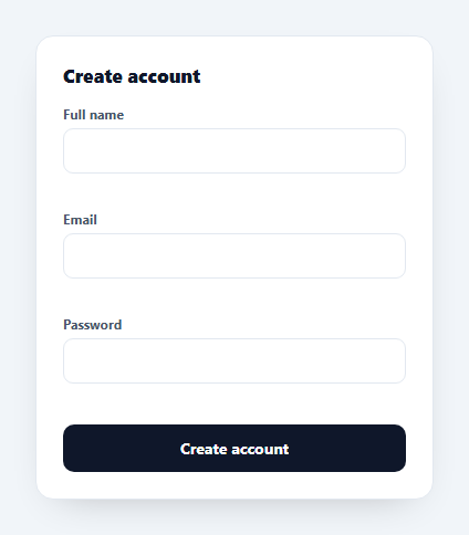
Inline validation gives users immediate, per-field feedback as they fill a form — a green tick when a field is right, a clear message when it's wrong — instead of a wall of errors after they hit submit. This snippet builds an accessible, well-timed inline-validation form in plain HTML, CSS, and vanilla JavaScript, with the subtle UX details that make the difference between helpful and annoying.
Validate at the right moment
The art of inline validation is timing. Validating on every keystroke from the start nags users while they're still typing their email; waiting until submit is too late. This form validates a field on blur the first time (marking it "touched"), then re-validates on input thereafter — so you get instant correction once you've engaged a field, but no premature red while you're mid-thought. Empty, untouched fields stay neutral.
Pluggable rules
Each field maps to a validator function that returns an empty string for valid or a message for invalid. The email rule uses a pragmatic regex, the password rule layers checks (length, then an uppercase letter and a number) and returns the most relevant message first. Because rules are just functions keyed by field name, adding a field or changing a rule is a one-line edit with no DOM wiring.
Clear success and error states
Valid fields get a green border and an inline SVG check icon baked into the input background, plus a "Looks good" note; invalid fields get a red border and a specific message. The states are driven by two classes so they're easy to theme, and the check is a data-URI SVG so there are no extra image requests.
Accessible and submit-safe
The form uses novalidate to take over validation while keeping semantic inputs (type="email", required, minlength) for assistive tech and autofill. On submit it force-validates every field, focuses the first invalid one, and only proceeds when all pass — so keyboard and screen-reader users are taken straight to what needs fixing. Messages sit in <em> elements tied to each field for a clear reading order.
Drop-in and framework-ready
The whole thing is one small script with a validators map and a render function, no dependencies. Swap the rules for your own, point submit at your API, and you have production-grade inline validation — a clean reference for the pattern behind every good sign-up and checkout form.
Build with AI
Build, Understand, Optimize, and Extend It With AI
You do not need to work out the validation timing rules purely by reading the code. Paste this snippet's HTML, CSS, and JS into an AI coding assistant like Claude and ask it to explain exactly why validate checks field.dataset.touched before showing an error on the input event but not on blur, or why the password validator returns its length message before its character-class message even when both conditions fail at once. The same assistant is useful for optimizing it — ask whether recomputing validate() on every single input event is wasteful for the password field's two regex tests and whether debouncing would help on a field with a heavier async rule, like a uniqueness check against a server. It is just as useful for extending the form: ask it to add an async validator that checks email availability against an API, a password-strength meter that reads the same validators map instead of duplicating the rules, or a confirm-password field that revalidates whenever the primary password field changes. Treat the code less like a finished artifact and more like a starting point for a conversation.
Prompt to recreate it
Copy this into your AI assistant of choice to build the effect from scratch, or as a jumping-off point for your own variant:
Build an inline-validation sign-up form in plain HTML, CSS, and JavaScript with novalidate on the form element and no external validation library.

Requirements:
- Three fields — name, email, and password — each wrapped in a container that tracks its own touched state via a data attribute, with an associated message element for showing validation feedback.
- A validators object keyed by field name where each entry is a pure function taking the current value and returning an empty string when valid or a specific error message string when invalid; the password validator must check length first, then character-class requirements (an uppercase letter and a digit), returning whichever failing message is most relevant.
- A shared validate function that: does nothing (clears state, no error) when the value is empty and the field has not been touched; marks the field invalid and shows the message once the field is touched (via blur) or an explicit force-validate flag is passed; marks the field valid with a success message and a distinct visual state (like a green border and check icon) when the validator returns no error.
- Wire each input so that blur marks the field touched and validates it for the first time, while the input event revalidates only if the field is already touched — so users are not shown red errors while still typing into a field for the first time, but do get live feedback once they have engaged it.
- On form submit, prevent the default action, force-validate every field regardless of touched state, and only proceed if all fields pass; if any field fails, move keyboard focus to the first invalid field's input instead of submitting.
- Keep the underlying inputs semantically typed (type="email", required, minlength) even though novalidate disables the browser's native validation bubbles, so autofill and assistive technology still get accurate hints.
Want to tighten it up first? Run this prompt through the AI Prompt Studio to score it across 8 quality dimensions, catch anti-patterns, and tune the wording for Claude, ChatGPT, or Gemini before you paste it in.
Source Code
<form class="iv-card" id="ivForm" novalidate>
  <h3>Create account</h3>
  <label class="iv-field" data-name="name">
    <span>Full name</span>
    <input type="text" name="name" autocomplete="name" required minlength="2">
    <em class="iv-msg"></em>
  </label>
  <label class="iv-field" data-name="email">
    <span>Email</span>
    <input type="email" name="email" autocomplete="email" required>
    <em class="iv-msg"></em>
  </label>
  <label class="iv-field" data-name="password">
    <span>Password</span>
    <input type="password" name="password" required minlength="8" data-rule="strong">
    <em class="iv-msg"></em>
  </label>
  <button class="iv-submit" type="submit">Create account</button>
  <p class="iv-done" id="ivDone" hidden>Account created.</p>
</form>*{box-sizing:border-box;margin:0;padding:0}
body{font-family:system-ui,-apple-system,sans-serif;background:#f1f5f9;display:flex;justify-content:center;padding:36px 18px}
.iv-card{background:#fff;border:1px solid #e2e8f0;border-radius:16px;padding:24px;width:100%;max-width:360px;box-shadow:0 14px 36px -22px rgba(0,0,0,.3)}
.iv-card h3{font-size:17px;font-weight:800;color:#0f172a;margin-bottom:16px}
.iv-field{display:block;margin-bottom:14px}
.iv-field>span{display:block;font-size:12px;font-weight:700;color:#475569;margin-bottom:5px}
.iv-field input{width:100%;border:1.5px solid #e2e8f0;border-radius:9px;padding:10px 36px 10px 12px;font-size:14px;font-family:inherit;outline:none;transition:border-color .15s,box-shadow .15s;background:#fff url("data:image/svg+xml,%3Csvg xmlns='http://www.w3.org/2000/svg'/%3E") no-repeat right 12px center}
.iv-field input:focus{border-color:#6366f1;box-shadow:0 0 0 3px rgba(99,102,241,.15)}
.iv-msg{display:block;font-size:11.5px;margin-top:5px;min-height:14px;font-weight:600}
.iv-field.iv-valid input{border-color:#22c55e;background-image:url("data:image/svg+xml,%3Csvg xmlns='http://www.w3.org/2000/svg' width='16' height='16' viewBox='0 0 24 24' fill='none' stroke='%2322c55e' stroke-width='3' stroke-linecap='round' stroke-linejoin='round'%3E%3Cpath d='M20 6 9 17l-5-5'/%3E%3C/svg%3E");background-position:right 12px center}
.iv-field.iv-invalid input{border-color:#ef4444}
.iv-field.iv-invalid .iv-msg{color:#dc2626}
.iv-field.iv-valid .iv-msg{color:#16a34a}
.iv-submit{width:100%;background:#0f172a;color:#fff;border:none;border-radius:10px;padding:12px;font-size:14px;font-weight:700;cursor:pointer;font-family:inherit;margin-top:4px;transition:opacity .15s}
.iv-submit:hover{opacity:.92}
.iv-done{margin-top:12px;text-align:center;font-size:13px;font-weight:700;color:#16a34a}var form = document.getElementById('ivForm');
var fields = Array.prototype.slice.call(form.querySelectorAll('.iv-field'));
var validators = {
name: function (v) { return v.trim().length >= 2 ? '' : 'Enter at least 2 characters.'; },
email: function (v) { return /^[^\s@]+@[^\s@]+\.[^\s@]+$/.test(v) ? '' : 'Enter a valid email address.'; },
password: function (v) {
if (v.length < 8) return 'At least 8 characters.';
if (!/[A-Z]/.test(v) || !/[0-9]/.test(v)) return 'Add an uppercase letter and a number.';
return '';
}
};
function validate(field, opts) {
opts = opts || {};
var input = field.querySelector('input');
var msg = field.querySelector('.iv-msg');
var name = field.getAttribute('data-name');
var value = input.value;
var error = validators[name](value);
var touched = field.dataset.touched === '1';
if (value === '' && !opts.force) {
field.classList.remove('iv-valid', 'iv-invalid'); msg.textContent = ''; return false;
}
if (error && (touched || opts.force)) {
field.classList.add('iv-invalid'); field.classList.remove('iv-valid'); msg.textContent = error; return false;
}
if (!error) {
field.classList.add('iv-valid'); field.classList.remove('iv-invalid'); msg.textContent = 'Looks good';
return true;
}
return false;
}
fields.forEach(function (field) {
var input = field.querySelector('input');
// Validate live after the first blur (so we don't nag while typing the first time).
input.addEventListener('blur', function () { field.dataset.touched = '1'; validate(field); });
input.addEventListener('input', function () { if (field.dataset.touched === '1') validate(field); });
});
form.addEventListener('submit', function (e) {
e.preventDefault();
var allValid = fields.map(function (f) { f.dataset.touched = '1'; return validate(f, { force: true }); }).every(Boolean);
if (allValid) {
document.getElementById('ivDone').hidden = false;
form.querySelector('.iv-submit').disabled = true;
} else {
var firstBad = form.querySelector('.iv-invalid input');
if (firstBad) firstBad.focus();
}
});Step by step
How to Use
- 1Paste HTML, CSS, and JSA sign-up form renders with name, email, and password fields.
- 2Fill a field and blurValidation kicks in on blur, then live as you correct it.
- 3See the statesValid fields show a green tick; invalid ones show a specific message.
- 4SubmitAll fields are force-validated; focus jumps to the first problem.
- 5Edit the rulesChange the validators map to add fields or adjust requirements.
- 6Wire your APIReplace the success branch with your real submit call.
Real-world uses
Common Use Cases
Got questions?
Frequently Asked Questions
On blur the first time you leave a field (it becomes "touched"), and on every input after that. This avoids showing red while you are still typing a value for the first time, but gives instant feedback once you have engaged the field and are correcting it. Empty, untouched fields stay neutral until submit.
Each field name maps to a function in the validators object that takes the value and returns an empty string (valid) or an error message (invalid). Add a field by adding an input with a data-name and a matching validator; change a rule by editing its function. No DOM code changes are needed because validation is data-driven.
It disables the browser's default bubble validation so this script can present consistent, styled, inline messages instead. The inputs still carry semantic attributes (type=email, required, minlength), which help autofill, mobile keyboards, and assistive technology, but the visible validation and submit gating are handled in JavaScript for full control.
Every field is force-validated (even untouched ones), the form does not submit, and focus moves to the first invalid input so the user is taken straight to the problem. When all fields pass, the success branch runs — here it shows a confirmation; in your app you would call your API.
Keep the validators as plain functions and hold each field's value, touched flag, and error in state. Compute the error on blur and on change, render the valid/invalid classes and messages from state, and gate submit on all errors being empty. React Hook Form, VeeValidate, or Angular Reactive Forms can replace the plumbing while keeping the same rules and timing. Tailwind users swap the classes for utilities.