
Learn Coding Visually
Learn to code with interactive, live-preview playgrounds — HTML, CSS, JavaScript, React & more.
 HTML Playground42 lessons · Click-based · Live preview
 CSS PlaygroundLearn CSS with a live editor
 JavaScript Playground60 lessons · DOM · Async · Canvas
 React PlaygroundLearn React with a live code editor
 GSAP PlaygroundLearn GSAP animation interactively
 SVG Playground44 lessons · shapes · paths · animation
 SCSS Playground45 lessons · Sass modules · tokens
 Tailwind PlaygroundLearn Tailwind CSS with a live editor
 Bootstrap 5 Playground50 lessons · live preview
Alert Banners — Free HTML CSS JS Snippet, 5 Variants
Alert Banners · Modals · Plain HTML, CSS & JS · Live preview
What's included
Features
About this UI Snippet
Alert Banners — 5 Semantic Variants with Icons, Inline Links & Dismiss Animation
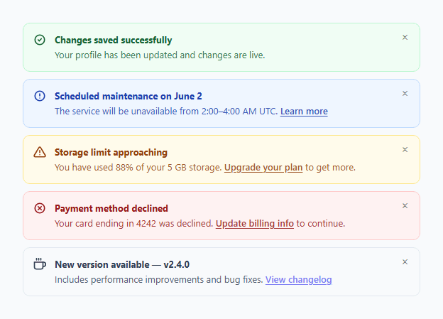
Alert banners communicate system messages, user feedback, and status information inline within the page — unlike modals which block interaction, alerts sit within the content flow and can be dismissed without interrupting the user's task. This snippet provides five semantic alert variants (success, info, warning, error, and neutral) with matching SVG icons, dismissible close buttons with a slide-out animation, and inline link support.
The five semantic variants
Each variant uses a distinctive colour palette for the background, border, and text: success (green — task completed, data saved), info (blue — informational notice, scheduled event), warning (amber — approaching limit, possible problem), error (red — action failed, payment declined), neutral (grey — product update, new feature announcement). All colours are WCAG-compliant against their respective backgrounds.
SVG icons
Each variant has a contextually appropriate SVG icon: a circle with checkmark for success, a circle with info "i" for info, a warning triangle for warning, a circle with × for error, and a coffee cup icon for neutral updates. All icons are inline SVG — no icon library required.
Entry animation
Alerts enter with a CSS keyframe animation: opacity 0→1 and translateY(-6px)→0 over 0.2s. This subtle slide-in draws the eye without being jarring. The animation is defined once on .alert and applies to all variants.
Dismiss animation
Clicking × adds the .dismissing class, which triggers a CSS animation: opacity to 0, max-height to 0, padding to 0, and margin to 0. The animationend event removes the element from the DOM. The max-height collapse avoids any JavaScript height calculation — the same pattern as the bottom sheet and upgrade banner snippets in this library.
Inline links
The alert body supports inline anchor elements styled with underline-offset: 2px and the alert's base colour for the link text. This lets alerts include actionable links ("Upgrade your plan", "Update billing info", "View changelog") without breaking the alert layout or colour system.
Using in your project
Add any variant's HTML to your page where the alert should appear. Wire the dismiss button. For dynamically shown alerts (e.g., after form submission), create the alert element with JavaScript, set its variant class, append it to a container, and run the dismiss function on the close button click.
Build with AI
Build, Understand, Optimize, and Extend It With AI
You don't have to work out the collapse animation by hand — paste this snippet's HTML, CSS, and JS into an AI coding assistant like Claude and ask it to explain exactly how the dismiss keyframe animates opacity, max-height, padding, and margin together to zero without any JavaScript measuring the element's real height, and why the animationend listener (not a fixed setTimeout) is used to remove the node. The same assistant is useful for optimizing it — asking whether five separate variant classes with duplicated structure could be generated from one shared template plus a color map instead. It's just as good for extending the banners: ask it to add an auto-dismiss timer with a pausable countdown on hover, stack multiple dynamically-created alerts with a toast-like queue, or add an "undo" action button that only some variants show. Treat the code less like a finished artifact and more like a starting point for a conversation.
Prompt to recreate it
Copy this into your AI assistant of choice to build the effect from scratch, or as a jumping-off point for your own variant:
Build a set of dismissible "alert banner" components in plain HTML, CSS, and JavaScript — no libraries, with at least five semantic color variants (success, info, warning, error, neutral).

Requirements:
- Each alert is a single flex row containing an SVG icon appropriate to its meaning (checkmark circle for success, info circle, warning triangle, X circle for error, a neutral icon), a body section with a bold title and a lighter-weight supporting message (which may include an inline link), and a small close button.
- Every variant must use its own background, border, and text color combination that passes accessible contrast, with the inline link inheriting a color that fits its variant.
- On page load, each alert must play a brief CSS keyframe entrance: fading in and sliding down slightly from a few pixels above its resting position.
- Clicking the close button must add a "dismissing" class to that specific alert (not affect sibling alerts), which triggers a second CSS keyframe that simultaneously animates opacity to 0 and max-height/padding/margin to 0 — collapsing the space it occupied without any JavaScript reading or setting a pixel height value.
- Only after that dismiss animation actually finishes (listen for the animationend event, not a hardcoded timeout matching the duration) should the element be removed from the DOM.
- Write the dismiss handler as a single reusable function that works identically for any variant, taking the clicked close button, finding its containing alert via closest(), and applying the class/listener logic described above.
Want to tighten it up first? Run this prompt through the AI Prompt Studio to score it across 8 quality dimensions, catch anti-patterns, and tune the wording for Claude, ChatGPT, or Gemini before you paste it in.
Source Code
<div class="page">

  <div class="alert success">
    <svg class="alert-icon" viewBox="0 0 24 24" fill="none" stroke="currentColor" stroke-width="2.2" stroke-linecap="round"><circle cx="12" cy="12" r="9"/><polyline points="9 12 11 14 15 10"/></svg>
    <div class="alert-body">
      <strong>Changes saved successfully</strong>
      <span>Your profile has been updated and changes are live.</span>
    </div>
    <button class="alert-close" onclick="dismiss(this)" aria-label="Dismiss">×</button>
  </div>

  <div class="alert info">
    <svg class="alert-icon" viewBox="0 0 24 24" fill="none" stroke="currentColor" stroke-width="2.2" stroke-linecap="round"><circle cx="12" cy="12" r="9"/><line x1="12" y1="8" x2="12" y2="12"/><line x1="12" y1="16" x2="12.01" y2="16"/></svg>
    <div class="alert-body">
      <strong>Scheduled maintenance on June 2</strong>
      <span>The service will be unavailable from 2:00–4:00 AM UTC. <a href="#">Learn more</a></span>
    </div>
    <button class="alert-close" onclick="dismiss(this)" aria-label="Dismiss">×</button>
  </div>

  <div class="alert warning">
    <svg class="alert-icon" viewBox="0 0 24 24" fill="none" stroke="currentColor" stroke-width="2.2" stroke-linecap="round"><path d="M10.29 3.86L1.82 18a2 2 0 0 0 1.71 3h16.94a2 2 0 0 0 1.71-3L13.71 3.86a2 2 0 0 0-3.42 0z"/><line x1="12" y1="9" x2="12" y2="13"/><line x1="12" y1="17" x2="12.01" y2="17"/></svg>
    <div class="alert-body">
      <strong>Storage limit approaching</strong>
      <span>You have used 88% of your 5 GB storage. <a href="#">Upgrade your plan</a> to get more.</span>
    </div>
    <button class="alert-close" onclick="dismiss(this)" aria-label="Dismiss">×</button>
  </div>

  <div class="alert error">
    <svg class="alert-icon" viewBox="0 0 24 24" fill="none" stroke="currentColor" stroke-width="2.2" stroke-linecap="round"><circle cx="12" cy="12" r="9"/><line x1="15" y1="9" x2="9" y2="15"/><line x1="9" y1="9" x2="15" y2="15"/></svg>
    <div class="alert-body">
      <strong>Payment method declined</strong>
      <span>Your card ending in 4242 was declined. <a href="#">Update billing info</a> to continue.</span>
    </div>
    <button class="alert-close" onclick="dismiss(this)" aria-label="Dismiss">×</button>
  </div>

  <div class="alert neutral">
    <svg class="alert-icon" viewBox="0 0 24 24" fill="none" stroke="currentColor" stroke-width="2.2" stroke-linecap="round"><path d="M18 8h1a4 4 0 0 1 0 8h-1"/><path d="M2 8h16v9a4 4 0 0 1-4 4H6a4 4 0 0 1-4-4V8z"/><line x1="6" y1="1" x2="6" y2="4"/><line x1="10" y1="1" x2="10" y2="4"/><line x1="14" y1="1" x2="14" y2="4"/></svg>
    <div class="alert-body">
      <strong>New version available — v2.4.0</strong>
      <span>Includes performance improvements and bug fixes. <a href="#">View changelog</a></span>
    </div>
    <button class="alert-close" onclick="dismiss(this)" aria-label="Dismiss">×</button>
  </div>

</div>
* { box-sizing: border-box; margin: 0; padding: 0; }
body { font-family: system-ui, sans-serif; background: #f8fafc; min-height: 100vh; display: flex; align-items: center; justify-content: center; padding: 32px 24px; }
.page { display: flex; flex-direction: column; gap: 10px; width: 100%; max-width: 560px; }
.alert { display: flex; align-items: flex-start; gap: 12px; padding: 13px 14px; border-radius: 10px; border: 1px solid; animation: slide-in 0.2s ease; }
@keyframes slide-in { from { opacity: 0; transform: translateY(-6px); } to { opacity: 1; transform: translateY(0); } }
.alert-icon { width: 18px; height: 18px; flex-shrink: 0; margin-top: 1px; }
.alert-body { flex: 1; font-size: 13px; line-height: 1.5; display: flex; flex-direction: column; gap: 2px; }
.alert-body strong { font-weight: 700; }
.alert-body span { opacity: 0.85; }
.alert-body a { font-weight: 600; text-decoration: underline; text-underline-offset: 2px; }
.alert-close { background: transparent; border: none; font-size: 16px; line-height: 1; cursor: pointer; opacity: 0.5; transition: opacity 0.12s; flex-shrink: 0; padding: 0 2px; margin-top: -1px; }
.alert-close:hover { opacity: 1; }
/* Variants */
.alert.success { background: #f0fdf4; border-color: #bbf7d0; color: #166534; }
.alert.success .alert-body a { color: #166534; }
.alert.info { background: #eff6ff; border-color: #bfdbfe; color: #1e40af; }
.alert.info .alert-body a { color: #1e40af; }
.alert.warning { background: #fffbeb; border-color: #fde68a; color: #92400e; }
.alert.warning .alert-body a { color: #92400e; }
.alert.error { background: #fef2f2; border-color: #fecaca; color: #991b1b; }
.alert.error .alert-body a { color: #991b1b; }
.alert.neutral { background: #f8fafc; border-color: #e2e8f0; color: #334155; }
.alert.neutral .alert-body a { color: #6366f1; }
/* Dismiss animation */
.alert.dismissing { animation: slide-out 0.2s ease forwards; }
@keyframes slide-out { to { opacity: 0; max-height: 0; padding: 0; margin: 0; overflow: hidden; } }function dismiss(btn) {
const alert = btn.closest('.alert');
alert.classList.add('dismissing');
alert.addEventListener('animationend', () => alert.remove(), { once: true });
}Step by step
How to Use
- 1Click the × button on any alert to dismiss itThe alert slides out via a CSS @keyframes animation (opacity + max-height to 0), then the animationend event removes it from the DOM. Each alert dismisses independently.
- 2Copy the variant you needCopy the single .alert div for the semantic type you need: success for saves, info for notices, warning for limits, error for failures, neutral for updates. Each variant is a standalone div — no surrounding wrapper required.
- 3Update the title and message textEdit the strong element for the alert title and the span element for the supporting message. Add anchor tags inside the span for inline action links — they inherit the alert colour scheme automatically.
- 4Show alerts dynamically from JavaScriptCreate the alert with createElement("div"), set className="alert success", set innerHTML with the icon and body content, and append to a container. Call requestAnimationFrame before appending to ensure the slide-in animation fires.
- 5Position alerts as page-level bannersFor full-width top-of-page alerts, remove max-width from .page and add border-radius: 0 to .alert. For fixed top-of-viewport alerts, wrap in position:fixed; top:0; left:0; right:0; z-index:100.
- 6Export in your formatClick "HTML" for a standalone file, "JSX" for a React component with an onDismiss callback and conditional rendering via useState, or "Tailwind" for a Tailwind CSS version.
Real-world uses
Common Use Cases
Got questions?
Frequently Asked Questions
The .dismissing class applies a CSS @keyframes animation that simultaneously sets opacity to 0, max-height to 0, padding-top to 0, padding-bottom to 0, and margin-bottom to 0. Because all properties are animated from their current value to 0, the alert collapses smoothly without needing JavaScript to read the element's current height. The animationend event fires after the animation completes and calls alert.remove() to clean up the DOM.
Create the alert after the API call resolves: const alert = document.createElement("div"); alert.className = "alert success"; alert.innerHTML = '<svg class="alert-icon">...</svg><div class="alert-body"><strong>Saved!</strong><span>Your changes are live.</span></div><button class="alert-close" onclick="dismiss(this)">×</button>'; container.prepend(alert). Use prepend() to add it to the top of the container. Add auto-dismiss after 5 seconds: setTimeout(() => dismiss(alert.querySelector(".alert-close")), 5000).
Wrap the alert in a fixed container: position: fixed; top: 0; left: 0; right: 0; z-index: 9999; padding: 0. Remove the border-radius from .alert or set it to 0. Set border-left: none; border-right: none; border-top: none to show only the bottom border as an accent line. Add padding-top to the main page content equal to the alert height to prevent content from being hidden behind the fixed alert.
Click "JSX" to download. Manage alerts as an array in useState: const [alerts, setAlerts] = useState([]). Each alert is an object with id, type, title, and message. The dismiss function filters by id: setAlerts(prev => prev.filter(a => a.id !== id)). Map alerts to Alert components. Use a CSS transition on the container for the dismiss animation instead of the DOM-manipulation approach — set opacity and max-height on a state class.