Source Code
<div class="app">
<div class="screen-content">
<h2 class="page-title">Bottom Sheet</h2>
<p class="page-sub">Mobile-style slide-up sheet with drag handle, backdrop, and snap close.</p>
<div class="btns">
<button class="trigger-btn" onclick="openSheet('share')">Share options</button>
<button class="trigger-btn outline" onclick="openSheet('filter')">Filter results</button>
</div>
</div>
<!-- Backdrop -->
<div class="backdrop" id="backdrop" onclick="closeSheet()"></div>
<!-- Sheet -->
<div class="sheet" id="sheet" role="dialog" aria-modal="true">
<div class="drag-handle"></div>
<div class="sheet-content" id="sheet-content">
<!-- Share content -->
<div class="sc" id="sc-share">
<h3 class="sheet-title">Share this page</h3>
<div class="action-grid">
<button class="action-item" onclick="closeSheet()">
<div class="action-icon" style="background:#0ea5e9">
<svg width="18" height="18" viewBox="0 0 24 24" fill="none" stroke="#fff" stroke-width="2.2" stroke-linecap="round"><path d="M23 3a10.9 10.9 0 0 1-3.14 1.53 4.48 4.48 0 0 0-7.86 3v1A10.66 10.66 0 0 1 3 4s-4 9 5 13a11.64 11.64 0 0 1-7 2c9 5 20 0 20-11.5a4.5 4.5 0 0 0-.08-.83A7.72 7.72 0 0 0 23 3z"/></svg>
</div>
<span>Twitter</span>
</button>
<button class="action-item" onclick="closeSheet()">
<div class="action-icon" style="background:#3b5998">
<svg width="18" height="18" viewBox="0 0 24 24" fill="#fff"><path d="M18 2h-3a5 5 0 0 0-5 5v3H7v4h3v8h4v-8h3l1-4h-4V7a1 1 0 0 1 1-1h3z"/></svg>
</div>
<span>Facebook</span>
</button>
<button class="action-item" onclick="closeSheet()">
<div class="action-icon" style="background:#25d366">
<svg width="18" height="18" viewBox="0 0 24 24" fill="#fff"><path d="M21 11.5a8.38 8.38 0 0 1-.9 3.8 8.5 8.5 0 0 1-7.6 4.7 8.38 8.38 0 0 1-3.8-.9L3 21l1.9-5.7a8.38 8.38 0 0 1-.9-3.8 8.5 8.5 0 0 1 4.7-7.6 8.38 8.38 0 0 1 3.8-.9h.5a8.48 8.48 0 0 1 8 8v.5z"/></svg>
</div>
<span>WhatsApp</span>
</button>
<button class="action-item" onclick="copyLink()">
<div class="action-icon" style="background:#6366f1">
<svg width="18" height="18" viewBox="0 0 24 24" fill="none" stroke="#fff" stroke-width="2.2" stroke-linecap="round"><path d="M10 13a5 5 0 0 0 7.54.54l3-3a5 5 0 0 0-7.07-7.07l-1.72 1.71"/><path d="M14 11a5 5 0 0 0-7.54-.54l-3 3a5 5 0 0 0 7.07 7.07l1.71-1.71"/></svg>
</div>
<span id="copy-label">Copy link</span>
</button>
</div>
</div>
<!-- Filter content -->
<div class="sc" id="sc-filter" style="display:none">
<h3 class="sheet-title">Filter results</h3>
<div class="filter-group">
<div class="filter-label">Price range</div>
<div class="filter-chips">
<button class="chip active" onclick="toggleChip(this)">Any</button>
<button class="chip" onclick="toggleChip(this)">Under $50</button>
<button class="chip" onclick="toggleChip(this)">$50–$200</button>
<button class="chip" onclick="toggleChip(this)">$200+</button>
</div>
</div>
<div class="filter-group">
<div class="filter-label">Rating</div>
<div class="filter-chips">
<button class="chip active" onclick="toggleChip(this)">Any</button>
<button class="chip" onclick="toggleChip(this)">4★ & up</button>
<button class="chip" onclick="toggleChip(this)">5★ only</button>
</div>
</div>
<div class="filter-actions">
<button class="filter-reset" onclick="closeSheet()">Reset</button>
<button class="filter-apply" onclick="closeSheet()">Apply filters</button>
</div>
</div>
</div>
</div>
</div>* { box-sizing: border-box; margin: 0; padding: 0; }
body { font-family: system-ui, sans-serif; background: #f8fafc; margin: 0; overflow: hidden; }
.app { min-height: 100vh; position: relative; display: flex; align-items: center; justify-content: center; padding: 32px 24px; }
.screen-content { display: flex; flex-direction: column; align-items: center; gap: 24px; text-align: center; }
.page-title { font-size: 22px; font-weight: 800; color: #0f172a; }
.page-sub { font-size: 14px; color: #64748b; max-width: 280px; }
.btns { display: flex; gap: 10px; flex-wrap: wrap; justify-content: center; }
.trigger-btn { background: #6366f1; color: #fff; font-size: 14px; font-weight: 600; padding: 11px 22px; border: none; border-radius: 10px; cursor: pointer; transition: background 0.15s; }
.trigger-btn:hover { background: #4f46e5; }
.trigger-btn.outline { background: transparent; color: #6366f1; border: 1.5px solid #6366f1; }
.trigger-btn.outline:hover { background: rgba(99,102,241,0.06); }
/* Backdrop */
.backdrop { position: fixed; inset: 0; background: rgba(0,0,0,0); pointer-events: none; transition: background 0.3s; z-index: 10; }
.backdrop.open { background: rgba(0,0,0,0.4); pointer-events: all; }
/* Sheet */
.sheet { position: fixed; bottom: 0; left: 0; right: 0; background: #fff; border-radius: 20px 20px 0 0; padding: 12px 20px 32px; transform: translateY(100%); transition: transform 0.35s cubic-bezier(0.32,0.72,0,1); z-index: 20; box-shadow: 0 -8px 40px rgba(0,0,0,0.12); max-width: 600px; margin: 0 auto; }
.sheet.open { transform: translateY(0); }
.drag-handle { width: 40px; height: 4px; border-radius: 2px; background: #e2e8f0; margin: 0 auto 16px; }
.sheet-title { font-size: 16px; font-weight: 800; color: #0f172a; margin-bottom: 20px; }
/* Share grid */
.action-grid { display: grid; grid-template-columns: repeat(4, 1fr); gap: 8px; }
.action-item { display: flex; flex-direction: column; align-items: center; gap: 8px; background: transparent; border: none; cursor: pointer; padding: 8px 4px; border-radius: 10px; transition: background 0.15s; }
.action-item:hover { background: #f8fafc; }
.action-icon { width: 48px; height: 48px; border-radius: 14px; display: flex; align-items: center; justify-content: center; }
.action-item span { font-size: 11px; color: #475569; font-weight: 500; }
/* Filter content */
.filter-group { display: flex; flex-direction: column; gap: 10px; margin-bottom: 20px; }
.filter-label { font-size: 12px; font-weight: 700; color: #64748b; text-transform: uppercase; letter-spacing: 0.6px; }
.filter-chips { display: flex; gap: 8px; flex-wrap: wrap; }
.chip { background: #f1f5f9; color: #475569; font-size: 13px; font-weight: 600; padding: 7px 16px; border-radius: 20px; border: 1.5px solid transparent; cursor: pointer; transition: all 0.15s; }
.chip.active { background: rgba(99,102,241,0.1); color: #6366f1; border-color: #6366f1; }
.filter-actions { display: flex; gap: 10px; margin-top: 4px; }
.filter-reset { flex: 1; background: #f1f5f9; color: #475569; font-size: 14px; font-weight: 600; padding: 12px; border: none; border-radius: 10px; cursor: pointer; }
.filter-apply { flex: 2; background: #6366f1; color: #fff; font-size: 14px; font-weight: 700; padding: 12px; border: none; border-radius: 10px; cursor: pointer; }
.filter-apply:hover { background: #4f46e5; }let activeContent = null;
function openSheet(type) {
document.querySelectorAll('.sc').forEach(el => el.style.display = 'none');
document.getElementById('sc-' + type).style.display = 'block';
document.getElementById('sheet').classList.add('open');
document.getElementById('backdrop').classList.add('open');
document.addEventListener('keydown', onKey);
}
function closeSheet() {
document.getElementById('sheet').classList.remove('open');
document.getElementById('backdrop').classList.remove('open');
document.removeEventListener('keydown', onKey);
}
function onKey(e) { if (e.key === 'Escape') closeSheet(); }
function toggleChip(el) {
el.closest('.filter-chips').querySelectorAll('.chip').forEach(c => c.classList.remove('active'));
el.classList.add('active');
}
function copyLink() {
navigator.clipboard.writeText(window.location.href).catch(() => {});
const label = document.getElementById('copy-label');
label.textContent = '✓ Copied!';
setTimeout(() => { label.textContent = 'Copy link'; }, 2000);
}Learn Coding Visually
Learn to code with interactive, live-preview playgrounds — HTML, CSS, JavaScript, React & more.
 HTML Playground42 lessons · Click-based · Live preview
 CSS PlaygroundLearn CSS with a live editor
 JavaScript Playground60 lessons · DOM · Async · Canvas
 React PlaygroundLearn React with a live code editor
 GSAP PlaygroundLearn GSAP animation interactively
 SVG Playground44 lessons · shapes · paths · animation
 SCSS Playground45 lessons · Sass modules · tokens
 Tailwind PlaygroundLearn Tailwind CSS with a live editor
 Bootstrap 5 Playground50 lessons · live preview
Bottom Sheet — Free HTML CSS JS Mobile Snippet
Bottom Sheet · Modals · Plain HTML, CSS & JS · Live preview
What's included
Features
About this UI Snippet
Bottom Sheet — Slide-Up Mobile Panel, Drag Handle, Backdrop & Share/Filter Content Variants
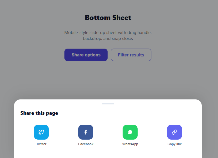
A bottom sheet is a mobile-first UI pattern where a panel slides up from the bottom edge of the screen to present options, actions, or secondary content without navigating away from the current page. It is the mobile equivalent of a modal or popover — less disruptive than a full-screen overlay, more prominent than a tooltip. This snippet provides a complete bottom sheet with backdrop, a drag handle, ESC-to-close, two content variants (share actions and filter chips), and a smooth cubic-bezier slide animation.
The slide animation
The sheet starts at transform: translateY(100%) — fully below the viewport. Adding .open changes it to translateY(0). The transition uses cubic-bezier(0.32, 0.72, 0, 1) — a spring-like curve that accelerates sharply then decelerates slowly, mimicking iOS sheet physics. The same animation reverses on close. The backdrop fades from rgba(0,0,0,0) to rgba(0,0,0,0.4) in sync.
The drag handle
The 40×4px pill at the top of the sheet is a universal visual signal that the panel is draggable. This snippet shows the visual handle without drag-to-dismiss JavaScript — add touchmove/touchend listeners to implement drag-to-dismiss where the sheet follows the finger and closes if dragged more than 40% of its height.
Two content variants
Clicking "Share options" shows a 4-column action grid (Twitter, Facebook, WhatsApp, Copy link) with coloured icon blocks. The copy link button uses the Clipboard API and shows a "✓ Copied!" feedback state. Clicking "Filter results" shows a filter sheet with price range and rating chip groups — toggleChip() manages single-selection within each group.
ESC key and backdrop close
The keydown listener (added on open, removed on close) closes the sheet on Escape. The backdrop div has onclick="closeSheet()" directly. Both patterns are identical to the modal close mechanisms.
Max-width centering
On desktop, the sheet has max-width: 600px and margin: 0 auto so it does not stretch edge-to-edge. On mobile, it fills the full viewport width. The border-radius: 20px 20px 0 0 gives the characteristic rounded top corners of a native mobile sheet.
When to use a bottom sheet versus a modal
Use a bottom sheet when: the action is context-preserving (users can still see the page behind the backdrop), the content is secondary to the page (share options, filter settings, action menus), or the interaction is common on mobile native apps (iOS action sheets, Android bottom sheets). Use a standard modal when: the action requires full attention (delete confirmation, critical error, onboarding step), or the content is substantial (form, detail view, settings panel). The bottom sheet signals "quick action" to users through its position and size; the modal signals "stop and decide".
Build with AI
Build, Understand, Optimize, and Extend It With AI
You don't have to decode the cubic-bezier control points by hand to understand the feel of this sheet. Paste this snippet's HTML, CSS, and JS into an AI coding assistant like Claude and ask it to explain exactly why cubic-bezier(0.32,0.72,0,1) produces the iOS-style fast-open-then-settle motion, and how openSheet swaps between the sc-share and sc-filter content blocks purely with inline display toggles. The same assistant can help optimize it — asking whether the keydown listener added on every open call could leak if openSheet is called twice without closing, or how to add real drag-to-dismiss without fighting the existing transform-based transition. It's also useful for extending the pattern: ask it to add a third content variant, snap points at partial heights, or a scrollable body with overscroll-behavior contain so background scroll never leaks through. Treat the code less like a finished artifact and more like a starting point for a conversation.
Prompt to recreate it
Copy this into your AI assistant of choice to build the effect from scratch, or as a jumping-off point for your own variant:
Build a mobile "bottom sheet" component in plain HTML, CSS, and JavaScript that slides up from the bottom of the screen over a dimming backdrop, with two swappable content variants — no libraries.

Requirements:
- A sheet element fixed to the bottom of the viewport, starting fully offscreen via transform: translateY(100%), that slides to translateY(0) when an "open" class is added, using a cubic-bezier easing that accelerates quickly at the start and decelerates gradually at the end (an iOS-style spring feel), with rounded top corners only.
- A separate backdrop element that fades its background from fully transparent to a dark translucent overlay in sync with the sheet's open state, and is not clickable at all while closed (pointer-events none) but closes the sheet when clicked while open.
- A small pill-shaped drag handle centered at the top of the sheet as a purely visual affordance.
- Two distinct content blocks inside the sheet, only one visible at a time via inline display toggling, selected by which trigger button opened the sheet: a grid of share action buttons with colored icon swatches, and a filter panel with two independently-toggling groups of selectable chip buttons (only one chip active per group at a time).
- Closing must be triggered three ways: clicking the backdrop, pressing Escape, and a button inside the sheet — and the Escape key listener must be added only while the sheet is open and removed the moment it closes, so it never fires while the sheet is already closed.
- One action button must copy the current page URL to the clipboard using the Clipboard API and show temporary "Copied!" text feedback that reverts after a couple of seconds.
Want to tighten it up first? Run this prompt through the AI Prompt Studio to score it across 8 quality dimensions, catch anti-patterns, and tune the wording for Claude, ChatGPT, or Gemini before you paste it in.
Step by step
How to Use
- 1Click the trigger buttons to open each sheet variantClick "Share options" to see the social action grid with copy link feedback. Click "Filter results" to see the chip-based filter sheet. Press ESC or click the backdrop to close.
- 2Add your own sheet contentCopy the .sc div structure and add a new id (e.g., sc-menu). In the HTML, add a new trigger button with onclick="openSheet('menu')". In the JS openSheet() function, add your new content type — the function shows/hides the matching .sc div automatically.
- 3Implement drag-to-dismissAdd touchstart to the .drag-handle: record startY = e.touches[0].clientY. In touchmove on the sheet: sheet.style.transform = "translateY("+Math.max(0,e.touches[0].clientY-startY)+"px)". In touchend: if dragged > 40% of sheet height, closeSheet(), else reset transform.
- 4Change the animation curveEdit cubic-bezier(0.32,0.72,0,1) on the .sheet transition to change the slide physics. Use ease-out for a simpler deceleration. Increase the 0.35s duration to 0.5s for a slower, more dramatic slide.
- 5Add more filter groupsDuplicate a .filter-group div inside sc-filter. Each group has a .filter-label and a .filter-chips row. The toggleChip() function manages active state within the parent .filter-chips container, so each group selects independently.
- 6Export in your formatClick "HTML" for a standalone file, "JSX" for a React component using useState for open state and content type, or "Tailwind" for a React + Tailwind CSS version.
Real-world uses
Common Use Cases
Got questions?
Frequently Asked Questions
CSS transition timing cubic-bezier(x1,y1,x2,x2) defines a Bezier curve between (0,0) and (1,1). The four values are the two control point coordinates. cubic-bezier(0.32, 0.72, 0, 1) places the first control point at (0.32, 0.72) — far right, high up — creating a very fast initial movement. The second control point (0, 1) — far left, at the top — creates a slow final approach. The result feels like a spring: fast start, gradual settle. This approximates the iOS UISheetPresentationController animation in CSS.
Add to the .sheet element: let startY = 0; sheet.addEventListener("touchstart", e => { startY = e.touches[0].clientY; }); sheet.addEventListener("touchmove", e => { const dy = e.touches[0].clientY - startY; if (dy > 0) { sheet.style.transition = "none"; sheet.style.transform = "translateY("+dy+"px)"; } }); sheet.addEventListener("touchend", e => { const dy = e.changedTouches[0].clientY - startY; sheet.style.transition = ""; if (dy > sheet.offsetHeight * 0.4) closeSheet(); else sheet.style.transform = ""; });
Add overflow-y: auto; max-height: 80vh to .sheet. Add overscroll-behavior: contain to prevent the scroll from propagating to the body behind the sheet (which would scroll the page). For a snap-to-size sheet that grows with content up to 80vh: set max-height: 80vh and let the content push the sheet height naturally. For a fixed-height sheet with internal scroll, set height: 60vh; overflow-y: auto.
Click "JSX" to download. Use useState(null) for the open content type — null means closed. Conditionally render the backdrop and sheet based on the state. Pass the content type as a prop to the Sheet component to control which content block renders. Add useEffect to manage the ESC key listener: attach when open state is not null, detach in the cleanup return. Use a portal (ReactDOM.createPortal) to render the sheet at document.body level to avoid z-index stacking context issues.