Source Code
<div class="msc-wrap">
  <ol class="msc-steps" id="mscSteps">
    <li class="msc-step active" data-step="0"><span class="msc-num">1</span><span class="msc-name">Contact</span></li>
    <li class="msc-step" data-step="1"><span class="msc-num">2</span><span class="msc-name">Shipping</span></li>
    <li class="msc-step" data-step="2"><span class="msc-num">3</span><span class="msc-name">Payment</span></li>
  </ol>

  <form class="msc-panels" id="mscForm">
    <div class="msc-panel active" data-panel="0">
      <h2 class="msc-h">Contact info</h2>
      <label class="msc-field"><span>Email</span><input type="email" placeholder="you@email.com" required></label>
      <label class="msc-field"><span>Phone</span><input type="tel" placeholder="+1 555 000 1234"></label>
    </div>

    <div class="msc-panel" data-panel="1">
      <h2 class="msc-h">Shipping address</h2>
      <label class="msc-field"><span>Full name</span><input type="text" placeholder="Alex Morgan" required></label>
      <label class="msc-field"><span>Address</span><input type="text" placeholder="123 Market St" required></label>
      <div class="msc-row">
        <label class="msc-field"><span>City</span><input type="text" placeholder="Austin" required></label>
        <label class="msc-field"><span>ZIP</span><input type="text" placeholder="78701" required></label>
      </div>
    </div>

    <div class="msc-panel" data-panel="2">
      <h2 class="msc-h">Payment</h2>
      <label class="msc-field"><span>Card number</span><input type="text" placeholder="4242 4242 4242 4242" required></label>
      <div class="msc-row">
        <label class="msc-field"><span>Expiry</span><input type="text" placeholder="MM/YY" required></label>
        <label class="msc-field"><span>CVC</span><input type="text" placeholder="123" required></label>
      </div>
      <div class="msc-summary"><span>Order total</span><strong>$148.00</strong></div>
    </div>

    <div class="msc-nav">
      <button class="msc-btn msc-back" id="mscBack" type="button" disabled>Back</button>
      <button class="msc-btn msc-next" id="mscNext" type="button">Continue</button>
    </div>
  </form>

  <div class="msc-done" id="mscDone">
    <svg viewBox="0 0 24 24" aria-hidden="true"><polyline points="20 6 9 17 4 12"/></svg>
    <h2>Order placed</h2>
    <p>A confirmation has been sent to your email.</p>
  </div>
</div>
* { box-sizing: border-box; margin: 0; padding: 0; }
body { font-family: system-ui, -apple-system, sans-serif; background: #f1f5f9; min-height: 100vh; display: flex; align-items: center; justify-content: center; padding: 28px; }
.msc-wrap { width: 100%; max-width: 420px; background: #fff; border: 1px solid #e8edf3; border-radius: 18px; padding: 26px 26px 22px; box-shadow: 0 20px 50px rgba(15, 23, 42, 0.08); }
.msc-steps { list-style: none; display: flex; justify-content: space-between; position: relative; margin-bottom: 26px; }
.msc-steps::before { content: ''; position: absolute; top: 14px; left: 14px; right: 14px; height: 2px; background: #e2e8f0; z-index: 0; }
.msc-step { display: flex; flex-direction: column; align-items: center; gap: 6px; position: relative; z-index: 1; }
.msc-num {
width: 30px; height: 30px;
display: flex; align-items: center; justify-content: center;
background: #fff; border: 2px solid #e2e8f0; border-radius: 50%;
font-size: 13px; font-weight: 700; color: #94a3b8;
transition: background 0.25s, border-color 0.25s, color 0.25s;
}
.msc-name { font-size: 11.5px; font-weight: 600; color: #94a3b8; transition: color 0.25s; }
.msc-step.active .msc-num { background: #6366f1; border-color: #6366f1; color: #fff; }
.msc-step.active .msc-name { color: #1e293b; }
.msc-step.done .msc-num { background: #22c55e; border-color: #22c55e; color: #fff; }
.msc-panel { display: none; animation: mscFade 0.3s ease; }
.msc-panel.active { display: block; }
@keyframes mscFade { from { opacity: 0; transform: translateX(8px); } to { opacity: 1; transform: translateX(0); } }
.msc-h { font-size: 17px; font-weight: 800; color: #0f172a; margin-bottom: 16px; }
.msc-field { display: block; margin-bottom: 13px; }
.msc-field span { display: block; font-size: 12.5px; font-weight: 600; color: #475569; margin-bottom: 5px; }
.msc-field input {
width: 100%; padding: 10px 13px;
border: 1.5px solid #e2e8f0; border-radius: 10px;
font-family: inherit; font-size: 14px; color: #0f172a; outline: none;
transition: border-color 0.15s, box-shadow 0.15s;
}
.msc-field input:focus { border-color: #6366f1; box-shadow: 0 0 0 3px rgba(99, 102, 241, 0.12); }
.msc-field input.invalid { border-color: #ef4444; box-shadow: 0 0 0 3px rgba(239, 68, 68, 0.12); }
.msc-row { display: grid; grid-template-columns: 1fr 1fr; gap: 12px; }
.msc-summary { display: flex; justify-content: space-between; align-items: center; margin-top: 6px; padding: 13px 15px; background: #f8fafc; border-radius: 10px; }
.msc-summary span { font-size: 13px; color: #64748b; }
.msc-summary strong { font-size: 18px; color: #0f172a; }
.msc-nav { display: flex; gap: 10px; margin-top: 20px; }
.msc-btn { flex: 1; padding: 12px; border-radius: 11px; font-family: inherit; font-size: 14px; font-weight: 700; cursor: pointer; transition: background 0.18s, opacity 0.18s, border-color 0.18s; }
.msc-back { background: #fff; border: 1.5px solid #e2e8f0; color: #475569; }
.msc-back:hover:not(:disabled) { border-color: #cbd5e1; }
.msc-back:disabled { opacity: 0.45; cursor: not-allowed; }
.msc-next { background: #6366f1; border: 1px solid #6366f1; color: #fff; }
.msc-next:hover { background: #4f46e5; }
.msc-done { display: none; text-align: center; padding: 18px 0 8px; animation: mscFade 0.35s ease; }
.msc-done.show { display: block; }
.msc-wrap.complete .msc-steps,
.msc-wrap.complete .msc-panels { display: none; }
.msc-done svg { width: 52px; height: 52px; padding: 13px; margin: 0 auto 14px; display: block; fill: none; stroke: #fff; stroke-width: 3; stroke-linecap: round; stroke-linejoin: round; background: #22c55e; border-radius: 50%; }
.msc-done h2 { font-size: 20px; font-weight: 800; color: #0f172a; }
.msc-done p { font-size: 13.5px; color: #64748b; margin-top: 6px; }const wrap = document.querySelector('.msc-wrap');
const form = document.getElementById('mscForm');
const steps = [...document.querySelectorAll('.msc-step')];
const panels = [...document.querySelectorAll('.msc-panel')];
const backBtn = document.getElementById('mscBack');
const nextBtn = document.getElementById('mscNext');
const done = document.getElementById('mscDone');
let current = 0;
function render() {
panels.forEach((p, i) => p.classList.toggle('active', i === current));
steps.forEach((s, i) => {
s.classList.toggle('active', i === current);
s.classList.toggle('done', i < current);
});
backBtn.disabled = current === 0;
nextBtn.textContent = current === panels.length - 1 ? 'Place order' : 'Continue';
}
function validateStep() {
const inputs = [...panels[current].querySelectorAll('input[required]')];
let ok = true;
inputs.forEach(inp => {
const valid = inp.value.trim() !== '' && inp.checkValidity();
inp.classList.toggle('invalid', !valid);
if (!valid && ok) inp.focus();
if (!valid) ok = false;
});
return ok;
}
nextBtn.addEventListener('click', () => {
if (!validateStep()) return;
if (current < panels.length - 1) {
current++;
render();
} else {
wrap.classList.add('complete');
done.classList.add('show');
}
});
backBtn.addEventListener('click', () => {
if (current > 0) { current--; render(); }
});
// Clear the invalid state as the user types
form.addEventListener('input', e => {
if (e.target.classList.contains('invalid')) e.target.classList.remove('invalid');
});
render();Learn Coding Visually
Learn to code with interactive, live-preview playgrounds — HTML, CSS, JavaScript, React & more.
 HTML Playground42 lessons · Click-based · Live preview
 CSS PlaygroundLearn CSS with a live editor
 JavaScript Playground60 lessons · DOM · Async · Canvas
 React PlaygroundLearn React with a live code editor
 GSAP PlaygroundLearn GSAP animation interactively
 SVG Playground44 lessons · shapes · paths · animation
 SCSS Playground45 lessons · Sass modules · tokens
 Tailwind PlaygroundLearn Tailwind CSS with a live editor
 Bootstrap 5 Playground50 lessons · live preview
Multi-Step Checkout — Free HTML CSS JS Form Snippet
Multi-Step Checkout · Forms · Plain HTML, CSS & JS · Live preview
What's included
Features
About this UI Snippet
Multi-Step Checkout — Stepper Form with Per-Step Validation and Success Screen
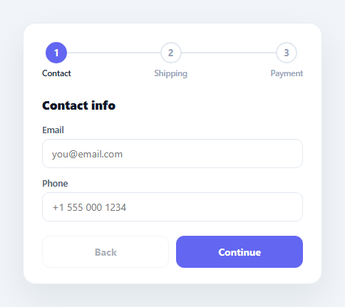
Long forms scare buyers away. Splitting checkout into a few focused steps — contact, shipping, payment — lowers the perceived effort, lets you validate each part before moving on, and gives a clear sense of progress. This component is a complete multi-step checkout: a numbered progress stepper across the top, three sliding panels, per-step validation that blocks advancement until the current fields are valid, back and continue navigation, and a success screen when the order is placed. It is built in semantic HTML, CSS, and vanilla JavaScript with no form library.
The progress stepper
The three steps are an ordered list with a connecting track drawn by a ::before pseudo-element line behind the numbered circles. Each step has three visual states managed by classes: upcoming (grey circle), active (filled indigo circle, dark label), and done (green circle). As the user advances, the render() function recomputes every step's state from the current index — active for the current step, done for any step before it — so the stepper always reflects exactly where the user is. The colour transitions are CSS, so each state change animates smoothly.
One panel visible at a time
All three panels exist in the DOM at once; only the one matching the current index has the .active class and display: block, the rest are display: none. When the active panel changes, a short mscFade keyframe slides it in from the right with a fade, giving a sense of forward motion through the flow. Keeping every panel mounted means field values persist when the user steps back and forward — nothing is lost because nothing is destroyed.
Per-step validation that gates advancement
The heart of a good multi-step form is that you cannot skip ahead with invalid data. Clicking Continue calls validateStep(), which collects the current panel's input[required] elements and checks each with value.trim() !== '' plus the browser's native checkValidity() (so the email field enforces a valid email format for free). Invalid fields get an .invalid class — a red border and ring — and focus jumps to the first one. Only if every required field passes does the index advance. This validates one step at a time rather than dumping every error at the end.
Forgiving error clearing
Errors should not linger after the user fixes them. A single delegated input listener on the form removes the .invalid class from any field the moment the user starts typing in it. This is the forgiving pattern — strict on submit, lenient as the user corrects — which feels far better than leaving a red border until the next Continue click.
Adaptive navigation and the success screen
The Back button is disabled on the first step (you cannot go back from contact), and the primary button relabels itself: it reads "Continue" on steps one and two and "Place order" on the final step, computed in render() from whether the current index is the last panel. Placing the order adds a .complete class that hides the stepper and panels and reveals a success screen with an animated green checkmark and confirmation text. Because the state is index-driven, the whole flow is just three functions — render(), validateStep(), and the click handlers — with no tangled conditionals.
Customisation
Add or remove steps by editing the stepper <li> items and the matching .msc-panel blocks — the script reads them dynamically with querySelectorAll, so the counts stay in sync automatically. Mark which fields are required with the required attribute, swap the #6366f1 accent and #22c55e done/success green for your brand, and replace the hard-coded order total with a real value. To submit to a backend, replace the success block in the final-step branch with a fetch POST of the collected field values.
Build with AI
Build, Understand, Optimize, and Extend It With AI
Rather than tracing the step-gating logic by hand, paste this snippet's HTML, CSS, and JS into an AI coding assistant like Claude and ask it to explain exactly how validateStep() leans on the browser's native checkValidity() to get email-format checking for free, and why keeping all three panels mounted (rather than creating/destroying them) is what lets field values survive going back a step. The same assistant can help optimize it, for instance asking whether the querySelectorAll re-scan of steps and panels on every render() call would still be efficient with many more steps, or whether the invalid-clearing input listener should be scoped per-field instead of delegated at the form level. It's also useful for extending the flow: ask it to add an inline order-summary sidebar that updates per step, wire real-time card-number formatting into the payment panel, or persist in-progress checkout state to sessionStorage so a refresh doesn't lose it. Treat the code less like a finished artifact and more like a starting point for a conversation.
Prompt to recreate it
Copy this into your AI assistant of choice to build the effect from scratch, or as a jumping-off point for your own variant:
Build a "multi-step checkout" form in plain HTML, CSS, and JavaScript using an index-driven stepper — no form library, no framework.

Requirements:
- A numbered progress stepper (contact, shipping, payment) with a connecting track line behind the step circles, where each step visually shows one of three states — upcoming, active, or done — computed purely from comparing its index to the current step index.
- Three form panels, one per step, all mounted in the DOM simultaneously; only the panel matching the current step index is visible (toggled via a class, not removed from the DOM), and switching panels must play a subtle slide-and-fade transition.
- Clicking "Continue" must first validate only the current panel's required fields, checking both that each is non-empty and that it passes the browser's native checkValidity() (so an email field enforces real email format with no custom regex); if any field fails, block advancing, visually mark the invalid fields, and move focus to the first one.
- Fields must clear their invalid state the moment the user starts correcting them, via one delegated input listener rather than per-field listeners.
- A Back button must be disabled on the first step, and the primary button's label must change to "Place order" only on the final step.
- Reaching the final step successfully and clicking Place order must hide the stepper and form entirely and reveal a distinct success view with a confirmation message.
- Adding or removing a step (a stepper item plus a matching panel) must require no changes to the JavaScript logic — the code must read the step/panel count dynamically.
Want to tighten it up first? Run this prompt through the AI Prompt Studio to score it across 8 quality dimensions, catch anti-patterns, and tune the wording for Claude, ChatGPT, or Gemini before you paste it in.
Step by step
How to Use
- 1Paste the HTML, CSS, and JSA checkout card renders on step 1 (Contact) with a three-step progress stepper and a disabled Back button.
- 2Click ContinueIf required fields are valid the form advances, the panel slides in, and the completed step turns green; invalid fields get a red ring and focus.
- 3Step back and forwardUse Back to return to a previous step — your entered values are preserved because panels stay mounted.
- 4Place the orderOn the final step the button reads "Place order"; clicking it reveals an animated success screen.
- 5Add or remove stepsEdit the stepper <li> items and matching .msc-panel blocks; the script reads them dynamically so counts stay in sync.
- 6Wire to a backendReplace the success branch with a fetch POST of the collected field values, keeping the same stepper and validation.
Real-world uses
Common Use Cases
Got questions?
Frequently Asked Questions
Add another <li class="msc-step"> to the stepper and a matching <div class="msc-panel" data-panel="3"> to the panels. The script reads steps and panels with querySelectorAll at load, so it adapts to the new count automatically — the last-step detection (current === panels.length - 1) and the stepper states all keep working without code changes.
validateStep() selects only the current panel's input[required] elements, so each step validates just its own fields. Each is checked for a non-empty trimmed value and the browser's native checkValidity(), which enforces type rules like email format and pattern attributes. Add the required attribute to any field you want to gate the step, and use input types (email, tel) or pattern for format rules.
Yes. All panels stay in the DOM the whole time — only the active one is shown via a class. Going back simply changes which panel is visible; the inputs and their values are never removed or re-created, so everything the user typed is still there when they return.
In the nextBtn handler's final-step branch (where it currently adds the .complete class), first gather the field values (e.g. with new FormData(form) or by reading each input), then await a fetch POST to your endpoint. Show the success screen on a successful response, or surface an error toast on failure. You can also disable the button and show a loading state during the request.
Keep the current step index and the form values in state. Render the active panel based on the index, and bind each step's stepper state (active/done) to comparisons with the index. Move validateStep() into a function that checks the current step's values before incrementing the index. Native checkValidity() still works on refs; or validate against your own schema. The CSS — stepper, panel fade, invalid styles — ports unchanged.