
Learn Coding Visually
Learn to code with interactive, live-preview playgrounds — HTML, CSS, JavaScript, React & more.
 HTML Playground42 lessons · Click-based · Live preview
 CSS PlaygroundLearn CSS with a live editor
 JavaScript Playground60 lessons · DOM · Async · Canvas
 React PlaygroundLearn React with a live code editor
 GSAP PlaygroundLearn GSAP animation interactively
 SVG Playground44 lessons · shapes · paths · animation
 SCSS Playground45 lessons · Sass modules · tokens
 Tailwind PlaygroundLearn Tailwind CSS with a live editor
 Bootstrap 5 Playground50 lessons · live preview
ECharts Animated Revenue Line with Zoom Brush — Free Snippet
ECharts Animated Revenue Line with Zoom Brush · Charts · Plain HTML, CSS & JS · Live preview
What's included
Features
About this UI Snippet
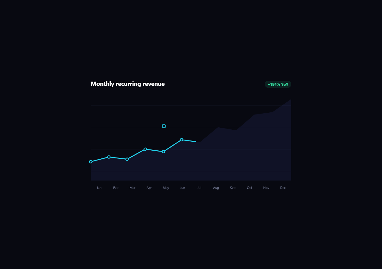
ECharts Revenue Line with Zoom Brush — Range Selection on a Time Series
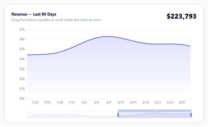
Most chart libraries can draw a line. Fewer make it comfortable to explore ninety days of it at once — which is exactly what a zoom slider (ECharts calls it dataZoom) is for. This snippet renders a smooth revenue line with a gradient fill, a draggable range slider under the axis, and scroll-to-zoom inside the plot area, then keeps a running total in sync with whatever range is currently visible.
Two dataZoom components, one state
The option array has two dataZoom entries: an 'inside' one that turns mouse-wheel and pinch gestures over the chart into zoom, and a 'slider' one that renders the visible drag handles under the axis. They share the same start/end percentages, so dragging the slider and scrolling inside the chart move the same window — ECharts keeps them synchronized automatically once both are declared.
The total isn't static
A dataZoom event fires on every drag, slider nudge, or scroll-zoom. The handler reads the current start/end percentages back off chart.getOption(), maps them to array indices, and sums that slice of the underlying data — so the header figure always reflects the window currently on screen, not the whole dataset. That's the difference between a chart you can zoom and a chart you can actually use to answer "how much revenue in this window?"
The gradient fill is a linear-gradient object, not CSS
ECharts area fills take a gradient object ({ type: 'linear', x, y, x2, y2, colorStops }) directly in areaStyle.color — no CSS, no SVG defs. Fading the fill's alpha to zero at the bottom is what keeps the axis labels legible instead of sitting under a solid color block.
boundaryGap: false
Setting it on the category axis pins the first and last points to the plot's edges instead of centering them in a category "cell" — the correct choice for a continuous time series like this one, versus the default gapped layout that suits discrete categories like a bar chart.
Reusing it
Swap the deterministic sample series for your own date/value pairs, and the total-recalculation handler keeps working unchanged since it only depends on the data array's shape. This is the base pattern for any large time series — stock prices, page views, server latency — where the reader needs both the big picture and the ability to drop into a specific week.
Build with AI
Build, Understand, Optimize, and Extend It With AI
You don't have to work out the dataZoom-to-total math by re-deriving it from the ECharts docs. Paste this snippet's HTML, CSS, and JS into an AI coding assistant like Claude and ask it to explain exactly how the dataZoom event handler converts the chart's start/end percentages into array indices, and why summing that slice on every zoom event is more correct than computing the total once at load time. The same assistant can help optimize it — ask whether recalculating the sum on every intermediate drag frame is wasteful compared to debouncing it, and whether the gradient object in areaStyle.color could be extracted into a reusable helper for other line charts. It's also useful for extending the effect: ask it to add a comparison line for the previous 90-day period, a brush-select mode for choosing an arbitrary date range instead of only the slider, or a CSV export of the currently zoomed window. Treat the code less like a finished artifact and more like a starting point for a conversation.
Prompt to recreate it
Copy this into your AI assistant of choice to build the effect from scratch, or as a jumping-off point for your own variant:
Build an animated revenue line chart with a zoom slider using Apache ECharts (load echarts from a CDN, no other library), in plain HTML, CSS, and JavaScript.

Requirements:
- Generate or accept roughly 90 sequential days of numeric data and render it as a smooth line chart with a gradient area fill beneath it that fades from a solid color at the line down to transparent at the chart's baseline.
- Set the category axis so the first and last data points sit flush against the plot's edges (not padded into centered cells), appropriate for a continuous time series rather than discrete categories.
- Add two synchronized zoom controls: an inside-type dataZoom so the user can zoom by scrolling or pinching directly over the chart, and a slider-type dataZoom rendered below the x-axis with draggable handles — both must control the same visible range.
- Show a running total above the chart that recalculates automatically whenever the visible range changes (dragging either zoom handle or scrolling), by reading the chart's current zoom percentages and summing only the data points currently within that visible window.
- Format both the running total and the tooltip values as currency (e.g. with a dollar sign and thousands separators), and make the tooltip trigger on hovering anywhere along the x-axis, not only when the cursor is exactly on a data point.
- Keep the chart instance responsive to its container being resized (for example inside a flexible card layout) by calling the chart's resize method whenever the container's size changes.
Want to tighten it up first? Run this prompt through the AI Prompt Studio to score it across 8 quality dimensions, catch anti-patterns, and tune the wording for Claude, ChatGPT, or Gemini before you paste it in.
Source Code
<div class="ecl-wrap">
  <div class="ecl-card">
    <div class="ecl-head">
      <div>
        <div class="ecl-title">Revenue — Last 90 Days</div>
        <div class="ecl-sub">Drag the bottom handles or scroll inside the chart to zoom</div>
      </div>
      <div class="ecl-total" id="eclTotal">$0</div>
    </div>
    <div class="ecl-chart" id="eclChart"></div>
  </div>
</div>*{box-sizing:border-box;margin:0;padding:0}
body{font-family:system-ui,-apple-system,sans-serif;background:#f8fafc;min-height:100vh;display:flex;align-items:center;justify-content:center;padding:24px}
.ecl-wrap{width:100%;max-width:660px}
.ecl-card{background:#fff;border-radius:16px;padding:22px 22px 8px;box-shadow:0 1px 8px rgba(0,0,0,.07);border:1px solid #e2e8f0}
.ecl-head{display:flex;justify-content:space-between;align-items:flex-start;gap:12px;margin-bottom:6px}
.ecl-title{font-size:13px;font-weight:700;color:#0f172a}
.ecl-sub{font-size:11.5px;color:#94a3b8;margin-top:3px}
.ecl-total{font-size:22px;font-weight:800;color:#0f172a;white-space:nowrap}
.ecl-chart{width:100%;height:320px}var el = document.getElementById('eclChart');
var totalEl = document.getElementById('eclTotal');
var chart = echarts.init(el);
// Deterministic 90-day series so the demo looks the same on every load.
var days = [];
var values = [];
var base = 4200;
for (var i = 0; i < 90; i++) {
var d = new Date(2026, 5, 1);
d.setDate(d.getDate() + i);
days.push((d.getMonth() + 1) + '/' + d.getDate());
var wave = Math.sin(i / 9) * 900 + Math.sin(i / 3.3) * 300;
var trend = i * 14;
base = 4200 + trend + wave;
values.push(Math.max(500, Math.round(base)));
}
function formatUsd(n) {
return '$' + Math.round(n).toLocaleString('en-US');
}
var option = {
grid: { left: 52, right: 20, top: 20, bottom: 70 },
xAxis: {
type: 'category',
data: days,
boundaryGap: false,
axisLine: { lineStyle: { color: '#e2e8f0' } },
axisLabel: { color: '#94a3b8', fontSize: 10 },
axisTick: { show: false },
},
yAxis: {
type: 'value',
axisLabel: { color: '#94a3b8', fontSize: 10, formatter: function (v) { return '$' + (v / 1000) + 'k'; } },
splitLine: { lineStyle: { color: '#f1f5f9' } },
},
tooltip: {
trigger: 'axis',
valueFormatter: formatUsd,
backgroundColor: '#0f172a',
borderWidth: 0,
textStyle: { color: '#fff', fontSize: 12 },
},
dataZoom: [
{ type: 'inside', start: 55, end: 100 },
{ type: 'slider', start: 55, end: 100, height: 22, bottom: 12,
borderColor: '#e2e8f0', fillerColor: 'rgba(99,102,241,.15)',
handleStyle: { color: '#6366f1' }, textStyle: { color: '#94a3b8', fontSize: 10 } },
],
series: [{
type: 'line',
data: values,
smooth: 0.3,
symbol: 'none',
lineStyle: { width: 2.5, color: '#6366f1' },
areaStyle: {
color: {
type: 'linear', x: 0, y: 0, x2: 0, y2: 1,
colorStops: [
{ offset: 0, color: 'rgba(99,102,241,.28)' },
{ offset: 1, color: 'rgba(99,102,241,0)' },
],
},
},
animationDuration: 900,
animationEasing: 'cubicOut',
}],
};
chart.setOption(option);
function updateTotalFromZoom() {
var opt = chart.getOption();
var dz = opt.dataZoom[0];
var lo = Math.round((dz.start / 100) * (values.length - 1));
var hi = Math.round((dz.end / 100) * (values.length - 1));
var sum = 0;
for (var i = lo; i <= hi; i++) sum += values[i];
totalEl.textContent = formatUsd(sum);
}
chart.on('dataZoom', updateTotalFromZoom);
updateTotalFromZoom();
var ro = new ResizeObserver(function () { chart.resize(); });
ro.observe(el);Step by step
How to Use
- 1Add the ECharts CDNLoad echarts.min.js before the snippet's JS runs.
- 2Paste HTML, CSS, and JSA 90-day revenue line renders with the last third in view.
- 3Drag the slider handlesNarrow or widen the visible date range.
- 4Scroll inside the chartMouse-wheel or pinch zooms the plot area directly.
- 5Watch the total updateThe header figure recalculates for the visible window.
- 6Hover a pointThe tooltip shows that day's exact revenue.
Real-world uses
Common Use Cases
Got questions?
Frequently Asked Questions
Both are dataZoom components declared with the same starting start/end percentages. ECharts treats every dataZoom entry on a chart as controlling the same underlying range unless you scope them to specific axes, so dragging the slider handles and scroll-zooming inside the plot area update one shared state, and either one moves the other's visual position automatically.
A dataZoom event handler reads the chart's current start/end percentages back from chart.getOption(), converts them into array indices against the underlying data length, and sums only that slice. It re-runs on every zoom or drag, so the header always reflects whichever window is currently visible rather than the full dataset's total.
Replace the days and values arrays with your own dates and numbers of equal length — everything downstream (the line, the gradient, the zoom-aware total, the tooltip formatter) reads from those two arrays and needs no other changes. Keep formatUsd or swap it for your own number formatter if the unit isn't currency.
It's the correct setting for a continuous time series: with it false, the first and last data points sit exactly at the plot's left and right edges. The default (true) is meant for discrete categories like bar-chart labels, where each gets a padded "cell" — applying that to a 90-point line would visually compress the series and misalign it with the zoom slider below.
Create the container in a ref/template ref, call echarts.init on mount, setOption once, and dispose the instance on unmount (chart.dispose() in the cleanup function). Keep a ResizeObserver on the container exactly as in the vanilla version — ECharts does not auto-resize with its container's CSS, only in response to an explicit chart.resize() call.