Learn Coding Visually
Learn to code with interactive, live-preview playgrounds — HTML, CSS, JavaScript, React & more.
 HTML Playground42 lessons · Click-based · Live preview
 CSS PlaygroundLearn CSS with a live editor
 JavaScript Playground60 lessons · DOM · Async · Canvas
 React PlaygroundLearn React with a live code editor
 GSAP PlaygroundLearn GSAP animation interactively
 SVG Playground44 lessons · shapes · paths · animation
 SCSS Playground45 lessons · Sass modules · tokens
 Tailwind PlaygroundLearn Tailwind CSS with a live editor
 Bootstrap 5 Playground50 lessons · live preview
ECharts Stacked Area Traffic Breakdown — Free Legend-Toggle Snippet
ECharts Stacked Area Traffic Breakdown · Charts · Plain HTML, CSS & JS · Live preview
What's included
Features
About this UI Snippet
ECharts Stacked Area Traffic Breakdown — a Legend That Actually Re-Stacks
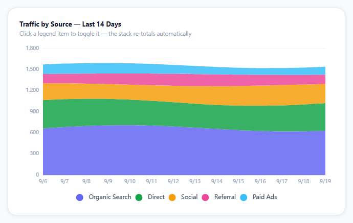
A stacked area chart's whole value is comparing composition over time — but the moment you want to isolate just "Organic Search" and "Direct" by eye, five overlapping colors become hard to parse. ECharts' legend solves this for free: click any entry, and that series is removed from the stack, with every series above it sliding down to fill the gap.
stack: 'total' is the only thing making it a stack
Each of the five series is an ordinary line series with an areaStyle — what turns five separate area charts into one stacked one is giving every series the identical stack string. ECharts sums series sharing a stack key at each x position, in the order they're defined, and lays each one's area on top of the running sum from the ones before it.
Toggling the legend re-stacks automatically
This is the detail that's easy to assume needs custom code and doesn't: clicking a legend entry to hide a series is a built-in ECharts interaction, and because the stack total is recomputed from whichever series are currently visible, hiding "Paid Ads" doesn't leave a gap — the remaining four series' stack simply sums to a smaller total and every area redraws to match. No event listener, no manual recomputation.
lineStyle: { width: 0 } is intentional
Each series sets its line width to zero, so only the filled area renders and not a stroke along its top edge — with five stacked colors already fairly saturated, a visible border on each would add visual noise without adding information.
emphasis.focus: 'series' isolates on hover
Hovering any area (not just its legend entry) dims the other four to a lower opacity, so you can trace one source's shape through the 14-day window without the surrounding stack competing for attention — the same idea as the Sankey diagram's adjacency focus, applied to areas instead of graph edges.
Reusing it
Swap the five traffic sources for any composition-over-time data — revenue by product line, server load by region, expenses by category — and the legend-driven re-stacking, hover isolation, and area styling keep working unchanged since they're driven by the stack key, not by any source-specific logic.
Build with AI
Build, Understand, Optimize, and Extend It With AI
You don't have to implement re-stacking logic by hand. Paste this snippet's HTML, CSS, and JS into an AI coding assistant like Claude and ask it to explain exactly how the shared stack: 'total' key causes ECharts to recompute the running sum automatically when a legend item is toggled, and why lineStyle width is set to zero on every series. The same assistant can help optimize it — ask whether the seeded wave function used for sample data produces a realistic-enough distribution compared to real analytics data, and whether emphasis.focus: 'series' is the right choice versus focusing on 'self' only. It's also useful for extending the effect: ask it to add a percentage-of-total view toggle (switching from absolute stacked values to 100% stacked), a date-range picker instead of a fixed 14-day window, or a way to reorder which source stacks on top via drag-and-drop legend items. Treat the code less like a finished artifact and more like a starting point for a conversation.
Prompt to recreate it
Copy this into your AI assistant of choice to build the effect from scratch, or as a jumping-off point for your own variant:
Build a stacked area chart showing traffic composition by source over a recent date range using Apache ECharts (load echarts from a CDN, no other library), in plain HTML, CSS, and JavaScript.

Requirements:
- Model at least five distinct data sources (for example Organic Search, Direct, Social, Referral, Paid Ads), each with its own color and roughly two weeks of daily numeric values with some natural variation.
- Render all sources as stacked filled areas sharing a single stacking group, so that the visible top edge of the whole chart represents the sum of every visible source at each day, and hide the stroke/border line on each area so only the filled color regions are visible.
- Include a legend below the chart listing every source by name and color, using the charting library's built-in legend-toggle behavior so that clicking a legend entry hides that source from the stack and automatically recomputes the stacked total from the remaining visible sources — do not implement this recalculation manually.
- On hovering any one area, dim every other area to a lower opacity while keeping the hovered one and its legend entry at full opacity, so a single source's shape can be visually traced across the date range.
- Show a tooltip triggered by hovering anywhere along the x-axis that lists every currently visible source's exact value for that specific day.
- Set the x-axis so the first and last data points sit flush against the plot's edges rather than padded into centered categories, appropriate for a continuous date range.
- Keep the chart instance responsive to its container being resized by calling the chart's resize method whenever the container's size changes.
Want to tighten it up first? Run this prompt through the AI Prompt Studio to score it across 8 quality dimensions, catch anti-patterns, and tune the wording for Claude, ChatGPT, or Gemini before you paste it in.
Source Code
<div class="esa-wrap">
  <div class="esa-card">
    <div class="esa-title">Traffic by Source — Last 14 Days</div>
    <div class="esa-sub">Click a legend item to toggle it — the stack re-totals automatically</div>
    <div class="esa-chart" id="esaChart"></div>
  </div>
</div>*{box-sizing:border-box;margin:0;padding:0}
body{font-family:system-ui,-apple-system,sans-serif;background:#f8fafc;min-height:100vh;display:flex;align-items:center;justify-content:center;padding:24px}
.esa-wrap{width:100%;max-width:660px}
.esa-card{background:#fff;border-radius:16px;padding:22px;box-shadow:0 1px 8px rgba(0,0,0,.07);border:1px solid #e2e8f0}
.esa-title{font-size:13px;font-weight:700;color:#0f172a}
.esa-sub{font-size:11.5px;color:#94a3b8;margin-top:3px;margin-bottom:6px}
.esa-chart{width:100%;height:320px}var el = document.getElementById('esaChart');
var chart = echarts.init(el);
var days = [];
for (var i = 13; i >= 0; i--) {
var d = new Date(2026, 8, 19 - i);
days.push((d.getMonth() + 1) + '/' + d.getDate());
}
var SOURCES = [
{ name: 'Organic Search', color: '#6366f1', base: 620, wobble: 90 },
{ name: 'Direct', color: '#16a34a', base: 340, wobble: 60 },
{ name: 'Social', color: '#f59e0b', base: 210, wobble: 80 },
{ name: 'Referral', color: '#ec4899', base: 130, wobble: 40 },
{ name: 'Paid Ads', color: '#38bdf8', base: 95, wobble: 55 },
];
function seededWave(i, phase) {
return Math.sin(i / 2.4 + phase) * 0.5 + 0.5;
}
var series = SOURCES.map(function (s, si) {
var data = days.map(function (_, i) {
return Math.round(s.base + seededWave(i, si * 1.7) * s.wobble);
});
return {
name: s.name,
type: 'line',
stack: 'total',
smooth: 0.25,
symbol: 'none',
lineStyle: { width: 0 },
areaStyle: { color: s.color, opacity: 0.85 },
emphasis: { focus: 'series' },
data: data,
};
});
var option = {
color: SOURCES.map(function (s) { return s.color; }),
legend: {
bottom: 0,
icon: 'circle',
textStyle: { color: '#334155', fontSize: 11.5 },
},
grid: { left: 46, right: 16, top: 16, bottom: 56 },
tooltip: {
trigger: 'axis',
backgroundColor: '#0f172a',
borderWidth: 0,
textStyle: { color: '#fff', fontSize: 12 },
axisPointer: { type: 'line' },
},
xAxis: {
type: 'category',
boundaryGap: false,
data: days,
axisLine: { lineStyle: { color: '#e2e8f0' } },
axisLabel: { color: '#94a3b8', fontSize: 10 },
axisTick: { show: false },
},
yAxis: {
type: 'value',
axisLabel: { color: '#94a3b8', fontSize: 10 },
splitLine: { lineStyle: { color: '#f1f5f9' } },
},
series: series,
};
chart.setOption(option);
var ro = new ResizeObserver(function () { chart.resize(); });
ro.observe(el);Step by step
How to Use
- 1Add the ECharts CDNLoad echarts.min.js before the snippet's JS runs.
- 2Paste HTML, CSS, and JSFive traffic sources stack into one 14-day area chart.
- 3Click a legend itemThat source drops out and the stack re-totals.
- 4Click it againIt rejoins the stack in its original position.
- 5Hover an areaThe others dim so you can trace one source's shape.
- 6Hover the x-axisThe tooltip lists every visible source's value for that day.
Real-world uses
Common Use Cases
Got questions?
Frequently Asked Questions
All five series share the same stack: 'total' string, which tells ECharts to sum them at every x position in series order and layer each area on top of the running total. Clicking a legend entry to hide a series is a built-in ECharts interaction, and because the stack sum is recalculated from whichever series are currently visible, the remaining areas automatically redraw to a smaller total with no gap and no manual event handling needed.
Without it, each stacked area would render with a visible stroke along its top edge in addition to the fill — with five saturated colors already stacked closely together, five more colored strokes adds visual clutter without adding information. Setting width: 0 keeps only the filled area visible, which is cleaner for a composition chart like this one.
Hovering over any one series' area (not just clicking its legend swatch) dims every other series to a lower opacity while keeping the hovered one at full opacity, so you can visually trace how one specific source's contribution changes across the 14-day window without the rest of the stack competing for attention.
Add or remove entries in the SOURCES array (each needs a name, a color, a base value, and a wobble amount for the sample wave), and the series-building map, the stacking, the legend, and the color assignment all derive from that array automatically — no other code needs to change for a fourth or sixth source.
Build the series array from your data source (an API response, a store selector) inside your component before passing it to setOption, initialize the chart once against a container ref, and call setOption again whenever the underlying data changes. Dispose the instance on unmount and keep the ResizeObserver pattern since ECharts does not auto-resize with CSS layout changes alone.