Learn Coding Visually
Learn to code with interactive, live-preview playgrounds — HTML, CSS, JavaScript, React & more.
 HTML Playground42 lessons · Click-based · Live preview
 CSS PlaygroundLearn CSS with a live editor
 JavaScript Playground60 lessons · DOM · Async · Canvas
 React PlaygroundLearn React with a live code editor
 GSAP PlaygroundLearn GSAP animation interactively
 SVG Playground44 lessons · shapes · paths · animation
 SCSS Playground45 lessons · Sass modules · tokens
 Tailwind PlaygroundLearn Tailwind CSS with a live editor
 Bootstrap 5 Playground50 lessons · live preview
ECharts Calendar Heatmap — Free Contribution Graph Snippet
ECharts Calendar Heatmap · Charts · Plain HTML, CSS & JS · Live preview
What's included
Features
About this UI Snippet
ECharts Calendar Heatmap — A Full Year of Daily Activity in One Grid
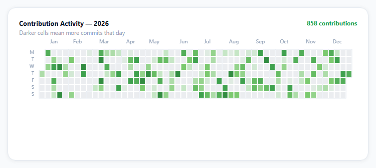
The GitHub contribution graph is one of the most recognizable data visualizations on the web — a full year compressed into a grid of colored squares, dense enough to spot streaks and gaps at a glance. Apache ECharts ships the exact building blocks for it: a calendar coordinate system that lays out a year as a week-by-day grid, and a heatmap series that colors each cell by value.
calendar is a coordinate system, not a chart type
Most ECharts series draw on a Cartesian or polar grid. heatmap here instead targets coordinateSystem: 'calendar', and the calendar component (declared as its own top-level option, like grid or polar) handles converting each date string into a cell position — you supply [date, value] pairs and never compute a row or column yourself.
visualMap drives the color scale, invisibly
The five-stop green scale (#ebedf0 through #196127, GitHub's own palette) comes from a visualMap component with show: false — it still does its job of mapping each cell's value to a color along that gradient, it just doesn't render its own legend/slider UI, which would be redundant for a calendar that's already self-explanatory.
Seeded data keeps the demo honest
The 365 daily counts come from a small seeded pseudo-random function rather than Math.random(), so the same pattern (and the same total in the header) renders on every page load — useful for anyone comparing before/after CSS tweaks, and standard practice for any demo that isn't hooked to live data.
The zero-weighted distribution matters
Real contribution graphs are mostly empty with occasional bursts, not evenly distributed. The generator weights toward zero (r > 0.55 before any commits count at all) specifically so the rendered heatmap looks like an actual usage pattern instead of uniform noise — a detail that matters more than it seems for a demo meant to be visually convincing.
Reusing it
Swap the generated data for real daily counts (from git log, an activity log table, or an analytics export keyed by date) and everything else — the color scale, month/day labels, tooltip — keeps working unchanged, since it only depends on [isoDateString, number] pairs.
Build with AI
Build, Understand, Optimize, and Extend It With AI
You don't have to work out date-to-grid-cell math yourself. Paste this snippet's HTML, CSS, and JS into an AI coding assistant like Claude and ask it to explain exactly how the calendar coordinate system converts an ISO date string into a specific week-column and day-row position, and why visualMap is configured with show: false while still driving the cell colors. The same assistant can help optimize it — ask whether generating 365 data points with a seeded pseudo-random function is the cheapest way to produce a stable demo dataset, and whether the color scale's five stops are evenly perceptually spaced or could be improved. It's also useful for extending the effect: ask it to add a year selector that swaps between multiple years' calendars, a click handler that opens a detail panel for the clicked day, or a second heatmap row showing a different metric (like lines-of-code) alongside the contribution count. Treat the code less like a finished artifact and more like a starting point for a conversation.
Prompt to recreate it
Copy this into your AI assistant of choice to build the effect from scratch, or as a jumping-off point for your own variant:
Build a GitHub-style calendar contribution heatmap for a full year using Apache ECharts (load echarts from a CDN, no other library), in plain HTML, CSS, and JavaScript.

Requirements:
- Generate or accept a full year of daily data as a list of [ISO date string, numeric count] pairs, with the distribution weighted so most days have a low or zero count and only some days have higher activity, similar to a real usage pattern rather than uniform random noise.
- Render it using the charting library's calendar-based coordinate system so that dates automatically map to the correct week-column and day-row grid position — do not manually compute pixel positions for each day.
- Color each day cell along a five-stop sequential color scale from a near-white/gray for zero activity up to a dark saturated color for the highest activity, using the library's value-to-color mapping mechanism configured to not render its own visible legend or slider (since the calendar grid is self-explanatory).
- Show month labels along the top of the calendar and abbreviated day-of-week labels along the side, matching the layout of a familiar contribution graph.
- On hovering any day cell, show a tooltip with that day's full date and its exact numeric count, using correct singular/plural wording (e.g. "1 contribution" vs "3 contributions").
- Display a running total above the calendar summing every day's count across the full year.
- Keep the chart instance responsive to its container being resized by calling the chart's resize method whenever the container's size changes.
Want to tighten it up first? Run this prompt through the AI Prompt Studio to score it across 8 quality dimensions, catch anti-patterns, and tune the wording for Claude, ChatGPT, or Gemini before you paste it in.
Source Code
<div class="ech-wrap">
  <div class="ech-card">
    <div class="ech-head">
      <div>
        <div class="ech-title">Contribution Activity — 2026</div>
        <div class="ech-sub">Darker cells mean more commits that day</div>
      </div>
      <div class="ech-total" id="echTotal">0 contributions</div>
    </div>
    <div class="ech-chart" id="echChart"></div>
  </div>
</div>*{box-sizing:border-box;margin:0;padding:0}
body{font-family:system-ui,-apple-system,sans-serif;background:#f8fafc;min-height:100vh;display:flex;align-items:center;justify-content:center;padding:24px}
.ech-wrap{width:100%;max-width:720px}
.ech-card{background:#fff;border-radius:16px;padding:22px;box-shadow:0 1px 8px rgba(0,0,0,.07);border:1px solid #e2e8f0}
.ech-head{display:flex;justify-content:space-between;align-items:flex-start;gap:12px;margin-bottom:6px;flex-wrap:wrap}
.ech-title{font-size:13px;font-weight:700;color:#0f172a}
.ech-sub{font-size:11.5px;color:#94a3b8;margin-top:3px}
.ech-total{font-size:12px;font-weight:700;color:#16a34a;white-space:nowrap}
.ech-chart{width:100%;height:220px}var el = document.getElementById('echChart');
var totalEl = document.getElementById('echTotal');
var chart = echarts.init(el);
// Deterministic pseudo-random daily counts for every day of 2026, seeded so
// the pattern (and the total) is identical on every load.
function seededRandom(seed) {
var x = Math.sin(seed) * 10000;
return x - Math.floor(x);
}
var data = [];
var total = 0;
var start = new Date(2026, 0, 1);
var end = new Date(2026, 11, 31);
var day = new Date(start);
var i = 0;
while (day <= end) {
var r = seededRandom(i * 7.13 + 1);
// Weight toward zero so most days are quiet, like a real contribution graph.
var count = r > 0.55 ? Math.round((r - 0.55) * 22) : 0;
var iso = day.getFullYear() + '-' + String(day.getMonth() + 1).padStart(2, '0') + '-' + String(day.getDate()).padStart(2, '0');
data.push([iso, count]);
total += count;
day.setDate(day.getDate() + 1);
i++;
}
totalEl.textContent = total.toLocaleString('en-US') + ' contributions';
var option = {
tooltip: {
backgroundColor: '#0f172a',
borderWidth: 0,
textStyle: { color: '#fff', fontSize: 12 },
formatter: function (p) {
var n = p.data[1];
return p.data[0] + '<br/><b>' + n + '</b> ' + (n === 1 ? 'contribution' : 'contributions');
},
},
visualMap: {
min: 0,
max: 12,
show: false,
inRange: { color: ['#ebedf0', '#c6e6c6', '#7bc96f', '#3fa14e', '#196127'] },
},
calendar: {
range: '2026',
cellSize: ['auto', 14],
left: 40,
right: 10,
top: 20,
splitLine: { lineStyle: { color: '#e2e8f0' } },
itemStyle: { borderWidth: 2, borderColor: '#fff' },
yearLabel: { show: false },
monthLabel: { color: '#94a3b8', fontSize: 10 },
dayLabel: { color: '#94a3b8', fontSize: 9, firstDay: 1 },
},
series: [{
type: 'heatmap',
coordinateSystem: 'calendar',
data: data,
}],
};
chart.setOption(option);
var ro = new ResizeObserver(function () { chart.resize(); });
ro.observe(el);Step by step
How to Use
- 1Add the ECharts CDNLoad echarts.min.js before the snippet's JS runs.
- 2Paste HTML, CSS, and JSA full year renders as a color-scaled grid of day cells.
- 3Read the header totalIt sums every day's count across the year.
- 4Hover a cellThe tooltip shows that exact date and its count.
- 5Scan for streaksDarker green runs show consistent activity.
- 6Scan for gapsLight gray cells mark days with zero activity.
Real-world uses
Common Use Cases
Got questions?
Frequently Asked Questions
The heatmap series is set to coordinateSystem: 'calendar' instead of the default Cartesian grid, and a separate top-level calendar component (given a range like '2026') handles converting each [date, value] pair in the series data into the correct week-column and day-row cell position. You never compute a row or column index yourself — only supply ISO date strings and numbers.
visualMap normally renders a visible legend or slider that lets viewers interact with the color scale. Here it is used purely for its color-mapping logic — converting each cell's numeric value into a color along the five-stop green gradient — without rendering that UI, since a calendar heatmap is self-explanatory and an extra legend would be redundant clutter.
Math.random() produces a different pattern (and a different header total) on every page load, which makes the demo inconsistent for screenshots, visual regression checks, or anyone comparing two versions side by side. The seeded function derives its output from a fixed formula, so the exact same 365 values render every time the snippet runs.
Replace the generator loop with your own array of [isoDateString, count] pairs — from a database query grouped by day, a git log parse, or an analytics export. The calendar component, color scale, tooltip, and header total all read from that data array's shape and need no other changes.
Initialize the chart once against a container ref/template ref and call setOption whenever your date-keyed data changes — for a full year swap, that's just a new range value and a new data array. Dispose the instance on unmount, and keep the same ResizeObserver pattern since ECharts does not auto-resize with CSS layout changes alone.