Learn Coding Visually
Learn to code with interactive, live-preview playgrounds — HTML, CSS, JavaScript, React & more.
 HTML Playground42 lessons · Click-based · Live preview
 CSS PlaygroundLearn CSS with a live editor
 JavaScript Playground60 lessons · DOM · Async · Canvas
 React PlaygroundLearn React with a live code editor
 GSAP PlaygroundLearn GSAP animation interactively
 SVG Playground44 lessons · shapes · paths · animation
 SCSS Playground45 lessons · Sass modules · tokens
 Tailwind PlaygroundLearn Tailwind CSS with a live editor
 Bootstrap 5 Playground50 lessons · live preview
ECharts KPI Gauge Cluster — Free Speedometer Dashboard Snippet
ECharts KPI Gauge Cluster · Dashboards · Plain HTML, CSS & JS · Live preview
What's included
Features
About this UI Snippet
ECharts KPI Gauge Cluster — Multiple Gauges, One Chart Instance
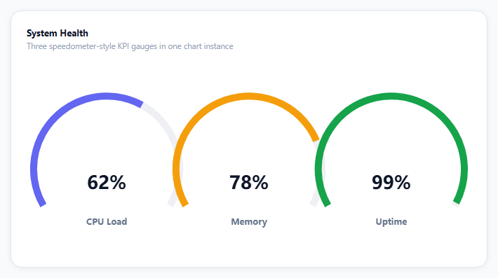
A single stat looks stronger as a speedometer than a number — but most gauge examples show exactly one, leaving you to guess how to place several side by side. This snippet answers that: three independent gauges (CPU, memory, uptime) rendered from one echarts.init call, each with its own center and progress color, animating smoothly to new values on an interval.
One chart, many gauge series
ECharts doesn't require a separate chart instance per gauge. Each entry in the series array can be its own type: 'gauge' with a center given as a percentage pair (['18%', '58%']) — that's what positions three gauges left-to-center-to-right inside one canvas instead of stacking them. A small factory function (makeGauge) builds each series from a center, name, value, unit, and color, which is what keeps three near-identical gauge configs from turning into 90 lines of copy-pasted options.
A speedometer, not a dial
Setting startAngle: 210 and endAngle: -30 sweeps the arc across the bottom three-quarters of the circle — the recognizable speedometer shape — rather than ECharts' default full circle. Hiding the pointer, anchor, and axis labels (show: false on each) and showing only the colored progress arc plus a centered number is what makes this read as a clean KPI card rather than a literal gauge instrument.
valueAnimation makes the number count, not jump
detail: { valueAnimation: true } is the one line that turns a value change into a rolling count-up/down rather than an instant swap — genuinely important here since the numbers update every three seconds and a jump-cut would be distracting at that frequency.
The "live" feeling is one setInterval
Every three seconds, each gauge's target nudges by a random amount (clamped to a sane range) and chart.setOption is called with just the changed data arrays — ECharts diffs the new option against the current one and animates only what changed, so the progress arcs sweep smoothly to their new positions instead of resetting.
Reusing it
Swap CPU/memory/uptime for any three percentage-based KPIs — SLA compliance, quota usage, satisfaction score — and replace the interval with a real polling call to your metrics endpoint. The factory function scales to two gauges or five by adjusting the center percentages.
Build with AI
Build, Understand, Optimize, and Extend It With AI
You don't have to work out gauge positioning by trial and error. Paste this snippet's HTML, CSS, and JS into an AI coding assistant like Claude and ask it to explain exactly how the center percentages on each gauge series position three gauges side by side within one chart canvas, and why startAngle/endAngle values of 210/-30 produce the speedometer shape instead of a full circle. The same assistant can help optimize it — ask whether the setInterval-driven random walk should be replaced with an actual data source, and whether valueAnimation's default duration is fast enough for a three-second update cadence without looking rushed. It's also useful for extending the effect: ask it to add a fourth gauge, color-code each gauge red/amber/green based on threshold values, or add a click handler that opens a detail panel for the clicked KPI. Treat the code less like a finished artifact and more like a starting point for a conversation.
Prompt to recreate it
Copy this into your AI assistant of choice to build the effect from scratch, or as a jumping-off point for your own variant:
Build a KPI dashboard with three speedometer-style gauges rendered in a single Apache ECharts chart instance (load echarts from a CDN, no other library), in plain HTML, CSS, and JavaScript.

Requirements:
- Render exactly three gauge charts side by side within one chart container and one echarts.init call — not three separate chart instances — by giving each gauge series its own center position as a percentage of the shared chart box.
- Shape each gauge as a speedometer: sweep the arc across roughly the bottom three-quarters of a circle (not a full circle) using custom start and end angle values, hide the pointer, hide the tick marks and axis labels, and show only a colored progress arc.
- Show a large animated number in the center of each gauge representing its current percentage value, with the number rolling smoothly between old and new values (not jump-cutting) whenever the value changes, and a small label beneath each number naming that gauge.
- Give each of the three gauges a visually distinct progress arc color and a different current value so they read as three separate KPIs (for example CPU load, memory usage, and uptime).
- On an interval of a few seconds, update all three gauges to new randomly-nudged values by calling the chart's option-setting method with only the changed values, so ECharts animates the arcs and numbers to their new positions rather than resetting instantly.
- Keep the chart instance responsive to its container being resized by calling the chart's resize method whenever the container's size changes.
Want to tighten it up first? Run this prompt through the AI Prompt Studio to score it across 8 quality dimensions, catch anti-patterns, and tune the wording for Claude, ChatGPT, or Gemini before you paste it in.
Source Code
<div class="ekg-wrap">
  <div class="ekg-card">
    <div class="ekg-head">
      <div class="ekg-title">System Health</div>
      <div class="ekg-sub">Three speedometer-style KPI gauges in one chart instance</div>
    </div>
    <div class="ekg-chart" id="ekgChart"></div>
  </div>
</div>*{box-sizing:border-box;margin:0;padding:0}
body{font-family:system-ui,-apple-system,sans-serif;background:#f8fafc;min-height:100vh;display:flex;align-items:center;justify-content:center;padding:24px}
.ekg-wrap{width:100%;max-width:680px}
.ekg-card{background:#fff;border-radius:16px;padding:22px;box-shadow:0 1px 8px rgba(0,0,0,.07);border:1px solid #e2e8f0}
.ekg-title{font-size:13px;font-weight:700;color:#0f172a}
.ekg-sub{font-size:11.5px;color:#94a3b8;margin-top:3px;margin-bottom:6px}
.ekg-chart{width:100%;height:280px}var el = document.getElementById('ekgChart');
var chart = echarts.init(el);
// Three gauges sharing one chart instance. Each gets its own "center" (in %
// of the chart box) and "radius" so they sit side by side instead of
// stacking on top of each other -- a single ECharts instance can host as
// many gauge series as fit.
function makeGauge(center, name, value, unit, color) {
return {
type: 'gauge',
center: center,
radius: '78%',
min: 0,
max: 100,
startAngle: 210,
endAngle: -30,
progress: { show: true, width: 10, itemStyle: { color: color } },
axisLine: { lineStyle: { width: 10, color: [[1, '#eef0f5']] } },
axisTick: { show: false },
splitLine: { show: false },
axisLabel: { show: false },
pointer: { show: false },
anchor: { show: false },
title: { show: true, offsetCenter: [0, '70%'], fontSize: 12, fontWeight: 600, color: '#64748b' },
detail: {
valueAnimation: true,
offsetCenter: [0, '20%'],
fontSize: 26,
fontWeight: 800,
color: '#0f172a',
formatter: function (v) { return Math.round(v) + unit; },
},
data: [{ value: value, name: name }],
};
}
var option = {
series: [
makeGauge(['18%', '58%'], 'CPU Load', 62, '%', '#6366f1'),
makeGauge(['50%', '58%'], 'Memory', 78, '%', '#f59e0b'),
makeGauge(['82%', '58%'], 'Uptime', 99, '%', '#16a34a'),
],
};
chart.setOption(option);
// Re-animate to a new random-ish reading every few seconds so the cluster
// reads as "live" rather than a static illustration.
var targets = [62, 78, 99];
setInterval(function () {
targets = targets.map(function (v) {
var next = v + (Math.random() * 14 - 7);
return Math.max(20, Math.min(99, Math.round(next)));
});
chart.setOption({
series: [
{ data: [{ value: targets[0], name: 'CPU Load' }] },
{ data: [{ value: targets[1], name: 'Memory' }] },
{ data: [{ value: targets[2], name: 'Uptime' }] },
],
});
}, 3000);
var ro = new ResizeObserver(function () { chart.resize(); });
ro.observe(el);Step by step
How to Use
- 1Add the ECharts CDNLoad echarts.min.js before the snippet's JS runs.
- 2Paste HTML, CSS, and JSThree gauges render side by side in one chart.
- 3Watch the numbers moveEvery few seconds each gauge animates to a new reading.
- 4Compare the colorsEach gauge has an independent progress color and value.
- 5Read the labels below the numbersCPU Load, Memory, and Uptime name each gauge.
- 6Resize the windowThe chart's ResizeObserver keeps all three gauges proportioned.
Real-world uses
Common Use Cases
Got questions?
Frequently Asked Questions
Each gauge series gets its own center property as a percentage pair of the chart's total box, such as ['18%', '58%'] for the left gauge and ['82%', '58%'] for the right one. Because center is relative to the whole chart canvas, not per-series, spacing the three x-percentages apart is what lays them out side by side in a single echarts.init instance.
The detail block sets valueAnimation: true, which tells ECharts to animate the displayed number between its old and new value over the same transition used for the arc, rather than swapping it instantly. Combined with calling setOption on an interval with only the changed data, this produces a smooth rolling-count effect.
A gauge's default sweep is a full circle; setting startAngle: 210 and endAngle: -30 restricts the arc to roughly 240 degrees across the bottom three-quarters of the circle, leaving a gap at the top — the shape everyone recognizes as a car speedometer. Adjusting those two angles is the only thing needed to reshape the arc.
Replace the setInterval body with a fetch (or WebSocket message handler) that retrieves your actual CPU, memory, and uptime numbers, then call chart.setOption with the same shape: an array of { data: [{ value, name }] } objects matching series order. Everything else — the animation, the layout, the colors — keeps working unchanged.
Initialize the chart once on mount against a ref/template ref, keep the option object in a variable outside your render cycle, and call chart.setOption from wherever your data updates (a WebSocket handler, a polling interval, a store subscription) rather than re-initializing the chart. Dispose the instance (chart.dispose()) on unmount to avoid leaking canvas contexts.