
Learn Coding Visually
Learn to code with interactive, live-preview playgrounds — HTML, CSS, JavaScript, React & more.
 HTML Playground42 lessons · Click-based · Live preview
 CSS PlaygroundLearn CSS with a live editor
 JavaScript Playground60 lessons · DOM · Async · Canvas
 React PlaygroundLearn React with a live code editor
 GSAP PlaygroundLearn GSAP animation interactively
 SVG Playground44 lessons · shapes · paths · animation
 SCSS Playground45 lessons · Sass modules · tokens
 Tailwind PlaygroundLearn Tailwind CSS with a live editor
 Bootstrap 5 Playground50 lessons · live preview
ECharts Sankey User Flow Diagram — Free Funnel Visualization Snippet
ECharts Sankey User Flow Diagram · Charts · Plain HTML, CSS & JS · Live preview
What's included
Features
About this UI Snippet
ECharts Sankey User Flow Diagram — Where Users Actually Go, Not Just Where They Stop
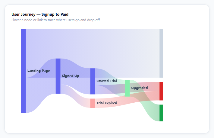
A conversion funnel chart tells you how many users made it to each stage. It can't tell you where the ones who didn't make it *went* — did they bounce immediately, or churn after a trial? A Sankey diagram answers that by drawing every path as a proportionally-sized ribbon, so drop-off isn't a shrinking bar, it's a visible flow into a "Bounced" or "Churned" node you can trace with your eye.
Nodes and links are just two arrays
ECharts' sankey series takes a flat data array of node objects ({ name }, optionally with a fixed itemStyle color) and a separate links array of { source, target, value } triples referencing those names. There's no manual layout math — ECharts computes each node's vertical position and every ribbon's thickness from the link values, laying columns out left to right based on the graph's actual topology.
Pinning outcome nodes with depth
"Paid" is reached in one hop from "Upgraded"; "Churned" is reached from two different paths at different lengths ("Trial Expired" and "Started Trial" directly). Left alone, ECharts would place them in different columns based on path length. Setting depth: 4 on both outcome nodes explicitly pins them to the same rightmost column, which is what makes the diagram read as "here's where everyone eventually lands" instead of a staggered, harder-to-scan layout.
emphasis.focus: 'adjacency' is the interactive payoff
Hovering a node or ribbon highlights only its directly connected links and dims everything else — that's the single option that turns a static diagram into a tool for tracing one specific path (say, "how many Signed Up users eventually reach Paid?") without mentally filtering out the rest of the graph yourself.
Gradient ribbons show direction
lineStyle: { color: 'gradient' } colors each ribbon as a gradient between its source and target node colors, so the eye can follow a flow's origin and destination even in a dense diagram — useful once you have more than four or five nodes, where flat-colored ribbons start to look interchangeable.
Reusing it
Swap in your own funnel stages and real conversion counts (from your analytics or product database), and the layout, gradients, and hover behavior keep working since they're driven entirely by the links value totals — no positions to hand-tune.
Build with AI
Build, Understand, Optimize, and Extend It With AI
You don't have to reverse-engineer ECharts' Sankey layout algorithm by reading source. Paste this snippet's HTML, CSS, and JS into an AI coding assistant like Claude and ask it to explain exactly how ECharts derives each node's column position and each ribbon's thickness from the flat links array, and why the depth property is needed to force Paid and Churned into the same rightmost column despite being reached by paths of different lengths. The same assistant can help optimize it — ask whether the gradient ribbon coloring adds real clarity at this node count or would look cleaner as flat colors, and whether the tooltip formatter's branching on dataType is the cleanest way to distinguish node hovers from link hovers. It's also useful for extending the effect: ask it to add a fifth stage between Signed Up and Started Trial, make the diagram vertical instead of horizontal, or add click-to-filter so clicking a node shows only its downstream paths in a side panel. Treat the code less like a finished artifact and more like a starting point for a conversation.
Prompt to recreate it
Copy this into your AI assistant of choice to build the effect from scratch, or as a jumping-off point for your own variant:
Build a Sankey diagram visualizing a user conversion funnel using Apache ECharts (load echarts from a CDN, no other library), in plain HTML, CSS, and JavaScript.

Requirements:
- Model the funnel as two separate data structures: a flat list of named stage nodes (for example Landing Page, Signed Up, Bounced, Started Trial, Trial Expired, Upgraded, Paid, Churned) and a separate list of directed links between node names, each carrying a numeric value representing how many users made that specific transition.
- Render it as a Sankey diagram where ribbon thickness is proportional to each link's value, and let the chart library derive node column positions and ribbon paths automatically from the link data rather than specifying manual coordinates.
- Explicitly align the two final outcome nodes (a positive outcome like Paid and a negative outcome like Churned) into the same rightmost visual column even though they may be reached by paths of different lengths, using whatever layout override the library provides for this.
- Give the negative/drop-off nodes (Bounced, Churned, Trial Expired) a distinct muted or red color and the positive outcome node a distinct green color, while leaving intermediate stage nodes a neutral accent color.
- On hovering any node or ribbon, highlight that element and its directly connected links/nodes at full opacity while dimming every other element in the diagram, so a single conversion or drop-off path can be visually traced.
- Show a custom tooltip that displays the source and target stage names with an arrow between them and the exact numeric value when hovering a ribbon, and just the stage name when hovering a node.
- Keep the chart instance responsive to its container being resized by calling the chart's resize method whenever the container's size changes.
Want to tighten it up first? Run this prompt through the AI Prompt Studio to score it across 8 quality dimensions, catch anti-patterns, and tune the wording for Claude, ChatGPT, or Gemini before you paste it in.
Source Code
<div class="esk-wrap">
  <div class="esk-card">
    <div class="esk-title">User Journey — Signup to Paid</div>
    <div class="esk-sub">Hover a node or link to trace where users go and drop off</div>
    <div class="esk-chart" id="eskChart"></div>
  </div>
</div>*{box-sizing:border-box;margin:0;padding:0}
body{font-family:system-ui,-apple-system,sans-serif;background:#f8fafc;min-height:100vh;display:flex;align-items:center;justify-content:center;padding:24px}
.esk-wrap{width:100%;max-width:680px}
.esk-card{background:#fff;border-radius:16px;padding:22px;box-shadow:0 1px 8px rgba(0,0,0,.07);border:1px solid #e2e8f0}
.esk-title{font-size:13px;font-weight:700;color:#0f172a}
.esk-sub{font-size:11.5px;color:#94a3b8;margin-top:3px;margin-bottom:6px}
.esk-chart{width:100%;height:340px}var el = document.getElementById('eskChart');
var chart = echarts.init(el);
// Nodes across four "columns" of the funnel. depth controls which vertical
// band a node is drawn in -- Sankey computes horizontal position from the
// graph itself, but depth lets us pin the two outcome nodes (Paid / Churned)
// into the same rightmost column even though they're reached at different
// path lengths.
var nodes = [
{ name: 'Landing Page' },
{ name: 'Signed Up' },
{ name: 'Bounced', itemStyle: { color: '#cbd5e1' } },
{ name: 'Started Trial' },
{ name: 'Trial Expired', itemStyle: { color: '#fca5a5' } },
{ name: 'Upgraded', itemStyle: { color: '#86efac' } },
{ name: 'Paid', itemStyle: { color: '#16a34a' }, depth: 4 },
{ name: 'Churned', itemStyle: { color: '#dc2626' }, depth: 4 },
];
var links = [
{ source: 'Landing Page', target: 'Signed Up', value: 4200 },
{ source: 'Landing Page', target: 'Bounced', value: 5800 },
{ source: 'Signed Up', target: 'Started Trial', value: 3100 },
{ source: 'Signed Up', target: 'Trial Expired', value: 1100 },
{ source: 'Started Trial', target: 'Upgraded', value: 2000 },
{ source: 'Started Trial', target: 'Churned', value: 1100 },
{ source: 'Upgraded', target: 'Paid', value: 2000 },
{ source: 'Trial Expired', target: 'Churned', value: 1100 },
];
var option = {
tooltip: {
trigger: 'item',
triggerOn: 'mousemove',
backgroundColor: '#0f172a',
borderWidth: 0,
textStyle: { color: '#fff', fontSize: 12 },
formatter: function (p) {
if (p.dataType === 'edge') {
return p.data.source + ' → ' + p.data.target + '<br/><b>' + p.data.value.toLocaleString('en-US') + '</b> users';
}
return '<b>' + p.name + '</b>';
},
},
series: [{
type: 'sankey',
data: nodes,
links: links,
emphasis: { focus: 'adjacency' },
lineStyle: { color: 'gradient', curveness: 0.5, opacity: 0.35 },
label: { color: '#334155', fontSize: 11, fontWeight: 600 },
nodeGap: 14,
nodeWidth: 16,
itemStyle: { color: '#6366f1', borderWidth: 0 },
}],
};
chart.setOption(option);
var ro = new ResizeObserver(function () { chart.resize(); });
ro.observe(el);Step by step
How to Use
- 1Add the ECharts CDNLoad echarts.min.js before the snippet's JS runs.
- 2Paste HTML, CSS, and JSThe user flow renders as colored ribbons between stages.
- 3Hover a nodeIts connected paths highlight while everything else dims.
- 4Hover a ribbonThe tooltip shows the exact user count for that transition.
- 5Trace a drop-offFollow the ribbons into Bounced, Trial Expired, or Churned.
- 6Trace a conversionFollow ribbons from Landing Page all the way to Paid.
Real-world uses
Common Use Cases
Got questions?
Frequently Asked Questions
It computes layout entirely from the links array: nodes with no incoming links start the leftmost column, and every other node's column is derived from how many hops it takes to reach from a source. You never set x/y coordinates directly — you only describe which nodes connect to which, with what value, and ECharts lays out the columns and ribbon thicknesses from that graph structure.
Both nodes have an explicit depth: 4 property, which overrides ECharts' automatic column placement (based on path length from the source) and pins them to the same rightmost column regardless of how many hops each path took to reach them. Without it, Churned — reachable in fewer hops from some paths — would land in an earlier column than Paid, making the diagram harder to read as a single set of outcomes.
On hovering any node or link, ECharts keeps that element and everything directly connected to it (its adjacent links and nodes) at full opacity, and fades every other element in the diagram. It is what lets you trace one specific path — say, Landing Page through to Paid — without the rest of the graph visually competing for attention.
Replace the nodes array with your own stage names (add itemStyle colors for any node you want to highlight, like a final outcome) and the links array with { source, target, value } objects using real counts from your analytics. Depth values are only needed for nodes you want to explicitly align into the same column; everything else lays out automatically.
Initialize the chart once against a container ref/template ref, call setOption with your nodes and links whenever the underlying data changes, and dispose the instance on unmount. Because layout is fully derived from the links array, updating the diagram for a new date range or cohort is just calling setOption again with new values — no layout recalculation needed on your end.