Learn Coding Visually
Learn to code with interactive, live-preview playgrounds — HTML, CSS, JavaScript, React & more.
 HTML Playground42 lessons · Click-based · Live preview
 CSS PlaygroundLearn CSS with a live editor
 JavaScript Playground60 lessons · DOM · Async · Canvas
 React PlaygroundLearn React with a live code editor
 GSAP PlaygroundLearn GSAP animation interactively
 SVG Playground44 lessons · shapes · paths · animation
 SCSS Playground45 lessons · Sass modules · tokens
 Tailwind PlaygroundLearn Tailwind CSS with a live editor
 Bootstrap 5 Playground50 lessons · live preview
ECharts Radar Skill Comparison — Free Two-Profile Snippet
ECharts Radar Skill Comparison · Charts · Plain HTML, CSS & JS · Live preview
What's included
Features
About this UI Snippet
ECharts Radar Skill Comparison — Overlapping Profiles Make Gaps Visible
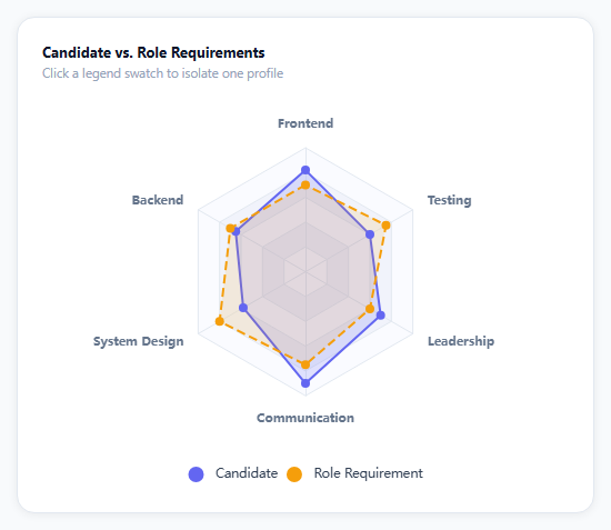
Comparing two multi-dimensional profiles as a table of six numbers takes real effort to parse. Overlay them as two shapes on the same radar and the gap analysis does itself: wherever the candidate's shape falls inside the role requirement's shape, that's the skill gap; wherever it extends beyond, that's where they exceed the bar.
One radar component, two series entries
The radar option (indicators, axis names, split styling) is declared once as its own top-level component, separate from the series. The actual comparison lives in series[0].data, an array of two profile objects — "Candidate" and "Role Requirement" — each with its own six-value array matched positionally to the indicator list. Adding a third profile (say, "Team Average") is just a third object in that array; the radar component itself doesn't change.
Dashed vs. solid distinguishes without relying on color alone
The role-requirement series uses lineStyle: { type: 'dashed' } while the candidate stays solid — deliberately, since color-blind readers or a black-and-white printout would otherwise have to rely entirely on hue to tell the two shapes apart. Distinguishing by line style as well as color is a small accessibility habit worth defaulting to on any overlaid comparison chart.
Six axes, one consistent max
Every indicator shares max: 100, which keeps the radar's grid perfectly regular (a hexagon of concentric rings) and means a given radius means the same thing on every axis — mixing scales (say, a 0-10 axis next to a 0-100 one) would silently distort the shape's proportions and mislead anyone reading it at a glance.
emphasis.focus: 'series' isolates a profile on hover
Hovering (or clicking the legend to select) one profile dims the other, which matters more here than on most charts since two overlapping semi-transparent fills can be genuinely hard to mentally separate at a glance without help.
Reusing it
Swap the six skill axes and the two profiles for any comparison — product feature coverage vs. a competitor, this quarter vs. last quarter, actual vs. target — the indicator list and the data array are the only two things that need to change.
Build with AI
Build, Understand, Optimize, and Extend It With AI
You don't have to figure out multi-series radar overlays by trial and error. Paste this snippet's HTML, CSS, and JS into an AI coding assistant like Claude and ask it to explain exactly how the radar component's shared indicator list and consistent max value keep the two overlaid profiles visually comparable, and why the role-requirement series is styled with a dashed line in addition to its own color. The same assistant can help optimize it — ask whether six axes is the right number for readability before a radar chart starts looking cluttered, and whether the semi-transparent area fills stay legible if a third profile is added. It's also useful for extending the effect: ask it to add a numeric gap summary below the chart (e.g. "System Design: -22") computed by comparing the two data arrays axis by axis, support for more than two overlaid profiles with an automatic color palette, or a toggle between showing values as raw scores versus percentiles. Treat the code less like a finished artifact and more like a starting point for a conversation.
Prompt to recreate it
Copy this into your AI assistant of choice to build the effect from scratch, or as a jumping-off point for your own variant:
Build a radar chart comparing two profiles across multiple skill or feature axes using Apache ECharts (load echarts from a CDN, no other library), in plain HTML, CSS, and JavaScript.

Requirements:
- Define at least six named axes (for example Frontend, Backend, System Design, Communication, Leadership, Testing), all sharing the exact same maximum scale value so the radar's grid rings represent the same proportion on every axis.
- Render exactly two overlapping profiles on that shared radar grid (for example "Candidate" and "Role Requirement"), each with its own six values matched to the axes, its own distinct fill color at partial transparency so the overlap between the two shapes stays visually legible, and its own line color.
- Give the two profiles visually distinct line styles beyond just color — for example one solid line and one dashed line — so they remain distinguishable even without relying on color perception.
- Include a legend below the chart showing both profile names with their colors, using the library's built-in legend-toggle behavior to hide/show either profile.
- On hovering one profile's shape, dim the other profile's shape and fill to a lower opacity so a single shape can be traced without the overlap interfering.
- Show a tooltip on hover displaying the exact value for the hovered axis and profile.
- Keep the chart instance responsive to its container being resized by calling the chart's resize method whenever the container's size changes.
Want to tighten it up first? Run this prompt through the AI Prompt Studio to score it across 8 quality dimensions, catch anti-patterns, and tune the wording for Claude, ChatGPT, or Gemini before you paste it in.
Source Code
<div class="erd-wrap">
  <div class="erd-card">
    <div class="erd-title">Candidate vs. Role Requirements</div>
    <div class="erd-sub">Click a legend swatch to isolate one profile</div>
    <div class="erd-chart" id="erdChart"></div>
  </div>
</div>*{box-sizing:border-box;margin:0;padding:0}
body{font-family:system-ui,-apple-system,sans-serif;background:#f8fafc;min-height:100vh;display:flex;align-items:center;justify-content:center;padding:24px}
.erd-wrap{width:100%;max-width:520px}
.erd-card{background:#fff;border-radius:16px;padding:22px;box-shadow:0 1px 8px rgba(0,0,0,.07);border:1px solid #e2e8f0}
.erd-title{font-size:13px;font-weight:700;color:#0f172a}
.erd-sub{font-size:11.5px;color:#94a3b8;margin-top:3px;margin-bottom:6px}
.erd-chart{width:100%;height:360px}var el = document.getElementById('erdChart');
var chart = echarts.init(el);
var indicators = [
{ name: 'Frontend', max: 100 },
{ name: 'Backend', max: 100 },
{ name: 'System Design', max: 100 },
{ name: 'Communication', max: 100 },
{ name: 'Leadership', max: 100 },
{ name: 'Testing', max: 100 },
];
var option = {
tooltip: {
backgroundColor: '#0f172a',
borderWidth: 0,
textStyle: { color: '#fff', fontSize: 12 },
},
legend: {
bottom: 0,
icon: 'circle',
textStyle: { color: '#334155', fontSize: 11.5 },
},
radar: {
indicator: indicators,
center: ['50%', '46%'],
radius: '62%',
axisName: { color: '#64748b', fontSize: 11, fontWeight: 600 },
splitArea: { areaStyle: { color: ['#fafbff', '#f1f3fb'] } },
splitLine: { lineStyle: { color: '#e2e8f0' } },
axisLine: { lineStyle: { color: '#e2e8f0' } },
},
series: [{
type: 'radar',
emphasis: { focus: 'series' },
data: [
{
name: 'Candidate',
value: [82, 65, 58, 90, 70, 60],
areaStyle: { color: 'rgba(99,102,241,.25)' },
lineStyle: { color: '#6366f1', width: 2 },
itemStyle: { color: '#6366f1' },
},
{
name: 'Role Requirement',
value: [70, 70, 80, 75, 60, 75],
areaStyle: { color: 'rgba(245,158,11,.18)' },
lineStyle: { color: '#f59e0b', width: 2, type: 'dashed' },
itemStyle: { color: '#f59e0b' },
},
],
}],
};
chart.setOption(option);
var ro = new ResizeObserver(function () { chart.resize(); });
ro.observe(el);Step by step
How to Use
- 1Add the ECharts CDNLoad echarts.min.js before the snippet's JS runs.
- 2Paste HTML, CSS, and JSTwo overlapping hexagons render across six skill axes.
- 3Find the gapsWhere the dashed shape extends past the solid one is a gap.
- 4Find the strengthsWhere the solid shape extends past the dashed one is a strength.
- 5Hover a shapeThe other profile dims so you can trace one shape clearly.
- 6Click a legend swatchToggle a profile on or off entirely.
Real-world uses
Common Use Cases
Got questions?
Frequently Asked Questions
The radar component (the six-axis grid itself) is declared once, and the series's data array holds two separate profile objects, each with its own values array matched positionally to the indicator list plus its own line and area styling. ECharts renders every entry in that data array as its own shape on the shared grid, which is what produces the overlap.
Relying on color alone to distinguish two overlapping shapes assumes every reader can distinguish those specific hues — not a safe assumption for color-blind readers or a grayscale printout. Giving the role-requirement series lineStyle: { type: 'dashed' } means the two shapes are distinguishable by pattern as well as color, which is a small habit worth defaulting to on any chart comparing exactly two overlaid series.
The radar's grid is a set of concentric rings shared across all axes, and each ring represents the same fraction of each axis's own max. If axes had different max values, an identical-looking radius on two different axes would represent very different real values, silently distorting the shape and misleading anyone reading it. A shared max: 100 across every indicator keeps a given radius meaning the same percentage everywhere.
Add a third object to the series data array with its own name, values array (matched positionally to the indicator list), and its own areaStyle/lineStyle/itemStyle colors. The radar component itself needs no changes — indicators and axis scale are shared across however many profiles are in the data array.
Build the indicators and series data from your own comparison data (component props, a store selector) before calling setOption, initialize the chart once against a container ref, and call setOption again whenever either profile's values change. Dispose the instance on unmount and keep the ResizeObserver pattern for responsive sizing.