Source Code
<div class="aes-stage">
  <div class="aes-card" id="aesCard">
    <svg class="aes-mark" viewBox="0 0 52 52" id="aesMark">
      <circle class="aes-circle" cx="26" cy="26" r="24" fill="none"/>
      <line class="aes-line aes-line1" x1="17" y1="17" x2="35" y2="35"/>
      <line class="aes-line aes-line2" x1="35" y1="17" x2="17" y2="35"/>
    </svg>
    <h3>Payment failed</h3>
    <p>Your card was declined. Check the details or try a different card.</p>
    <div class="aes-actions">
      <button type="button" class="aes-retry" id="aesRetry">Try again</button>
      <button type="button" class="aes-ghost">Use another card</button>
    </div>
  </div>
</div>*{box-sizing:border-box;margin:0;padding:0}
body{font-family:system-ui,-apple-system,sans-serif;background:#f1f5f9;min-height:100vh;display:flex;align-items:center;justify-content:center;padding:24px}
.aes-stage{display:flex;justify-content:center}
.aes-card{background:#fff;border-radius:18px;padding:32px 28px;width:320px;text-align:center;box-shadow:0 18px 44px rgba(15,23,42,.12)}
.aes-card.shake{animation:aesShake .4s cubic-bezier(.36,.07,.19,.97)}
@keyframes aesShake{10%,90%{transform:translateX(-1px)}20%,80%{transform:translateX(2px)}30%,50%,70%{transform:translateX(-5px)}40%,60%{transform:translateX(5px)}}
.aes-card h3{font-size:18px;font-weight:800;color:#0f172a;margin:18px 0 8px;opacity:0;transform:translateY(8px);animation:aesText .4s ease .55s forwards}
.aes-card p{font-size:13px;color:#64748b;line-height:1.55;opacity:0;transform:translateY(8px);animation:aesText .4s ease .65s forwards}
@keyframes aesText{to{opacity:1;transform:translateY(0)}}
.aes-mark{width:80px;height:80px;display:block;margin:0 auto}
.aes-circle{stroke:#ef4444;stroke-width:3;stroke-dasharray:151;stroke-dashoffset:151;animation:aesCircle .55s cubic-bezier(.65,0,.45,1) forwards}
.aes-line{stroke:#ef4444;stroke-width:4;stroke-linecap:round;stroke-dasharray:26;stroke-dashoffset:26}
.aes-line1{animation:aesLine .25s cubic-bezier(.65,0,.45,1) .5s forwards}
.aes-line2{animation:aesLine .25s cubic-bezier(.65,0,.45,1) .72s forwards}
@keyframes aesCircle{to{stroke-dashoffset:0}}
@keyframes aesLine{to{stroke-dashoffset:0}}
.aes-actions{display:flex;flex-direction:column;gap:9px;margin-top:20px;opacity:0;animation:aesText .4s ease .8s forwards}
.aes-retry{background:#ef4444;color:#fff;border:none;border-radius:10px;padding:11px;font-size:14px;font-weight:700;cursor:pointer;transition:background .15s}
.aes-retry:hover{background:#dc2626}
.aes-ghost{background:none;border:none;color:#64748b;font-size:13px;font-weight:600;cursor:pointer;padding:4px}
.aes-ghost:hover{color:#475569}var card = document.getElementById('aesCard');
function play() {
// Re-clone the SVG to restart its stroke-draw animations from scratch.
var mark = document.getElementById('aesMark');
mark.parentNode.replaceChild(mark.cloneNode(true), mark);
// Shake the card once, restarting the animation via forced reflow.
card.classList.remove('shake');
void card.offsetWidth;
card.classList.add('shake');
}
// Shake on first load to punctuate the error landing.
setTimeout(function () { card.classList.add('shake'); }, 760);
// "Try again" replays the whole error animation (stand-in for a real retry).
document.getElementById('aesRetry').addEventListener('click', play);Learn Coding Visually
Learn to code with interactive, live-preview playgrounds — HTML, CSS, JavaScript, React & more.
 HTML Playground42 lessons · Click-based · Live preview
 CSS PlaygroundLearn CSS with a live editor
 JavaScript Playground60 lessons · DOM · Async · Canvas
 React PlaygroundLearn React with a live code editor
 GSAP PlaygroundLearn GSAP animation interactively
 SVG Playground44 lessons · shapes · paths · animation
 SCSS Playground45 lessons · Sass modules · tokens
 Tailwind PlaygroundLearn Tailwind CSS with a live editor
 Bootstrap 5 Playground50 lessons · live preview
Animated Error State — SVG Error Cross HTML CSS
Animated Error State · Animations · Plain HTML, CSS & JS · Live preview
What's included
Features
About this UI Snippet
Animated Error State — Stroke-Drawn Error Cross with Shake
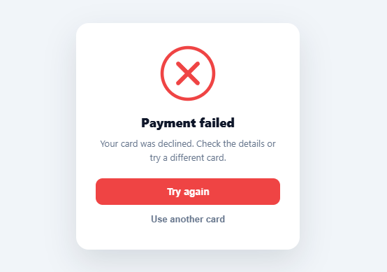
When an action fails — a declined payment, a rejected upload, a failed save — a clear, well-animated error state turns a frustrating dead end into a moment the user understands and can recover from. This snippet builds that error state with pure SVG and CSS: a red circle and cross that draw themselves on, a card shake that punctuates the failure, staggered text, and clear recovery actions — the error counterpart to a success checkmark, no library needed.
The error cross draws on with stroke animation
The mark is an SVG circle plus two crossing lines, all animated with the stroke-dasharray / stroke-dashoffset technique that powers every self-drawing SVG. Each shape's dasharray equals its length and its dashoffset starts at that length (hidden), animating to zero so the line appears to draw itself. The sequence is deliberate: the circle draws first, then the two cross lines draw one after the other (at staggered delays), so the error assembles outline-then-X rather than appearing all at once. The whole thing is red (#ef4444) with rounded line caps, matching the universal "error/failed" visual language.
A shake that conveys "no"
Where a success state feels gentle, an error benefits from a small, sharp shake — a multi-keyframe horizontal translateX wobble on the card that reads instantly as "that didn't work," the same motion native dialogs use to reject invalid input. It fires once when the error lands (timed to just after the cross completes) and again on retry. The shake uses an aggressive cubic-bezier so it snaps rather than sways, which is what makes it read as rejection rather than playfulness. Crucially it's brief — a long shake would feel punitive; a quick one just registers the failure.
Recovery actions, not a dead end
A good error state always offers a way forward, so the card pairs the message with a primary "Try again" (red, matching the error) and a secondary "Use another card" path. This is the most important UX principle for errors: never leave the user stranded with only an error message — give them the obvious next step. The actions fade in last in the animation sequence, after the user has registered what went wrong, so the eye flows from mark → message → options.
Staggered choreography
Like a polished success state, the sequence is choreographed: circle draws → cross draws → card shakes → heading and description rise in → actions appear. Each piece is timed with animation delays so the eye follows the story of the error rather than being hit with everything simultaneously. This restraint is what separates a considered error state from a jarring red flash.
Replayable and recolorable
"Try again" replays the full animation (a stand-in for a real retry attempt) by cloning the SVG to restart its CSS stroke animations and re-triggering the shake with the forced-reflow pattern — the reliable way to restart CSS animations on demand. Everything is built from SVG and CSS, so it scales crisply to any size and recolors by swapping the red, and weighs nothing compared to a GIF or Lottie error animation. Pair it with the success-checkmark snippet to cover both outcomes of any async action with a consistent visual language.
Build with AI
Build, Understand, Optimize, and Extend It With AI
You don't have to work through the replay trick by hand — paste this snippet's HTML, CSS, and JS into an AI coding assistant like Claude and ask it to explain exactly why the play function clones and replaces the SVG node instead of just removing and re-adding a CSS class, and why the shake animation needs the forced reflow via card.offsetWidth to restart reliably. The same assistant is useful for optimizing it — asking whether the staggered animation-delay values across the circle, cross lines, text, and actions could be expressed as CSS custom properties for easier tuning, or whether the clone-based replay has any accessibility side effects worth checking. It's just as good for extending it: ask it to add a distinct shake intensity for repeated failures, generalize the component to accept a dynamic error message and two configurable action labels, or pair it with a matching success-checkmark component sharing the same stroke-draw timing constants. Treat the code less like a finished artifact and more like a starting point for a conversation.
Prompt to recreate it
Copy this into your AI assistant of choice to build the effect from scratch, or as a jumping-off point for your own variant:
Build an "animated error state" card in plain HTML, CSS, and JavaScript — no libraries, using SVG stroke-drawing and a replayable shake, for showing a failed action like a declined payment.

Requirements:
- A card containing an SVG error mark made of a circle and two diagonal crossing lines, a heading, a description, and two action buttons (a primary "Try again" and a secondary alternative action).
- Each SVG shape's stroke-dasharray must equal its own path length and its stroke-dashoffset must start at that same length (fully hidden), then animate to zero via CSS keyframes so it appears to draw itself on. Sequence the shapes so the circle draws first and completes, then the two cross lines draw one after another at staggered delays — never all three drawing simultaneously.
- Separately from the drawing animation, the card itself must play a short, sharp horizontal shake using a multi-keyframe translateX wobble with a snappy (not smooth) easing curve, timed to fire just after the cross finishes drawing, so the error visually "lands" right as the assembled X appears.
- The heading, description, and action buttons must fade and slide up into place with staggered delays after the mark and shake, so the sequence reads as: mark draws on, shake punctuates it, then text and actions settle in — not everything appearing at once.
- Implement a replay function triggered by the "Try again" button that reliably restarts both the SVG stroke animations (which only play once per element by default) and the shake animation. For the SVG, achieve this by cloning the element and replacing the original in the DOM; for the shake, achieve this by removing its animation class, forcing a synchronous reflow by reading an offsetWidth-style property, then re-adding the class.
- Use one consistent color (a red) across the stroke, the primary button background, and nothing else, so the error state reads as a single coherent visual language.
Want to tighten it up first? Run this prompt through the AI Prompt Studio to score it across 8 quality dimensions, catch anti-patterns, and tune the wording for Claude, ChatGPT, or Gemini before you paste it in.
Step by step
How to Use
- 1Paste HTML, CSS, and JSAn error card renders and plays: the circle and cross draw, the card shakes, and the text and actions fade in.
- 2Watch the sequenceNote the choreography — circle, then cross lines, then a sharp shake, then the message and recovery buttons.
- 3Replay itClick "Try again" to replay the full error animation cleanly from the start.
- 4Show it on a real failureReveal the card (or call play()) when an async action fails — a declined payment, failed upload, or save error.
- 5Recolor itChange the red (#ef4444) on the circle, lines, and retry button to match your error palette.
- 6Pair with successUse this alongside the success-checkmark snippet so both outcomes share one animated visual language.
Real-world uses
Common Use Cases
Got questions?
Frequently Asked Questions
Hide the card initially and reveal it (or mount the component) when your async action's catch/rejection fires — a failed fetch, a declined payment webhook, a rejected upload. Because CSS animations run on element insertion/load, showing the card plays the sequence; to replay after a retry without remounting, call play() which restarts the SVG animations and shake.
A short, sharp horizontal shake is a near-universal "rejection" signal — it's the motion native dialogs use for invalid input and password fields use for a wrong entry, so users read it as "that didn't work" without reading any text. Success states feel gentle and settled; errors benefit from that brief, snappy negative motion. Keep it short — a long shake feels punitive rather than informative.
An error state's job isn't just to say something failed — it's to get the user unstuck. Always pairing the message with the obvious next step (Try again, use another card, contact support) turns a dead end into a recoverable moment, which is the single most important error-UX principle. An error with no path forward is a far worse experience than the failure itself.
CSS animations only run once per element load, so the replay clones the SVG and replaces the original — the fresh element runs its stroke animations from scratch — and re-triggers the shake with the forced-reflow trick (remove class, read offsetWidth, re-add class) so the re-added animation is treated as new. This is the standard reliable way to restart CSS animations on demand.
In React, render the SVG in JSX and key it on an error counter so a new key remounts and replays; in Vue, bind :key to a trigger ref; in Angular, use *ngIf to mount on failure. The CSS and stroke-dash technique are framework-agnostic — only the remount/replay mechanism uses each framework's reconciliation, which actually makes the replay simpler than the vanilla clone approach.