Source Code
<nav class="links">
  <a href="#" class="u-slide">Slide in</a>
  <a href="#" class="u-center">Center out</a>
  <a href="#" class="u-wipe">Wipe across</a>
  <a href="#" class="u-grow">Grow up</a>
  <a href="#" class="u-bounce">Springy</a>
</nav>
* { box-sizing: border-box; margin: 0; padding: 0; }
body {
font-family: system-ui, sans-serif;
background: #0f172a;
min-height: 100vh;
display: flex; align-items: center; justify-content: center;
}
.links {
display: flex; flex-wrap: wrap; gap: 36px;
font-size: 18px; font-weight: 600;
}
.links a {
position: relative;
color: #e2e8f0;
text-decoration: none;
padding-bottom: 4px;
}
/* Shared pseudo-element underline */
.links a::after {
content: "";
position: absolute;
left: 0; bottom: 0;
height: 2px;
width: 100%;
background: #818cf8;
}
/* 1. Slide in from left (scaleX from the left edge) */
.u-slide::after {
transform: scaleX(0);
transform-origin: left;
transition: transform 0.3s ease;
}
.u-slide:hover::after { transform: scaleX(1); }
/* 2. Grow from the center outward */
.u-center::after {
transform: scaleX(0);
transform-origin: center;
transition: transform 0.3s ease;
}
.u-center:hover::after { transform: scaleX(1); }
/* 3. Wipe across: enter from left, exit to right */
.u-wipe::after {
transform: scaleX(0);
transform-origin: right;
transition: transform 0.3s ease;
}
.u-wipe:hover::after { transform-origin: left; transform: scaleX(1); }
/* 4. Grow up in height */
.u-grow::after {
height: 0;
transition: height 0.25s ease;
}
.u-grow:hover::after { height: 3px; }
/* 5. Springy overshoot */
.u-bounce::after {
transform: scaleX(0);
transform-origin: left;
transition: transform 0.45s cubic-bezier(0.34, 1.56, 0.64, 1);
}
.u-bounce:hover::after { transform: scaleX(1); }// 100% pure CSS — no JavaScript. Hover each link to see a different underline animation.Learn Coding Visually
Learn to code with interactive, live-preview playgrounds — HTML, CSS, JavaScript, React & more.
 HTML Playground42 lessons · Click-based · Live preview
 CSS PlaygroundLearn CSS with a live editor
 JavaScript Playground60 lessons · DOM · Async · Canvas
 React PlaygroundLearn React with a live code editor
 GSAP PlaygroundLearn GSAP animation interactively
 SVG Playground44 lessons · shapes · paths · animation
 SCSS Playground45 lessons · Sass modules · tokens
 Tailwind PlaygroundLearn Tailwind CSS with a live editor
 Bootstrap 5 Playground50 lessons · live preview
Animated Underline Links — CSS Hover Snippet
Animated Underline Links · Animations · Plain HTML, CSS & JS · Live preview
What's included
Features
About this UI Snippet
Animated Underline Links — Five Hover Effects with scaleX & transform-origin
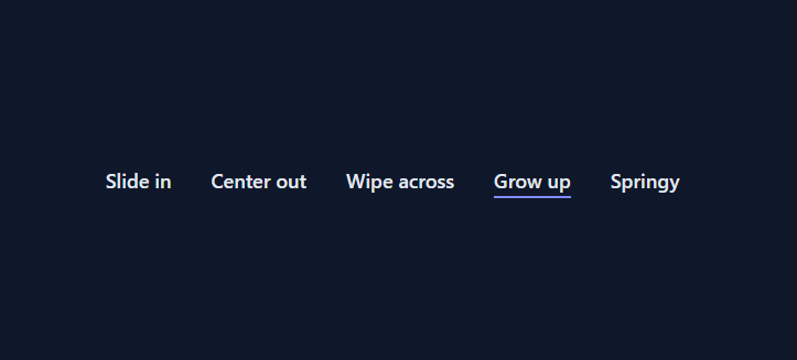
An animated underline on hover is one of the most-searched CSS effects because it is the single cheapest way to make navigation links (in a hover dropdown menu or tab bar) and text links feel polished and interactive. This snippet ships five distinct underline animations — slide in from the left, grow from the center, wipe across, grow up in height, and a springy overshoot — all built with a single pseudo-element and pure CSS. There is no JavaScript at all; everything runs on :hover.
The shared underline pseudo-element
Every link draws its underline with an ::after pseudo-element instead of the default text-decoration, because a pseudo-element can be animated and a text underline cannot. Each link is position: relative and its ::after is position: absolute; left: 0; bottom: 0; height: 2px; width: 100% — a thin bar spanning the link's full width, pinned to the bottom. The animation then controls how that bar appears. Using a pseudo-element also means the underline can be a different color from the text, can have its own thickness, and never affects the link's layout.
scaleX and transform-origin: the core of four effects
Four of the five effects are variations on one idea: scale the underline horizontally and control which edge it grows from. The bar starts at transform: scaleX(0) (zero width) and animates to scaleX(1) (full width) on hover. The magic is transform-origin, which sets the anchor point: transform-origin: left makes it slide in from the left, transform-origin: center makes it grow from the center outward to both edges, and transform-origin: right makes it retract toward the right. Animating transform is GPU-accelerated, so all of these are perfectly smooth even on long navigation bars.
The wipe-across effect: switching the origin on hover
The "wipe across" link is the cleverest: its underline rests with transform-origin: right; scaleX(0) (collapsed to the right edge), but on hover the rule changes transform-origin: left; scaleX(1). Because the origin flips at the moment of hover, the bar appears to enter from the left and, when you move away, exit toward the right — it wipes through rather than simply appearing and disappearing. This origin-swap trick is a favorite for elegant nav links and shows how much expressiveness a single transform-origin gives you.
The grow-up effect: animating height instead of scale
The fourth link animates a different property entirely. Its underline starts at height: 0 and grows to height: 3px on hover with transition: height 0.25s ease. Instead of widening, the bar thickens upward from the baseline — a subtle, weighty feel that suits bold headings and primary nav. This demonstrates that "animated underline" is not limited to scaleX; any animatable property (height, opacity, background-position for gradient underlines) can create a distinct effect.
The springy variant: overshoot easing
The fifth link uses the same left-origin scaleX slide but with transition: transform 0.45s cubic-bezier(0.34, 1.56, 0.64, 1). The 1.56 in the curve pushes the scale slightly past 1.0 before settling back, so the underline overshoots its full width and springs into place. This is the same overshoot curve used for bouncy buttons and toggles, applied to an underline for a playful, energetic feel. Swapping the easing function is the easiest way to change a link's personality without touching anything else.
Why pseudo-element underlines beat text-decoration
The default text-decoration: underline cannot be animated, cannot be repositioned, and sits awkwardly close to the text. A pseudo-element underline can animate its width, height, color, and position; can be offset for breathing room (bottom: 0 with padding-bottom: 4px on the link); and can use gradients or patterns. It is also trivially reusable: define the ::after once and apply different animation rules per class, exactly as this snippet does with five classes sharing one base bar. For multi-line links, note that pseudo-element underlines do not wrap; if you need wrapping underlines, the modern text-decoration with text-underline-offset is the right tool — but for single-line nav links, the pseudo-element approach wins on animation.
Accessibility and usability
These are real <a> elements, so they are focusable and keyboard-navigable. To extend the hover effect to keyboard users, add :focus-visible alongside every :hover rule (for example .u-slide:hover::after, .u-slide:focus-visible::after { transform: scaleX(1) }) so tabbing to a link reveals the underline too. Because the underline is decorative motion, wrap the transitions in @media (prefers-reduced-motion: reduce) to show a static underline for users who prefer less animation. Keep enough color contrast between the underline and the background, and remember that an underline appearing only on hover should not be the *only* indicator that something is a link — color or context should also signal it.
Customizing the underlines
Change the underline color and thickness in the shared ::after (background and height). Speed up or slow down any effect by editing its transition duration. Mix and match: apply u-center to your primary nav and u-slide to footer links. For a gradient underline, set the ::after background to a linear-gradient and animate background-size/background-position instead of scale. Because each effect is a self-contained class built on the same bar, you can copy just the one you want or keep all five as a hover-effect library.
Build with AI
Build, Understand, Optimize, and Extend It With AI
You don't have to work through five transform-origin values by hand — paste this snippet's HTML, CSS, and JS into an AI coding assistant like Claude and ask it to explain exactly why the wipe-across effect flips transform-origin from right to left at the moment of hover instead of using a single fixed origin, and why scaleX is used instead of animating width directly for the four scale-based variants. The same assistant is useful for optimizing it — asking whether any of the five effects could cause layout thrashing on a very long navigation bar, and confirming that transform-based animations really do stay off the browser's layout/paint path. It's just as good for extending it: ask it to add a sixth gradient-underline variant that animates background-position instead of scale, wire up focus-visible support so keyboard users see the same five effects, or generalize the underline color and thickness into CSS custom properties so a design system can theme all five variants from one place. Treat the code less like a finished artifact and more like a starting point for a conversation.
Prompt to recreate it
Copy this into your AI assistant of choice to build the effect from scratch, or as a jumping-off point for your own variant:
Build a set of five distinct "animated underline" hover effects for text links in plain CSS only — no JavaScript, using a single shared pseudo-element as the underline for every variant.

Requirements:
- Every link uses position: relative and draws its underline as an ::after pseudo-element (not the native text-decoration property, since that cannot be animated), absolutely positioned at the bottom of the link, full width, with a fixed small height and its own background color independent of the text color.
- Variant one ("slide in"): the underline starts at scaleX(0) with transform-origin set to the left edge and animates to scaleX(1) on hover, so it appears to grow rightward from the left.
- Variant two ("center out"): identical to variant one but with transform-origin set to center, so the underline grows outward toward both edges simultaneously from the middle.
- Variant three ("wipe across"): the underline rests at scaleX(0) with transform-origin set to the right edge; on hover, change transform-origin to the left edge AND scale to 1 in the same rule change, so entering plays as a left-to-right reveal, and moving the mouse away plays as a right-directed retraction — the origin itself must flip between the resting state and the hover state, not stay fixed.
- Variant four ("grow up"): instead of scaleX, animate the underline's height property from 0 to a few pixels on hover, so it thickens upward rather than widening horizontally.
- Variant five ("springy"): use the same left-origin scaleX slide as variant one, but give it a longer transition duration and a cubic-bezier easing function with a control point above 1, so the underline visibly overshoots full width before settling back, producing a bouncy spring effect.
- Ensure every transition only animates transform (or height for variant four), never width directly, so all five effects stay GPU-friendly and never trigger a layout recalculation.
Want to tighten it up first? Run this prompt through the AI Prompt Studio to score it across 8 quality dimensions, catch anti-patterns, and tune the wording for Claude, ChatGPT, or Gemini before you paste it in.
Step by step
How to Use
- 1Pick an effect classChoose u-slide, u-center, u-wipe, u-grow, or u-bounce and add it to your <a>. Keep the shared ::after base styles.
- 2Add the base underlineEnsure links are position: relative and have the ::after bar (left/bottom/height/width). All effects build on it.
- 3Set color and thicknessChange the ::after background color and height to match your design (e.g. height: 2px to 3px).
- 4Cover keyboard focusAdd :focus-visible::after rules next to each :hover::after so links underline when tabbed to, not just hovered.
- 5Respect reduced motionWrap the transitions in @media (prefers-reduced-motion: reduce) to show a static underline for users who prefer less motion.
- 6Export in your formatClick "HTML" for a standalone file, "JSX" for a React component, or "Tailwind" for a React + Tailwind version.
Real-world uses
Common Use Cases
Got questions?
Frequently Asked Questions
Draw the underline as an ::after pseudo-element (the default text-decoration cannot be animated). Start it at transform: scaleX(0) and animate to scaleX(1) on hover with transition: transform. The text-decoration property itself cannot transition, which is why a pseudo-element bar is used.
transform-origin sets the anchor the scale grows from. left makes the underline slide in from the left, center makes it grow outward from the middle to both edges, and right retracts it to the right. Switching the origin on hover (right to left) creates the wipe-across effect that enters left and exits right.
transform: scaleX is GPU-accelerated and does not trigger layout, so it stays smooth even across a full navigation bar. Animating width forces layout recalculation on every frame and can stutter. scaleX is the performant choice for underline reveals.
Add a :focus-visible rule next to each :hover rule, e.g. .u-slide:hover::after, .u-slide:focus-visible::after { transform: scaleX(1) }. This reveals the underline when a keyboard user tabs to the link, not just on mouse hover.
Yes. Set the ::after background to a linear-gradient and, instead of scaleX, animate background-size or background-position to reveal it. The same pseudo-element base supports gradient and patterned underlines.
Yes. Click "JSX" for a React component or "Tailwind" for a React + Tailwind version. The effects are pure CSS classes on <a> elements, so they work identically in React; just apply the desired underline class to each link.