Source Code
<nav class="menu">
<a href="#" class="item">Home</a>
<div class="item has-drop">
<a href="#">Products
<svg class="arr" viewBox="0 0 24 24"><polyline points="6 9 12 15 18 9"/></svg>
</a>
<div class="drop">
<a href="#"><strong>Analytics</strong><span>Track your growth</span></a>
<a href="#"><strong>Automation</strong><span>Save hours weekly</span></a>
<a href="#"><strong>Integrations</strong><span>Connect your stack</span></a>
<a href="#"><strong>Security</strong><span>SOC 2 & SSO</span></a>
</div>
</div>
<div class="item has-drop">
<a href="#">Resources
<svg class="arr" viewBox="0 0 24 24"><polyline points="6 9 12 15 18 9"/></svg>
</a>
<div class="drop">
<a href="#"><strong>Documentation</strong><span>Guides & API</span></a>
<a href="#"><strong>Blog</strong><span>News & tips</span></a>
<a href="#"><strong>Community</strong><span>Join the forum</span></a>
</div>
</div>
<a href="#" class="item">Pricing</a>
</nav>* { box-sizing: border-box; margin: 0; padding: 0; }
body {
font-family: system-ui, sans-serif;
background: #f1f5f9;
min-height: 100vh;
display: flex; justify-content: center; align-items: flex-start;
padding: 48px 24px 0;
}
.menu {
display: flex; align-items: center; gap: 4px;
background: #fff;
padding: 8px 16px;
border-radius: 16px;
box-shadow: 0 4px 20px rgba(15,23,42,0.08);
}
/* Style both plain link items (a.item) and dropdown triggers (.item > a) */
a.item, .item > a {
display: flex; align-items: center; gap: 5px;
padding: 10px 16px;
border-radius: 9px;
font-size: 14px; font-weight: 600; color: #334155;
text-decoration: none;
transition: background 0.15s, color 0.15s;
}
a.item:hover, .item > a:hover { background: #f1f5f9; color: #6366f1; }
.has-drop { position: relative; }
.arr {
width: 15px; height: 15px;
fill: none; stroke: currentColor; stroke-width: 2.5;
stroke-linecap: round; stroke-linejoin: round;
transition: transform 0.2s;
}
.has-drop:hover .arr { transform: rotate(180deg); }
/* The dropdown panel — hidden until the parent is hovered */
.drop {
position: absolute;
top: calc(100% + 8px);
left: 0;
min-width: 240px;
background: #fff;
border: 1px solid #e2e8f0;
border-radius: 12px;
box-shadow: 0 16px 36px rgba(15,23,42,0.14);
padding: 8px;
display: flex; flex-direction: column;
opacity: 0; visibility: hidden;
transform: translateY(8px);
transition: opacity 0.2s, transform 0.2s, visibility 0.2s;
}
/* Invisible bridge so the cursor can travel from trigger to panel */
.has-drop::after {
content: "";
position: absolute;
top: 100%; left: 0; right: 0;
height: 12px;
}
/* Reveal on hover OR keyboard focus within — pure CSS */
.has-drop:hover .drop,
.has-drop:focus-within .drop {
opacity: 1; visibility: visible;
transform: translateY(0);
}
.drop a {
display: flex; flex-direction: column; gap: 2px;
padding: 10px 12px;
border-radius: 8px;
text-decoration: none;
transition: background 0.12s;
}
.drop a:hover { background: #eef2ff; }
.drop strong { font-size: 13.5px; color: #1e293b; }
.drop span { font-size: 12px; color: #64748b; }// 100% pure CSS — no JavaScript. Hover (or keyboard-focus) a menu item with a caret.Learn Coding Visually
Learn to code with interactive, live-preview playgrounds — HTML, CSS, JavaScript, React & more.
 HTML Playground42 lessons · Click-based · Live preview
 CSS PlaygroundLearn CSS with a live editor
 JavaScript Playground60 lessons · DOM · Async · Canvas
 React PlaygroundLearn React with a live code editor
 GSAP PlaygroundLearn GSAP animation interactively
 SVG Playground44 lessons · shapes · paths · animation
 SCSS Playground45 lessons · Sass modules · tokens
 Tailwind PlaygroundLearn Tailwind CSS with a live editor
 Bootstrap 5 Playground50 lessons · live preview
CSS Hover Dropdown Menu — Pure CSS Snippet
CSS Hover Dropdown Menu · Navigation · Plain HTML, CSS & JS · Live preview
What's included
Features
About this UI Snippet
CSS Hover Dropdown Menu — Fade-Slide Panel, Hover Bridge & focus-within
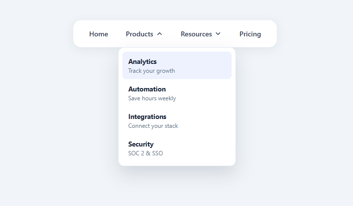
A CSS-only hover dropdown menu is one of the most-searched navigation snippets because developers want a multi-level nav (like a mega menu) that opens on hover without writing any JavaScript. This snippet is a complete, polished hover menu: top-level items, dropdown panels that fade and slide in, a rotating caret, the all-important invisible hover bridge so the menu does not vanish as you move toward it, and :focus-within so it also opens for keyboard users. It is 100% CSS — there is no script at all.
How a CSS-only dropdown opens
The trick is the descendant combinator with :hover. Each menu item that has a submenu is a .has-drop with position: relative, and its panel .drop is position: absolute beneath it. The panel is hidden by default and revealed with the single rule .has-drop:hover .drop — "when the parent item is hovered, show the child panel." No class toggling, no event listeners (unlike the JS-driven dropdown menu); the browser's hover state does all the work. This is the canonical pure-CSS dropdown pattern, and it is genuinely useful for marketing navs where hover-to-open is the expected behavior.
Animating in: visibility + opacity + transform
A common mistake is hiding the panel with display: none, which cannot be transitioned, so the menu pops in abruptly. This snippet instead hides it with opacity: 0; visibility: hidden; transform: translateY(8px) and reveals it with opacity: 1; visibility: visible; transform: translateY(0). The transition animates all three, so the panel fades and slides down smoothly. visibility is included (not just opacity) so the hidden panel cannot be clicked or focused while invisible, and because visibility is transitionable it delays correctly on the way out. This opacity-plus-visibility combo is the right way to animate a show/hide that display: none cannot.
The invisible hover bridge — the part that makes it usable
The single biggest flaw in naive CSS dropdowns is that the panel is positioned with a gap below the trigger (here top: calc(100% + 8px)), so when you move the cursor from the menu item down toward the panel, it crosses empty space, loses :hover, and the menu snaps shut before you reach it. This snippet fixes that with an invisible bridge: .has-drop::after is an empty pseudo-element spanning the full width of the trigger and height: 12px below it, covering the gap. Because the bridge is part of the .has-drop element, hovering it keeps :hover alive, so the cursor can travel from trigger to panel without the menu closing. This one detail is the difference between a frustrating demo and a dropdown people can actually use.
The rotating caret
Each dropdown trigger has a caret SVG that rotates 180° when its menu opens, via .has-drop:hover .arr { transform: rotate(180deg) } with a transition: transform 0.2s. The caret uses stroke: currentColor so it automatically matches the link's text color, including the hover color change. This gives the universal "this item expands" affordance and visual confirmation that the menu is open.
Keyboard support with :focus-within
Hover-only menus exclude keyboard users, so this snippet adds .has-drop:focus-within .drop alongside the hover rule. :focus-within matches an element when it or any descendant has focus, so when a keyboard user tabs into the trigger link, the panel opens and stays open while focus is anywhere inside it — letting them tab through the submenu links. This makes the menu operable by keyboard without any JavaScript, a meaningful accessibility improvement over hover-only CSS dropdowns. For full WAI-ARIA menu semantics (arrow-key navigation, Escape to close, aria-expanded) you would add a small script, but :focus-within covers the essential keyboard case for a navigation menu.
The panel content layout
Each dropdown link is a two-line item — a bold <strong> label and a small <span> description — laid out as a flex column, the rich "mega-menu lite" style used by modern SaaS navs. Links show a soft tinted background on hover. Because the items are just anchors in a flex column, you can add icons, badges, or section headings, or widen the panel and switch to a multi-column grid for a full mega menu. The panel has a generous box-shadow and rounded corners so it reads as a floating surface above the page.
Customizing the menu
Re-theme by changing the link hover colors, the caret/accent color, and the panel's border and shadow. Adjust the open animation by editing the translateY(8px) offset and the 0.2s durations. Change the bridge height (12px) to match your trigger-to-panel gap. To right-align a panel that would overflow the viewport, set right: 0 instead of left: 0 on that .drop. To turn a panel into a mega menu, increase its min-width and lay the links out in a CSS grid. Because the whole menu is declarative CSS, it is easy to extend without touching any logic.
Build with AI
Build, Understand, Optimize, and Extend It With AI
You don't have to hunt through the CSS to see why the menu doesn't snap shut the instant you move your cursor toward it. Paste this snippet's HTML, CSS, and JS into an AI coding assistant like Claude and ask it to explain exactly what the invisible hover-bridge pseudo-element does geometrically and why it has to be a child of the same hoverable element rather than a sibling, and why the hidden panel uses opacity and visibility together instead of just one or the other. The same assistant can help optimize it — for instance asking whether the fixed 12px bridge height is enough for every gap size if someone increases the panel's top offset, and what would visibly break if it weren't. It's also useful for extending the menu: ask it to add full keyboard arrow-key navigation and Escape-to-close behavior on top of the existing focus-within support, convert one panel into a true multi-column mega menu, or make a panel automatically flip to right-aligned when it would overflow the viewport's right edge. Treat the code less like a finished artifact and more like a starting point for a conversation.
Prompt to recreate it
Copy this into your AI assistant of choice to build the effect from scratch, or as a jumping-off point for your own variant:
Build a pure-CSS hover dropdown navigation menu in plain HTML and CSS with zero JavaScript for the interaction itself — no menu library.

Requirements:
- A horizontal nav bar containing plain links plus at least two dropdown-triggering items, where each dropdown trigger is a positioned relative wrapper containing a trigger link and an absolutely positioned panel beneath it.
- The panel must be hidden by default using a combination of opacity, visibility, and a vertical transform offset (not display none, since that cannot be transitioned), and revealed purely through a CSS selector that targets the panel only when its parent wrapper is being hovered — no JavaScript class toggling, no event listeners for open/close.
- Because the panel sits below the trigger with a visible gap, add an invisible pseudo-element on the trigger wrapper that exactly spans that gap (full width, matching height) so that hovering through the gap on the way down to the panel never breaks the hover chain and closes the menu prematurely.
- Also reveal the same panel when focus is anywhere inside the trigger wrapper (not just literally on the trigger link) using a focus-within selector, so keyboard users tabbing through the page can open and use the dropdown without any script.
- Each trigger must include a caret icon that visually rotates 180 degentically when its panel is open, using the same hover and focus-within selectors, and the icon's color must inherit from the surrounding text color so it stays in sync with any hover color change.
- Dropdown panel items should support a two-line layout (a bold title plus a smaller descriptive line) so the pattern can grow into a richer mega-menu later just by widening the panel and switching its internal layout to a grid.
Want to tighten it up first? Run this prompt through the AI Prompt Studio to score it across 8 quality dimensions, catch anti-patterns, and tune the wording for Claude, ChatGPT, or Gemini before you paste it in.
Step by step
How to Use
- 1Copy the nav structureEach dropdown is a .has-drop wrapper (position: relative) containing a trigger link with a caret and a .drop panel.
- 2Keep the hover bridgeThe .has-drop::after pseudo-element fills the gap between trigger and panel so the menu does not close as the cursor travels down. Do not remove it.
- 3Edit the menu itemsChange the top-level links and the bold title + small description inside each .drop link to your content.
- 4Re-theme itUpdate the link hover colors, the caret/accent color, and the panel border and shadow to match your brand.
- 5Handle viewport edgesFor a panel near the right edge, set right: 0 instead of left: 0 on that .drop so it does not overflow.
- 6Export in your formatClick "HTML" for a standalone file, "JSX" for a React component, or "Tailwind" for a React + Tailwind version.
Real-world uses
Common Use Cases
Got questions?
Frequently Asked Questions
Wrap each submenu trigger in a position: relative element and position the panel absolutely beneath it. Hide the panel by default and reveal it with .has-drop:hover .drop — when the parent is hovered, the child panel shows. The browser hover state drives it, so no JavaScript is needed.
There is usually a gap between the trigger and the panel, and moving the cursor across it loses :hover. Add an invisible bridge — a ::after pseudo-element on the trigger spanning the gap (full width, ~12px tall) — so hovering the gap keeps the menu open while the cursor travels to the panel.
display: none cannot be transitioned, so the panel would pop in abruptly. Using opacity, visibility, and transform lets the panel fade and slide, and including visibility ensures the hidden panel cannot be clicked or focused while invisible.
This snippet adds .has-drop:focus-within .drop so the panel opens when a keyboard user tabs into the trigger and stays open while focus is inside it. For full menu semantics (arrow keys, Escape, aria-expanded) you would add a small script, but focus-within covers the essential keyboard case.
Increase the .drop min-width and lay its links out in a CSS grid with multiple columns and section headings. Because the items are plain anchors, you can add icons, badges, and featured blocks freely.
Yes. Click "JSX" for a React component or "Tailwind" for a React + Tailwind version. The menu is pure CSS, so it works in React unchanged; for richer behavior you can add open state and arrow-key handling, but the CSS hover/focus-within reveal needs no logic.