Source Code
<section class="wd-top">
  <h2>Build something</h2>
  <p>A smooth SVG wave separates this section from the next.</p>
  <div class="wd-divider" aria-hidden="true">
    <svg viewBox="0 0 1200 120" preserveAspectRatio="none">
      <path class="wd-wave wd-back" d="M0,60 C200,110 400,10 600,55 C800,100 1000,20 1200,60 L1200,120 L0,120 Z"/>
      <path class="wd-wave wd-front" d="M0,80 C220,40 380,110 600,75 C820,40 1000,105 1200,70 L1200,120 L0,120 Z"/>
    </svg>
  </div>
</section>
<section class="wd-bottom">
  <div class="wd-controls">
    <button type="button" class="wd-chip is-on" data-style="layered">Layered</button>
    <button type="button" class="wd-chip" data-style="single">Single</button>
    <button type="button" class="wd-chip" data-style="animated">Animated</button>
  </div>
  <p>The lower section. Try the styles above.</p>
</section>*{box-sizing:border-box;margin:0;padding:0}
body{font-family:system-ui,-apple-system,sans-serif}
.wd-top{position:relative;background:linear-gradient(135deg,#6366f1,#8b5cf6);color:#fff;text-align:center;padding:54px 24px 0}
.wd-top h2{font-size:26px;font-weight:800}
.wd-top p{opacity:.9;margin-top:8px;font-size:14px}
.wd-divider{position:relative;left:0;width:100%;line-height:0;margin-top:36px}
.wd-divider svg{display:block;width:100%;height:90px}
.wd-wave{fill:#f8fafc}
.wd-back{opacity:.5}
.wd-bottom{background:#f8fafc;color:#334155;text-align:center;padding:24px 24px 64px}
.wd-controls{display:flex;gap:8px;justify-content:center;margin-bottom:14px}
.wd-chip{background:#fff;border:1px solid #e2e8f0;border-radius:20px;padding:7px 16px;font-size:12.5px;font-weight:700;cursor:pointer;font-family:inherit;color:#475569}
.wd-chip.is-on{background:#6366f1;border-color:#6366f1;color:#fff}
/* Single style hides the back wave */
.wd-divider.is-single .wd-back{display:none}
.wd-divider.is-single .wd-front{opacity:1}
/* Animated style drifts the waves horizontally */
.wd-divider.is-animated svg{width:200%}
.wd-divider.is-animated .wd-front{animation:wdDrift 9s linear infinite}
.wd-divider.is-animated .wd-back{animation:wdDrift 13s linear infinite reverse}
@keyframes wdDrift{from{transform:translateX(0)}to{transform:translateX(-50%)}}
@media (prefers-reduced-motion:reduce){.wd-divider.is-animated .wd-front,.wd-divider.is-animated .wd-back{animation:none}}var divider = document.querySelector('.wd-divider');
var chips = Array.prototype.slice.call(document.querySelectorAll('.wd-chip'));
function apply(style) {
divider.classList.remove('is-single', 'is-animated');
if (style === 'single') divider.classList.add('is-single');
if (style === 'animated') divider.classList.add('is-animated');
}
chips.forEach(function (chip) {
chip.addEventListener('click', function () {
chips.forEach(function (c) { c.classList.remove('is-on'); });
chip.classList.add('is-on');
apply(chip.getAttribute('data-style'));
});
});Learn Coding Visually
Learn to code with interactive, live-preview playgrounds — HTML, CSS, JavaScript, React & more.
 HTML Playground42 lessons · Click-based · Live preview
 CSS PlaygroundLearn CSS with a live editor
 JavaScript Playground60 lessons · DOM · Async · Canvas
 React PlaygroundLearn React with a live code editor
 GSAP PlaygroundLearn GSAP animation interactively
 SVG Playground44 lessons · shapes · paths · animation
 SCSS Playground45 lessons · Sass modules · tokens
 Tailwind PlaygroundLearn Tailwind CSS with a live editor
 Bootstrap 5 Playground50 lessons · live preview
Wave Divider — SVG Wave Section Dividers (3 Styles)
Wave Divider · Layouts · Plain HTML, CSS & JS · Live preview
What's included
Features
About this UI Snippet
Wave Divider — Layered, Single and Animated SVG Section Dividers
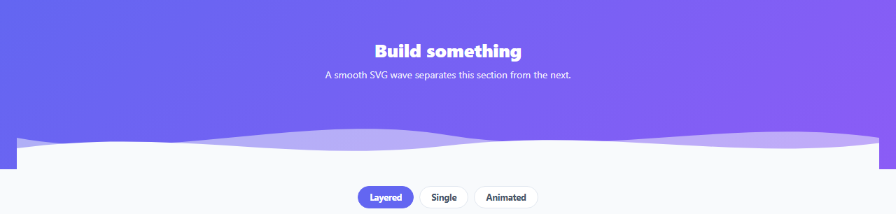
A wave divider is the curved SVG shape that blends one full-width section into the next instead of a hard horizontal edge — a staple of modern landing pages. This snippet provides three switchable styles (layered, single, and animated drifting waves) built with scalable SVG paths, in plain HTML, CSS, and vanilla JavaScript with no images.
Scalable SVG paths, not images
Each wave is an SVG <path> using cubic Bézier curves, inside a viewBox="0 0 1200 120" with preserveAspectRatio="none". That last attribute is the key: it lets the wave stretch to any width while keeping a fixed height, so the divider spans the full page on a 4K monitor or a phone without distorting into a blob. Because it's vector, it stays crisp at every size and weighs almost nothing.
Colour by fill, layered for depth
The wave's fill is simply the colour of the section below it, so the curve reads as that section rising into the one above. The layered style stacks two paths — a faded back wave and a solid front wave at different phases — which creates a sense of depth and motion even when static. The single style hides the back wave for a cleaner, flatter look.
Optional animation
The animated style doubles the SVG width and drifts the two waves horizontally at different speeds with a CSS @keyframes translate, producing a gentle, endless ocean-like motion. Because the waves loop seamlessly (the path repeats across the doubled width), there's no visible jump. The animation respects prefers-reduced-motion, falling back to a static divider for users who opt out.
Drop-in between any two sections
The divider sits at the bottom of the upper section with line-height: 0 to avoid stray gaps, and the front wave's fill matches the lower section's background. To reuse it, you change two colours — the upper section's background and the wave fill — and you have a divider between any pair of sections. The style switcher here is just for demonstration; in production you'd pick one.
Lightweight and customisable
Editing the path's control points reshapes the wave — taller crests, more peaks, a gentler roll — and there are no dependencies. It's a clean, practical reference for the SVG wave-divider pattern that otherwise gets copy-pasted from generators.
Build with AI
Build, Understand, Optimize, and Extend It With AI
Ask an AI coding assistant like Claude to explain precisely what preserveAspectRatio="none" changes about how the SVG viewBox stretches, and why leaving it out would make the wave crop or letterbox on very wide or narrow screens instead of filling the divider cleanly. It's also worth a correctness check on the animated variant — ask how doubling the SVG width and translating by exactly -50% produces a seamless loop, and what would happen visually if the translate distance didn't exactly match one repeat of the path. For extending it, ask for a version where the wave shape morphs on scroll instead of drifting at a constant speed, a generator that produces the cubic Bezier path from a few simple "wave height" and "wave count" parameters, or a variant using multiple color-blended layers for a more painterly gradient look. Treat the code less like a finished artifact and more like a starting point for a conversation.
Prompt to recreate it
Copy this into your AI assistant of choice to build the effect from scratch, or as a jumping-off point for your own variant:
Build a full-width SVG wave section divider in plain HTML and CSS with three switchable styles (layered, single, animated) — no images, no canvas.

Requirements:
- Use an inline SVG with a fixed viewBox and preserveAspectRatio="none" so the wave path stretches to fill any container width while keeping a fixed pixel height, rather than preserving its native aspect ratio and cropping or letterboxing.
- Build the wave shape as one or more path elements using cubic Bezier curve commands, closed down to the bottom two corners so each path fills as a solid shape rather than rendering as a stroked line.
- Support a "layered" style with two overlapping wave paths at different phases and opacities to create a sense of depth, and a "single" style that hides the back layer for a flatter look, toggled via a CSS class on the divider container (not by re-rendering different markup).
- Support an "animated" style that doubles the SVG's rendered width and horizontally translates each wave layer via a CSS keyframe animation at a different speed per layer, looping seamlessly because the path pattern repeats identically across the doubled width, wrapping the translate distance to exactly one repeat.
- Respect prefers-reduced-motion by disabling the drift animation entirely for users who have that preference enabled, falling back to the static wave.
- Set each wave path's fill color to match the background color of the section below the divider (not the section above), so the curve visually reads as that lower section rising up into the one above it.
Want to tighten it up first? Run this prompt through the AI Prompt Studio to score it across 8 quality dimensions, catch anti-patterns, and tune the wording for Claude, ChatGPT, or Gemini before you paste it in.
Step by step
How to Use
- 1Paste HTML and CSSTwo sections render with a wave blending between them.
- 2Match the colorsSet the wave fill to the lower section's background color.
- 3Pick a styleUse the chips to compare layered, single, and animated.
- 4Reshape the waveEdit the path's control points for taller or busier waves.
- 5Enable motion (optional)Add the is-animated class for drifting waves; it respects reduced motion.
- 6Reuse itDrop the divider between any two sections and recolor.
Real-world uses
Common Use Cases
Got questions?
Frequently Asked Questions
By default an SVG keeps its aspect ratio, so a wave would scale uniformly and either crop or letterbox on wide screens. Setting preserveAspectRatio="none" lets the path stretch horizontally to fill any width while keeping a fixed pixel height, which is exactly what a full-width divider needs — it spans the page on any monitor without becoming a tall blob or a thin line.
Set the wave path's fill to the background color of the section below the divider, and the divider sits at the bottom of the section above. The curve then reads as the lower section rising into the upper one. To reuse the divider elsewhere, you only change the upper section's background and the wave fill.
The animated style doubles the SVG width and the path repeats across it, then a CSS keyframe translates the waves by −50% (one full repeat) and loops. Because the shape at 0% and 100% is identical, the reset is invisible, giving a continuous drift. Two waves move at different speeds for parallax, and the animation is disabled under prefers-reduced-motion.
Edit the cubic Bézier control points in the path's d attribute — raising or lowering the C handle y-values changes crest height, and adding more C segments adds peaks. Keep the path closed down to the bottom corners (L 1200,120 L 0,120 Z) so it fills solidly. A wave generator can produce a starting path you then tweak.
Render the SVG markup as a component and pass the fill color and a style prop. The styles are pure CSS, so they port directly; toggle the variant class from a prop. For animation, keep the keyframes in your stylesheet and respect prefers-reduced-motion. Tailwind users can apply the fill and sizing with utilities and keep the SVG path inline.