Learn Coding Visually
Learn to code with interactive, live-preview playgrounds — HTML, CSS, JavaScript, React & more.
 HTML Playground42 lessons · Click-based · Live preview
 CSS PlaygroundLearn CSS with a live editor
 JavaScript Playground60 lessons · DOM · Async · Canvas
 React PlaygroundLearn React with a live code editor
 GSAP PlaygroundLearn GSAP animation interactively
 SVG Playground44 lessons · shapes · paths · animation
 SCSS Playground45 lessons · Sass modules · tokens
 Tailwind PlaygroundLearn Tailwind CSS with a live editor
 Bootstrap 5 Playground50 lessons · live preview
Plan Downgrade Warning Card — Concrete Feature-Loss Preview Before Confirming
Plan Downgrade Warning Card — Feature Loss Preview · Pricing · Plain HTML, CSS & JS · Live preview
What's included
Features
About this UI Snippet
Plan Downgrade Warning Card — Making Loss Concrete Before Confirming
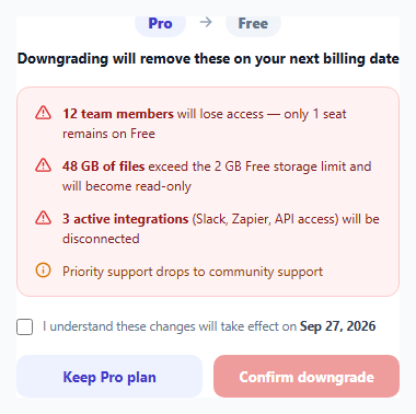
A generic "Are you sure you want to downgrade?" dialog rarely stops anyone, because it doesn't say anything the user doesn't already expect. This card takes a different approach: it computes and displays exactly what will break, using the account's real current usage against the target plan's real limits — specific seat counts, specific storage overage, specific integrations — so the cost of downgrading is concrete rather than abstract.
Why generic warnings under-inform and specific ones actually work
"You'll lose access to some features" is true of almost any downgrade and carries no decision-relevant information. "12 team members will lose access — only 1 seat remains on Free" tells the user precisely who is affected and by how much, which is the information that actually determines whether downgrading is a good idea for *this specific account* at *this specific moment* — not a generic warning that would read identically for an account with 2 users or 200.
Severity is visually differentiated, not uniform
Every warning isn't equally disruptive. Losing 11 teammates' access is a different order of problem than "priority support becomes community support," so the loss list distinguishes major consequences (a red triangular warning icon, darker red text) from minor ones (.minor class, an amber info icon, lighter tone) — letting a user's eye triage severity within the list itself rather than treating every bullet point as equally alarming.
The acknowledgement checkbox as a genuine speed bump, not a formality
The "Confirm downgrade" button starts disabled and only becomes clickable once the user checks a box explicitly stating they understand the listed consequences and the exact date they take effect. This isn't decorative — it forces at least a moment of active engagement with the specific losses just listed, rather than letting a user reflexively click through a wall of red text the way they might dismiss a generic confirm dialog.
A concrete effective date, not "immediately"
The acknowledgement text names a specific date (Sep 27, 2026) rather than saying changes apply "right away" — most billing systems apply a downgrade at the *next* billing cycle rather than instantly, and stating the real date both sets accurate expectations and subtly reassures the user they have a known runway before anything actually changes, rather than fearing an immediate, jarring loss of access.
Build with AI
Build, Understand, Optimize, and Extend It With AI
Ask an AI assistant to explain why account-specific, concrete numbers in a downgrade warning are more effective at informed decision-making than generic feature-loss copy, and to discuss where the line falls between a legitimate consequence-preview pattern like this one and a manipulative "confirmshaming" dark pattern. It's also worth asking for a version that computes the loss list dynamically from a sample usage object, or one that offers a partial downgrade path (e.g. removing only excess seats) as an alternative to a full plan downgrade.
Prompt to recreate it
Copy this into your AI assistant of choice to build the effect from scratch, or as a jumping-off point for your own variant:
Build a plan downgrade warning card in HTML, CSS and vanilla JavaScript that shows a user concrete, specific consequences of downgrading before letting them confirm — no external libraries.

Requirements:
- A header showing the downgrade path (e.g. "Pro → Free") and a heading stating when the changes take effect.
- A list of specific, concrete consequences using realistic account data (e.g. "12 team members will lose access — only 1 seat remains", "48 GB of files exceed the 2 GB limit and will become read-only", "3 active integrations will be disconnected") rather than vague generic warnings.
- Visually differentiate more severe consequences (data loss, access loss) from less severe ones (e.g. a support tier downgrade) using distinct icon and color treatments.
- Include a checkbox the user must explicitly check, acknowledging they understand the listed consequences and a specific effective date, before the "Confirm downgrade" button becomes clickable — the button must be genuinely disabled (not just dimmed) until the checkbox is checked.
- Include an equally prominent "Keep current plan" button as an alternative action alongside the downgrade confirmation.
- On confirming, update the button to a "scheduled" success state; on choosing to keep the plan, acknowledge that choice as well.
Want to tighten it up first? Run this prompt through the AI Prompt Studio to score it across 8 quality dimensions, catch anti-patterns, and tune the wording for Claude, ChatGPT, or Gemini before you paste it in.
Source Code
<div class="demo">
  <div class="downgrade-card">
    <div class="dg-head">
      <div class="dg-path">
        <span class="dg-plan from">Pro</span>
        <svg width="16" height="16" viewBox="0 0 24 24" fill="none" stroke="currentColor" stroke-width="2.4" stroke-linecap="round"><path d="M5 12h14M13 6l6 6-6 6"/></svg>
        <span class="dg-plan to">Free</span>
      </div>
      <p class="dg-title">Downgrading will remove these on your next billing date</p>
    </div>

    <ul class="loss-list">
      <li>
        <svg width="15" height="15" viewBox="0 0 24 24" fill="none" stroke="currentColor" stroke-width="2.3" stroke-linecap="round" stroke-linejoin="round"><path d="M12 9v4M12 17h.01M10.3 3.9 1.8 18a2 2 0 0 0 1.7 3h17a2 2 0 0 0 1.7-3L13.7 3.9a2 2 0 0 0-3.4 0Z"/></svg>
        <div><strong>12 team members</strong> will lose access — only 1 seat remains on Free</div>
      </li>
      <li>
        <svg width="15" height="15" viewBox="0 0 24 24" fill="none" stroke="currentColor" stroke-width="2.3" stroke-linecap="round" stroke-linejoin="round"><path d="M12 9v4M12 17h.01M10.3 3.9 1.8 18a2 2 0 0 0 1.7 3h17a2 2 0 0 0 1.7-3L13.7 3.9a2 2 0 0 0-3.4 0Z"/></svg>
        <div><strong>48 GB of files</strong> exceed the 2 GB Free storage limit and will become read-only</div>
      </li>
      <li>
        <svg width="15" height="15" viewBox="0 0 24 24" fill="none" stroke="currentColor" stroke-width="2.3" stroke-linecap="round" stroke-linejoin="round"><path d="M12 9v4M12 17h.01M10.3 3.9 1.8 18a2 2 0 0 0 1.7 3h17a2 2 0 0 0 1.7-3L13.7 3.9a2 2 0 0 0-3.4 0Z"/></svg>
        <div><strong>3 active integrations</strong> (Slack, Zapier, API access) will be disconnected</div>
      </li>
      <li class="minor">
        <svg width="15" height="15" viewBox="0 0 24 24" fill="none" stroke="currentColor" stroke-width="2.3" stroke-linecap="round" stroke-linejoin="round"><circle cx="12" cy="12" r="10"/><path d="M12 16v-4M12 8h.01"/></svg>
        <div>Priority support drops to community support</div>
      </li>
    </ul>

    <label class="ack-row">
      <input type="checkbox" id="ackBox" />
      <span>I understand these changes will take effect on <strong>Sep 27, 2026</strong></span>
    </label>

    <div class="dg-actions">
      <button class="btn ghost" id="keepBtn">Keep Pro plan</button>
      <button class="btn danger" id="dgBtn" disabled>Confirm downgrade</button>
    </div>
  </div>
</div>
* { box-sizing: border-box; margin: 0; padding: 0; }
body { font-family: system-ui, sans-serif; background: #f8fafc; display: flex; align-items: center; justify-content: center; min-height: 100vh; padding: 24px; }
.downgrade-card { width: 400px; max-width: 100%; background: #fff; border: 1px solid #e2e8f0; border-radius: 18px; padding: 24px; display: flex; flex-direction: column; gap: 18px; }
.dg-head { display: flex; flex-direction: column; align-items: center; gap: 10px; text-align: center; }
.dg-path { display: flex; align-items: center; gap: 10px; color: #94a3b8; }
.dg-plan { font-size: 13px; font-weight: 800; padding: 5px 12px; border-radius: 999px; }
.dg-plan.from { background: #eef2ff; color: #4338ca; }
.dg-plan.to { background: #f1f5f9; color: #64748b; }
.dg-title { font-size: 13px; font-weight: 700; color: #111827; }
.loss-list { list-style: none; display: flex; flex-direction: column; gap: 12px; background: #fef2f2; border: 1px solid #fecaca; border-radius: 12px; padding: 14px 16px; }
.loss-list li { display: flex; gap: 10px; align-items: flex-start; font-size: 12px; color: #7f1d1d; line-height: 1.5; }
.loss-list li svg { flex-shrink: 0; margin-top: 1px; color: #dc2626; }
.loss-list li strong { color: #991b1b; }
.loss-list li.minor { color: #92400e; }
.loss-list li.minor svg { color: #d97706; }
.ack-row { display: flex; align-items: flex-start; gap: 9px; font-size: 11.5px; color: #64748b; line-height: 1.5; cursor: pointer; }
.ack-row input { margin-top: 2px; accent-color: #dc2626; width: 15px; height: 15px; flex-shrink: 0; cursor: pointer; }
.ack-row strong { color: #334155; }
.dg-actions { display: flex; gap: 10px; }
.btn { flex: 1; border: none; padding: 11px; border-radius: 10px; font-size: 13px; font-weight: 700; cursor: pointer; font-family: inherit; }
.btn.ghost { background: #eef2ff; color: #4338ca; }
.btn.ghost:hover { background: #e0e7ff; }
.btn.danger { background: #dc2626; color: #fff; transition: background 0.15s, opacity 0.15s; }
.btn.danger:hover:not(:disabled) { background: #b91c1c; }
.btn.danger:disabled { opacity: 0.45; cursor: not-allowed; }const ackBox = document.getElementById('ackBox');
const dgBtn = document.getElementById('dgBtn');
const keepBtn = document.getElementById('keepBtn');
ackBox.addEventListener('change', () => {
dgBtn.disabled = !ackBox.checked;
});
dgBtn.addEventListener('click', () => {
if (dgBtn.disabled) return;
dgBtn.textContent = 'Downgrade scheduled ✓';
dgBtn.disabled = true;
ackBox.disabled = true;
});
keepBtn.addEventListener('click', () => {
keepBtn.textContent = 'Staying on Pro ✓';
});Step by step
How to Use
- 1Compute the loss list from real account dataReplace the hardcoded numbers (12 team members, 48 GB, 3 integrations) with values derived from the account's actual current usage versus the target plan's real limits.
- 2Order items by severityKeep the most disruptive consequences (seat loss, data loss) above less severe ones (support tier change) so users see the biggest risks first.
- 3Use the .minor class for lower-severity itemsReserve the default red styling for consequences that meaningfully break functionality; use .minor's amber styling for softer downgrades.
- 4Set the real effective dateReplace the hardcoded "Sep 27, 2026" with the account's actual next billing date computed server-side or from your billing provider.
- 5Wire the confirm button to your billing APIReplace the placeholder button-text change with an actual downgrade request to your subscription/billing backend.
Real-world uses
Common Use Cases
Got questions?
Frequently Asked Questions
Specific, account-derived numbers (like "12 team members will lose access") are the information a user actually needs to judge whether downgrading is wise for their situation right now — a generic warning is true of nearly any downgrade and doesn't help anyone make a better-informed decision.
It forces a brief moment of explicit acknowledgement of the specific consequences just listed, reducing the chance of someone downgrading reflexively without registering what they're about to lose — while still keeping the flow to a single extra click, not a lengthy additional confirmation step.
In this demo it's described as becoming "read-only" rather than deleted — the exact behavior depends on your product; whatever it is, state it explicitly in the loss list rather than leaving the user to guess whether their data is safe.
Compare the account's current usage metrics (seats used, storage used, active integrations) against the target plan's defined limits server-side or client-side, and generate one loss-list item per metric that would exceed the new plan's limit.
No — this snippet intentionally differentiates severity with an amber .minor style for lower-impact changes like a support tier downgrade, so the visual weight of the warning list matches the actual severity of each consequence rather than treating everything as equally alarming.
Yes for a real implementation — the hardcoded date in this demo should be replaced with the account's actual next billing date, since most subscription systems apply downgrades at the next cycle rather than instantly, and an inaccurate date would set the wrong expectation.