Source Code
<section class="sbc-hero">
  <div class="sbc-inner">
    <div class="sbc-logo">Findly</div>

    <div class="sbc-searchwrap">
      <svg class="sbc-icon" viewBox="0 0 24 24" aria-hidden="true"><circle cx="11" cy="11" r="7"/><path d="m21 21-4.3-4.3"/></svg>
      <input class="sbc-input" id="sbcInput" type="text" placeholder="Search docs, guides, and API references" aria-label="Search" autocomplete="off">
      <button class="sbc-clear" id="sbcClear" aria-label="Clear search" type="button">✕</button>
    </div>

    <div class="sbc-chips" id="sbcChips">
      <button class="sbc-chip" type="button">Getting started</button>
      <button class="sbc-chip" type="button">Authentication</button>
      <button class="sbc-chip" type="button">Webhooks</button>
      <button class="sbc-chip" type="button">Rate limits</button>
      <button class="sbc-chip" type="button">Pricing</button>
    </div>
  </div>
</section>
* { box-sizing: border-box; margin: 0; padding: 0; }
body { font-family: system-ui, -apple-system, sans-serif; background: #fff; }
.sbc-hero { min-height: 100vh; display: flex; align-items: center; justify-content: center; padding: 40px 24px; }
.sbc-inner { width: 100%; max-width: 620px; display: flex; flex-direction: column; align-items: center; }
.sbc-logo { font-size: 32px; font-weight: 900; letter-spacing: -0.02em; color: #1e293b; margin-bottom: 36px; }
.sbc-searchwrap { position: relative; width: 100%; }
.sbc-icon { position: absolute; left: 20px; top: 50%; transform: translateY(-50%); width: 20px; height: 20px; fill: none; stroke: #94a3b8; stroke-width: 2; stroke-linecap: round; pointer-events: none; }
.sbc-input {
width: 100%; padding: 17px 48px; border-radius: 999px; border: 1.5px solid #e2e8f0;
font-family: inherit; font-size: 16px; color: #0f172a; outline: none;
box-shadow: 0 1px 4px rgba(15, 23, 42, 0.04);
transition: border-color .15s, box-shadow .15s;
}
.sbc-input::placeholder { color: #94a3b8; }
.sbc-input:focus { border-color: #6366f1; box-shadow: 0 0 0 4px rgba(99, 102, 241, 0.12), 0 1px 4px rgba(15, 23, 42, 0.04); }
.sbc-clear {
position: absolute; right: 14px; top: 50%; transform: translateY(-50%);
width: 26px; height: 26px; border-radius: 50%; border: none; background: #f1f5f9; color: #64748b;
font-size: 12px; cursor: pointer; display: none; align-items: center; justify-content: center;
transition: background .15s;
}
.sbc-clear:hover { background: #e2e8f0; }
.sbc-searchwrap.has-value .sbc-clear { display: flex; }
.sbc-chips { display: flex; flex-wrap: wrap; gap: 9px; justify-content: center; margin-top: 20px; }
.sbc-chip {
padding: 8px 16px; border-radius: 999px; border: 1px solid #e2e8f0; background: #f8fafc; color: #475569;
font-family: inherit; font-size: 13px; font-weight: 600; cursor: pointer; transition: background .15s, border-color .15s, color .15s;
}
.sbc-chip:hover { background: #eef2ff; border-color: #c7d2fe; color: #4338ca; }
@media (max-width: 480px) {
.sbc-logo { font-size: 26px; }
.sbc-input { padding: 15px 44px; font-size: 15px; }
}const wrap = document.querySelector('.sbc-searchwrap');
const input = document.getElementById('sbcInput');
const clearBtn = document.getElementById('sbcClear');
const chips = document.querySelectorAll('.sbc-chip');
function syncClearButton() {
wrap.classList.toggle('has-value', input.value.length > 0);
}
// Real focus/typing state — the clear button only appears once there's text
input.addEventListener('input', syncClearButton);
clearBtn.addEventListener('click', () => {
input.value = '';
syncClearButton();
input.focus();
});
// Suggestion chips fill the input and focus it, like a real search-engine homepage
chips.forEach((chip) => {
chip.addEventListener('click', () => {
input.value = chip.textContent;
syncClearButton();
input.focus();
});
});Learn Coding Visually
Learn to code with interactive, live-preview playgrounds — HTML, CSS, JavaScript, React & more.
 HTML Playground42 lessons · Click-based · Live preview
 CSS PlaygroundLearn CSS with a live editor
 JavaScript Playground60 lessons · DOM · Async · Canvas
 React PlaygroundLearn React with a live code editor
 GSAP PlaygroundLearn GSAP animation interactively
 SVG Playground44 lessons · shapes · paths · animation
 SCSS Playground45 lessons · Sass modules · tokens
 Tailwind PlaygroundLearn Tailwind CSS with a live editor
 Bootstrap 5 Playground50 lessons · live preview
Search-Engine-Style Hero — Free HTML CSS JS Snippet
Search-Engine-Style Hero · Heroes · Plain HTML, CSS & JS · Live preview
What's included
Features
About this UI Snippet
Search-Engine-Style Hero — One Big Input as the Whole Homepage
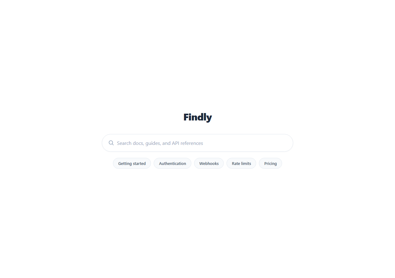
Most marketing heroes lead with a headline and a CTA button. This one leads with a search box — the search-engine-homepage pattern, where the input itself is the primary and only interactive element, and everything else (a logo, a handful of suggestion chips) exists to support it. It's the right hero for a docs site, an internal tool, or any product whose entire value proposition is "find the thing fast."
Minimalism as a design decision, not an oversight
There's no headline, no subheading, no CTA button competing for attention — just a logo mark and one large pill-shaped input, centered in the viewport with generous surrounding whitespace. This isn't a stripped-down placeholder; it's a deliberate echo of the search-engine homepage pattern (Google, Algolia's own doc search, Kagi), which works because it removes every decision except "type and go."
A real, working input, not a static mockup
The input has a genuine focus ring (border-color shift plus a soft box-shadow glow) and a clear button that only appears once there's actual text in the field — tracked with a real input event listener, not just CSS :placeholder-shown tricks. Clicking the clear button empties the field, hides itself again, and returns focus to the input, the same round-trip a real search UI needs.
Suggestion chips that actually populate the field
Below the input, a row of topic chips (Getting started, Authentication, Webhooks...) are real buttons wired with click handlers that set the input's value to the chip's label and refocus the field — clicking a chip functions exactly like typing that query yourself, including making the clear button appear. This is the same pattern search and docs sites use for zero-effort query suggestions.
Why a pill shape and heavy padding
The border-radius: 999px pill shape and generous 17px vertical padding are deliberate: a search input this size reads as a single confident action rather than a form field to fill out, and the large touch target matters as much on mobile as it does for visual weight on desktop.
Customizing it
Wire the input event or a submit trigger (Enter key, or add a submit button) to your actual search endpoint or client-side search index. Replace the suggestion chips with your product's real popular queries or categories. Swap the logo for your wordmark, and adjust the accent color used in the focus ring and chip-hover state to match your brand.
Build with AI
Build, Understand, Optimize, and Extend It With AI
You don't have to guess whether the clear-button logic is solid. Paste this snippet's HTML, CSS, and JS into an AI coding assistant like Claude and ask it to explain how the has-value class toggling keeps the clear button's visibility genuinely tied to the input's real content instead of relying on a CSS-only pseudo-class trick, and why removing the competing headline and CTA is a deliberate design choice for a search-first product rather than an unfinished hero. The same assistant can help you wire it up for real — ask it to add a debounced fetch call to a search API as the user types, or to implement keyboard navigation (arrow keys, Enter) across a dropdown of live results appearing beneath the input. It's also useful for extending the pattern: ask it to add recent-search memory via localStorage, or make the suggestion chips dynamically ranked by click frequency. Treat the code less like a finished artifact and more like a starting point for a conversation.
Prompt to recreate it
Copy this into your AI assistant of choice to build the effect from scratch, or as a jumping-off point for your own variant:
Build a minimal, search-engine-homepage-style hero in plain HTML, CSS, and JavaScript — no framework, no search library.

Requirements:
- A centered, vertically-stacked hero with a small logo/wordmark above one large, pill-shaped (fully rounded) search input as the clear visual centerpiece — no competing headline or call-to-action button, since the search input itself is the primary action.
- The input needs a real, working focus state (a visible border color change plus a soft glow via box-shadow) — not just a static screenshot-style appearance.
- Add a small circular clear button positioned inside the input on the right side that is hidden by default and only becomes visible once the input actually contains text, tracked with a real input event listener (not a CSS-only trick). Clicking it must empty the input, hide itself again, and refocus the input.
- Below the input, add a row of five small pill-shaped suggestion chip buttons with short topic labels. Clicking any chip must set the input's value to that chip's label text and refocus the input — functioning exactly as if the user had typed that query themselves, including making the clear button appear.
- Keep the whole layout minimal with generous whitespace, and make it responsive so the input and logo scale down cleanly on narrow screens.
Want to tighten it up first? Run this prompt through the AI Prompt Studio to score it across 8 quality dimensions, catch anti-patterns, and tune the wording for Claude, ChatGPT, or Gemini before you paste it in.
Step by step
How to Use
- 1Paste the HTML, CSS, and JSA minimal hero renders — a logo, a large pill-shaped search input, and suggestion chips.
- 2Click into the inputA focus ring appears around the field.
- 3Type a queryA clear button fades in on the right; clicking it empties the field and refocuses it.
- 4Click a suggestion chipThe input fills with that chip's text and refocuses, exactly as if you'd typed it.
- 5Wire up real searchConnect the input event (or an Enter/submit trigger) to your search endpoint or index.
- 6Customize the chipsReplace the five suggestions with your product's real popular queries.
Real-world uses
Common Use Cases
Got questions?
Frequently Asked Questions
An input event listener checks input.value.length on every keystroke and toggles a has-value class on the wrapping element. The CSS only displays .sbc-clear when that class is present, so the button genuinely tracks the field's real content rather than relying on a CSS-only :placeholder-shown trick, which wouldn't reset correctly after the field is cleared programmatically.
Each chip has its own click handler that sets the input's value to the chip's text content and calls input.focus(). This also triggers the same has-value state update as manual typing would (the code calls the same sync function), so the clear button appears immediately, exactly matching the behavior of typing the query yourself.
No — it handles the input's visual and interaction states (focus, clear, chip-fill) but doesn't call any search API or filter any data, since that depends entirely on your backend or search index. Wire a submit handler (Enter keypress, or add a submit button) to your real search endpoint or a client-side library like Fuse.js or Algolia's InstantSearch.
A fully rounded, heavily padded input reads as a single confident action rather than one field among many in a form — the search-engine-homepage convention. It also gives a larger, easier touch target on mobile, which matters when the input is the hero's only interactive element.
Hold the query string in state. The input's onChange updates it and derives the has-value condition directly from the string's length (no separate class-toggling needed). Each chip's onClick sets the same state value. Bind the clear button's visibility to query.length > 0. Click JSX, Vue, or Angular in the export panel for the converted component.